

Ann Seeber
-
Posts
3,808 -
Joined
-
Last visited
-
Days Won
102
Content Type
Profiles
Gallery
Forums
Posts posted by Ann Seeber
-
-
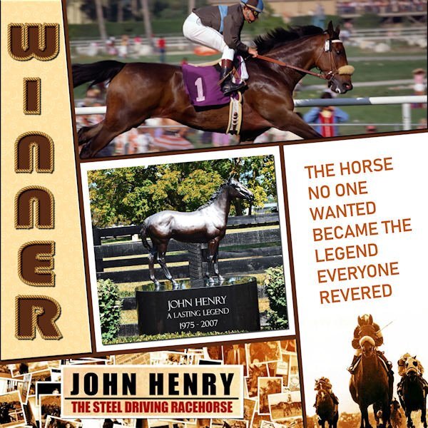
Here's my Day 6 - I filled all sections with images and/or text. We saw this horse in person at the Meadowlands Racetrack in NJ. Everyone was so excited to see The Legend. I discovered they made a 90 minute documentary about him and the DVD is available for ONLY $100!! ? The sad part is that he was incorrigible as a young horse, so he was gelded and, as a result, was unable to pass on his talents to any progeny. The font I used for the title is Bauhaus 93. The vector tube script was perfect!

-
 2
2
-
 1
1
-
 12
12
-
-
2 hours ago, Rene Marker said:
She then stated that she knows it is 5 degrees because she made the template.
Thanks, Rene. I'm unsure how you find the information as to the angle of the image on the layer.
-
1
-
-
Carole: I just watched the video for Day 6, and you say: "for this particular template, if you are using it, you can rotate your title to match the line, but I can tell you that it was an angle of five degrees." My question is how do you know it was five degrees?
-
3
-
1
-
-
1 hour ago, Susan Ewart said:
Thank you for your compliments. I should try that, I've only used it making the engraved metal and on the leather tag so I dont quite understand it yet. I agree about text on a curve, once I tame that pen tool that is.?
I hear ya! I had to re-do my line 4 times before it looked like a curve! ?
-
3
-
 1
1
-
-
3 hours ago, Susan Ewart said:
I cut it out of the top paper, using the magic wand to select the letters and then hitting delete on the paper layer.
Gorgeous layout Susan! Love the colors, especially. I usually give my title letters the Effects/Cutout treatment and I think the result is the same with less work. I was surprised how easy the text on a curve turned out to be!
-
4
-
-
20 minutes ago, Linda Hitt said:
I was really tempted to put a shadow on the Title!
I know Carole said not to use a shadow, but I did. I duplicated the vector layer, rasterized it and added a shadow. My text is rather narrow and needed an emphasis.
-
1
-
-
A photo from Chuck Calio on The Hudson Valley in Pictures titled Quiet Time. The stars are from my kit of glitter star templates by Esperanza Mixto on Pixelscrappers. I used various effects on plain color fills. The title font is Before the Rainbow from the Freebie Challenge.

-
12
-
6
-
-
4 hours ago, Cassel said:
Those translucent stars are lovely.
Thank you, Carole. I have a selection of them as templates which I can colorize and, in this case, lower the opacity to give them more of the look of translucency. There are 10 versions, and they are labeled: ps-esperanza-mixto-glitter-star-templates-kit, from Pixelscrappers.
-
2
-
-
40 minutes ago, Mary Solaas said:
Using my desert pics and the build a kit workshop elements and papers - this is my day 3 text workshop. Interesting how to use the magic wand to make the area for the journaling.
Mary, you are really getting GOOD at this! Wonderful layout!!
-
2
-
 1
1
-
-
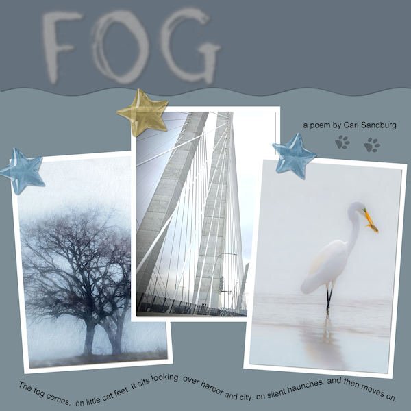
LESSON 4 - FOG - I hunted up 3 photos on Unsplash to illustrate Carl Sandburg's poem "FOG". The stars are from my new kit. The colors are from my kit's palette. The cat footprints were from a free site that Google found. I was pleased that I got the text on a path to work properly the first time!
-
8
-
9
-
-
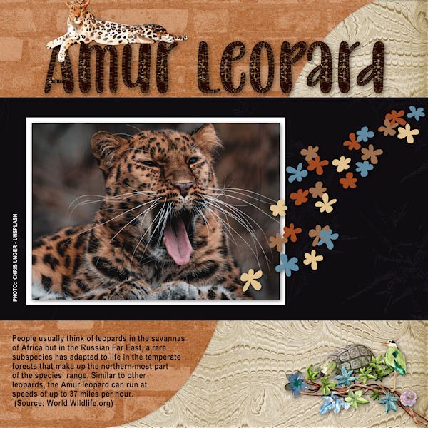
Here's my Lesson 3 - The Amur Leopard. The photo is from Unsplash, the title font is Baby Olivia, the papers and the scatter are all mine from my new Rustic Kit. The lounging leopard and the turtle/bird cluster are from an Animal Kingdom Kit by ddeb.
-
6
-
11
-
-
1 hour ago, Cassel said:
You might want to tweak the placement of the text as the overlapping with the decorative element is inconsistent. Maybe move the text a little downward or resize the decorative element a little to shift upward? That change in size for the title really gives that impression of jumping!!
Thanks, Cassel. Here's my revised version.
-
4
-
3
-
-
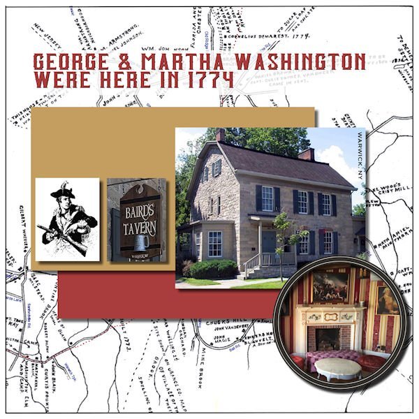
My late husband and I lived and worked in the Historic Village of Warwick (NY) for over 40 years. No one goes around in period costume but there are many buildings restored to their original glory from the 16th and 17th centuries. It was dubbed the Queen's Village after the citizens rallied for King George during the Revolutionary War. Then General George Washington visited and stayed awhile. There was an iron forge that created this huge chain that was shipped to the Hudson River and stretched across to repel British invaders.
-
2
-
1
-
-
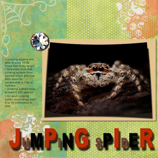
Here's my Lesson 2 - Jumping Spider. Used Cass script for the curved photo from Unsplash, Rainclouds & Rainbows kit for the papers, splashes and element and an old Halloween kit for the spiderweb.
-
3
-
1
-
12
-
-
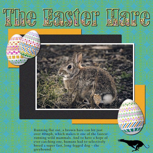
LESSON 1 - THE EASTER HARE - Photo from Pixabay by Matteo Baronti; Cass-decorated eggs; TITLE - Bernard MT Condensed filled with PSP Tube candies (for Easter, of course); Greyhound silhouette from Vector Stock. I also used Cassel's template and the MarisaL Tangible Hope kit. (Thanks for the kit, Carole, I noticed it was free because it was from your account)
-
4
-
11
-
-
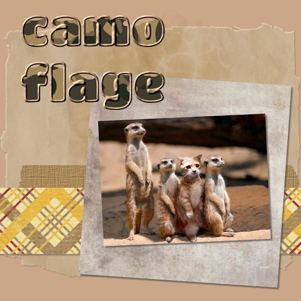
23 minutes ago, Julie Magerka said:
I decided to post right away before I see the wonderful work that others will produce. The layout here is simple, but it's a photo that always makes me smile.
I had to work on the outlined & filled text a couple of times before I got it to cooperate. Those layers mess me up sometimes....which one I AM on vs. which one I SHOULD be on!
The font is Titan One, and it's nice and thick for this purpose. I'd never used the Effects>Texture>Sculpture and was happy to try it. Nice effect.
I just found the cat in with the meercats! Ha ha!! Clever photo and nice use of the text. Love your colors. I recently discovered the sculpture effect and am floored as to its potential! Thanks, Cassel!
-
4
-
1
-
-
I downloaded the Corel Freebie of the week and added some photos from my daughter and granddaughter's recent trip to the San Francisco Ballet to see Giselle performed.
-
4
-
3
-
-
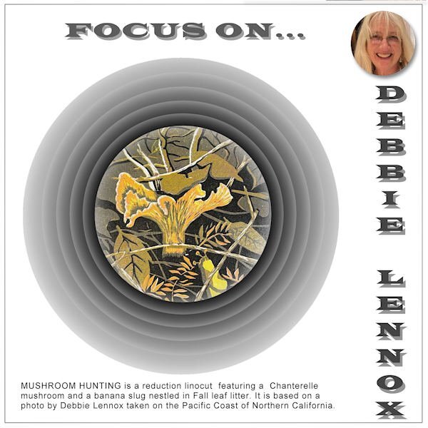
Artist daughter Deb finished her reduction linocut of her mushroom photo and I showcased it here:
-
5
-
2
-
-
I - Inebriated! How you'll be after happily drinking all that Guinness. ?
-
1
-
1
-
-
I've played with many different crafts over the years. I started with sewing my own clothes from paper patterns (Simplicity, etc) mainly because I was so skinny nothing fit from the store. I made clothes for my daughters when they were small, also. My Mom introduced me to crochet. She did some beautiful work including a large white afghan (machine wash and dry) that I still use. It's so heavy, it could qualify as a "heavy blanket" that is all the rage now. I also tried knitting. I was always interested in art, so I sketched and did some paint-by-numbers items. I got into embroidery and my cousin, Linda from Cohoes, NY, and I would compete to see who could finish their project faster! ? (I think it was a sampler featuring the Lord's Prayer.) I was never very good at photography and couldn't afford a good camera. I borrowed my husband's camera when I took a photography class in college and traveled my area shooting historic scenes in black and white and developing them in our lab. That was fun. I transitioned naturally to computer graphics because I thought myself rather "ham-handed" with supplies IRL. I was never much good at coding as I couldn't remember anything without the book open on my lap. My best talent was using color as it was always very important to me, from clothes to home decor. I also like to cook but that was in the past when I at least had more than one to cook for. Most of my hobbies involved animals: dogs, cats, tropical fish and snakes. I also advocate for wild animals, especially Big Cats, and for a stop to "cub petting" and "animal tourism."
-
3
-
1
-
-
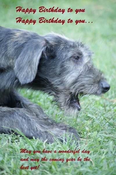
6 hours ago, Julie Magerka said:
March 17 is a day I can't ignore....no, no Irish in my genes...it's my birthday.
Happy Birthday, Julie. Here's one of my Irish Wolfhounds making the announcement! ?
-
1
-
4
-
-
I'm here, too. Looking forward to this!
-
3
-
-
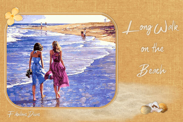
2 hours ago, Michele said:
I can't give credit for the illustration because I couldn't find the original on Google. Layered a couple of papers by Gina Jones from PS and played with the opacity to get the hue I wanted. I used a rounded rectangular selection to change the shape of the pic and added a couple of select selection borders on separate layers. Some clipart from DSS to add some interest. The font is Sexy Beachy from DaFont.
I found the artist... Palette knife art by Howard Behrens | ART BLOG MarkovArt (wordpress.com)
-
2
-
1
-
-
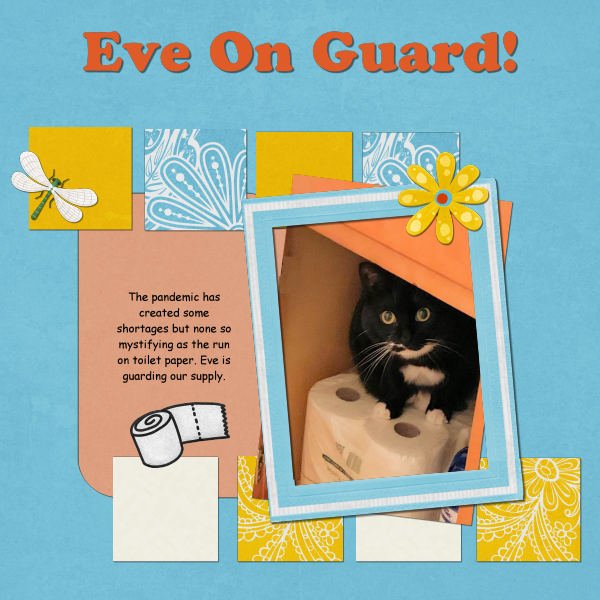
Back in the early days of Covid, everyone seemed to be hoarding toilet paper and I had this cute photo of Eve, guarding our supply...
-
1
-
6
-
2
-


Text Workshop 2023
in Showroom
Posted
Is it really rotated? I thought it was cut at an angle (5%?)