-
Posts
3,339 -
Joined
-
Last visited
-
Days Won
80
Content Type
Profiles
Gallery
Forums
Everything posted by Ann Seeber
-
My page 7 - Debra Lennox Art - Mendocino (that's in Northern California, on the Pacific coast, about 3-1/2 hours north of San Francisco). The background gradient is called Baseball, and I used a layer effect of Exclusion. The font is still Agency. I left the template as is because it worked for me. What seems most odd is doing layouts with NO shadows!
- 374 replies
-
- 11
-

-
Wow, I didn't realize it was so colorful! This is a great virtual trip you have given us. Thanks Corrie.
-
-
M = Mocha - when chocolate is added to coffee (or vice versa).
-
Wow, this is super informative, Susan. A clear explanation for all those thing-a-ma-bobs real photogs use. ? Can you put s separate white background behind just that left photo? I've done that on occasion, myself.
-
-
-
Here is Day 5 - page 6 of Debra Lennox Art - Category: Many Moons - Linocut "Dancing Moon." She does have many moons, but this is my favorite. I have it on my living room wall. Being consistent with the font: Agency. I didn't split the photo mat because I've been waiting for a template with a large area for the image. I'll try a split on page 7 or 8, depending on the templates. The background color and part of the title is flood filled with the off-white of the moon in the image.
- 374 replies
-
- 13
-

-
I've started working with a local shelter to trap and home local stray cats. Most recent was a female calico that had 4 kittens. We lost one kitten but all the rest are safe in homes now, including "my mama, Maybelline." Now I'm leaving out food for a young calico, but it is very elusive, and I rarely see it, though it's eating the food, mostly. It took me over 6 months to get Maybelline to be calm (though she still hissed at me if I got too close LOL) I'm just glad she got her own home and is safe now. My two pampered brats would not have allowed her in the house.
-
Time to post pages 4 & 5 of Debra Lennox Art. Since the two pages go together, I whipped out the Open Book script. These pieces are from her Country Living gallery. The font is still the same. I'll post the text separately as the book is not as readable. "Debra Beck Lennox paints in watercolor, oil, acrylic and is currently a printmaker. Her watercolors celebrate the light and texture of her favorite places while the paint flows freely and expressively. Her acrylics and oils feature vivid colors and strong composition that tell a visual story. Playing with many techniques express different feelings, depending on her mood. "
- 374 replies
-
- 13
-

-

-
And the love between you and Poncho shows in every photo and layout. I feel the same about my cats. Since I am 82 and they are 13 & 9, who knows who will go first? If I'm ever left alone without at least one of them, I might adopt an older cat. They languish in shelters and deserve some love in their waning years, also.
-
They look either from under the sea or from beyond the stars!
-
I enjoyed the coffee with chicory that I tried when visiting New Orleans.
-
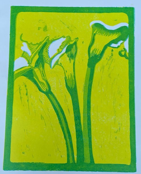
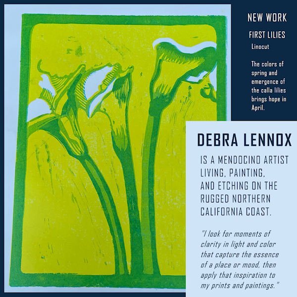
Here is the linocut with no other distractions. This IS straight...and how the artist wants the viewer to see it. Looking at the magazine page I decided to try a revision of the layout. See what you think of this now...
-
Here is my page 3 DEBRA LENNOX ART - PACIFIC OCEAN. Featured is her etching called Salmon on the Fin. As you can see, the fish is diagrammed for consumption. This is one of my favorites of her work but unfortunately, she sold it and there are no prints left either. ?The title font is still Agency. The background is another of her watercolors, "Finding Magic," that was an impressionistic treatment of the Pacific, and I used a Hard Light layer effect.
- 374 replies
-
- 13
-

-

-
Sue: I can see there's some text in white on the photo but at forum size, it's unreadable for me. Can you post it separately?
-
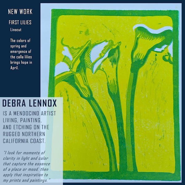
My page 2 is now ready. It features Debbie's New Work, and I chose this piece mainly because it fit the portrait format. The pale blue is part of the piece. The font is still Agency.
- 374 replies
-
- 13
-

-

-

-
These are all beautiful! Hoping to get page 2 done today. syl
-
I didn't either so I looked it up. (I searched using Bing this time.) My search yielded these facts: "Reduction linocut is a method of block printing in which each colour layer is carved into the same lino block. Part of the design is carved into the block and printed. The process is then repeated for each layer of colour. The design is often printed working from the lightest first to darkest colours last. Often referred to as a ‘sabotage’ print."
-
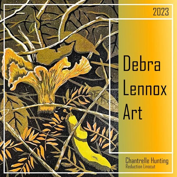
I finally hit on a topic that got me enganged so I did the cover. Debra Lennox is my daughter. The font is Agency and the background gradient is one from my files titled Tulips. *shrug* That bright yellow guy on the right under the mushroom is called a banana slug. ?
- 374 replies
-
- 13
-

-

-
Beautiful cover and camera, Susan. I'd buy that magazine in an instant!
-
-
-
Mine will be about whatever topic has the most photos. ?


