Ann Seeber
-
Posts
3,518 -
Joined
-
Last visited
-
Days Won
91
Content Type
Profiles
Gallery
Forums
Everything posted by Ann Seeber
-
Welcome back, Sue. I've missed you!
-
Trying to download the template but all I get is this: Oops! That page can’t be found. It looks like nothing was found at this location. Maybe try searching?
-
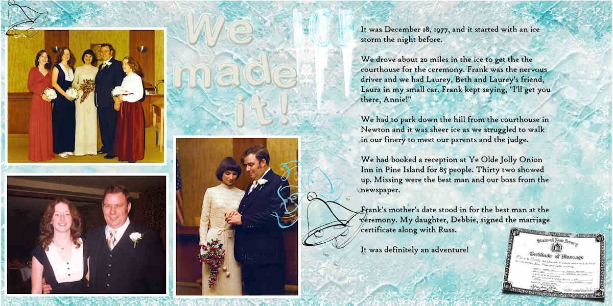
Here's where I documented my own wedding which was celebrated in December of 1977 just after an ice storm the night before. It doesn't look possible to split it so here it is in all its glory! I made this in 2021.

-
I guess I should post the one I made which is part of a larger layout. This used the Pencil Sketch 2 script to start...
-

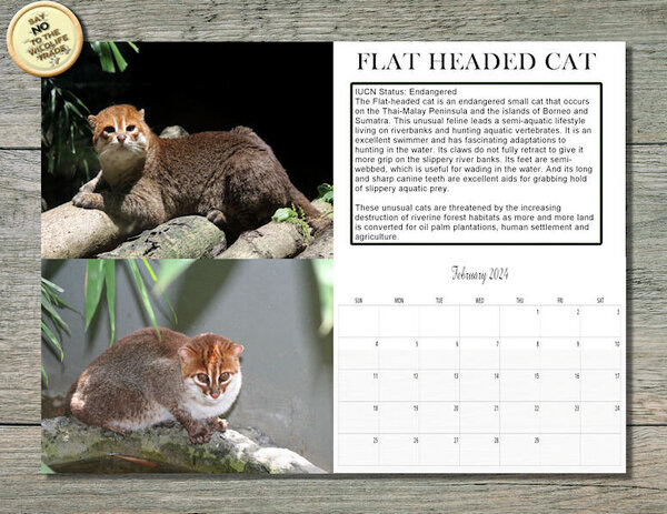
FEBRUARY 2024 WILD CAT CALENDAR-FLAT HEADED CAT_600.jpg
Ann Seeber posted a gallery image in Member Albums
From the album: ANN SEEBER - MISCELLANEOUS
-
Here's my Wild Cat Calendar for February, 2024, featuring the Flat-Headed Cat. Similar to the Fisher Cat in habits as he swims and eats fish and other aquatic animals. I will post this full size on Facebook so you can print it out @ 11" x 8.5" if you wish.
-
is that related to White = Window; Black = Block?
-
I think I just signed up a second time! 😁 The showroom link did take me to 2023 but I have this page bookmarked so I guess it is the new 2024 showroom? I still think of this as the Love Story Challenge!
-
Congrats on the new printer! I have an Epson WorkForce Pro and use it a lot. I agree about using materials from the printer manufacturer, especially ink. Cheap ink products will probably damage your printer as they don't have the special ingredients included to keep it from jamming. I know it is more expensive but I only buy ink directly from Epson and never have jam-ups.
-
This is my Week Five: I bought this Phalaenopsis (Moth Orchid) from the supermarket in June, 2023, when it was in full bloom but had gone on sale for half price. The care instructions said to put three ice cubes on the pot, below the leaves, each week. I happened to have Miracle Grow orchid fertilizer from previous attempts so this time I made up a solution and froze it in ice cube trays. (I had resisted using ice in the past, thinking the orchids are tropical and would not appreciate ice.) Well, it flourished and now it is putting out its third set of blooming stems, still going strong after 7 months! It's the best result I've ever had trying to keep one of these plants alive. I've resisted attempting to repot it, fearful I would ruin the spell. Font is Showcard Gothic
-
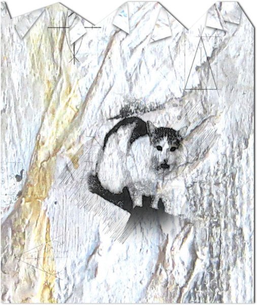
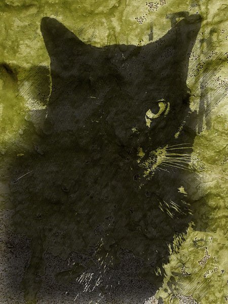
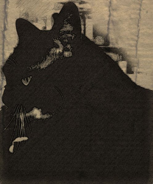
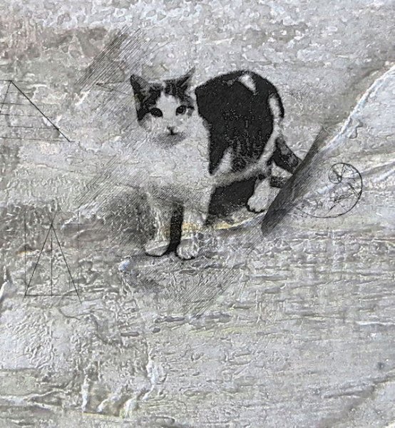
This is what I'm currently working on: Carole's Pencil Sketch2 script. Having a lot of fun! I did the four cats and then combined them with papers and embellishments from the ID-Circle of Life Kit. I have a total of 5 images; one for each cat and then the composite layout. All the backgrounds are from the kit. I also included a folded edge on the lower left sketch of Mommy in the composite. EDIT: Didn't care for the layout so I revised it a bit.
- 145 replies
-
- 12
-

-

-

-
Yay! I love practicing with masks!
-
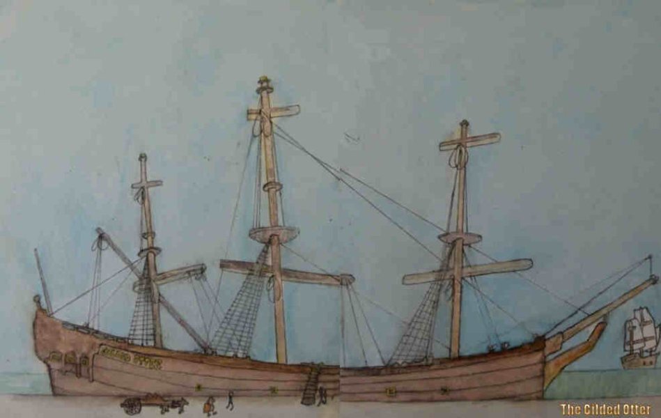
My father had a "family Bible" with entries of our Dutch Terwilliger ancestors going back to the early 1600's also. They arrived in the New World by sailing up the Hudson River and disembarking in Kingston, Ulster County, New York. Across the river is New Paltz, where we found a set of paintings of the ship, the Gilded Otter, in an antiques shop, split on two wooden boards. My daughter Laurey has been pursuing our genealogy via Ancestry.com. I tried reuniting the two sides of the ship, though not super successful in my eyes, a few years ago, using PSP.
-
Rene before my first husband and I could get married in 1960, he had to be baptized into my Lutheran Church as he had been raised Bible Baptist and they didn't do infant baptism. It had to wait until you were of age to make the commitment. He was 23 that year and I was only 19.
-
Really nice, Anja! I especially like the one with a little touch of color.
-
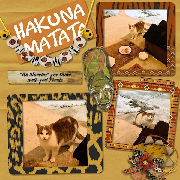
I take it: pets. 😺 Here are my Ferals with better photos. I call the young male Thunderbolt and the adult is Mommy. I used a new kit from Gingerscraps called The Circle of Life based on The Lion King. The new word is: Valentine.
- 6 replies
-
- 10
-
-
-
My Edge browser (Microsoft) does automatic translations now since I asked it to do some recently. Firefox does not. I don't know about Chrome since I removed it from my desktop. I can also copy the text and open Google Translate and paste it in there.
-
It's called "MySave" and I was told to put it in "trusted scripts." I pulled it out and put it on my taskbar with a little icon near the normal blue Save floppy - check with Carole.
-
Corrie and Susan - this was happening to me a lot! I kept finding my .pspimage files in the folders for papers, etc. so I talked to Carole and she pointed me to a little script to use for my Saves that has ended the confusion. It's not you, it appears to be a bug in 2023. At my age I don't need any more hints that I'm losing it! LOL
-
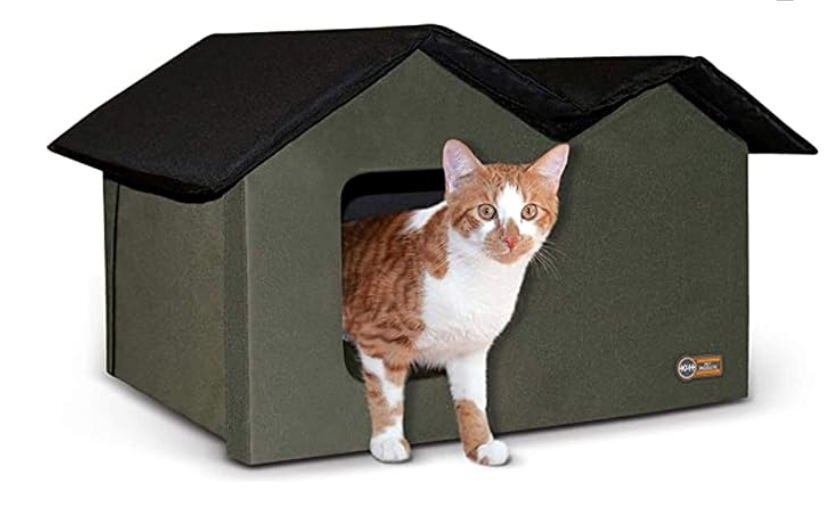
Yes, daughter Laurey gave it to me for Christmas. It fits together with Velcro. There's a door in the back, too. The young guy uses it a lot, aside from liking to lounge on top in nicer weather. 😺
-
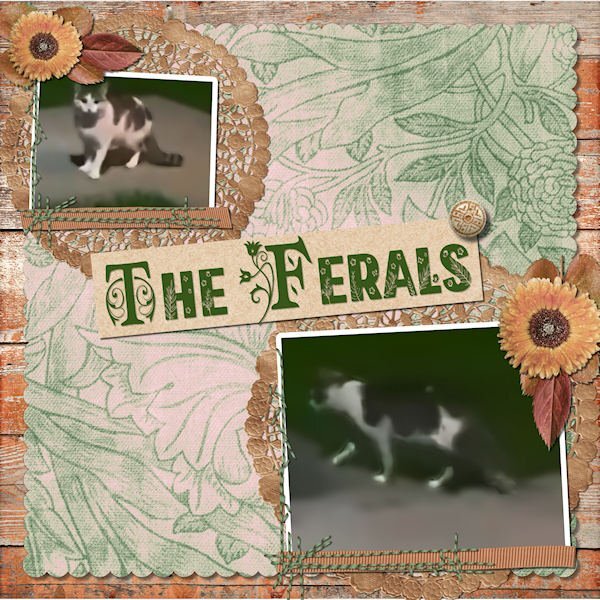
LESSON 7 - A classic scrapbook page, hoping to overcome some really lame photos clipped from a video. A little more involved than I usually do but I think it looks nice. All the elements and papers came from a kit called True Heart Digitals and the fonts are am-index and flora garden. The top cat is a mature female (I think) and the lower one is probably her nearly grown (possibly male) kitten. They seem to act as a bonded pair. She hides under a neighbor's car when I come out on the porch whereas he is bolder and comes running, meowing at me for food. I now have a Cat Cabin on the porch with straw for bedding. I've included a promo photo of it here.
- 426 replies
-
- 14
-
-
-
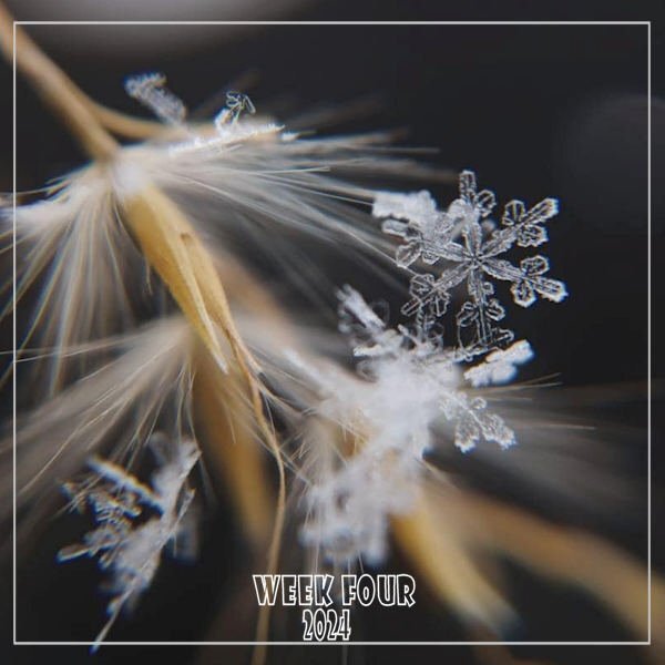
WEEK FOUR - Celebrating our frigid, snowy weather; a nice closeup from the Hudson Valley in Pictures gallery by Cindy Plumb Bishop on 01-20-24. I changed my font from Wide Latin to Showcard Gothic.
-
@Cassel - Is there some reason why you are only using "clip-to-it" and not "raster-to-mask" scripts? I have usually used the clip/to script for papers and accessories, and the raster/mask for photos in the past.
-
TEMPLATE WORKSHOP 6 - JONAH JAMES_600.jpg
Ann Seeber commented on Ann Seeber's gallery image in Template Workshop
 This image has an error. I inadvertently used the wrong great-grandchild photo on the left.
 -
 Corrected layout. Left photo was wrong.