
Ann Seeber
-
Posts
3,108 -
Joined
-
Last visited
-
Days Won
69
Content Type
Profiles
Gallery
Forums
Posts posted by Ann Seeber
-
-
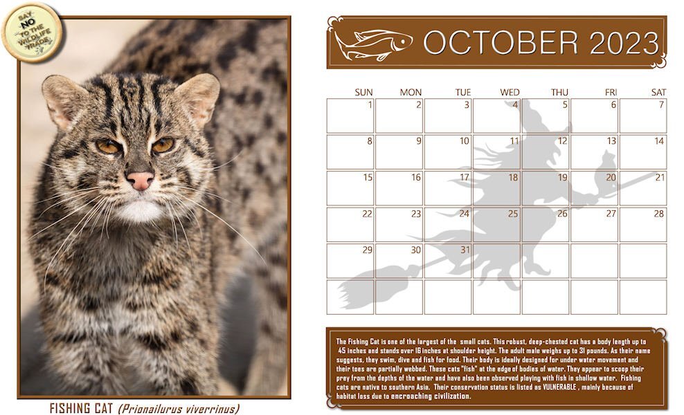
Happy October! I love Halloween, and wild cats. Here's my October Wild Cat Calendar featuring Sushi, the Fishing Cat. There's a full-size version on our Facebook page that you can print @ 11" x 8.5". I do one for my refrigerator door.
LAYOUT DETAILS:
Info from: SMITHSONIAN'S NATIONAL ZOO Fishing cat | Smithsonian's National Zoo
2023 Calendar Template from Cassel
Fish and Halloween Witch illustration - Pngtree
Title font under photo and journaling- Agency
Fishing Cat photo of the recent rescue, Sushi, from The Wild Cat Sanctuary in Sandstone, MN
I find it hard to read the journaling on the reduced-size version here so I'm posting it separately:
"The Fishing Cat is one of the largest of the small cats. This robust, deep‐chested cat has a body length up to 45 inches and stands over 16 inches at shoulder height. The adult male weighs up to 31 pounds. As their name suggests, they swim, dive and fish for food. Their body is ideally designed for under water movement and their toes are partially webbed. These cats "fish" at the edge of bodies of water. They appear to scoop their prey from the depths of the water and have also been observed playing with fish in shallow water. Fishing cats are native to southern Asia. Their conservation status is listed as VULNERABLE, mainly because of habitat loss due to encroaching civilization."

-
 3
3
-
 9
9
-
-
39 minutes ago, Phil Kettmann said:
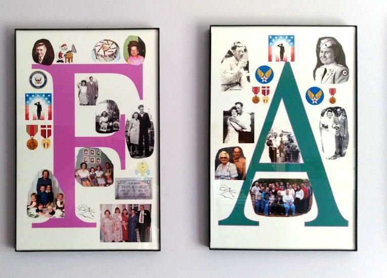
My project started many years ago but I finished it in Sept of 2023. It is a series of pictures to hang in the family room. It is a series of six pictures all 11x17 inches the biggest size my printer will print.It is printed on glossy photo paper.
All of the picture gathering and editing was done using Paintshop Pro Ultimate 2023.
It is composed of many family photo's gather for many years. The F in Family are pictures of my mother and father-in-law. The A is my mother and father. The M is my wife and our family. We had 3 children so it worked out just fine. The I is our son, the L is our oldest daughter and her family, and last but not least the Y is our youngest child and her family.
I posted a larger picture of just the F and A.
I have used Corel software (Paintshop and Video Studio) for close to 20 years and I'm still learning new things about how it works. Maybe one day I might open the instructions.

What a very nice presentation, Phil. You are giving me ideas! Oh, and welcome to the Campus. Hope to see more of your work.
-
3
-
-
1 hour ago, Michele said:
Redo of Day 5. I forgot that they were supposed to be two separate pics. I knew it when I started but lost track of what I was supposed to be doing ?. I also reduced the size of some of the stars as per Sue's welcome suggestion.
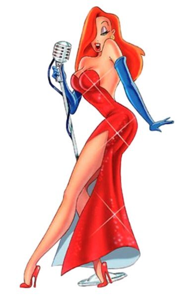
Michele, your illustrations remind me of Jessica Rabbit in the Disney film, "Who Killed Roger Rabbit?" when she sings, famously, "I'm not bad, I'm just drawn that way!" ?
-
 2
2
-
3
-
-
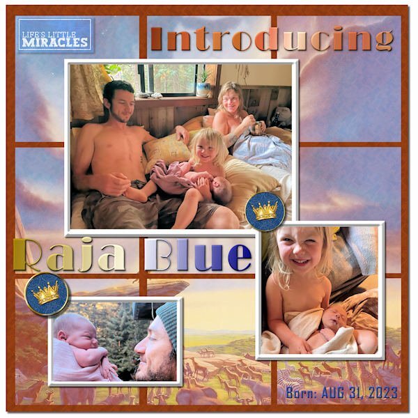
Thought I'd also post my Sketch Challenge here to introduce my new great grandson, Raja Blue Lennox, little brother to Magic. He was born at home on Aug 31, and it took the parents a week to come up with a name. ? I think he weighed in at nearly 9 lbs. Daddy Will introduced him with a musical rendition of the opening to The Lion King, so I went with the theme and used a Lion King poster in the background, mirrored and screened in each of the 9 squares. The mat behind them has a wood grain pattern. The crown brads are from Janet Kemp. The title font is Broadway, treated to a Copper gradient and a Chrome Reflection gradient. The little word art top left is from Marisa Lerin. I tried out PSP's One Step Photo Fix and was impressed with the results. I think it is improved in PSP 2023.
-
6
-
-
Finally finished my Sketch Challenge. Introducing my new great grandson, Raja Blue Lennox, little brother to Magic. He was born at home on Aug 31, and it took the parents a week to come up with a name. ? I think he weighed in at nearly 9 lbs. Daddy Will introduced him with a musical rendition of the opening to The Lion King, so I went with the theme and used a Lion King poster in the background, mirrored and screened in each of the 9 squares. The mat behind them has a wood grain pattern. The crown brads are from Janet Kemp. The title font is Broadway, treated to a Copper gradient and a Chrome Reflection gradient. The little word art top left is from Marisa Lerin. I tried out PSP's One Step Photo Fix and was impressed with the results. I think it is improved in PSP 2023.
-
1
-
12
-
-
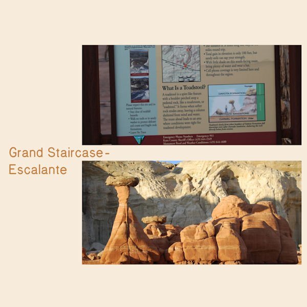
8 hours ago, Bonnie Ballentine said:
Day 5
This is my least favorite of my pages but it was a fun hike to this formation.
Bonnie, your photos are fabulous. In this case, I think I would put the photo of the rocks on the top and the signage on the bottom. Just my opinion.
-
1
-
1
-
-
25 minutes ago, Michele said:
Here's my Day 4. Hayden has a bunch of Barbie illustrations, especially now with the Barbie movie out. But I decided to go with his old-school collection. (I know it's supposed to be a two-page layout, but I was afraid if I combined it into one image, it wouldn't be very visible once I sized them down.) Hayden has a bunch of Barbie illustrations, especially now with the Barbie movie out. But I decided to go with his old-school collection.
I'm trying to visualize her dancing in those shoes with Fred Astaire -- backwards! You can do it, Babs!
-
2
-
-
35 minutes ago, Susan Ewart said:
I love the drawings, hand done ones, they are like art to me. My friend and I used to draw houseplans when we were 12-13 yrs old. I can imagine how bad they must've been. One course in drafting(in high school) told me, I couldnt visualize the 3D space. We had exercises where we had to draw the exploded 2D view of a cube with indents in the cube, or we have to draw the 3D version from the exploded drawing. I couldnt do it. I wished I'd paid more attention and wasnt so shy that I never asked for help. I never really was taught how to "see" it both in 2D and 3D.
I just went through reams of graph paper at home, re-arranging walls and furniture. ?
-
1
-
-
21 minutes ago, Susan Ewart said:
I did a drafting elective in high school and penmanship was one of the things we had to learn. I love architecture. But I sure bombed at drafting. My Calligraphy teacher has the most amazing handwriting and printing. Calligraphy is considered drawing letter and not writing, that's probably why I was so bad at it, that and I was a heavy handed lefty.
I went back to college for an AAS in Visual Communications and had the opportunity to do an elective in Auto-Cad, which is what the draftspeople and architects now use instead of hand drawing everything (which my daughter preferred - she hated Auto Cad. I call her my Luddite! LOL If she could she'd stick with a slide rule instead of a computer) Well, I LOVED Auto-Cad and begged my advisor to ok Auto-Cad II for me. I'm clumsy at hand drawing, myself, but Cad was a dream! Deb has Cad in her office but hires people to do her drawings with it. ?
-
13 hours ago, Susan Ewart said:
WOW! Ann, this is really beautiful. What a diverse artist Debra is. And an architect, she must have beautiful penmanship as well.
Yes, she literally writes by hand in Copperplate Gothic. They had an entire course on it in college. She has lots more pieces on display on her website here if you'd care to explore.
-
3
-
-
32 minutes ago, bina greene said:
Day 7 template, click image to dl pls.
Bina, when I click on this one it serves up a .zip file. That didn't happen before. ???
-
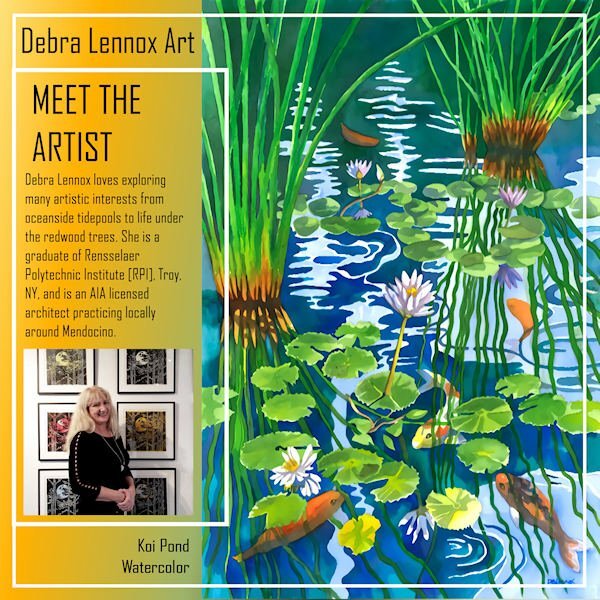
Here's my Back Page for Debra Lennox Art. I mirrored the Front Page mainly by sliding the parts of the photo group over and moving the double frames. I used the same gradient as the cover. I'm still using the same font: Agency. I have this watercolor on my bedroom wall but had to position it so you see it as you walk down the hallway as it is quite large @ 32" h. x 40" w. with matting and frame. Deb has 2 children, both married, and there are 2 grandchildren, Magic and Raja.
I meant to also post the thumbnails of all 8 pages. I've added it now.
-
12
-
-
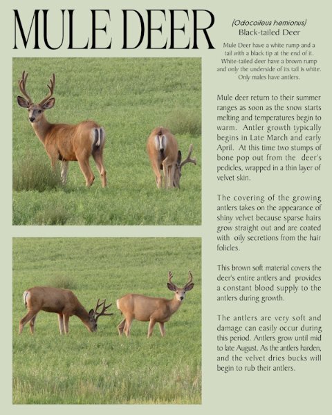
2 hours ago, Sue Thomas said:
Well, it's officially Autumn, and I really don't like these darker evenings and mornings. The days are only going to get shorter and shorter.
For the last page I used yesterday’s (day 6) 2 mask layers that I edited. Using the edit selection tool I moved the masks to the opposite side of the page, using the guides to keep everything aligned. Mule deer in velvet.
Nice, Sue. I used the same technique for my page 8 but mirroring the front page. See it posted below.
-
4 hours ago, Susan Ewart said:
these are really good ideas for me to try. going to copy/paste these posts so I dont forget.
@SusanEwart, the blend modes were the main reason I now lean on PSP2023 as they are so handy to just scroll through and see the effect in real time on the image. It's a new feature of '23.
-
3
-
-
My page 7 - Debra Lennox Art - Mendocino (that's in Northern California, on the Pacific coast, about 3-1/2 hours north of San Francisco). The background gradient is called Baseball, and I used a layer effect of Exclusion. The font is still Agency. I left the template as is because it worked for me. What seems most odd is doing layouts with NO shadows!
-
11
-
-
2 minutes ago, Corrie Kinkel said:
Day 6 of my trip to Het Depot and this page features the glass floor on which you can walk, although not everyone dared to! I saw people very hesitating set a step on that glass flooring! It was difficult to get a photo of the floor because of all the reflection from the glass everywhere. In the end I put my phone on the floor and was able to take a photo of a part of it. I have other photos where you can see the floor and the entrance to the restaurant but those didn't show the colors of the floor very well. Those show more the context of it all, but didn't look good in this page, even if I changed the templates to other dimensions. I'm planning to use these Magazine pages to print an album for the friend I was taking this little trip with. She will be 75 later this year and as she doesn't take much photos I think it will provide a nice gift. Of course I have much more photos of the museum visit and will make more magazine pages for that album. Luckily her birthday is to the end of November, so I have hopefully time enough to do so.
Wow, I didn't realize it was so colorful! This is a great virtual trip you have given us. Thanks Corrie.
-
3
-
 1
1
-
1
-
-
59 minutes ago, Sue Thomas said:
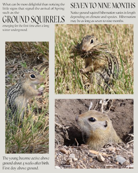
Instead of turning 4 masks into one I decided on two masks. Seeing as I featured the ground squirrel on the front over, and the magazine issue is a Spring one, I deemed it appropriate to dedicate a page to them. After all I have come to know quite a few of them very well, and they me.
So cute. For the first day of Spring, I thought this little meme appropriate...
-
7
-
2
-
-
M = Mocha - when chocolate is added to coffee (or vice versa).
-
23 minutes ago, Susan Ewart said:
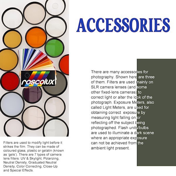
Day 4
Right off the bat I see I forgot to take the stroke off the title. I was going with the yellow-red color on the pouch of the light meter but changed my mind. I like the way we changed the color of the (rasterized) font. It's a neat effect. Still cant decide on a background as anything makes the left photo look dull and grey. Unless I go for a very dark background. My "virtual" editor of my "virtual" magazine would faint of the cost of a full color page! ?
Wow, this is super informative, Susan. A clear explanation for all those thing-a-ma-bobs real photogs use. ? Can you put s separate white background behind just that left photo? I've done that on occasion, myself.
-
1
-
-
25 minutes ago, Cassel said:
I guess my brain just does not accept the fact that the image is straight!!! ? Maybe I'll need to make an open magazine script with less thickness
I think it looks better when I mirrored the layout horizontally. Did you see that?
-
J = Just Brew It!
-
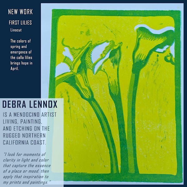
Here is Day 5 - page 6 of Debra Lennox Art - Category: Many Moons - Linocut "Dancing Moon." She does have many moons, but this is my favorite. I have it on my living room wall. Being consistent with the font: Agency. I didn't split the photo mat because I've been waiting for a template with a large area for the image. I'll try a split on page 7 or 8, depending on the templates. The background color and part of the title is flood filled with the off-white of the moon in the image.
-
13
-
-
50 minutes ago, Susan Ewart said:
I was thinking about that too...adopting an older cat. Or maybe volunteering or fostering.
I've started working with a local shelter to trap and home local stray cats. Most recent was a female calico that had 4 kittens. We lost one kitten but all the rest are safe in homes now, including "my mama, Maybelline." Now I'm leaving out food for a young calico, but it is very elusive, and I rarely see it, though it's eating the food, mostly. It took me over 6 months to get Maybelline to be calm (though she still hissed at me if I got too close LOL) I'm just glad she got her own home and is safe now. My two pampered brats would not have allowed her in the house.
-
3
-
5
-
-
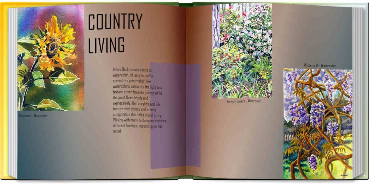
Time to post pages 4 & 5 of Debra Lennox Art. Since the two pages go together, I whipped out the Open Book script. These pieces are from her Country Living gallery. The font is still the same. I'll post the text separately as the book is not as readable.
"Debra Beck Lennox paints in watercolor, oil, acrylic and is currently a printmaker. Her watercolors celebrate the light and texture of her favorite places while the paint flows freely and expressively. Her acrylics and oils feature vivid colors and strong composition that tell a visual story. Playing with many techniques express different feelings, depending on her mood. "
-
1
-
12
-


Alphabet game - HALLOWEEN
in Chit Chat
Posted
A = Apples - bobbing for Apples is a fun game for a Halloween party