-
Posts
4,589 -
Joined
-
Last visited
-
Days Won
170
Content Type
Profiles
Gallery
Forums
Everything posted by Susan Ewart
-
WOW! so much wonderful stuff to look at. The upper right circle and the way the top one is cut if so interesting. The beautiful tinted lines. Of course the out of bounds picture and frame. The background is super. April rocks! not only did it bring much needed showers to clean off the world, it brought your beautiful layout.
-
FABULOUS! I love everything about your layout. raindrop shape is beautiful isnt it. I really like the background paper and the upper left corner piece. Nice touch.
-
WOW! These are fabulous. particularly love this watercolor paper. Great color combo too. Would've made a great paper/palette for the Build A Kit.
-
These are great. thank you for the steps!
-
BRAVO Cindy! Good for you. It's a great feeling to succeed isnt it. I'm glad you stuck in out and got through.
-
Ooops! I did add a bevel and a shadow! Because, why not? extra practice.
-
On a cold day in 2021 twice the month it is now (This is April - If January is 1, February is 2, March is 3, and the April is....). April's month number x 2 will give you a place to start. Or another mathmatical hint would be to find the 3rd word in the sentence, use that, and a word that is at double the amount of the 3rd word. (3x2=?).
-
Sometimes you just gotta live a little dangerously. ?
-
Lots of fun and good videos too on some of them. particularly like the video on #5. Now I must go buy some eggs to hide for my hubby. all the talk about what we used to do for easter, I think I will make a little hunt for tomorrow.
-
I think you just made a fabulous quote, "Get dressed and get real!" You mean business and so does that quote.
-
Those are beautiful flowers. I love that plaid.
-
Those are very neat. I tried it but didnt get good results and it kept saying I was in line and it took more than 5 minutes. I am not that patient, the results were not great. For me I find it a dilemma. If i think it but dont have the skills to execute it, and I have someone/something else design it, who is the artist? I do understand it is a tool in our toolbox and we should use all the tools at our disposal. I will come around as it has very pleasing results for you. I think I'm not creative enough or perhaps descriptive enough to get those needed results. That 3rd from the left top row flower grouping is really pretty and would make a great paper. Maybe I should re-think my logic.
-
that's good to hear. That must've been a sight, an 80+ lb lap dog. Poor thing. I have one cat that watches the lightning/with thunder booming out the window. the other cat is no where to be seen.
-
Just home from work and wondering how you faired through the storm (it's after midnight Mountain time for me). I hope the worst wasnt as bad as expected.
-
yes, this is how mom did it. thank you.
-
what a wonderful memory (except the war part of course). You reminded me that we also colored eggs too, under my moms supervision. I remember a vinegar smell, is that something that is used or put in the water I wonder. These are things I cant ask my mom anymore. Our birthdays are two months apart, less a day.
-
I remember participating in Easter Egg hunts when I was a child. And I remember hiding eggs, but I dont remember for who as I dont have kids. Must have been my nieces and nephews.
-
I'm in and have never done a double page before. Not sure what pictures to use yet.
-
-
- filling text with an image
- text workshop lesson 7
- (and 1 more)
-
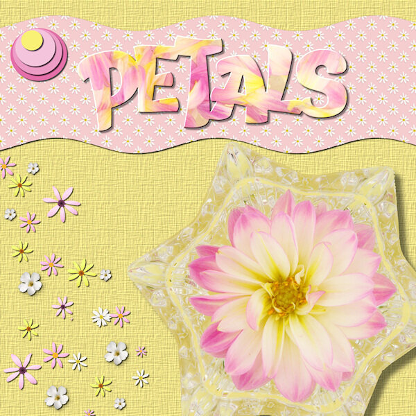
Lesson 7 Spring is in the air, except for the snowfall yesterday and today. The font is: Wish Apic (Creative Fabrica) I used flower picture tubes Photo's and papers, elements I made. Thank you for another wonderful course. I learned something new in every lesson. I really like that transluscent look in the titles we did that on. And being able to separate the letters and work on them on their own is the favorite technique I learned.
- 331 replies
-
- 15
-

-

-

-
I have presets too, button, papers (thick and regular), reverse (for papers), ribbon, string etc. And yes, I tweak them pretty much all the time. I think it was in the Basic Course that I got some cheat sheets for shadows that came with the course. I also try and make notes of shadow settings in tutorials, lessons, workshops and see if it works for my layout. If it does and I dont have a preset for it then I'll make one. One thing I wonder if say I'm constantly changing a preset to the same, can I re-save the preset with the new "starter" settings. I should look into that.
-
Your words are so spot on. I will take a detox time too and turn my attention to my new camera. It was busy this past week with two workshops running at the same time. Once it's done we'll be craving more...after all, it's an addiction. But what a great addiction it is.
-
I add the shadows (on a separate layer) and then I turn the shadow layer on and off and see the difference. It always surprises me that the shadow does make a difference in most situations. At least when they are on the separate layer you can choose to keep them on or turn them off.
-
-
- vector tube script
- text workshop lesson 6
-
(and 1 more)
Tagged with:
-
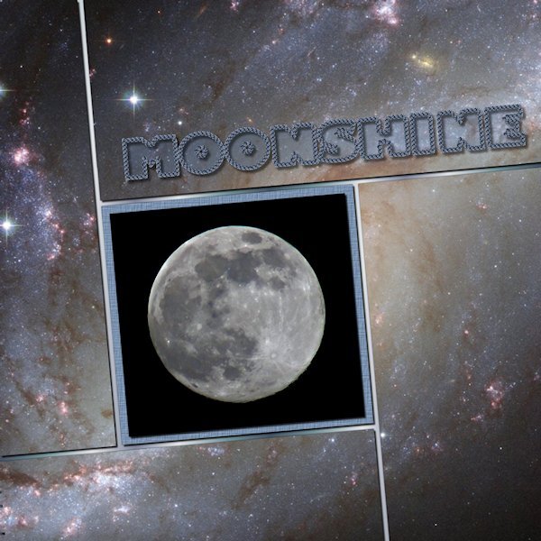
Day 6 and I'm caught up. Now to catch up in the Build A Kit workshop. I really like all the templates we've gotten and this one I especially like. I love that free Vector Tube script. I got it a long time ago but had no idea how to use it until today. What a great tool to have in the virtual toolbox. I used the who photo (creative fabrica I think) as the back ground. Putting a duplicate above each layer and used the magic wand and deleting, as we learned from the start. The moon photo is mine and the font is windows Gill Sans Ultr Bold, one of my favorites of the "fat" fonts. That still makes me laugh to see that..."fat" fonts. I used a gradient for the base paper.
- 331 replies
-
- 13
-

-


