

Susan Ewart
-
Posts
3,995 -
Joined
-
Last visited
-
Days Won
128
Content Type
Profiles
Gallery
Forums
Posts posted by Susan Ewart
-
-
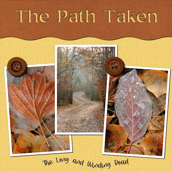
3 hours ago, Mary Solaas said:
Absolutely love this, Susan. The winding road pictures are my absolute favorite - it's exciting thinking about what's around the bend in the road.
I quite agree Mary. You dont realize how far you've gone until you look at your watch or your stomach starts to growl and you have to turn back.
-
 1
1
-
 1
1
-
 2
2
-
-
3 hours ago, Ann Seeber said:
Gorgeous layout Susan! Love the colors, especially. I usually give my title letters the Effects/Cutout treatment and I think the result is the same with less work. I was surprised how easy the text on a curve turned out to be!
Thank you for your compliments. I should try that, I've only used it making the engraved metal and on the leather tag so I dont quite understand it yet. I agree about text on a curve, once I tame that pen tool that is.?
-
2
-
-
Day 4. Text on a Path. I like being reminded how to do text on a path. At first I thought my Text too was out-to-lunch because I couldnt highlight the text. Are you ready for a laugh...well, I had not put the paper in place of the grey holder spot so I couldnt see the text being highlighted because it was the same color. I put a temp paper in and there my text was, all highlighted and happy. The temporary paper (yellow) I kept and added a texture effect. The brown paper is from APJess-Furry cuddles (Digital Scrapbook) that I also added the Blinds texture. The buttons are from Digital Scrapbook - I forget who. Font is Stay Latte for the bottom and Mustard Med for the top, I cut it out of the top paper, using the magic wand to select the letters and then hitting delete on the paper layer...and initially forgot to hide the grey layer, another Duh moment.

-
2
-
13
-
-
Here I am back at Lesson 3 still. Errands are done and now to play catch up. The fonts for the whole thing is The Blowar. Two of the papers (Brass, green metal patina) from Digital Scrapbook KMRD-Steampunk-brass metal, and metal patina. Photo by my hubby a loooong time ago, probably around 2006. Yup that's me in the yellow top, my one and only attempt at glass blowing. I already had a huge studio with Lampwork and Fusing glass that I didnt want to add more glass and more expensive equipment. What did I make? A nice 'horse hoof shaped blob of glass...that was supposed to be a nice round sphere. Much easier to work glass in a flame, or cut it up and stick in a kiln, for me anyway. PSP was acting very sluggish today, dont know why.
-
4
-
10
-
-
2 hours ago, Rene Marker said:
I didn't use a shadow but I did put a 2 pixel black stroke around my letters. It doesn't show much on the small version but looks good on the large version.
I do this too. It helps to make it stand out a bit more.
-
19 hours ago, Mary Solaas said:
Using my desert pics and the build a kit workshop elements and papers - this is my day 3 text workshop. Interesting how to use the magic wand to make the area for the journaling.

Look who's becoming a "Word Art" pro. Beautiful layout, the colors work really well together.
-
1
-
 1
1
-
1
-
-
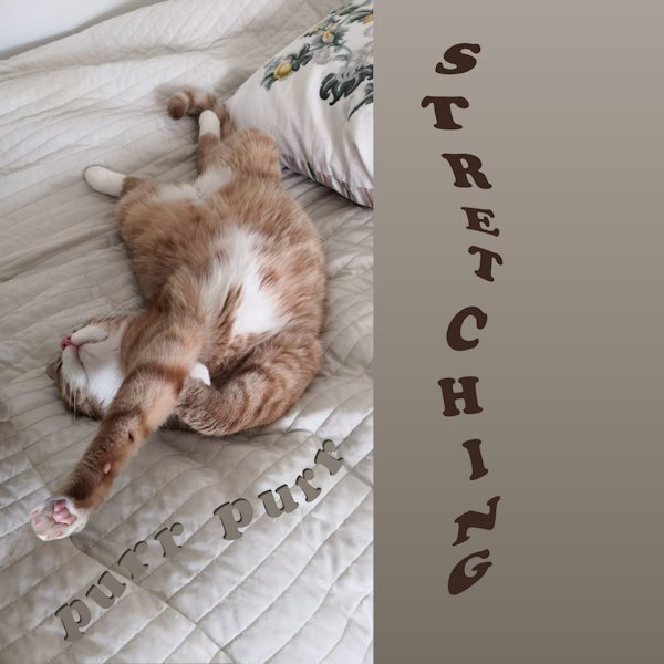
17 hours ago, Pirkko Seppälä said:
here is my work for Day 4 Sulo warms the sleeping place for his mistress ?
What if I wanted to write in the path from top to bottom?
OMG! So cute.
-
17 hours ago, nadine said:
My Day 4 with my granddaughter who is learning to dance the twist by videoconference. Her dance teacher making videos for classes during covid in 2020, so that his students learn while having fun. She loved that. ?
text: "Videoconference Dance Classes, due to Covid"
All Credits on my gallery
What a beautiful layout! The background is stunning and the flower cluster is very nice.
-
1
-
-
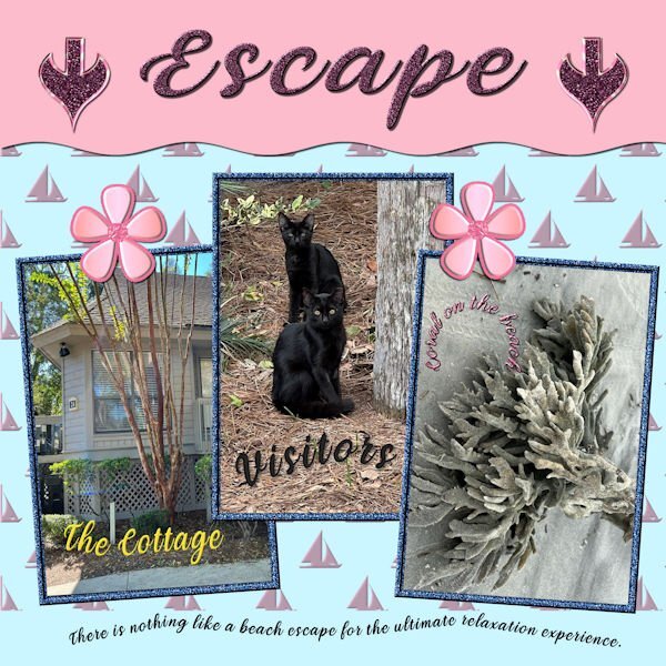
15 hours ago, Donna Sillia said:
I finally finished No. 4 after many issues with the move and pick tools. I am still using my kit items and finding out that either don't like some or the colors don't work. For the background, used an embossed background but the bevel I had loaded had a light pink color. I decided to use it since that is one of my colors. The font used is Veni; the pictures are my own from Hilton Head.The jeweled flowers are part of my kit. The arrows were made today from presets, and I will add them to my kit. I've used the title before so I must be longing to return to the ocean. I am sort of getting the hang of curved text and started using it in my card making projects. I also should add that I am trying to be more aware of the use of shadows. I am saving them on their own layer so that they can be adjusted.
This is a beautiful layout. The colors go very well together. I found I need to make changes to mine too. Two colors I knew I didnt get right from the start, but I went with them. And the dark colors dont seem to be dark enough, as well as I should have had more colors in my pallet.. I absolutely love your arrows and your awesome cottage visitors. I used to live very near the ocean and worked a few blocks from the ocean where I could stand on the beach and see America (Blaine, WA). Now I'm living in a prairie province. I miss the ociean and the mountains. Side note: have you ever watched the Hercule Poirot shows (I think filmed in the 80's-90's? The show is set in the 30's and so much Art Deco pieces in it. We've been watching them on U-tube(we cancelled Netflix, who knew U-tube had all kinds of movies for free).
-
1
-
-
32 minutes ago, Rene Marker said:
I have 24 drop shadow presets that I use. But even with the presets I will tweak them before applying them. Pretty much they are a starting point in my process. Some are my go to shadows to use all the time. Others get me close to the settings I might want. For example one of them were settings that Carole has recommended for strings. I made the preset then use it on a string but quite often might make slight adjustments for what I'm working on. The thing is that I don't have to remember the settings for all the various things. The preset can get me close to what I need.
Great advice, thank you.
-
1
-
1
-
-
15 minutes ago, Linda Hitt said:
Day 4 project. I used Carole's layout with a few minor changes. Wings are from Marisa Lerin's Birdhouse In My Soul Kit. The background is from Marisa's Garden Party Paper Kit. The photos are compliments of my oldest daughter who is learning photography.
BEAUTIFUL images! Your daughter is a natural. You will have loads of images to come I hope.
-
1
-
2
-
-
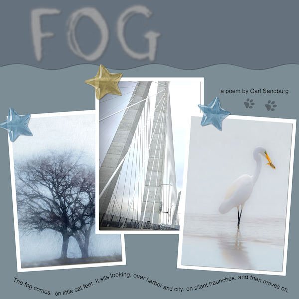
2 hours ago, Ann Seeber said:
LESSON 4 - FOG - I hunted up 3 photos on Unsplash to illustrate Carl Sandburg's poem "FOG". The stars are from my new kit. The colors are from my kit's palette. The cat footprints were from a free site that Google found. I was pleased that I got the text on a path to work properly the first time!
Wow Ann! This is fabulous. The quote is purr-fect! Those photo's are really give the layout a great atmosphere.
-
1
-
1
-
-
3 hours ago, Linda J Walker said:
I'm calling this Day 2 & 3--I used my title for Day 2, on my Day 3 page. I'm not sure if that makes me efficient or a slacker ?
I don't know why, but my text became a 'floating selection'. It took me a bit of time to figure out what to change, so it was a frustrating evening! I imagine there is some reason you would want text to be a 'floating selection', but I don't know why.
I'd say that makes you efficient. I admire any one who can grow anything. I manage okay to grow Parsley, Thyme and Rosemary, but nothing else I grow survives. My husband says it's because I forget to water them..hahaha. It's true. I start out all gung ho, then I just neglect plants. Going on that, I would have made a bad mother.
-
2
-
-
5 hours ago, Linda J Walker said:
Susan--my first real 35 mm camera was a Ricoh XR1, which I still have. But I don't know if I could still buy 35 mm film today. I bought my Ricoh when I graduated from high school because I could not afford a Pentax K1000, and the Ricoh was very similar and cheaper, and used the Pentax K-mount lenses. Good memory!
That is so cool, your Ricoh. Not many people know that brand. My sister in law sent all her old cameras to me recently (as did my brother - only he sent me his Nikon F3!) and one of them was a Ricoh XR1. I had being mostly collecting cameras from the 20's up to the 60's but ended up also with a number of 35 mm SLR's from my era of starting out. So now I display them as well. You can still get film too. I saw some in a store recently. I heard there's a bit of a revival in shooting film. We sure had to nail our exposures, when shooting film, didnt we? Often you couldnt re-shoot the subject if you blew your exposure.
-
1
-
-
6 hours ago, Donna Sillia said:
I didn't make any plaids for my kit, so I created one in my color pallette. Fortunately, the restaurant matches. The pictures are mine. The fonts that I used are FlamingoShadow, Arial, and Gumondo, I think. The center paper is a texture in PSP that was yellow but colorized to the coral color with a little tweaking with Flaming Pear, Kyoto color. The left side is from the plaid with a gaussian blur applied.
That is a striking plaid. I love it.
-
1
-
4
-
-
Not my best work, it's too busy and too much focused (hahaha pun intended) on the right side. I used stuff from my kit and learning I need way more stuff and that "stuff" needs to be in different orientations. The photo was a test for me getting ready to photograph my camera collection. The Pentax K1000 was the first SLR camera I ever used, it has a soft spot in my heart. And of course this isnt the actual camera I used, cause then I would have stolen it from my high school...and I'm a good girl and don't do that sort of thing?. Anyway, my brother, who at the time was a commerical diver living in Borneo, came home to visit the family and came to the open house at my high school. He was blown away by the schools dark room and my interest in photography, so much so, that he bought me my first camera, a Ricoh KR10, which I sold and now wish I still had. I know. BEST. BROTHER. EVER! Looking forward to Lesson 3, it looks wonderful.
-
5
-
14
-
-
4 hours ago, Mary Solaas said:
No shadows on "Spring Is Here" as I just wanted to get the thing saved. My problem with PSP Ultimate 2022 was definitely with that layout. Could it possibly be with the many undos and redos? And, if so, can I remove the history from the layout pspimate?????
Mary, I once had a problem with PSP 2022 and saving files. Not sure what you issue was (cause I'm behind on the WS and reading the forum) but sometimes it would not save. I'd get a popup saving it couldnt save it. With my PSP 2022 I have to check everytime in the options when I'm doing 'save as' to make sure it's either on PSP 2022 or X8-2022. Even though I've never had it on X8 for any reason, my PSP will revert to that. Usually I get a message saying it's going to merge all the layers if I want to save. then I know it has reverted to that SAVE AS mode. I cant weeks without it doing it, then it just reverts to X8 for no reason. I have just downloaded 2023 but havent set it up yet, so still using 2022
-
2
-
-
13 minutes ago, Cassel said:
I am curious to know what you put in the title. Are those confetti?
It is confetti, yours I think. I wanted to put a rainbow in....I have rainbows, but where i put them I dont know, so I went with confetti for now. Was going to do the umbrellas but I only wanted the umbrellas and the tube had rain boots and other stuff. I just realized now, if I'd put it on a separate layer (I think I forgot to do that) I could have just duplicated umbrellas and did it that way.
-
1
-
-
17 minutes ago, Linda J Walker said:
Day 1 title--this was going to be a page with a photo of my garden seedlings inside just beginning to grow.
But since it is Day 2 already, that page won't be happening right now, so I am posting just my text title.
I love the title "baby" plants, it put a smile on my face.
-
1
-
1
-
1
-
-
This effect looks cool. I didnt realize just how cool until I put a paper behind it. I used the kit I have made. Last night I though, yuk, none of this looks good together but after a good sleep and no headache, it doesnt look that bad to me now. The photo is really old (2006) and shot with a point and shoot camera; my first foray into digital and first time not shooting with an interchangeable lens system. I didnt do well with the lag time between pressing the shutter and it taking the picture and soon moved back into a DLSR camera. This shot was taken either in Vernon, BC where I lived at the time, or more likely in the Fraser Valley (westcoast of BC)
-
4
-
11
-
-
3 hours ago, Michele said:
I just looked at lesson 1 and all I can think of is Baby Got Back by Sir Mixalot. (? I Love Big Butts ?) LOL
OMG, YIKES! Ha hahahaha, thanks for the laugh just before I'm off to work. ? Hilarious! had to watch the whole video to read all the words.
-
1
-
1
-
-
It's wonderful to see how good everything looks together. I had wondered how, after all our work, how they would perform. You have done beautifully.
-
1
-
-
1 hour ago, Anne Lamp said:
Thanks Cassel- I did not realize I could go to the topics to perhaps learn how to make some of the things included in the "Build a Kit" . Thanks Susan Ewart also, Your response made me thing that maybe I will still try most some of those tuts etc. There are so many great tutorials and classes it is easy to get lost when trying to find one . What I need to figure out sometimes is in a totally unrelated tut or class.
I know what you mean. It's hard to focus on one given idea and follow through. This Build A Kit workshop will help you to focus on the topic. I look forward to seeing your creations.
-
1
-
-
31 minutes ago, Sue Thomas said:
For this one I applied textures, which I actually prefer to the other ones. The textures give depth and substance,
Those are wonderful. I agree, the textures add that finishing touch that elevates it above the others. What a great card this will make.
-
2
-
 1
1
-


Text Workshop 2023
in Showroom
Posted
"does this FAT font make me look fat?" hahahaha. Fat fonts is a funny term, but I find I dont have enough of them either.