-
Posts
4,589 -
Joined
-
Last visited
-
Days Won
170
Content Type
Profiles
Gallery
Forums
Everything posted by Susan Ewart
-
Beautifully done Mary, you are an inspiration with the Labs. That clip looks real! I think I know them as "bulldog" clips and you are right, the bigger ones are hard to open.
-
That's cool. I would have love to see what the whole set looks like. They (T-cups) are little pieces of art, I can afford. However, I now have way too many so I must say goodbye to some of them this year.
-
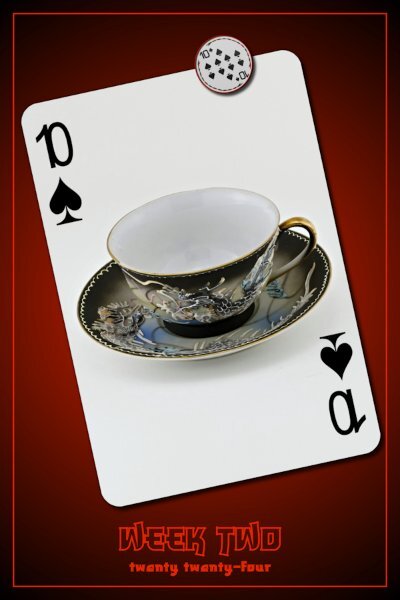
P52 Week Two Font is Shizuko (Creative Fabrica) This is a very textured cup (physically textured) with some dragons on it. It's pretty cool, but hard to really show from this angle.
-
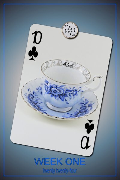
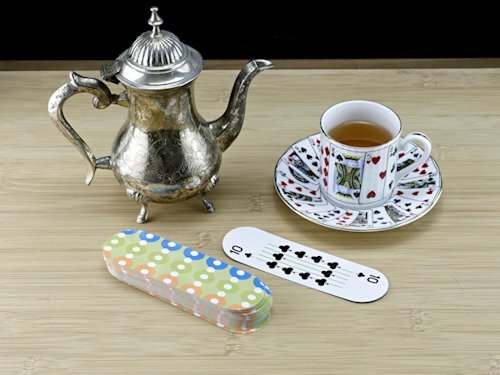
P52 Week One I am finally on board. I used Arial for this card. Two scripts were used: Custom Playing Cards and the new Counting Cards. Both very versatile scripts by the way. I love having the the choice of Vector format for the lettering on the Counting Cards Script - thank you Carole for thinking of the user and giving so much versatility to us. The Custom playing card script is very cool. It makes mask for the photo, but you have the option to turn off the mask and put the photo between the bottom and 'suit' layer...but dont be like me and forget to use the magic wand and clip off the extra photo bits or you wont get that round card corner from the bottom layer. the second photo I add is how I will choose which card to do for each week. It's all going to be the same photo and deck (isnt that the weirdest looking deck of cards?) so maybe I'll only post the turned over card every once in a while. the little Magnet I made is from this round (what I thought was a) deck of cards, only about 2 inches in diameter. It's called 5 Crowns and has and extra suit. I thought they were cute and were a complete deck. well, there is no Aces or 2's so I'll have to make up something. And I changed the color as the clubs were green. I needed a way to show an off-white playing card in the forum which is white so I chose to use the Counting Cards script and place in on a background. It's fun getting back to PSP. I will still be behind, but I'm going to catch up after this coming busy week.
-
Count me in too. I love a party....there's always masks at a party isn't there?
-
Being adopted I find all your ancestry stories to be fascinating. Thank you for sharing them so openly. Ann, I didn't even notice until I read your post about you putting the two halves together.
-
I just check it out and it's a cool script. I'd also add to watch the video, it's very good. Michele, does all those brushes shown in the video come with that script? that alone is worth the price!
-
These are perfect fireworks! They look like flowers with a stem.
-
T = Twenty Ones (21's) Usually for db bicep curls; 7 reps from the bottom to half way, then, 7 reps from half way to the top, then, 7 full range of motion reps. 21 reps total is 1 set.
-
I love how you wound the ribbon through the Font. What a stunning layout and that photo is outstanding!
-
Q= Quadruped doing exercises while on hands and knees (lots of ones for the glutes, abductors)
-
This sounds wonderful. I like that size, there is nothing like the feel of a physical book in your hand. I cant wait for it to be published.
-
I come from a long experience of quitting. Once I got into my 50's I decided enough of that! Thanks for the vote of confidence...I could have used you when I was younger.
-
hahaha, I love that one too!
-
Thank you Monique! It took me a long time to play with that template to find some kind of vision. I almost gave up.
-
I know, I feel the guilt too. At work one time (there is floor to ceiling windows in parts of the warehouse) we were working in front of the windows and there was rabbits with babies and we were so delighted at seeing it. Then, the ravens came and they were picking off the babies and dropping them from high. One staff ran out and picked up a baby but it passed in her hands. We were horrified. I love ravens and I love bunnies. I get the whole circle of life thing, but I don't have to like it or watch it unfold. I moved to where I couldn't see out the window.
-
N = No pain, no gain...did we have this one. If ever there was a silly quote this is it. If there is pain, that's not good. Sore muscles are one thing, pain is quite another, listen to your body.
-
Day 7 I changed the template completely (started with the Diamond Day 7 template). the little tag is where the journal spot was and the title is in the same spot as the template. I did add shadows but they arent going to be visible, except on the screwhead. I originally wanted to use a label to cover up the alligator clip but thought it would look more "specimen-y" with it. the title and the outer frame have an inner bevel. Filled with a gradient (all the frames) and a pattern called Black Gold for the fill in the title. Fonts used: Herkings (Creative Fabrica), and Arial (Windows) Tag: my tag from the Vector Workshop (highly recommend this workshop!) Thank you Carole for another wonderful workshop. I'm always so delighted to re-remember the things I forgot from the last time through. I saw so many beautiful and inspiring layouts and often thought; "that's awesome, why didn't I think of that"?
- 426 replies
-
- 14
-

-

-
You are so lucky. I would love this! I had a Merlin in my yard on Sunday. I was most excited. He/She came, sat, pooped, and left. But we watched for about 15 minutes. I can never get enough of birds. Your layout is beautiful.
-

January ALL ABOUT ME Challenge (2024) - Birth place
Susan Ewart replied to Cassel's topic in Challenges
How cool to be able to photograph the same church as your father did. Imagine you standing in roughly the same spot your dad did. That gives me goosebumps. -
Have a fabulous trip Donna. I'm looking forward to seeing the photos of your adventures.
-
Thank you so much Cristina, that means the world to me.💖
-
I worry mine will go down that route too. I do understand your worry. I am a world class worrier and I get so tired of worrying. And I know I wont be needing to deal with that as I get older too. Aging is so cruel.
-
I didnt know that, about the bug. What is the script called?
-
You just did a huge project with your travel/trip double pages, no wonder you are tired out. This is great...and this is also not a race.


