Susan Ewart
-
Posts
4,252 -
Joined
-
Last visited
-
Days Won
141
Content Type
Profiles
Gallery
Forums
Everything posted by Susan Ewart
-

January ALL ABOUT ME Challenge (2024) - Birth place
Susan Ewart replied to Cassel's topic in Challenges
How cool to be able to photograph the same church as your father did. Imagine you standing in roughly the same spot your dad did. That gives me goosebumps. -
Have a fabulous trip Donna. I'm looking forward to seeing the photos of your adventures.
-
Thank you so much Cristina, that means the world to me.💖
-
I worry mine will go down that route too. I do understand your worry. I am a world class worrier and I get so tired of worrying. And I know I wont be needing to deal with that as I get older too. Aging is so cruel.
-
I didnt know that, about the bug. What is the script called?
-
You just did a huge project with your travel/trip double pages, no wonder you are tired out. This is great...and this is also not a race.
-
So pretty Julie. I love "naked" tree silhouettes.
-
I never thought to do that before. I always forget to try things even if I think it's silly. There was several blend modes that looked good too. It was hard to pick the one I went with.
-
Ann, that is so wonderful that you are caring for these feral cats. You might be the only love they know. I like that house, is it from amazon? I heard also to only use straw, as blankets can freeze.
-
Thank you Carole. I will look at how to do that. I never thought about it being the auto-preserve (I dont even know what that is or how to use it other than seeing those folders that show up) but that sure makes sense. Is this something I would want to normally keep on, or can I just turn it off for good?
-
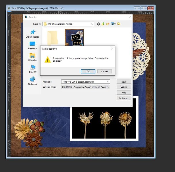
Carole: Here is the message I got. I clicked okay and "thought" it wasn't saving it at all. Well, clearly I had been in another folder before I did that because it was saving it into that folder, clearly I wasn't paying attention. I kept saving and saving and I could see it wasn't under my Day 6 folder....so, I guess the hitting okay worked fine (the operator obviously didn't work fine -ME!). But other than that. Why do you think it was going to "fail". At the time I was trying to find a nice fill for the font and was trying out all kinds of gradients, then patterns and different settings. Do you think I was just clicking too much too fast and it got messed up trying to save the temp files fast enough?

-
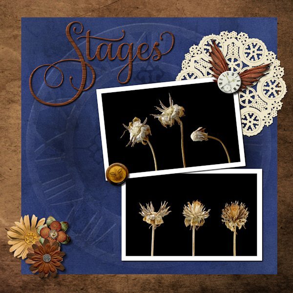
Day 6 What a great video using the blend modes with the textured paper. I used the paper (blue) from the kit as I new I wanted blue anyway. Blend mode used was Multiply. the layer above I had a metal element (was a brass metal clock outer ring element) that I resized to the the blue paper fully then used the blend mode Dodge to make it look like it was part of the paper design (opacity of clock lowered to 38). Ditto for the faint clock hands at 9 and 12, using a blend mode of Softlight and reduce opacity to 57. Title has an inner bevel. Paper doily I used HSL to make it a light ivory instead of stark white. Tiny white clock I added an inner bevel as well. I had a weird message about not being able to save. I'm not super happy with the title fill but was having such issues saving that I just went with it in case catastrophe struck. The deets: Background paper: Riley B Graphics (Creative Fabrica) Blue Paper and white clock face: Janet Scott - elegant autumn mini kit (Digital Scrapbook) Bottom flowers/clock ring/clock hands/wings: (on blue paper): Kerry Dempsy -KMRD Steampunk Elements (Digital Scrapbook) Bee Wax Seal: Billie Irene Steampunk something or other kit (Digital Scrapbook) Font: Samantha Upright (Creative Fabrica) - used glyphs on "S" "t" and "s"
- 426 replies
-
- 13
-

-

-
I am looking forward to seeing your project come to life! What an interesting idea. You have good resolve, I often thought about doing something like that, then by day three i see something shiny and forget what I was supposed to be doing. (seeing something "shiny" is a joke my friends and I have about how easy it is to get distracted by something else).
-
Thank you for this explanation. I've been using the long way so I don't forget how, but the scripts are great if I have a ton of masks to do.
-
Love this. The spaceship is a great touch.
-
hahaha, I know, right (poor, poor Moon). But don't feel sorry for it....isn't it always "mooning" us?
-
I've said it before. You are an amazing friend to Judy(and to all your friends, I am sure) and a real powerhouse, so inspiring to me.
-
wow Corrie, those flowers are beautiful. (the real ones you photographed). About why you don't like being sensible....because it makes you feel older than you are. No matter how old I get..."sensible" will always seem like something "older" (than me) people should do and not me.
-
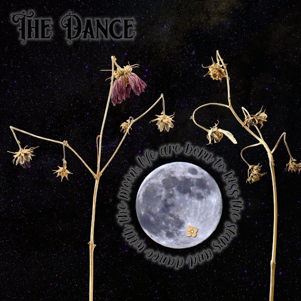
Day 5 First, apologies for really messing with the template. I did keep the round circle that the stitching was around and turned it into a mask and fit the moon (yup, I did some unspeakable things to the moon to make it not as real). Also, the little flower on the (*Ahem*) private "underparts" of the moon (you know, it looks like a cat walking away from you with it's tail up). They are right in the spots they started at too. I couldn't seem to make the template work with the small pictures like I have in the past so I had to improvise. I used "text on a path" for the quote around the moon, and wanted to add the author but it would have looked weird with a big gap of small lettering. For both the title and the quote I used a layer style of outer glow. That is an odd thing. I had it at the lowest possible setting and 50% opacity and it's really still too big. I did have to lower the opacity of the layer as well so it wasn't too overwhelming. I wonder if there is a better way, and not have to use the layer style as there is not much fine control with it. Once I had that I turned the font color black. The stars was a starry background paper I got somewhere, that I put above the photo layers and used "screen" blend mode. I thought these subjects looked like they were dancing when I shot them, they are the Forgotten Moonflower Fairy Queens. Font: Title is Morgan Tattoo and the quote font is Morning both by Creative Fabrica Quote: by Avijeet Das Little Flower: Digi-Dewi -Relax, flower-brown (Digital Scrapbook.com)
- 426 replies
-
- 15
-
-

-
-
...and who doesn't want more horsey. They are the best!
-
I love that little lamb in the top picture. This is what happiness looks like!
-
Thank you. Make sure to tell me if I do overstep. I did live 20+ years in Surrey, BC; nothing you say to me will phase or offend me.
-
Yikes Carole! I just make a remark on a post that I thought was interesting and it has blocked it. Did I say something offensive? Or is this the AI-police at work?😨
-
The paragraph was very interesting. Do you know why the cloak is usually blue? I'm curious.
-
I hope you keep doing layouts of any sort long past this class so I can keep seeing your beautiful works.