-
Posts
4,589 -
Joined
-
Last visited
-
Days Won
170
Content Type
Profiles
Gallery
Forums
Everything posted by Susan Ewart
-
-
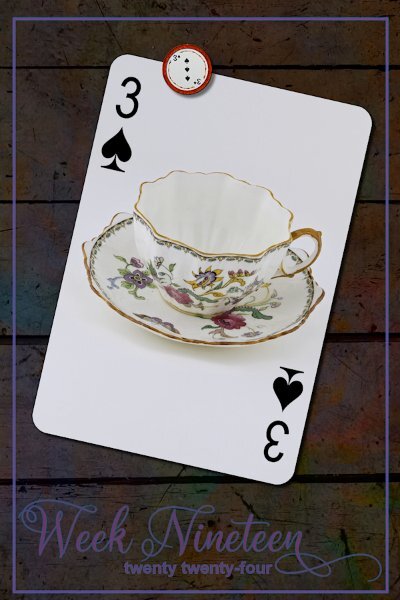
Week 19 I'm finally back to some PSP time. Playing catch-up as usual. This jpg is darker than the .pspimage file. bummer. There is more color in the original and the date and week number is meant to be subtle but not this subtle.
-
I think it's one of the hardest decisions to make Corrie. Driving offers such independence and it's hard to give that up. Your both sound very reasonable about why it was time to stop driving. You are lucky to have such good transportation nearby.
-
And it's so obvious, what they are doing. You'd think drug dealers would want to be more inconspicuous. and now having home-pick up service. I had a manager once who, on her days off, worked at her friends "farm". Then we hired someone and she recognized the manager as the "drug lady" in the area (where you could go buy drugs). We never told her we knew, we let her go on telling us she worked at the "farm" on such and such day. Was hard not to look at my co-worker and not laugh.
-
It's sad that we cant even feel safe in our own homes. When I lived in another province, there was a lot of home invasions happening, mostly to elderly and some elderly were beaten and some were beaten so badly they passed away from the injuries. I was in my late 30's and even I felt scared to be alone in my own home, or to answer the door bell. In some of the invasions, they just busted the door in and went in demanding money. Does it seem that in current times it's somewhat worse because we have to be tolerant of so many things. In British Columbia (where I lived before), they recently made all drugs legal (I think the federal govt did that there as a test to see if it would make fewer drug addicts and crime because of the addiction). Now the BC govt is asking this new law to repealed because the situation got worse not better. It's like adding fire to fire to put it out. Corrie, that's a scary situation to be in. people on drugs are so unpredictable. Just last week in Edmonton a young 16 yr boy was walking their dog with his mother and a homeless man they've seen many times, jumped out of the bush and stabbed the young boy in the neck, he passed away at the scene. They think he had some kind of drug related "episode", thankfully he has been deemed fit for trial. It makes you want to go live far away from people. The older I get the more I am aware of situations like that and how helpless I probably am to do anything about it.
-
We moved into a brand new house on the wrong side of town (unknown to us at the time). Very quickly we found out across the street and two houses down was a drug house (rental). One weekend we saw over 100 people come and go and even had drug deals going down right outside our front door. It was getting worse and worse and we figured it was only time before we would be broken into. So we put the house up for sale and bought one in a better part of town. People were coming to look at the other house right when the police came to bust the house and the utility company came to shut off the gas and electricity. The potential buyers took one look at what was going down and didn't even get out of the car. Worse was my friend here in Edmonton (who've now just moved to Scotland), lived in a high end townhouse (2 level) condo complex. The city decided to buy a unit and house a homeless person in it (for free, or rather on the tax payers money). This homeless person quickly turned the unit into a chop shop for stolen bicycles, stolen goods as well as being a drug supplier to the street people that flocked to the unit. The tenant would freely past his key fob out to any street person and there was no end of people coming and going from the unit often over 20 people in the unit. All the residents had something stolen from the underground parking and storage lockers. the residents feared taking their garbage to the dumpster as there was often very sketchy, scary people coming there to buy drugs. Many complaints and letters to the city later, and a smashed bottle over someone's head, the city is finally taking it to court, as it's very hard to evict someone, even if they are engaging in criminal activity. The residents were told to take pictures for the court case. It's been very stressful and scary for the residents as these street people are very unpredictable. It's sad for the original owners who are the victims. I sure hope they are able to bring charges to the people that did this.
-
Oh, they are adorable.
-
I think you are twins...I have a hard time telling you apart...🤣 You both have a hat on and you both wear glasses, totally twins!
-
What a nice neat and tidy workspace Corrie. I'm jealous.
-
I also forgot to mention at the top right corner of the forum page you can click on FOLLOW and choose your options. Even if I'm not posting in a particular forum, I'll click on it to see the beautiful layouts people make. Like Sue Thomas said, you can pick up some really interesting techniques from looking at forums.
-
That would be fabulous. Post them in the "What your working on now (May 2024)?" (click on Forums>Showroom>What are you working on in(in May 2024)? Make sure to click on the word Showroom to get to the main section of that. When you have just anything you are working on you post it there. When you are doing workshops or Challenges, there will be a spot in those sections of the forum for you to post. We resize our 3600x3600 projects to 600x600 and then make sure it's less than 500 KB. There is also a FB group to join that you can post your full sized projects. Carole might comment on more places to find out what and how to post. I'm just running out the door or I'd find them. Sorry. I looked at forum too late. Oh, and we also have a gallery you can look through.
-
Welcome John, looking forward to seeing you in the workshops and forums.
-
Thanks, I wouldn't have thought to do that. Great idea.
-
Perfect graphics for this Peggy and this card would put a smile on the recipients face for sure (something they probably need at that moment).
-
Very beautiful photos. I love to see birds from other parts of the world. The Magpies here are quite different. How luck to Cockatoos in the wild, I cant even imagine how cool that would be to see.
-
Great Card, I'd come to this. BTW are you from Jasper, AB?
-
Cool! Even your text on a path has movement; like that of flapping wings (up, down, up down)
- 356 replies
-
- 10
-

-

-

-
Sharla, this is the best advice I've gotten. thank you so much. I do repot into bigger and I agree, it's really expensive. I'll start feeding them and even try to remember to water then now and then (kidding). the rosemary is great because I can neglect it and it just keep growing and even flowers. You are so right about the thyme, mine is woody but I didnt know about cutting it back. they were pretty old too, so I send them over the plant version of the rainbow bridge. Sad to say, I only move the pots around for photo ops and not for the plants sake. I would have being a terrible mother! It's all about me😁. I haven't had very good luck growing food plants in the past. I plant and forget, usually my husband feels bad for the plants and takes over care (another reason I would have been a bad mother, on the other hand, my husband would have been a GREAT mother!). I'm trying two veggies this year; peas and pumpkins. We'll see how that goes. I subscribe to your ways....not following the rules. If it works, great, if it doesn't....I can always buy potted plants to photograph. I appreciate your advice and help. BTW, I would read the back of the package and think, naaa, that doesn't work for me, I'm going to do it this way. And I bought one kind of bulb....the directions say, plant with the "crown" up. I"m thinking, what?! I'm growing a plant not a Princess! I just planted the little green part sticking upwards, hoping it really is a plant since the whole dried up thing looked like the mother-of-all dried up cat hairballs! Plants are weird...so am I, I guess we go together.
-
do you give it new soil every year too? I have been doing that with my Rosemary and Thyme because I overwinter them in the heated garage with lights. I'm just wondering if I need to be doing that. My thyme didn't do so well this year, probably should have potted them larger at the end of the season. I'm interested in people that do plants in pots and what they do, because I did the flowers (for the first time ) last year in pots so I could move them to different spots depending on the sun and backgrounds. My herbs and plants only grow because of their own tenacity and because of my serious lack of experience. I commend them for growing in spite of me.
-
This is so sweet.
-
I love this Wendy! Beautify done.
-
This is s a good idea Ann.
-
I love this. I was scrolling the new cards from the bottom so before I saw your name I guessed that this was from you. Beautiful colors and layout. I like both versions; straight and wavy. With even a small amount of supplies/elements you make a big impact.
-
That's too bad Michele. I hope your recovery goes well and fast. take care
-
Incredible work from everyone. It's really inspiring. Looks like I might not be able to join as this week is going to be an exhausting one! But I will look forward to seeing your beautiful creations.


