Susan Ewart
-
Posts
4,251 -
Joined
-
Last visited
-
Days Won
141
Content Type
Profiles
Gallery
Forums
Everything posted by Susan Ewart
-
me too, this is the one I decided to use other words than I should have.
-
The Who is in the clue. You are the "One" to get it done! You got this Anne! Remember Carole's clue: The clues are meant to be easy. Use the search feature on the blog. Most clues refer to article titles. If you are really stuck, you can always ask questions in this thread in the forum.
-
That was fun and I downloaded some blogs with techniques I keep forgetting and that I dont want to forget. This time I'll print them and start a binder so it's easier to find.
-
Woo hoo, this is the one time you want all your eggs in one basket!
-
I agree, this coppery color is amazing.
-
Don't you just want to go and wrap your arms around her neck. I did that when I worked with horses. they were so tolerant and in the winter so warm to hug. She a beautiful snow-kissed girl.
-
So sad Julie, for your friend. I love the baby's expressions. As always, a very beautiful layout. Happy Easter to you. and I've been meaning to ask, how's your eyes?
-
Ageing is so cruel isnt it? When our "headspace" is finally at it's best, the rest of the body is falling apart.
-
Wow! they look fabulous. I have in the past done cutting sort of like that, for a 3D element inside a Christmas card (in various years). Nothing as elaborate as this though. It must take a steady hand to do such tiny intricate details that the eggs have.
-
Oh no Corrie. I hope laser is the treatment you get to have. Sending you positive vibes (and a hug for good measure) for your appointment.
-
It's funny, I know I have access to the workshops and yet I still wait for them to come around. I guess I like doing it with a group. But I think after the Build A Kit it might be a good idea to have a go at the Text Workshop again.
-
Me too.
-
Thank you Corrie. It's all about compromise isnt it. ....and lots of praying!
-
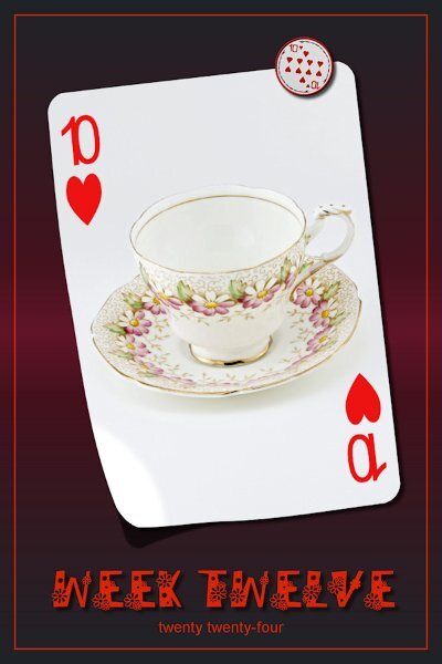
P52 Week 12 I used a gradient background, meant to texture it but forgot. Cass-lifted photo script used as well. Font is DaisyRegular. My font viewer's little circuitry imploded on this font. I have another one called Daisy, but my font viewer calls "it" Daisy Regular (with a space between the words - but the font is actually only called Daisy) and no amount of manipulation or pleading to the font Gods would allow the viewer to see both of them. So weird. so I had to install this one in Windows. Programs are great....when they do what you "think" they are going to do. 😁

-
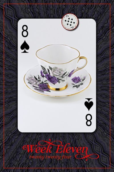
P52 Week 11 The font is Claire Murphy (Creative Fabrica). the background is a PSP pattern (feathers) at I think size 200, 120 deg. angle then I used the kaleidoscope effect. Not shown in this lower resolution; the color in the pattern has purple in it like in the T-cup.
-
Thank you for the name of the font and the info about the new script. I wonder how font designers come up with font names, some are rather odd.
-
Great shot and I like the choice of font around the moon. I think I might need to get that periodic script. I looks really cool.
-
I love that poem, it's beautiful. As is the layout.
-
She's BEAUTIFUL! And thank you. I can never get tired of seeing horses.
-
I love it too. Especially since it's all in layers and vectors so we can make changes as we need. It's a great and very useful script.
-
hahaha...the "MEGA" - mini kit. A mini kit with about 40 add-ons. This is so pretty Ann, you have the nicest background for this. I think I might be so behind (in P52 and Build A Kit) that I've caught up to myself. This would have been the perfect journal card for my kit wouldn't it?
-
Oh, thank Carole, I forgot there is a freebie in the store (creationcassel) that you can use. I had bought the script right away so totally forgot about the freebie.
-
Yes, the outer frame, along with the year and the week #'s are a script in Carole's store (creationcassel.com) called Counting Cards 1 - Weeks Not sure everyone is using it, some might be making it from scratch...there is a tutorial in the campus for doing a frame with words in the frame line itself that would also be cool. But please do what you want as the rules are loose. You gotta be you!
-
You got horses! They make good photo subjects. any cows close to home right now...cows are awesome!
-
most likely a confidence or lack of experience issue for sure. it's right on the money though.