Susan Ewart
-
Posts
4,250 -
Joined
-
Last visited
-
Days Won
141
Content Type
Profiles
Gallery
Forums
Everything posted by Susan Ewart
-
That top photo is stunning Mary!
-
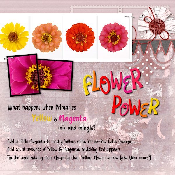
Day 4 Diamond QP Here is a color flow from the subtractive color (absorbs light as apposed to RGB which is additive and reflects light) color system CMY commonly used for printing (inks, paint etc). Starting with Yellow (very low on the value scale) and strong willed Magenta (fairly high on the value scale). Note the colors of the flowers are not PURE colors, in fact if all all three primaries are present and not any one of them at full strength, it's a tone (Hue+grey). Just keeping up with my color practice along with my PSP practice. I changed the color of the back ground with either Hue Map or HSL or likely both. the Fonts are Flower Love and Friendly Cactus. I used Objects>Convert Text to Curves>As Character Shapes for separate the letters so I could move them separately. Then rasterized and inner beveled.

-
I see now, thank you.
-
As a Black cat owner I love everything about this layout Donna. The quote is so perfect.
-
Oh Jeni, you are so lucky to live where you do. I have loved Australia since I first saw "The Man from Snowy River" and "Pharlap" many many years ago. And New Zealand, so rich and green and so many interesting animals and birds, that I've only seen on nature shows. I'm looking forward to more of your showcasing.
-
Thank you Julie!
-
What a wonderful layout, love the photo. It sure puts a smile on my face. I hope I have as much energy as this lady seems to have when I get to where she is (in age; 29 yrs with 50 years of experience, right?)
-
I would have loved to see the hard edges so I can see the difference. Julie, I love your layout style. It's a hard one for me to emulate (don't we tend to love what is out of artistic reach). I really love AMarie's work too.
-
Jeni, I am really enjoying your pages. The scenery and critters are so wildly different than in Western Canada where I am. That water dragon is so cute, are they as big as iguanas.
-
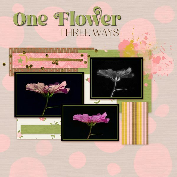
Day 3 Diamond Extra QP You know you need more practice with Filter forge (13) when you cant figure out how to get a photo into it. It was different than version 12 and I haven't used it in a long time. They have great filters so I don't know why I haven't. The Fonts are Break Love and Breath from CF. Bottom photo is my original. upper right is PSP effects>photo effects> infrared. the left photo is the one I used filer forge on, I forget the name now.
- 170 replies
-
- 10
-

-
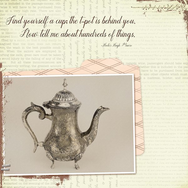
Day 2 Diamond Extra QP I used the PencilSketch2 script on this little t-pot I have. After the script, I chose to add the max gaussian blur(the the background layer) and then repeated over and over until it was basically a solid color yet still textured. I chose to not use the diagrams or the hatch as I wanted a clean, yet old-world look. Then I used the the original photo as a layer above the sketch layer and reduced the opacity(of the photo layer) to bring the sketch layer through even to look like a sketch, but with help from the photo layer to make it more solid. Font is Humilde Regular from CF (probably). side note on this font. If I chose to use Bold on the top tool bar I would lose the descenders, instead I added a stroke in black and then, rasterize so I could use Paint Behind (blend mode) with the color of the QP background to make it more readable. The quote is by Hector Hugh Munro and I have used this quote in my "rubber stamp" days.
-
Day 1, using the Diamond Extra template. I used a photo from the distant past, a Carousel from Burnaby Village Museum (in British Columbia). I even gave a donation to save/restore it many years ago and they have a book with the names of everyone who donated and my name is in it. This carousel was also featured in a stamp set of Canadian carousels and the photo they used is the horse that I have showcased in the past. This is my busy (several extra jobs) week at work so I might be sporadic with my postings. I'll try and keep up though. The font is Cowboy Kids, either Creative Fabrica or Google fonts, all is mixed up together now in my font viewer.
-
That is so interesting Sue. I did not know they froze and thawed. It's very interesting and so cool that you found them, especially the one amongst the leaves.
-
hahaha, if only I was a Time Lord, where is "the Doctor" (Who) when I need him/her. I still have one lesson to go then my MEGA-mini Kit (the Mini Kit with 20+ add-ons 😁)will be completed.
-
I have wondered about my photography images after I am gone. I have no kids and I think, it will just be all gone, who would want them? It really is something to think about isn't it. When a relative passes, does anyone remember about the computer and what might be on it? I have to say, other than thinking all my photos will be just gone(when the computer gets recycled), I had never really thought about the works I have created with the photos. I am interested in what others think as well.
-
Beautiful, Michele. It's so delicate and feels like warm spring hug (from Mother Nature).
-
Fiona, I love the background.
-
Happy Birthday Carole. Hope your day is superb tomorrow. And BIG thank you for bring gifts to your own party...for us!
-
Me too. Behind on P52, 3-4 weeks now. And I thought I'd have the weekend for photography. It was not to be. Hopefully I'll find time in the week. See you in the workshop.
-
Wow! Ann! I cant even begin to know how you did this. But i want the script that makes the beads. These are gorgeous. The background is really cool too.
-
Awesome Julie!
-
Simple STUNNING Julie. You got that right, when it comes to color, Mother Nature never gets it wrong.
-
I don't find it distasteful or cruel. the Natural world works to keep it self in balance. Your images are interesting and the experience of seeing this must be surreal.
-
I'm just impressed at how many birds, mammals and insects (anything crawly and/or winged) that I wouldnt know if a mistake had been made. I bet they two look very similar.
-
This is fabulous Mary!