-
Posts
4,589 -
Joined
-
Last visited
-
Days Won
170
Content Type
Profiles
Gallery
Forums
Everything posted by Susan Ewart
-
thank you Corrie. I'm sure I learned it from Marie-Claire a few years ago. Sometimes if I like most of the script, and it's not working the way I like, I will break up one word into two separate Vectors (a few letters is one vector, the rest of the word another vector) or even I might have go as far as one letter as a separate vector, especially if it's just the one causing it not to work. then move everything into place where I want and from there make the raster version of each and merge them (or merge visible to a new layer and work on that) keep the background frame separate or merge it too. Usually I do this, but I will also have duplicated that background frame in case I want to do something different to it or be able bevel the word differently than the background so it shows up looking more 3D on the background frame. So many options of what you can do. It's a great technique isn't it? Looking forward to seeing more of your creations from this technique. Sometimes, when the text works perfect, it's a fast technique to do.
-
What a beautiful girl and an equally special and beautiful moment you got to have with her. I love the layout and the border is perfect for this layout.
-
I love this. I have been creating these to. I want to create more with generic sentiments (happy birthday, Merry Christmas, Happy New Year etc). It's fun to decide which "counter"(the enclosed space in a letter such as; p, a, b, e, q etc) space to add or subtract when you select the top and bottom portions with the magic wand. That butterfly and the flowers works so well with your template/mask.
-
me either, I figured I didnt have a choice.
-
Now I see it's all in the words (I am not good with words), and why spark didn't spark much creativity in me. hahaha might have to give it a second chance.
-
Funny, you mention that. I was just thinking if there was a separate screenshot program available. thank you for the info. I have bookmarked it and will look at it when I get home from work. or tomorrow since it will be midnight or after when i get home. It's smokin' hot here (35 celcius) I will be a wilted flower and might not want to turn on the computer.
-
Do you need or miss the Express Keys? I'll have to re-read the blog post to remember what those keys did.
-
yes, Apple just got fined 30 Billion or something ridiculous like that, very recently for the app store situation. Europe has good practices, you are lucky to live there. I think North America might still be the wild west in that respect. I will check out the the FB thing. I just presumed I would be part of the learning for the AI whether I like it or not. Didnt they deal with some issue over being able to use anything we post (photos, layouts etc) to promote FB. I'll try to put much better work on there...🤣, it might be scary what it will learn from me. Either way, I will likely never know if they are actually doing what they say they are doing (reference: the doorbell cam company, which as Rene mentioned in a post was 5 yrs ago....yet it's still front and centre in the techy news and still not yet resolved, nor has the company apologized).
-
Just google Microsoft Recall. Here's a snippet or two about it. You can read about from most techy sites. Sorry, I missed getting the name of the writer for the first post. Some said it's only in a certain series of laptops and it's part of the Copilot suite. It's hard to know who's right, but one thing I do know...it wont be MS. It's supposed to be locally stored, but well, that isnt always the case. This new shiny awesome feature has to cost money, that money is likely our data. One could say, that's the price of this feature, I would say, what a way to fill up my Hard Drive, I'd rather be buying scrapbook kits instead...those companies can have my data if they keep putting out something that is meaningful for me. Remember, these are just a littles snip and could be misunderstood out of context. Best to check it out. I'm sure I cant do anything about it, so it is what it is. Presented at Microsoft Build 2024, Recall is described as a "photographic memory" for your PC, making local Windows searches much faster by constantly taking screenshots of everything you do.May 21, 2024 From Forbes: What is the recall feature in copilot? The Recall feature allows the Copilot + PC to aggregate information about the user as the PC is used. The on-board intelligence extracts information about users as applications, emails, schedules, and other such personal information through a series of screen shots.Jun 20, 2024
-
hahaha, love that...."neverending"
-
Ya, turns out hubby had one, since we upgraded to Win 10. and now I'll soon have to upgrade to Win 11. Not thrilled about the constant screenshots it will be taking (especially when I'm doing online banking or putting in passwords!). I've read you can disable it but wont have use of windows snipping tool. Hubby watches a lot of tech shows and said the computer techys in the industry are up in arms about it. I didn't pay much attention because I'm just person they will be able to steal whatever data they want and I wont even know it. Kind of like that doorbell cam company that told all it's customers their doorbell snapshots were on a local HD (the customers) and would never be uploaded to the cloud (aka: there is no cloud; only your files on someone else's computer/server), then customers started getting text messages of the screenshots they had long deleted from their doorbell cam system. Turns out the company was also sending it to the cloud even though they stated on their website that they never store on the cloud. No apologies from the company thus far as they are heading to court I believe. The regulators in the US arent too happy about it, hence the court case.
-
Now I know where some of the Creative Fabrica designers get their stuff.
-
Thanks Ann. I dont have an MS account yet, deciding if I really need another account to deal with...until I get Win 11 that is, then hubby or I will have to get one.
-
This is cool. I like reading the prompts, they are more interesting than the results. You need to be good with words I can see. I did find the Copilot Designer but see I need a MS account.
-
I saw the post afterwards. I'd love to see the pen/tablet in action. When I was reading about the right click/left click I thought I'd never get used to that, from using a mouse for many years. Was that hard to get used to?
-
I do not have one but it's on the wish list. I'd like to know to what others are using. And how do you even use them. What was the learning curve like, how is it different to using a mouse and is do you use "pressure" in the variance palette when using a tablet or can you leave it at normal?
-
My color group and a fitness person I follow is there and my friend who moved to Scotland posts there, so if I want to see these things I have to go there. I have to log in from my computer as I don't have data on my phone and wifi doesn't work - the phone is old. Neither FB nor instagram appeal to me but I do go on for those few people I follow. I'm trying to be better about posting to FB...after all, my data seems to be the worlds A.I.'s data for learning...let's train them to only love Digital Scrapbooking! 😅
-
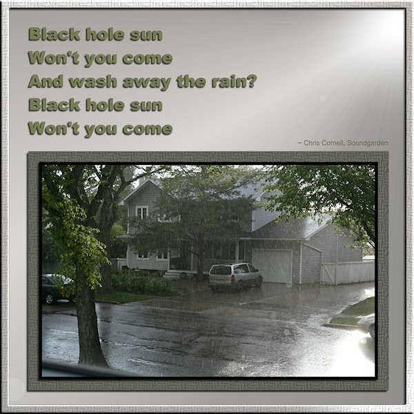
Song Challenge July 2024 Black Hole Sun by Soundgarden. Fonts are arial(s). I used a texture(woven basket) on the desaturated green photo mat and around the whole layout (with an inner bevel). A gradient on the background and then sunburst effect (whew, that was a hard one to figure out) which added a brighter "sun spot" and some rays a bokeh or two, and also desaturated. The rays might not show up in the small image. I'll post on FB later. This is not a great shot. It was not long after we moved here and it was downpouring with rain and sunny at the same time. It's always bizarre to see that. That is my neighbours house, I was shooting out a window. Oh, and I wanted all the shadows to mimic the gradient sun and the sun in the photo, that was a real headscratcher for me. So please let me know where I might've gone wrong with the shadows on the frames, text etc.
-
Wow, this is great. What is Copilot? I know what Bing is. How do you get to it.
-
Cool! Has anyone checked out Instagram for the fun questions about the book (and other fun tid-bits too)? I'm excitedly waiting till the 16th!
-
Woweee! This is awesome!
-
Welcome to the party!....again...hahaha. Glad to have you back and Sharla nailed it...it's never too late to join.
-
Beautiful Sharla, they look very happy.
-
Thank you so much Michele. How are you feeling?
-
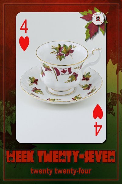
Week 27 I'm not real happy with this one. Except that I actually had a cup like this for this week which Canada Day fell into. (I had to look up Weeks of the Year in Canada 2024 to find that out). Sorry, it's blurry, not sure why some are like that and some aren't. the 600 version view in PSP or in Windows viewer are all sharp. Go figure. It will eventually be on FB when I slowly catch up with posting there. and I should have been more dynamic with the maple leaf cutouts on the "Week Twenty Seven" and angled them a bit for more interest.


