Susan Ewart
-
Posts
4,796 -
Joined
-
Last visited
-
Days Won
186
Content Type
Profiles
Gallery
Forums
Everything posted by Susan Ewart
-
We are getting above zero mornings now. It's glorious. Corrie, have a wonderful trip, looking forward to both you and Sue's photos from each of your trips.
-
This is so interesting; thinking of plants in this way. We just take them for granted without realizing the wonder that they are. I learned about dandelions closing up at night. I know some flowers do this but I didn't know dandelions did until I went to photograph them at night, only to discover they were closed up tight and fast asleep. I tip-toed away slowly and quietly as I have heard if you wake a sleeping dandelion they turn into a venus flytrap and eat you! Kidding aside, it blows my mind they can even do that, I think it must be fairy magic (and little help from their biological systems).
-
I'm in and will work with PSP.
-
Well explained Sue. And you are right, this is much easier than expected. I use this technique a lot for birthday wishes, goodbyes and other occasions. I'm going to check out that masterclass.
-
me too!
-
this is so beautiful.
-
Thank you Kasany, I did not know about this site.
-
That is a nice explanation of the best times to photograph sunsets and sunrises. It's been some time since I tried to capture any of them. I work mid-afternoons to evening and usually miss the sunset. Or rather while I'm working I can see part of it out the window and know that I'm missing it yet again. One exciting thing on one of the empty lots across from my work has gophers (I think that's what they are) out now. They looked funny being out while thereis still snow on the ground. I've worked there 11 years and it wasn't until last year I noticed them on the several empty lots around my work. They really blend in to the grasses around them.
-
thank you so much. Sunrise happens so quickly it seems, sometimes I look out and think I should go get the camera and I do, but when i get back, it's changed and not as good as it was.
-
Holy man, my grammar is pretty scary and can cause some interesting confusion in communication. It's like that book called "Eats Shoots and Leaves". Where you put the punctuation can be the difference between what a panda eats (shoots and leaves) and a psycho-killer (has a bite to eat, shoots people, and leaves the scene). It's amazing we can communicate at all, there is too many rules. A guy I once worked with showed me funny thing: Tri-weekly (occurring or appearing three times a week) Try weekly (try something on a weekly bases) Try, weakly (not trying very hard) All sound the same, but all mean very different things.
-
This is fabulous Corrie. Incredible sunrise and really good use of that script (I'm going to put on my wish list for the birthday buying spree). the background is really cool, I studied it for sometime, super effective at framing the layout and focusing the eye to the centre.
-
here is a sunrise from 2017. I dont have a lot of sunrises, mostly I have sunsets. At sunrise I'm generally working out so I miss them. Now that I have equipment at home I can stop and see the sunrise. this is from the Word Frame tutorial . it seems the fall/winter are good times for crazy colors.

-
This is one that was based on a technique Marie-Claire had shown in the forums and some of us were so impressed we tried the technique. It's a technique I now use often when sending a digital greeting to someone. I really was grateful she had shown hers. This was not a spectacular sunrise, just one I found at the time quickly from my files.
-
Loved your examples, especially Adam and Eve. Yup, my best (weight)lifting days peaked in 2019! I peeked through the blinds to see if there are birds in the yard and saw the neighbours cat...peeking can be a good thing. Echo was chased off gently (a tap on the window does it), after all, I also want my yard to be friendly to all who need to use it. Thanks for the lesson. You wouldn't believe how bad I am a using "big" words and get corrected, I just laugh now. I often think I should just stick to one-syllable words. And lastly, what can you do about my horrible math skills?
-
I agree. The Basic Scrapbook course was the first thing did after the first bootcamp I took (where I finally learned how to use PSP after buying for 3 yrs and not touching it!). and now with a diamond membership I was able to do the new ones Module 6 and 7! It's such a good course, where i learned so much and also learned how to bind a tool among other gems to make the workspace better for the user. Also the suggested settings for the shadows, that really was a go-to over and over for me.
-
I have seen the show. My husband works at a large tire warehouse and they load mining tires on the trucks that are destined for the ice road.
-
How about two points of view on peaking and peeking. 1. The sun itself it peeking at look at Anne on the shore, cause the sun is nice like that 2. Anne, on the shore is thinking, the sun is peaking out and having a look a me! Either way, it's an awesome ex'peer'ience for Anne no matter who is looking a who.
-
Right? I'm with you, although as a child I live on a lake (okay, not "On" the lake, but lakefront) we used to skate on the frozen part for miles. But to drive on a lake, no way.
-
Wow, those are beautiful photos. I don't recall every seeing a partial eclipse.
-
That's so awesome. Your dogs treat their toys better than I treated mine.
-
I haven't tried that. I should add that to the Q and A and how to make metal swirls like you used in the bootcamp tutorial.
-
I was happy with the gradient (Thank you PSP!) and didnt want to cover it with a paper so i just made the round rectangle selection and promoted the untextured layer so the gradient would carry through. I liked the result. I was thinking, how will I make it standout so I added a little bevel (thicker paper?). I'm glad to have finished the workshop, unlike the other workshops I did not finish. I'm am hoping the wedding stuff is all finished by the end of the month so can resume the workshops and projects I have started and ones yet to be started. You must be close to your holiday. I hope you come back with amazing photos like the ones you have being treating us to from your last holiday.
-
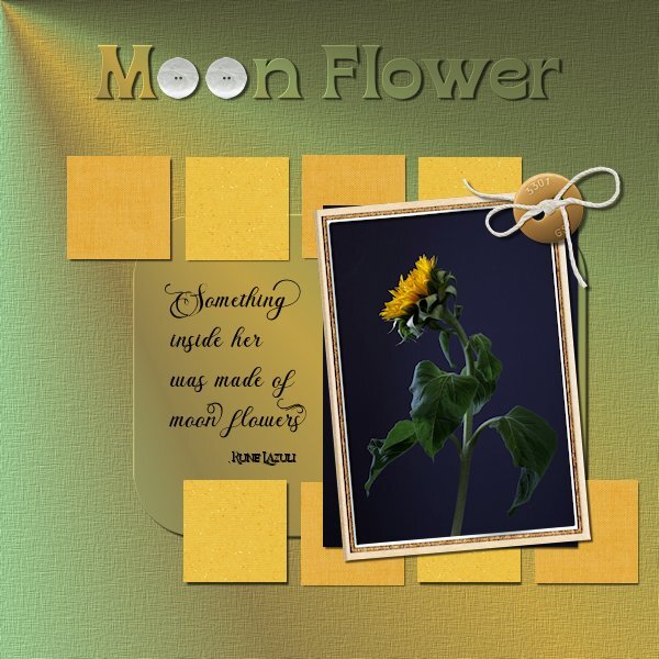
Project 5 This time I pulled a photo from my files, I think I shot these in October. I had another photo in mind but this one beckon me to use it. I made my own background paper with a gradient (looking like a beam of light on the flower) and for the rounded rectangle which I selected then promoted and added a small bevel. The squares I followed the tutorial and used scrapbook papers. Fonts: Briantone, Bricktown and Borensa (title, one of my faves) buttons: Melo Vrijhof button 04 and Billie Irene travel button 4 (DigitalScrapbook) frame: Marisa L gl21 frame 3 (DigitalScrapbook) Little squares: Janet Scott Dark yellow Fabric and DigiDewi Princess Paper Sparkle yellow dk (DigitalScrapbook) Photo: mine
- 181 replies
-
- 10
-

-

-
This is so pretty. the petal looks neat tucked behind.
-
oh my gosh, this is really interesting. Again, your letter G fits perfectly with the story. Well photographed, I can see all the details and it is really detailed. The craftmanship of this Mastermark is unbelievable.