-
Posts
435 -
Joined
-
Last visited
-
Days Won
4
Content Type
Profiles
Gallery
Forums
Everything posted by fiona cook
-
Like the subject very much and like your artwork. Can you tell me how you make the fuzzing out for the discreet portrait photos please?
-
Day 2 I am going ahead with the idea of using some of the ideas and template in this workshop for my niece's graduation card so this is her name. I ended up making a selection of each letter and then changed the colours as I had already converted to a raster at that stage. I added an inner bevel.
- 339 replies
-
- 11
-

-

-
I am using PSP2021 (not PSP2023) and had the problem with the character width on some fonts so the effect didn't work. I then tried out Carole's 0.1 outline technique but couldn't get it to work. In the end was defeated but had a bit of fun with a character that did work.
- 339 replies
-
- 14
-

-

-
Day 1 The first font I used (Swiss721 BlkCnBT Bold) didn't work too well as the fill part was too condensed so I expanded the fill but it then spilled out around the outline on some letters. I then tried in Arial Black ( a safe bet) but had to reduce the kerning a bit. I used X3 Stars for my Picture Tube. It helped laying a Guide Line at the top level where I wanted the stars to appear and then filling downwards. As far as a project goes to apply the effect, I am thinking of a greetings card for my niece in Africa who is about to graduate.
- 339 replies
-
- 16
-

-

-
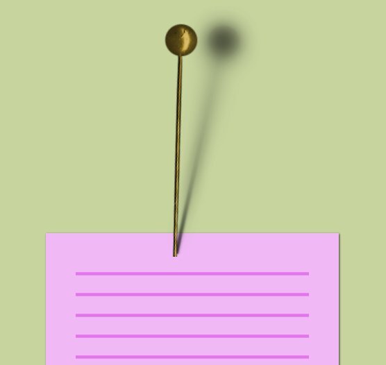
I had trouble with the clusters tutorial and needed to have more time to digest it. Sheila's practice of labelling each layer in the cluster sounded worthwhile. I rejoined, albeit late, (busy bank holiday weekend!) for the cast shadow. I did wonder at the time about the highlight on the pin head and thought if the head was a large sphere, it probably would catch the light in that position so it didn't look bad to me. I didn't see a link to a quiz so not sure what your results were about. Thank you again Carole for your ideas and tuition and thank you participants for all the useful suggestions.
-
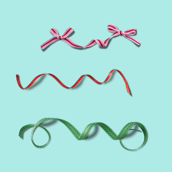
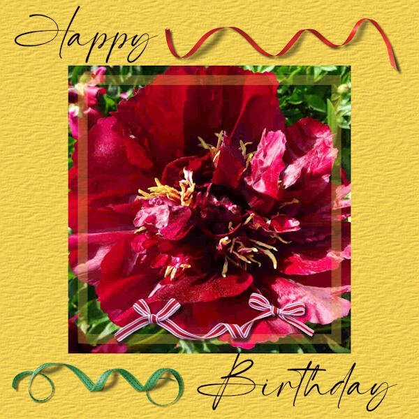
Lesson5 I've added the ribbons to a project but all three on my design are a bit much but show how versatile they can be.
- 262 replies
-
- 10
-

-

-
Now there's a good idea. I tend to label the layers anyway but adding the values, brill!
-
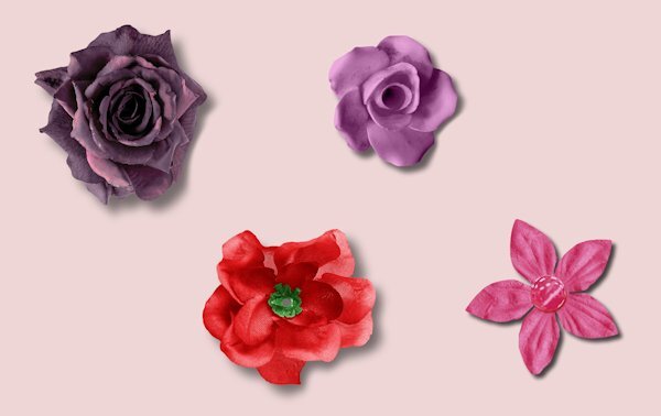
Lesson 4 Pink flower like a card shadow 20: 20: 70: but increased the blur: 30 No Warp Brush Pale purple rose: 30:30:70:40 Used Warp brush and reduced the opacity of the shadow afterwards in the layers palette which makes me wonder how you can go back to the drop shadow settings after actioning it to see what values were set? Deep purple rose and Lacey red flower : 50:50:50:80, using Warp brush on both and tried using more of the edge of the warp brush this time not the centre.
-
Thanks for the tip Carole for shadows for translucent layers. I later tried it for Lesson2. Having set the shadow opacity to 40%, it made the coloured layer too dark but I double clicked on the shadow layer to get the layer properties where the opacity value appeared here at 100 so this I reset to 40 and it then seemed to work.
-
-
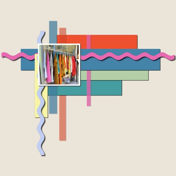
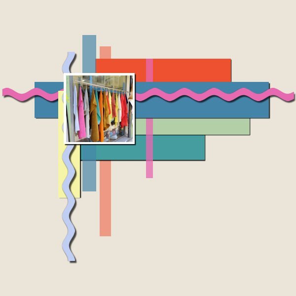
Lesson2: Colour palette from the colours in the photo. Rikrak drop shadow as card stock 20;20;70 20 and a reverse shadow 0:0:30:10. The yellow strip reverse shadow 0:0:50:10. The pale vertical strips are reduced opacity, like a transparent tape, so wasn't sure how to make a shadow for them. Putting a shadow on only shows through the strip, making it darker so I left off completely.
- 262 replies
-
- 13
-

-

-
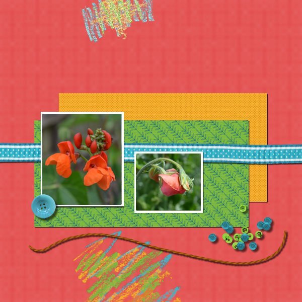
Nifty Cassel tips for settings values helps a lot so now I have updated my methods. The string I treated like thick card stock so 20:20:70:20 and the sequins thicker so 30:30:60:30
- 262 replies
-
- 10
-

-

-
I am in too although still trying to find time to complete previous projects and for the Shadows Workshop will not be around for a lot of it. Will be playing catch up! The information and ideas from Carole's workshops are so varied, I am not wanting to miss out. See you all later.
-
Thank you all of you for your encouragement. I have been concerned that I wouldn't be able to apply myself timewise but like a lot of things, where there's a will, there's a way! I get into a project and it consumes my time. My brother visited recently and he berated me for not using my DSLR camera like I used to. It's so easy to snap away with a mobile phone. Maybe I can add the camera use to my objectives for this project. Thanks again for the tips. I did start collecting images for this project last month but didn't keep up the momentum due to commitments but maybe, rather than being put off, it can be the best endeavour to take one picture a week. Thanks again all. By way of contribution, here's one of my first ones then. Happy Year.
-
I have combined two recent workshops: the Vector workshop and the latest Twine Time, to produce a birthday card for my niece. I made the Picture Tube frame first as part of the workshop. Where the chain tube appeared underneath the lettering of Zuki I made selections of those parts, promoted to new layers and moved to above the 'ZUKI' text layer. (I suppose I could have made all those selections in one go, in shift and promoted as one layer but I didn't think to try in time). For the purple background I added Noise to the outside to contrast with the inside plain purple. Happy Birthday text is created on a vector path.
- 151 replies
-
- 13
-

-

-
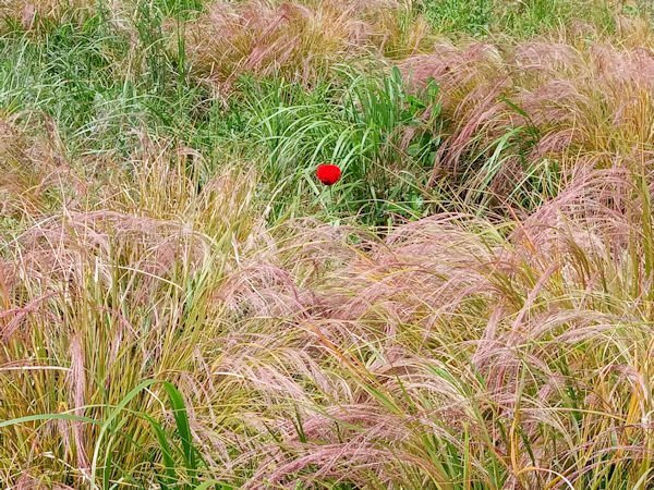
I am a bit late to join in with this but as I go walking a little bit I thought that I would photograph fields (various...wherever I am) throughout the year. One objective being to get a bit of variety somehow. I am not sure how to present them yet but just thought I's join in and can see some lovely images from you already.
-
In the Pop Quiz I got 6/10. Then I redid it and still got one wrong. That CRAC thing. I think my concentration must have been going when studying that.
-
Beautiful. Everything so right about it.
-
Well done Carole. You must live and breathe Paintshop Pro!
-
Lesson 7. I copied the vector layer, removed the stroke and added fill and texture but have made the mistake of adding this on top of the inner bevel! Not sure how I could have achieved this properly.
-
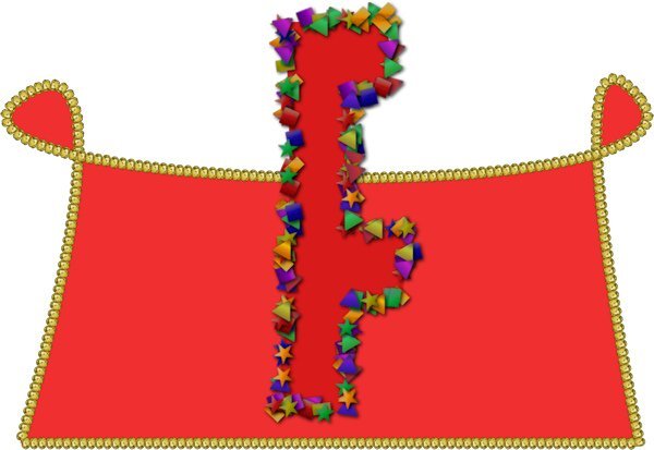
Lesson 6. Text used 'Mister Earl' but it is an unusual character 'F'. The Picture Tube is 'Confetti' which I made look thicker by reapplying the Vector Tube script.
- 400 replies
-
- 10
-

-

-
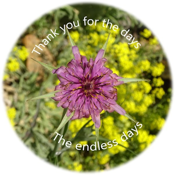
With the text on circle exercise, I got muddled up with where to double-click. To Reverse Path double click on the actual circle path (not the layer). To get the text to go under the circle, double click on the object text path Layer (not on the image) and select all.
-
So sorry not to contribute before now as have had unexpected family commitments and only just managed to catch up. The first lessons I found quite tricky but got into it from lesson 5. Although the text on the path with the cat got bit distorted even if I changed the size of the text.
- 400 replies
-
- 10
-

-

-
I'm in even though I have done the class before and this year may not be able to join in until later. Yes it's a fiddly subject I think but practice makes perfect so they say. Ever hopeful!


