Jeni Simpson
-
Posts
425 -
Joined
-
Last visited
-
Days Won
12
Content Type
Profiles
Gallery
Forums
Everything posted by Jeni Simpson
-
I have all three and have yet to look at the other two, I tend to be trying to get accustomed to Photo at this stage.
-
Rene, thank you so much for your research on shadows. I have all my presets in PSP, however, in Affinity I was having difficulties, I think it is my laptop that needs renewing. My keyboard is shocking, it looks fine but so many keys take a few presses to register, and when I watch Carole using the sliders in FX, it drives me nutty, mine do not have such ease of use! When I type font, it shows as don't! Oh, BTW, I watched a guy this morning, from IAMRENSI YouTube channel, who says you can also slide the 'FX' from one layer to another layer, to get the same effects on both layers.
-
Thanks Rene, I joined Affinity Revolution, and I've done a few of the tutorials. Also, you mentioned the designer from the Lilypad who has tutorials as well. I'll check out that forum you mentioned here.
-
Template 6 Affinity 2.6 Ashlee visited Southland with her mum at the age of 4. With the two of them coming down from Christchurch, we thought we'd show them all over the Southland province. They were fascinated by the wildlife we have down here, and how close we could come to them. The Sea Lion behind Ash is safe so long as his mate is nowhere around, so sunning themselves amongst the beach-goers is common. With the mate around, just don't come between them. I have come across Sea Lions sunning themselves on the rocks or hiding amongst the tussocks, as Ashlee did in the lower photograph. The kit is Jessica Dunn's Coastal Spring, I used her Painted Papers, and the font is Lena.

- 588 replies
-
- 14
-

-

-
Wow, Bena, that is great information. I have surfer friends on the Gold Coast, and my housemates in Sydney would venture out on boards into the harbour, but I have never realised there is that line, in Australia, of all places, one doesn't cross on a board. Although I have visited Rockhampton, I'm no surfer, so I didn't notice that line. It didn't occur to me why my friends in Townsville never talked about going surfing. Nor did I know about saltwater crocs! Thank you for opening my eyes!
-
Thank you, Carole. I have re-done the page, removing the shadow from the smaller text and making a larger shadow for the word Tulips, so it doesn't get lost again. I'm afraid I sometimes go back to the graphic designer in me when I put text on top of something, or mess around with elements, etc, forgetting it is a scrap page I am creating...I'll do better
-
Template 6 Affinity 2.6 Ashlee and her mum travelled down from Christchurch to stay with us, and we took them to many places around Southland. Ashlee was 4 years old and would start school in a few months. She had never struck wildlife on the beach before, so it was quite unusual for her to see the huge Sea Lion stretched out close to her. I have found them sunning themselves on the rocks, or, hiding amongst the tussocks, as she is doing in the lower photograph. If they are sunning themselves, they can be quite harmless, if you get in the way of him and his mate, you'd better watch out! Kit used is Jessica Dunn's Coastal Spring, and the font is Lena.
- 588 replies
-
- 15
-
-

-
-
Template 3 Diamond When camping near this small lake, we woke to fog. There is something about fog, I think, that gives a mysterious look to the surrounds. I have used Jessica Dunn's kit River Fog. The fonts are Greater Works and Golden, both from CreativeFabrica. To give a foggyish look to the word fog, I selected a small scrap of one of the foggier-looking papers and placed it over the wording and lowered the opacity quite a bit.
- 588 replies
-
- 15
-
-
Susan, they were tall, well above our six-foot-high fence between our neighbours and us. The fence in the pic below would be just below the bottom of the photo. You can see our neighbours shed in the pic.
-
I have lovely memories of the Kookaburra laughing. A wonderful start to the day, waiting at a bus stop in Sydney. We have the blue Kingfishers in New Zealand, although I have to say, since moving back to the South Island in 1975, I have not seen them.
-
Template 5, still in Affinity 2.6 The photographs were taken years ago, on different days, in Hagley Park in Christchurch, when I was living there. I have used Marisa Lerin's Change kit, and the fonts are from Creative Fabrica, Astrologer, and Active School. The paper in the circle was a problem. I wanted something not too strong and tried to darken it up a bit, and with the problems I am having with my laptop, it wasn't working, so I left it alone. I could probably have opened PSP and fixed it, but wanting to use just Affinity, I didn't. The ric rac is something I created many years ago when I first looked into scrapbooking, and did a few tutorials. The duck is a Papango, or Blue Teal duck. The roses were bunched up on a bush, the colours appealed to me. The thrush seemed to be letting me know he had first dibs on that water fountain. The koru, the shape of the fern on the right, represents new beginnings.
- 588 replies
-
- 14
-
-
Susan, I am enjoying all your templates, your photographs show a great sense of style, and the colours you choose are perfect.
-
Euka, what an amazing country you live in. It is so vast and beautiful. I have never been across to West Australia, although my brother lived in Geraldton, now in Kalgoorlie. It is great being able to travel from my lounge, nowadays. I posted a reply before and found it had 2 quotes attached to the one reply, so deleted that to take less room.
-
The architecture is stunning, I can envisage the skirt swirling, it is so beautiful.
-
Yes, they are, Ann. They grow like weeds in my garden.
-
Template 2 Diamond A sunflower from my garden, taken a few years ago. It is probably the last time I grew these stunning flowers. They were taller than I am. I love their strong stems. Kit is Jessica Dunn's Reach for the Sun mini kit, fonts are Benilla Calligraphy and Asking Ladies Bold.
- 588 replies
-
- 13
-
-
Template 4 Affinity 2.6 Gethsemene Gardens was an interesting garden created in 1957 by a Christian couple on their Clifton Hill property high above Christchurch. After many failed attempts to sell the gardens, and sadly, with the passing of the husband, Ken Loader, the property has since been subdivided and sold. The gardens were offered as a venue for functions, and Noah's Ark, opened in 2004, is still being used for this purpose. There were prayer gardens, a small church, scriptures spelled out in shrubbery, a nursery, and Noah's Ark. The kit used is Rachel Martin's PS September 2020 Blog Train, and the font is Niagara Solid.
- 588 replies
-
- 14
-
-
Ann, the Opera and Ballet Theatre of Kosovo is beautiful. I can understand having so many photographs of such a stunning building.
-
I love PSP, and when it was mentioned that PSP would not be updated, I did Carole's Affinity Workshop and enjoyed using that programme. I still use PSP, however, when there is a chance of creating using Affinity, I go for it. I am also enjoying learning heaps in online tutorials for Affinity. It is different, and I enjoy using Affinity.
-
Thank you. I love them, whether large or small.
-
Carole, if you are talking about the Tulips template, I added a drop shadow to the word tulips of opacity 70%, radius 6 px, and offset of 12 px. What would have been a better choice?
-
Template 3 Still using Affinity Photo. 5 kilometres from home is Triflor New Zealand, an agent for Triflor Netherlands. Many farms dotted around the area grow bulbs for Triflor. I noticed one field just outside our village yesterday, with bulbs recently planted. https://www.farmersweekly.co.nz/people/how-a-southland-tulip-farm-grows-a-blooming-business/ The great advantage of living in a rural area is the community spirit. Every year, in October, the local Presbyterian Church holds a Tulip Day out at Triflor in Edendale. Triflor donates the bulbs, and the church takes the orders and payment. The customers pay around 80 cents per bulb, which goes directly to the church. Kit used is Jessica Dunn Spring Day mini Fonts are High Tower Text and Bargetta Script
- 588 replies
-
- 14
-
-
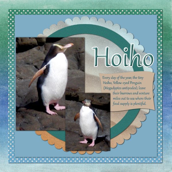
Template 2 I thought I posted this one last night and I've been back on the pages and haven't seen it, so here goes. Apologies if it has been posted before. Using Jessica Dunn's kit Coastal Spring and the font Gabriola. I probably could have placed a white frame around the photographs. This young penguin wandered close to me, although I did zoom in a bit, so not this close. They are an endangered species, so I quickly left after snapping this photograph of the wee soul. It is the tiny Yellow-eyed Penguin, supposedly the tiniest of penguins. They are nesting on the Catlins coast, about 1 hour from where I live.
- 588 replies
-
- 14
-
-
Deana, it took me a while to work it out, but once I managed to 'get' it, I found it helpful. I used another one for years that was brilliant, but unavailable now.
-
Thank you, Christina, I too, love Lynn Grieveson's style, I have been looking at her work since you mentioned her.