-
Posts
2,564 -
Joined
-
Last visited
-
Days Won
22
Content Type
Profiles
Gallery
Forums
Everything posted by Michele
-
I absolutely adore this. I fell in love with him when I was a child watching the Ed Sullivan Show.
-
N = Napkins and plenty of them, especially if we're grilling ribs!
-
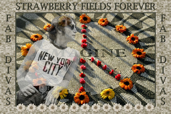
I think it might have looked better if the layer with Lennon on it had a slightly lower opacity. I had already merged both of the images onto a new layer so even though I could have fixed it, I didn't have enough time to do it over. (OCD can be an asset or a liability! lol) I was really at a loss for the background I was going to use because I wanted the flowers to be the only colored elements. I played around and finally used the Mosaic-Antique texture effect on a recolored watercolor background and darkened it using a Levels adjustment layer. The font is Lucida Bright, a system font that mimicked the original mosaic.
-
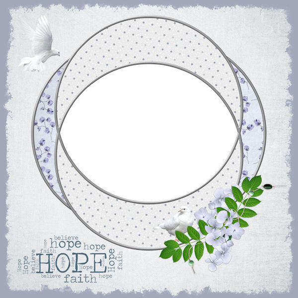
I used various elements from my stash of freebies. Gotta love blog trains and free sites. The sun image was originally an outline that I filled with the reddish/brownish color. To do this I used the magic wand selection brush in Add mode on all the empty spots, increased the selection by a few pixels, and flood-filled it on a new layer beneath the sun. I also used the Change to Target brush to recolor the two hanging elements. The font is Dream Her, free from DaFont; I applied an inner bevel and some texture to the text to try and make it look like the sun.
-
From the album: Michele Fineron
-
From the album: Michele Fineron
-
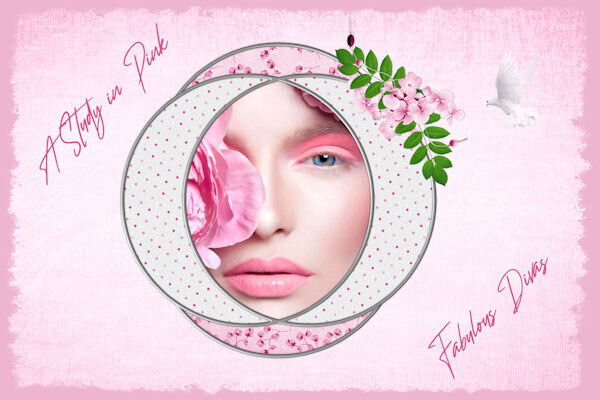
Today's daily look gave me the opportunity to use one of AnnieC's templates from a blog train a few years ago. I might have used it previously as I totally love it; she's one of my favorite designers. I found the woman's pic years ago while googling for another project. The font is Wanted Signature.
-
From the album: Michele Fineron
-
From the album: Michele Fineron
-
Done! I posted it in my group and the two Admins Only groups for the game.
-
It's my gaming group, Carole.
-
I will feel a sense of relief, Ann. I've been doing this for almost ten years and the company that runs the game has pretty much given up on it. The only reason I keep doing it is for the loyal members of my group.
-
I love this layout, Ann. I would NEVER be able to do something this intricate within the time frame I need for my daily pic. Well, I think the game will be ending soon so I'll be able to spend my time doing master classes, labs, etc.
-
It should, Ann. I don't remember exactly how I came up with the numbers, but they work for me. (I used to be a whiz in algebra, but that was about 50 years ago!)
-
I don't know what it is with me and "cute" pics this week, but that looks like the best ice cream date ever! The frame (it started out as a paper) is from a Scrap Designers Blog Train; the tricky part was changing the dimensions from 3600 x 3600 to 3000 x 2000. Facebook changed how it displays pics a while ago so if you don't change it, FB adds its own borders. I wish I had enough time to create more of my own stuff, but I only have an hour or two every day from inspiration to fruition. Anyway, I thought the frame really complimented the little girl and her puppy. The little waffle cone heart in the top right corner is from CF. I used two fonts, Summer's Ice Cream and Ferrero Rocker; the first one was all cones which I thought was too much.
-
From the album: Michele Fineron
-
Thanks so much, Susan. First I used a black outline on the font. Then I added 1) a small black drop shadow at a low opacity and 2) a larger orange drop shadow at a higher opacity and moved it below the first one. Does that make sense? I'm glad you liked the low-opacity lady on the background; I thought it might have been too much.
-
Thank you, Mary. I used to do mitered frames myself and it took me a long time. This script is well worth the money.
-
Thanks, Fiona. Duane Bryers created his "calendar girl" in the 1950's.
-
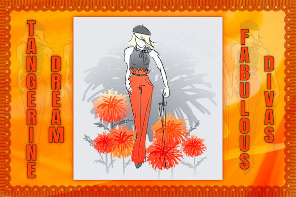
The background paper I used is from CF's Tangerine Dreams set. I found the illustration years ago, probably on a Google search (the game is repeating the daily themes from 2016, but I'm trying to create new pics every day). I clipped the girl and added her on top of the background layer several times at very low opacity; I'm not sure if that made the BG look too busy. Cass's Mitered Corner Frame script is one of my favorites and saved me a lot of time creating this frame. You can't see it at this size, but the ribbon frame has a Multiply blend mode, letting the background show through a bit. The font is Anton.
- 276 replies
-
- 12
-

-

-
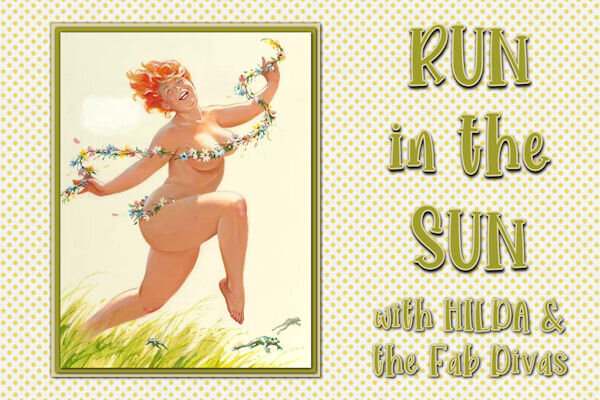
I just ADORE the Hilda pin-ups by Duane Bryers so I thought I would have a little fun with this theme. The font is Morning Sun.
- 276 replies
-
- 13
-

-

-

-
I absolutely fell in love with this sweet little face. The fonts are Bubble Bath and Jellyka - Love and Passion. I created the background paper using the Balls and Bubbles effect (Artistic Effects).
- 276 replies
-
- 11
-

-

-
From the album: Michele Fineron
-
From the album: Michele Fineron
-
From the album: Michele Fineron


