-
Posts
2,674 -
Joined
-
Last visited
-
Days Won
22
Content Type
Profiles
Gallery
Forums
Everything posted by Michele
-
Love clusters!
-
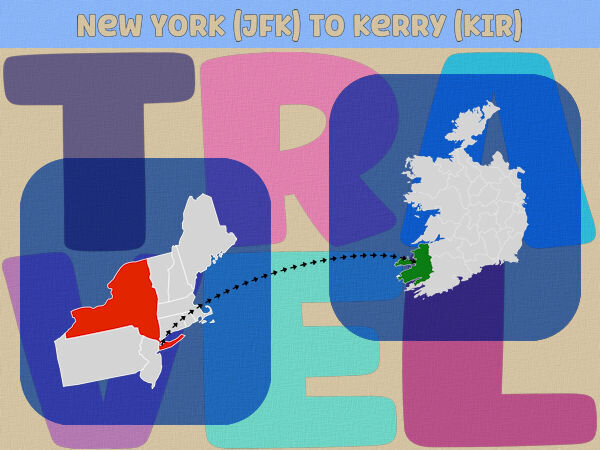
A little late, but here's my Day 2. My trip was in February 2002 and people were still very rattled so soon after 9/11 (as you can well imagine). Some of them told me not to go, but I said, "If I don't, they win."
- 275 replies
-
- 12
-

-

-
From the album: Michele Fineron
-
Years ago when I went out to get into my car to go to work, there was a preying mantis on my side view mirror. I drove all the way to work (some of the time on a highway) and it was still there! Talk about stick-to-itiveness.
-
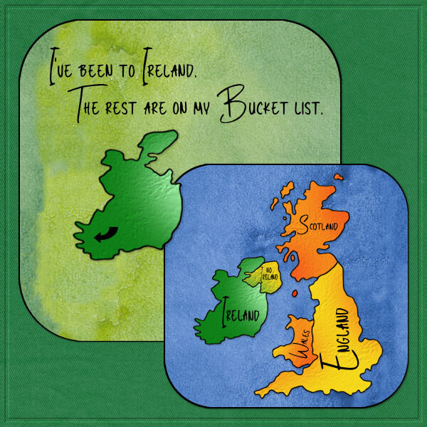
Thanks, @Jenifer Lyn. Though I don't have any Irish in my ancestry, I'm in love with the music and culture. I had an opportunity to go for only two or three days with a group, but I would have gone if it was only for one day! If you ever get a chance to go, you should. It's a gorgeous country and the people are lovely.
-
@Gerry Landreth, I'm going to be using that phrase from now on. I suffer from it quite often. ?
-
Thank you, @Cassel. Any praise from you is so appreciated. I got the watercolor paper so many years ago that I don't know the source. (I was so bad at keeping identifying info back then.) The name is Green Valley 1, but that's all I can tell you; I even tried an image search and couldn't find it. I recolored it for the blue piece.
-
Thanks so much, @Suzy. It's a pearl texture I got from Design Bundles. It's a sister site of Font Bundles.
-
I love this entire page, @Mary Solaas. The little surfboards are a great touch! I've been going through the Creative Scrap tuts and next on my list are the labs.
-
I love papers as I can also use them when making ribbons, bows, etc. as well as combining them in a project. I also use them to flood-fill elements I already have or shapes I create. Blog trains are a favorite source for me so I look forward to seeing your creations. I don't know if you'll be offering layered templates, but I often use them as is or for inspiration. I wish you luck and send congratulations.
-
Here's my Day 1. I had absolutely no inspiration so it's pretty boring. LOL
- 275 replies
-
- 13
-

-

-
From the album: Michele Fineron
-
Thank you so much, @Sue Thomas. I try to challenge myself as I am not intuitively creative. I get so much inspiration from everyone here.
-
Back to my gaming group now. I've had the illustration for years so I don't remember where it came from; I used a mask to frame it. In order to balance it out, one of Cassel's corner punches came in handy. The font is 11S01 Black Tuesday Offset; I got it free from somewhere about ten years ago. I didn't have a system for saving information about the fonts, etc. back then. I'm doing a better job now. lol
- 139 replies
-
- 10
-

-

-
From the album: Michele Fineron
-
Here's a card I made for an old friend. I used a mini kit from Gina Jones at PS. The musical element is a nod to how we met years ago...Concerts at Jones Beach Theatre. The font is Blaster and it's in my system fonts.
-
Most of the elements are from a template by AnnieC included in the March 2021 ALFLT Blog Train. There was a lot of improvising to fit it into FB's new pic size. I had the opportunity to add a paper fold I made in the Creative Scrap tutorials; it helped balance the l/o. The font is About Loving from CF. Hope my cousins liked the card.
-
From the album: Michele Fineron
-
From the album: Michele Fineron
-
@Suzy You're probably being too hard on yourself. I understand that as I agonize over almost every detail of my projects. I've had a tough time with the border punches, but the more I use them, the easier it gets. When you have time, just play with them. That will give you more confidence as you'll be learning while you play.
-
Thanks, Sue. I keep most things I create in pspimage format so I don't have to start from scratch either. It makes our creative life much easier. ?
-
I've been doing a lot of the Creative Scrap tutorials lately. For the vast majority, I've been following the Detailed Handout so I can listen to music while I'm doing them. For this one, I had to watch the video. As great as the handouts are, sometimes I just need Carole's voice to get the technique into my head. ?


