-
Posts
2,615 -
Joined
-
Last visited
-
Days Won
22
Content Type
Profiles
Gallery
Forums
Everything posted by Michele
-
I love the color combo you used. In fact, I'm going to save them to a palette! How did you make what looks like a flower chain that's above and below the main blue part?
-
I totally agree. I've never thought of extending anything beyond the border. I love the look of it, @Mary Solaas
-
Happy accidents!
-
I've been working on the creative scrap tutorials and I love how this one came out. The first one was adding noise with monochrome checked which was cool. But then I did it with monochrome unchecked and what a nice surprise!
-
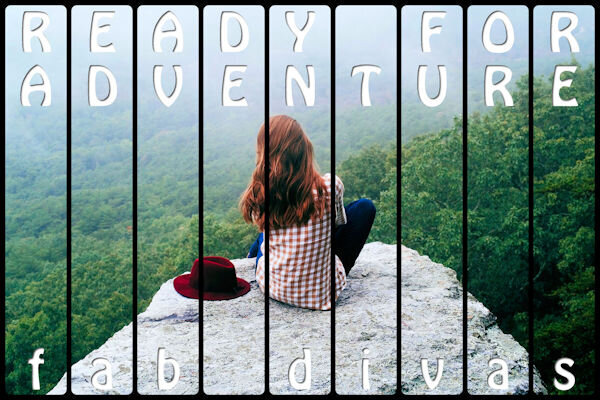
I used Cassel's WordSlats script for this one. I started with a black background and ran it three different times for each row of text. Copied one on top of the other and moved it to where I wanted the second line of text to be. Using the magic wand selection brush inside the new words, I switched to the original layer and hit delete. Once I hid the second layer, both lines were on one layer. Lather, rinse, repeat for the third row of text. Finally, all three were on one black layer with the words cut out. I used the magic wand again to choose the black and copied/pasted into selection the picture of the woman on the rock. The font is Hobo Std which is what Carole used on her free samples.
- 139 replies
-
- 13
-

-

-
Thought I would go for an old photo album look for this theme. The photo corners are by Sheila Reid from PixelScrappers. The main font is Tomatoes (free from Fontspace), but I used Lazy Ride (free from FPTFY) for the numbers. I've had the background for so many years that I can't recall where it came from. Given more time, I could have created my own paper with everything I've learned in the Campus. Also don't know where the party pic came from. I've been doing a much better job recording the origin information in the last several years, but the old ones are from who knows where.
- 139 replies
-
- 11
-

-

-
From the album: Michele Fineron
-
From the album: Michele Fineron
-
My daughter had a Fisher Price camera, but that was long before digitals.
-
And a good time was had by all! That waterslide is awesome.
-
You think? LOL Denk je? ?
-
-
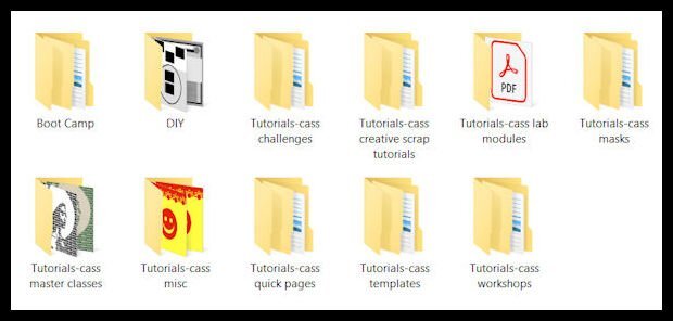
This is how I keep track instead of a spreadsheet. I have a folder called Tutorials with sub-folders for the different types of tutorials. Within each category, there are more sub-folders for the tutorials.
-
J = Juicy Lucy, a cheeseburger with the cheese inside.
-
You are so clever, @Ann Seeber. Thanks for the smiles.
-
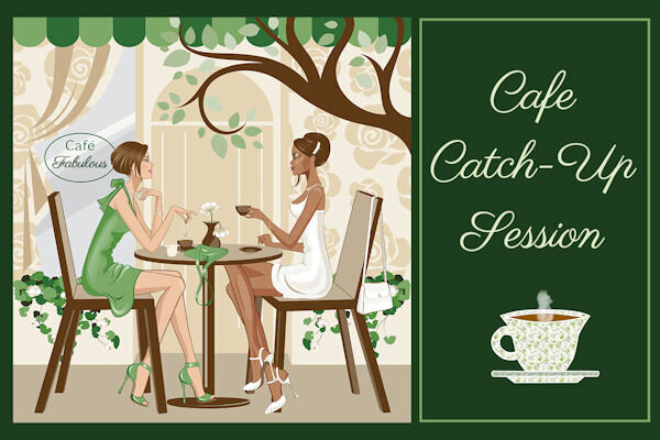
You challenged me to use my newly-learned vector skills from the workshop in my gaming group, @Cassel. Challenge accepted! I added the cup from Lesson 4 to my original pic from 2016. I even used lesson 7 to add some decorations where I wanted them. The font is Parisienne, free from I don't remember where. Thanks again for a wonderful workshop.
-
From the album: Michele Fineron
-
This is an updated version of a theme they first gave us back in 2016 (see 2nd pic for the original). If I want to reuse an idea from then, I have to modify the dimensions for FB. The background was made using the Balls & Bubbles effect over a black layer. Before you give me credit for that lovely text, on a rare occasion back then I used Flaming Text logo designer. I updated it for today's layout. I imagine I could have created it myself, but I didn't have enough time.
-
From the album: Michele Fineron
-
Thanks, Ann, but I cheated and used a pic of a podium on Google, removed the background, and changed the color (it was originally purple). I can't imagine how long it would take me to create it from scratch. Maybe I'll try that challenge!
-
It's sometimes challenging to make a layout that fits FB's parameters. Hence, the sideways text; the font is SchwabachDeko, free from fontspace. The background is a solid layer to match the sepia effect applied to the pic. On top of it is a lovely overlay paper from Digital Scrapbook, formerly Pixel Scrapper, by Janet Kemp. The "border" around the pic was made using the Magic Wand on the outside, changing the size of the selection and adding a cutout on a separate layer. To finish it off I used the 3D buttonize effect on top of it all.






.jpg.0f10a601e8a728adc291539d82aeb1cd.jpg)
