-
Posts
2,615 -
Joined
-
Last visited
-
Days Won
22
Content Type
Profiles
Gallery
Forums
Everything posted by Michele
-
This is one of my old projects from a 2018 challenge. Unfortunately, the original pics don't show in the older forum threads so we can't see the inspiration layout that Cassel posted.
- 303 replies
-
- 19
-

-

-

Cass Challenge 1801 13 (2018_08_02 16_43_59 UTC) 600.jpg
Michele posted a gallery image in Member Albums
From the album: Michele Fineron
-
I = Italian Roast
-
What an achievement, @Carole Asselin. Did you ever, in your wildest dreams, think the site would become this successful? I always look forward to your treasure hunts.
-
Our "family whistle" was when the street lights turned on.
-
I love how you have different pics for each stamp.
-
Y = Yauco a coffee from Puerto Rico.
-
Sounds interesting. My stomach doesn't tolerate coffee anymore. I wonder if this would be easier.
-
I found this beautiful stained glass image in Creative Fabrica (can you believe it's meant to be a mouse pad?). I used it to make the background paper by applying 100 Gaussian blur on the original, adding the Mosaic Antique effect, and then another little blur. The text was made using the text cutter option for the font (Andalusia). Then Inner Bevel on both the text and the main pic.
- 158 replies
-
- 13
-

-

-
I made the paper using what I learned in the Meli-Melo creative scrap tutorial and added a texture and some extra blur. Doing/re-doing these tutorials is really helping me. The font is Ambrogio and I used the Outer Bevel 3-D effect.
- 158 replies
-
- 11
-

-

-
From the album: Michele Fineron
-
From the album: Michele Fineron
-
As I said on the FB page, I really love your use of the punch in the bottom right corner. Besides being pretty, it really does balance out the composition as a whole.
-
T = Taster's Choice
-
Absolutely. It's a lovely book.
-
A Tree Grows in Brooklyn? lol
-
I was also a "free range" child, but growing up in Brooklyn, NY was quite different than your wonderful country upbringings.
-
Day 7: I don't know why, but I struggled a bit with this one. Half the time I make things hard for myself I think.
- 275 replies
-
- 12
-

-

-
Well, then, how about adding a couple of "bushes" in front of the screws? I know whatever you come up with will be great.
-
I don't know how thick the doors are, but could you maybe put the screws on the tree behind the door frames? Then you can cut keyholes in the back of the door frames so you can slip them onto the screws. If they're not thick enough, you could add another layer to the back. Does any of this make sense to you?
-
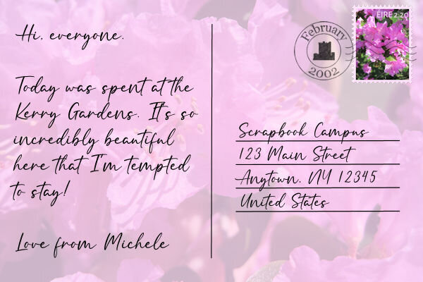
Here's my postcard for Day 6. I updated my Day 3 date stamp by adding some wavy lines I see in most postmarks. I drew a straight line, converted it to a raster, and used Effects: Distortion: Wave.
- 275 replies
-
- 12
-

-

-
Thanks, @Suzy. If you watch the video for that day, Cassel had us select the bottom right stamp on the sheet and promote it to a layer. Before deselecting, we moved back to the original layer and deleted that space. Then we could move the promoted stamp anywhere we wanted. Of course, with my OCD I tried getting all the holes to line up on the sheet, but I think I needed a square stamp in order to do that. ?
-
I don't have access to the pics I took in Ireland as they were not digital and they ended up in storage. Instead, I decided to make stamps from some floral pics I had taken during a spring walk a number of years ago.
- 275 replies
-
- 13
-

-


600.jpg.83dd67efc79b5cf770fc47a966bca1dc.jpg)


