Forum Replies Created
-
AuthorPosts
-
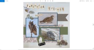
You’d swear I’m a newbie in the campus, but I’m not. I’m baffled on how to add a page directly onto forum. Displaying a much larger image.
A simple , no fuss card, used Carole’s gimp tube, and waved it. Text slightly rotated, after adding text on a curve. I replaced the border, with one of my own. Extracted the bird, placed it on a plain background, added snowflakes, and snow, to finish I added some noise to the border, and the background paper.
I uploaded my first page yesterday in the gallery, in the appropriate section. I assumed it would be automatically added to the forum, it would seem not.
There isn’t anything to add to Michele’s comment
Pirrko, Thanks for the screen shot. I wasn’t at the laptop to do one myself. That is exactly what I said to do. Petra is wanting to create a side border, and not a frame, but same principals apply. There is always more than one way to do anything. Personally I prefer to use the pen tool. As the vector edges are much smoother than a raster. This method of using the wave tool, is much quicker.
Cindy, to the best of my knowledge, no there isn’t a video. Aren’t you able to follow the basic instructions I gave, or do you need more details instructions.
Petra, there are various ways to create a wavy border. I often use the pen tool, another way is to use the wave tool, in distortion effects. Select the area you want to wave with the magic wand. Use the wave tool, invert and delete. Wave tool settings may vary, depending on the size of the page. You can also create the wave effect, using the wave tool without using the magic wand, just use the pick tool.
November 11, 2022 at 1:53 pm in reply to: I need script help – knowing what I have and what it does! #86173Mary I’m not a seasoned, dedicated scrapbooker, but I’m pretty sure somewhere in the blog, there is a tutorial on how and where to save your scrapbooking papers, ribbons etc etc etc. I believe it also covers down loaded kits. I’m sure Carole can post the link.
Suzy! I really don’t know how to respond to your latest comment. In fact I’m at a loss for words. Wow!
Mary, if it helps at all. When I create, say instance, a seamless tile for a pattern, I have a folder ‘seamless tiles’ for those sort of things. naming it for example, ‘chevron patter 1’ As quite often there will be more than one chevron pattern design. Of course that doesn’t apply to every tutorial. I have a folder for labels. At least that way, you won’t have to start from scratch, but once you have the initial template, you can either edit it, or simply colour it to suit the project you are working on.
November 10, 2022 at 4:45 pm in reply to: I need script help – knowing what I have and what it does! #86085My system isn’t as elaborate or detailed as many of yours are. I like to keep things simple and organized, when I can. Saying that, my system works for my needs. Over the years I haven’t accumulated as many purchases as some of you have from Carole’s store. Through the creative scrap, I’ve learnt how to create so much myself. Although the scripts are by far much quicker.
Why would you want to duplicate the readme text, and place it somewhere else, when it’s already easily accessible in the zipped folder, along with the jpeg preview, and the script. All nicely bundled together. Which is easily accessible, when you have all of Carole’s purchases in one folder. To me that is creating unnecessary work for yourselves.
What I do is place the jpeg preview onto an A4 sheet. Once the sheet is full I print it off. It will also include the tubes and brushes, along with the scripts. Should I need to refer to the readme text for any reason, I will refer to the sheet, to make sure I have the correct title of the script, then open the zipped folder, to read the readme text. For precautionary reasons I have all of Carole’s purchases in a separate folder on my external hard drive, and on a SD card.
I will sometimes flick through the sheets for inspiration for projects.
Love it Marie. Beautiful pics. Mother Nature’s autumnal colours. You’ve displayed her colours proudly.
Marie-Claire, thank you for the kind words on my work. I’m pleased that you and many others notice, as they are meant to be small subtle details, that give that special touch to a page.
Carole refers to that technique as out of bounds. There is a masterclass on it.
Extract the area using the eraser tool. Very very carefully, I might add. Leaving one pixel behind will destroy the effect. Move above the frame. It’s imperative that everything retains its original sizes and position. These are the basic steps. I will use other tools and techniques depending on the project. I u always use a mask when I do extracting. Check out the masterclass called Out of this world.
Thank you Susan. Hopefully, they will help inspire others to have a go at creating that effect. As I said using my own photos gives me an advantage, and correcting lighting is paramount.
I do admire your work Michelle. You page is great, as always. I agree, myself included, tend to use the inner bevel more. Although I do use the outer bevel in many of my frames and framing. It looks great on the text. I use the dimension script a lot, for 3D effects, especially on text and shapes.
Carole, as was I, thinking of you thinking of me, and my birds. ?❤️
After watching today’s masterclass on blending. I thought I’d I show you some examples of the pages I have created using the same techniques demonstrated today. I have always used masks, and adjustment layers, as Carole said, they can be reopened at any time to be edited. I suppose I do have some advantage. I always use my own photos, which more often than not means that the backgrounds are almost identical or at least very similar. Especially when the shots are taken in the same area on the same day. Correct lighting should always be taken into account when blending, for the best realistic blend result.
Corrie, thank you. I trust you will make a full recovery in time. I suppose it’s a case being patient, in order for the body to repair. I’m making progress at a steady pace. Like you I have to print my calendars. The 2 advent calendars, are finished, and the reusable labels have been added. I will post them on Wednesday. In ample time for 1st December. There was a time when I could rely on the postal services to deliver within a specific time frame. Not any more.
I’m making headway on my cards. The sort of theme for this year, is to keep it simple, favouring my favourite colours, earth tones with a hint of a Victorian feel to them. I’ve done several different templates. To add an extra touch to this simple front cover, I used a sellotape that I had created some time ago, to hold down the embellishments.
Thank you Dawn and Susan.
I still stand by what I said previously, to omit Scrapbook Campus and PSP from the catchy phrase. I also feel the catchy phrase has to be short.
An open door to tuition (instruction) and inspiration.
A gateway to tuition (instruction) and inspiration.
O = Orthodox Church
It’s only now that I’ve had the chance to scroll through all the wonderful work everyone has been doing over the past month or so. Marie-Claire your page is wonderful. As are those that created their own versions. It opens up so many possibilities. I do a similar thing to make a boring frame more interesting. I use vector shapes, and fonts for the embellishments. The technique would be the same.
Personally I wouldn’t change the name, and why should Carole do that. It’s her ‘baby’ after all, so to speak. If the campus was my creation, I would have sentimental value attached to the title, and other emotional attachments to it. Plus the fact that it was her love for scrapbooking that sparked the birth of the Scrapbook Campus. I would on the other hand do exactly what Rene suggested, which I feel would suffice, as today the majority of people tend to go by pictorial rather than word publicity when looking for something in particular. In order to attract a wider audience, and that is to change the home page to include as much as possible, that suites everyone’s creative needs. As I said in one of my phrases to cover a ‘ broad spectrum”
When I posted my phrases, they were meant to target all creative activities, and not specifically to scrapbooking.
I do a wide range of activities, all of which are covered in the campus tutorials. Should you decide to go down that route Carole, I would willing provide, wordart, greeting cards, quotes, photos, whatever, for you to use.
Carole, have you ever done a survey, on those points that you made?
I had never done paper scrapbooking, or digital scrapbooking, until I found your site. I used PSP to edit photos, create cards and calendars. Programs, and posters for various organisations I was involved in, also business cards. Such as PTA (parent, teacher assoc) Pony Club, Local Ploughing match and the like.
The phrases I have posted, are from what I have experienced through being a member of the campus.
Starting to prepare for the challenge. I have several elderly aunts that knit, crochet, and sew. Thought I’d create knitting effect cards for them.
Learn, where your digital creativity can break boundaries.
OR
Learn, to push your digital creativity to new boundaries.
Personally, I would omit PSP and the Scrapbook campus from the phrase. It’s irrelevant whether you are a scrapbooker or not. As everything in the campus can be used in copious forms of digital art, photography, wordart, cards, advertising poster, and the list goes on and on. Once you have mastered even a few techniques demonstrated in the campus tutorials, those skills allows you to digitally create what you envisage in your mind
Jannette, think you meant to say ‘previous versions of PSP’
I’m unable to find the link to catchy phrase. I just thought of one
I have registered! Many of you will already know that for many years now, well since I moved to Canada I have created my own cards/ecards/ calendars. Back in the early days I used Picture It and Publisher by Microsoft. Before switching to PSP. On occasion I will create an envelope to match the card. I have several envelope templates, some which I have created myself, some using Carol’s envelope scripts, others my own templates. There is something very rewarding and personal in creating one’s own cards, using one’s own photos. As always, the recipients, are in awe, regarding each one as a unique, priceless piece of work, created specifically for them.
Starting to work on ecards. I tend to favour 5×7 size. This is one of 3 I’ve done today. I can slot different photos into the empty paces provided. I’ve yet to write a personal message in the space below. Simple subtle framing. I use the same techniques in my more elaborate frames. Cutout, inner bevel, drop shadow, and buttonize.
Imagination at work through tutorials.
Knowledge and creativity through tutorials lasts for ever.
I will be participating.
“Artistically inspiring tutorials and creative ideas across (the board) a broad spectrum”
or simply
“Artistically inspiring”
I feel that it may be a good idea not to emphasise scrapbooking, even though it’s in the title. Initially I wasn’t a scrapbooker. I was a bit sceptical when I first saw the site. Mind you as soon as I had a browse through the site, I knew it was what I was looking for.
More than the mind can absorb.
A wealth of information.
-
AuthorPosts