Forum Replies Created
-
AuthorPosts
-
Thank you so much Corrie. I’ve posted it on Facebook, even though I can post a much larger file on FB, Facebook compresses it down. So much fine details are lost.
Thank you Annie, you are always so kind, and I really do appreciate your comments. I’ve often said, that it takes longer to take the photos than it does to showcase them. I do enjoying shooting mother natures living gems, large and small. As you know I do have a particular passion for macro shooting insects. Each and every one are living jewels.
I created the cute ground squirrel collage, here is one of Bees and Butterflies. I saw a similar layout, and decided to copy it. I liked the polaroid effect. I used Carole’s polaroid script twice, and duplicated them. Of course so much detail of of the insects are lost due to resizing. Macro photography.
I did split the mask, I also created another mask to add the larger photo. Used the guides to align the spacing evenly between them. The welsh flag is green and white with a red Welsh dragon. The italic text degraded considerably after resizing.
Cristina, I have to say that yesterday was first time I experienced it. Using 2021. Annie, was saying it happens in 2022 as well. I’ll see if it happens again. It must be a fairly common blip in PSP. Thank you for letting me know. I love the pages you have created using the photo as a background, and highlighting interesting aspects of it. Great work.
I’d like to thank those for their comments on my pages, and to congratulate everyone on their pages. There are far to many to comment on individually.
Ann S, I prefer the white on the green. I wouldn’t have it overlapping on the green if it was all black. Picking a yellow from the flowers may have been my choice. It’s all down to personal preference. As long as you are happy with it, that’s the main thing.
Thank you for the kind compliment Annie. Your pages are terrific. Australia really is a continent of contrasts, you are doing the photos proud. Thank you for letting me know, I thought I had done something to cause the issue. Should it happen again, I’ll see if it rectifies itself first, before closing and reopening. It’s comforting to know that it must be a blip within PSP, and not of my making. I’m off to bed now, you have a most enjoyable day.
Carole, I’m using PSP 2021 Ultimate. I also emptied the temp folder before restarting PSP. It was strange, as nothing like that has ever happened before with the text tool. Perhaps I clicked, or pressed a key without realizing it. Anyway, once I reopened the program, all was fine.
Monique, thank you. I think you mean strolling, as in going for a stroll (gentle walk).
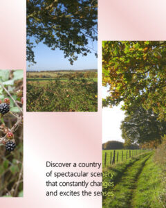
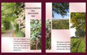
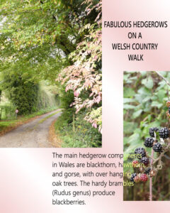
Here is my day4. I did make a few adjustments to accommodate the photos I used. I can also assure you that the blackberries when lined up will fit perfectly. 🙂 Carole, when I went to create the text for today’s challenge, I was unable to see the text as I was typing. Only when I clicked to accept it I could see what I had written. I closed down PSP, reopened it, and all was well all again. I’m wondering if the line spacing wasn’t anything I did, but something in PSP (Text). Saying that I should have picked that up, but I didn’t.
Carole, well spotted, I may not have used control A to select all the text, and missed the last line when selecting the text. To alter the spacing. I can easily amend it. I didn’t notice it. Thank you.
Annie, what a stupendous page. I love everything about it. The font is so fitting, as is the background paper. I really like the revised cover page, not that there was anything wrong with the original. The page size makes all the difference. May I make one suggestion on the opera house page? The split text, I would be inclined to stretch it vertically, before converting it to a raster. So you have more height on both on and off the photo. Giving more definition. Everyone who has participated has submitted exquisite pages. With Carole at the helm, we all have something to offer, whether it’s a tip, or knowledge to help someone out. The campus is an awesome place to be.
Art, thank you for your comment. I’ve enjoyed you pages, you are a talented man. Turning your hand to many crafts. Well done.
Oh wow Corrie, that is a stunning page. You also did a grand job on the advert. With regard to the QR code, Carole does have a tutorial in the Creative scrap, in the campus. It’s one of her older tutorials.
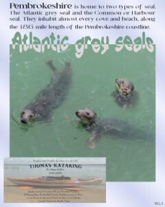
I’ve added the advert, as it is also informative. In case you can’t read it on the magazine page. I lowered the opacity of the photo to make the text stand out more.
Here is my day 3. I also like the idea of a separate page for ads. I hope it isn’t going to create more work for you though Carole. I waved the text first, seeing as it’s a water photo. I also added a different style of advert using one my photos. The seal photo is also my own, as over the years I have been fortunate enough to see them. The calling of the ocean and the sea air, I love it, and miss it. It’s a fictitious advert, but one can dream!
Monique, I agree with Corrie, magazines are meant to be informative. I am enjoying the theme you chose. I would enjoy reading about Appeltern in one of your magazine pages.
So many wonderful pages, each one a source of inspiration. I’m also enjoying the visual trip around the world from the comfort my chair. Well done ladies and gentlemen!
Beautiful page Corrie, you take beautiful flower photos. You have a good keen eye. Using an advert is another way to showcase a photo or in this case an element, which I extracted from a photo. The gift shop was aptly named for this page. As it featured the Welsh sheep. Perhaps an advert challenge could be planned for down the road. Using elements created by us, like chains, belt buckles, buttons, and hundreds more.
Thank you Ann. There are turnips and swedes, they are both root vegetables. Swedes are more yellow than turnips and a different shape. North Americans refer to them as Rutabagas. A swede is not a turnip, although they are both root vegetables.
Day 2, I kept more in keeping with the initial layout. I do like the 8×10 size for magazines, and flyers. On the cover I mentioned recipes, and seeing as I showcased a Welsh ewe and her lamb, I added the traditional Welsh cawl recipe. Magazine pages are packed with adverts, so I decided to showcase a Welsh love spoon, with the Welsh Dragon on it. There actually is a gift shop in Haverfordwest called the The Sheep Shop. The landscape is a photo I took several years ago of where I was raised from a baby. You can just see the chimneys of the house, the buildings are nestled amongst the trees. My parents have been long gone, but my brother still farms sheep. Craig Las means Rock Blue in English ( Blue Rock) Much of the Welsh language is spoken backwards, when translated into English. Having small hands as a child, I have drawn thousands and thousands of lambs over the years, and rolled the same amount of fleeces. Oh yes, I also added a page number. WCF is an abbreviation of the magazine title.
Very nice Gerry, I always use 8×10 for my magazine size.
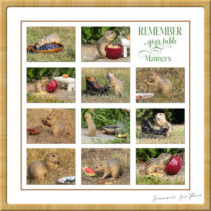
Annie, thank you ever so much my dearest kind friend. Carole commented on the page in the Facebook group. “Those are adorable” she wrote. Some of them have featured in previous pages. Richardson’s and 13 lined ground Squirrels.
I have many little friends, they join me for a bite to eat, and a beverage daily (elevenses). They are very unruly, and undisciplined. Very anti social, and extremely territorial to their own kind. I join them on the ground photographing them. They run over me, and occasionally give me little nip. Some will take a treat out of my hand, yet they are still very wild, and have their wits about them. They are some of the most entertaining creatures to observe. Now you know how I spend some of my time. I created a template some time ago, using masks. If anyone can think of a better title, let me know. If I was to print it off, I’d hang it in the kitchen overlooking the dining table.
Fiona, not to the main photo layer because it’s a mask. You can either merge the mask group, or click the top layer of the mask, and then paste as a new layer your image. Because they will be on their own layer, you can move them around and resize them to your liking.
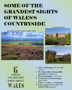
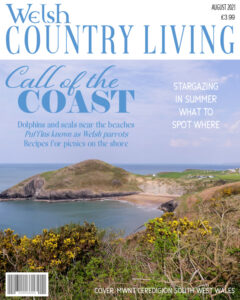
I see there are already lots of lovely pages posted, well done! Some of you will already know that I will use a magazine cover layout to showcase my insects, mammals and landscape photos. I got a bit carried away with this layout I’m afraid. I will keep to the layouts for the next pages. I thought I’d showcase some photos I take when I go home, of my beautiful homeland, Wales. I’ll share my little tip with you. When I select a photo for a cover, I choose one which has a relevantly plain area like the sky in this photo, to use for the text. That way, the photo isn’t obstructed to much by the text. After all, it is the photo that I’m showcasing. Wales is renowned for it’s outstanding coastlines, and it’s marine habitat.
Cristina, good morning, you are leading the way with you beautiful front cover. It’s bold and dramatic. It will certainly stand out on the magazine shelves. I see you used the instant effects. It’s not the first time either. I’m going to have to explore those effects more closely. Well done, I love it. I’ll probably get mine done later on this afternoon, as the temps are still up in the high 30s. Sat it was 40.7c. 39c yesterday, and giving a high of 37c for today.
I agree, plain white can be a little problematic. I overcome it, especially on envelopes, by using a paper texture on the white. With a very low depth, with some smoothness, the more subtle the better. Or I will us a very very slightly off white. It will be barely noticeable but it will make a difference.
Outstanding, striking masterpiece Annie. It evokes so many different emotions. Depending on how you look at it. I like the added envelope. I will often create a matching envelope for a card, especially when sending it as an ecard. A job Well done, my friend
HARP. Stringed musical instrument
Football
Great page Art, you put a lot of work into it. It would have to be Canada, I see orca whales in the page, so I’ll say you are out in BC. As I’ve seen orca whales, many years ago when I visited Vancouver Island.
-
AuthorPosts


