Forum Replies Created
-
AuthorPosts
-
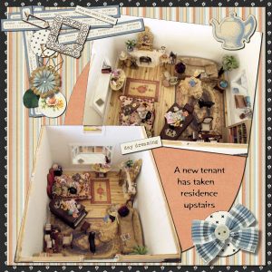
There’s Cass’s Cluster Maker Script used again on the dollhouse interior page.
I learned a lot and had fun working on this project, even though it took me a couple of months to complete it due to the research and learning of new techniques.
Here’s Cass’s Wooden Alphabet again, and also her Threaded Ribbon Script and one of her Bow Scripts.
Thank you so much for your kind words, Annie!
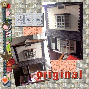
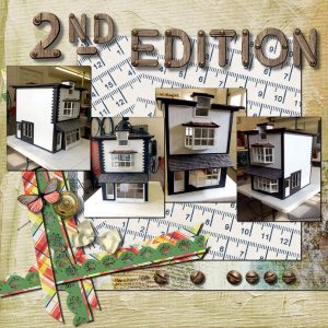
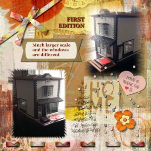
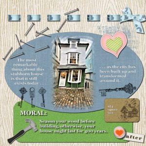
There were two versions of this dollhouse made, and since I had photos of both I included the two variants in the scrapbook project.
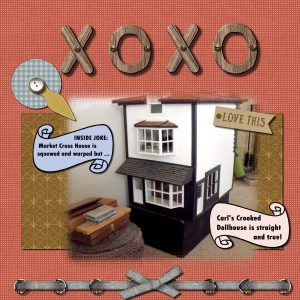
Here I used Cass’s Screwheads and Wooden Alphabet (which was perfect for this project), and also her Cluster Maker, Strip Cluster Maker, and Photo Masks Scripts.
I used Cass’s Photo Masks Script and Threaded Ribbon Script on these pages.
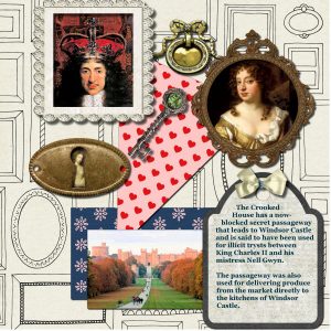
I played around a little with an idea from Cass’s Peek-a-Boo Master Class to put a small painting of the King’s mistress in the keyhole.
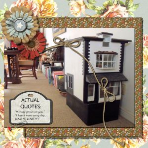
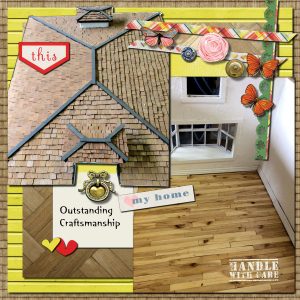
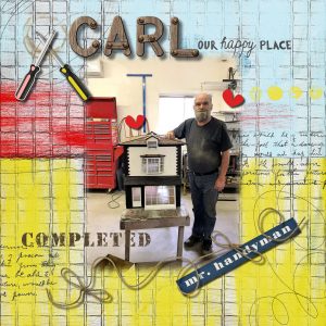
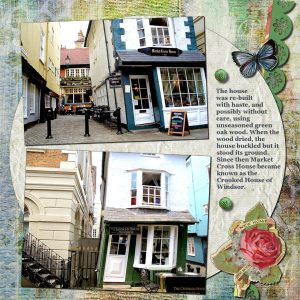
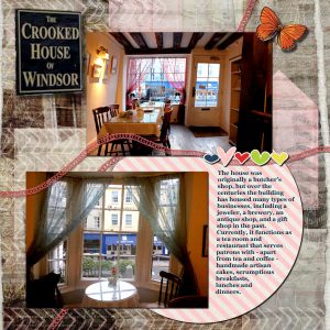
Earlier this year my dear friend Carl, a professional miniaturist, gave me a 1:12 scale dollhouse, one of two replicas he made of London’s famous Market Cross House. In gratitude I created a scrapbook about the Market Cross House (later known as the Crooked House of Windsor) and his dollhouse as a gift for him, and also as a new project to teach myself how to scrapbook as I am a newbie. I used papers and elements from Pixelscrapper’s “Our House” bundle. Here are some of the pages.
Wow, Annie, I LOVE your page! It makes me wish I was going to Guadeloupe too! Also thank you for your feedback on my work.
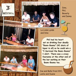
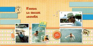
I tweaked my right-hand page of the Mark tutorial with a couple of drink stickers from Pixelscrapper’s Sheila Reid’s “At the Beach” bundle and think it added to the look and the accompanying story. Since I am new to scrapbooking I sometimes revisit previous work to “improve” it or apply something new I’ve learned to the page. In this case I should have worked on it a little longer before posting.
I found a free image of a coconut tree trunk for the Mark tutorial of the day. The mark came out OK but I will need more practice on this tutorial for better results and more confidence in using it.
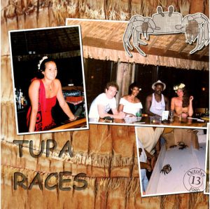
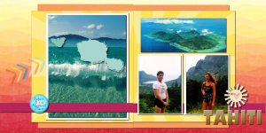
I picked colors from the photo for background papers and text color. The “3 Moorea” element is a scan of a ticket for the Tupa (Crab) Races. The crab sticker is from Brooke Gazarek of Pixelscrapper’s “Tropics” bundle.
I am so grateful to Cass and to everyone who has participated so far in this Travel Tale challenge. I learn so much and gain inspiration from the shared creations in the forum. What fun; thank you very much!
I made two Day 7 layouts, one with Marisa Levin’s template and another one with Cass’s “Mark” tutorial.
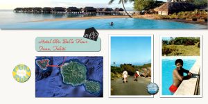
The first uses two photos I pieced together to make a panoramic picture for the background. It wasn’t wide enough to cover the whole page though, so I filled the empty space with one of Pixelscrapper’s solid papers from the “Tropics” bundle by Brooke Gazarek, along with a couple of her word art elements. That’s Cass’s useful Beach Alpha at lower right, and of course the postmark from her tutorial which I’ve been using on a lot of the pages.
Royanne, I really appreciate your feedback about Cass’s Clip It script. I definitely will check it out on your recommendation. Love your layout too and all your ambitious shadow-work; I am still very basic on my shadowing skills.
DeLoris, that’s a great job on the postcard. I had forgotten about the postcards with a faint photo on the side for the message. Well done!
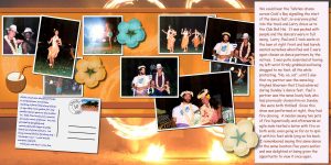
Here’s my Day 6. The coconut drink sticker and hibiscus flowers are elements from Pixelscrapper’s Sheila Reid’s At the Beach. The background photo is of some Tahitian fire dancers I found on the Internet. I had a good time putting this one together, even though we had to wait for instructions on making the postcard. I learn so much on these challenges; thank you, Cass!
I wish I weren’t so frustrated with this stamp creation, which should be straightforward. Unfortunately, I can’t seem to get my Eraser to work as shown in the Postage Stamp video. I’m including a screen shot of what it does and here are my Eraser settings:
Eraser tool shape: circular
Size: 20
Hardness: 100
Step: 167
Density: 100
Thickness: 100
Rotation: 0
Opacity: 100
Checked F11 for Brush Variance and everything is Normal and 0.
I am holding down the shift key after the initial click as I click on each corner, but there is an erratic erasing on one side, none at all on the next two, and just the last bit of the forth side shows the perforation. What in the world could be causing this to happen?
Royanne, I forgot to mention how much I enjoyed your Day 4 layout, especially your leather tag, very nice. The detail is excellent. And that’s a beautiful photo of the Everglades, DeLoris — love it!
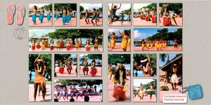
Here’s my Day 4. Though difficult to see, the leather tag has the Bali Hai Hotels logo on it. The photos are from an outstanding Tahitian dance show presented by the Bali Hai Moorea Hotel. They hold a nighttime dance fest as well, complete with fire dancing (subject for another scrapbook layout).
I love seeing everyone’s creations! Thank you for the kind words of encouragement to all.
DeLoris, your layout really captures the cell block spirit of Alcatraz. I visited Alcatraz many years ago when there were still US govt-guided tours. One thing that stood out for me was the prison menu posted on a big black felt board with white plastic letters on the way into the cells: turkey with gravy, mashed potatoes, buttered peas and carrots, fresh buttered rolls, coffee, tea, milk, orange juice, pumpkin pie with whipped cream (and it was not a holiday menu) — they put out a nice spread for the prisoners which was calculated to quell mutiny. I found that of interest.
Here’s my Day 3. I struggled with getting the option for reverse path to appear (it was greyed out almost every time I tried it) but once I got it I was able to finally finish the postmark. I plan on getting good use out of that postmark too since it took me so long to create it!
I am still using Elif Sahin’s “Heatwave” papers and elements from Pixelscrapper. The two Tahitian stamps with the Chapeaux en Polynesie were scanned from an old postcard mailed during this trip.
And here is my Day 2, still with “Heat Wave” by Elin Sahin of Pixelscrapper.
Here is my Day 1. I’m using “Heat Wave” by Elin Sahin of Pixelscrapper, and Cassell’s Beach alpha.
Thank you too, Marie-Claire. I loved the photos of your beautiful dog Enzo. You have some outstanding pictures of him.
We have a 3-year-old rescue, a black-faced long-haired German Shepherd named Hawkeye. He’s a good-looking dog but it’s very hard to take a decent photo of him, so I really appreciate what a good model Enzo was for you. Thank you again for sharing him with us.
Marie-Claire, I like how you’ve done it with one big photograph peeking through the slots, and a panoramic picture as the background/foreground. I’ll try that layout on a future project.
Cassel, I’m grateful to you for the Day 7 information about printing. I don’t have plans to print any of the Double Take pages yet, but was wondering how to print 12 pages of scrapbook photos made earlier this month as a gift for a friend who recently gave me a dollhouse. All the photobook printing companies I’m familiar with have a minimum requirement of 20 pages. But now I see I can purchase a regular 12″x12″ scrapbook, have my individual pages printed and place them in that instead without any modifications. It’s good to know how to add margins for binding areas on future photobook pages; you have answered so many questions I had about that and exactly at the right time. Thank you very much; I really enjoyed this challenge and learned a lot I’ll use again and again!
Thank you, Annie. I chuckled at your missing photo of and commentary about Izzy the kitty!
Very sorry to hear about the loss of your friend, DeLoris. A good friend of ours also passed away recently and unexpectedly; the memorial service will be next Sunday.
Here’s my Day 6 challenge completed.
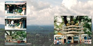
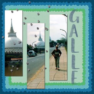
Here is my Day 5, of the Maiden frescoes in the Ceylonese citadel of Sigiriya.
I’m getting some great inspiration from the different ways everyone is approaching this challenge. Thank you all so much for sharing your creations!
Here’s my Day 4. I crashed out the program when attempting the text so once I got everything loaded again I opted to do something simpler, just text with a chisel, then shadowed like a frame. I will try Cassel’s letter arrangement suggestion another time in the future.
Very nice, Sheila! I like your use of repeating elements; that also ties the two pages together.
Here’s my Day 3. I have a lot of landscape-oriented photos for this project so I had to try a slightly different layout for the second page, a horizontal picture mask instead of a vertical one. I also discovered that when I used a regular photo for the background it wasn’t wide enough to cover both pages with my tweaked layout so after much experimenting I swapped out another background photo which was shot in panorama format instead. Now I had more options when adjusting the background to show the best parts of the photo in the negative space.
OK, here’s my take on Day 2 of the challenge:
Jan, I love your Australian bird pictures! They work perfectly with the Day 1 template.
Sheila, your flower photos are beautiful and also work very well with the template. I’m glad I looked at the enlarged versions of your pages because the stitching on the photos is a very nice touch.
My photos did not work so well with the layout, being more landscape-oriented, but I gave it a try anyway.
Here’s my contribution; this is my first double page. I learned a lot about masks with this project and became more comfortable using them. This is also the first time I have used a layout template. Thank you, Cassel, for the challenge!
Dawn, thank you so much for your kind words but those little stitched circles element wasn’t made by me. It was created by Marisa Lerin of Pixelscrappers in an element set for their “Picnic Day” bundle. Guess you noticed that I liked it so much that I used it twice!
Marlene, I love what you’ve done with that photo layout. Your pictures are well composed too. Sorry to hear about your mishap, though.
And I finally got around to using the Picnic Alpha and Cass’s freebie Spring Confetti Tube, along with the Little Lord Fauntleroy font (from Lab 8-05).
This was a fun challenge; thank you!
This one has the Star Paper Pattern and Rainbow Starburst from Lab 8-04 and the Little Lord Fauntleroy font (from Lab 8-05):
I really like your page, Cristina, and how the picnic pattern in the scallop matches the picnic cloth in one of your photos. Very nice! It looks like a very inviting spot for al fresco dining too.
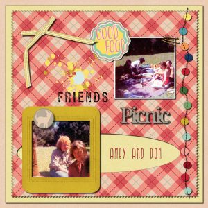
I dug around and found some old picnic pictures for this challenge, and also combined it with some Lab exercises.
Here’s one with a pinked edge and Iron Furnaces font (from Lab 8-04):
Wow, that’s really cool, Betty! That’s like a cross between the Bullet Hole video and the Peek-a-Boo class. Well done.
I didn’t make anything with the Earth Day videos, just binge-watched 11 of them (really enjoyed it) and did a little script shopping.
The videos have me ping-ponging back and forth, trying to decide between The Lab membership or Diamond. So far I’ve taken the Basic Scrapbooking course. I’ve been learning so much and having a ball doing it!
Just a few. When they retired my folks used to have a ranch in Oregon so I have some old pictures I took back then that are fun to revisit for the farm project.
-
AuthorPosts


