Forum Replies Created
-
AuthorPosts
-
Again, I am blown away with everybody’s projects. <3
Minka & Corrie, your pages are so cute.
Nicely done, Bonnie.
Minka, I think they’re both wonderful.
Great fun, Lynda! And I love the font you used for the title.
Great job, Ann. It’s a very useful tool. Funny how everyone except for dad was wearing something red that day.
Sue & Karon, thanks so much for your kind words.
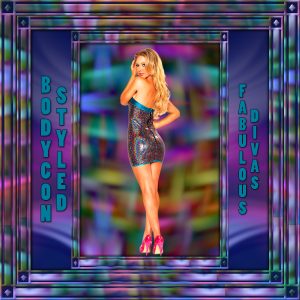
I loved the girl I found for my gaming group’s theme today, Bodycon Styled, but I really wanted to glam the page up. I took a small piece of her dress, resized it and used Effects: Reflection Effects: Pattern to get a background I liked. I duplicated the background, rotated the copy by 90%, then reduced the opacity and merged. I followed some of the following tut, but did not have time for the plugins. https://www.artistrypsp.com/Jemima/Tutorials/2016Frames/SunsetFrame/sunsetframe.htm
You guys are all so inspirational! Good way to pass time during the pandemic.
With this pesky pinched nerve of mine, I haven’t been able to do anything except for the daily pics for my gaming group. Just thought I’d share some recent ones I did. If anyone is curious about how I did something, I’m happy to share. Hope you enjoy looking.
Hey, I just discovered that you can drag and drop the pics to the Upload Images icon. That just made it a lot easier to share.
Goodness, everybody has been so busy. I’m loving looking at all that you’re doing.
U = Umbrella Tree ~ I admit I had to use google
Wow, I’m really impressed with what everyone is doing. Great work!
I love what everyone is doing. Your layouts are all wonderful.
Love them all, Bonnie. 🙂
I love what you did for this challenge, Sandra. What a wonderful tribute to your dear grandmother.
Thanks for the kind words, Karon.
Nemisis, wishing you Happy Learning in September. 🙂
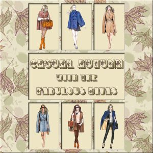
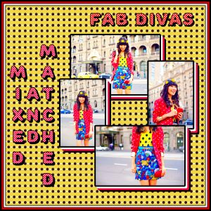
For my gaming group’s daily theme. I made the background paper. Used various drop shadows mixed with selections: select selection borders to frame out the fashion pics. The font is Rounds, free from 1001 Fonts; I use it a lot when I want a nice fat font. I’ve found that when I’m making something to present on Facebook, if I don’t use bold colors, FB really dulls them down in addition to lowering the overall quality. Hope you enjoy it.
Great page for the rumble, Bonnie.
What a beautiful tribute to your son, Lynda.
Lovely layout, Karon.
Wonderful job, Corrie.
Thank you, Karon and Cristina. My mojo has been missing for a long time and I’ve had a pinched nerve for about six weeks now (just my luck that it affects my dominant arm). Making two pages that I was proud enough of to share is a step in the right direction. Thanks again for your encouragement. It helps more than you know.
They are glorious, Sue, but I already told you that on FB. 🙂
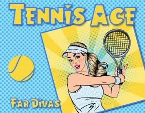
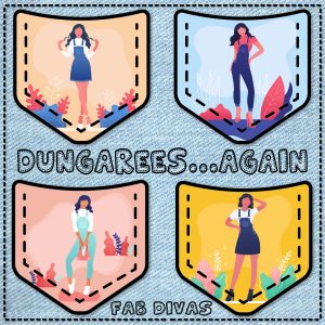
Something for my gaming group. I downloaded the four pics from Vecteezy and the font is Patchwork Stitchings. After I placed the pocket over each pic layer, I used the selection tool to select the inside of the pocket. Then I inverted the selection, switched to the pic layer, and deleted. Hope you like it.
Thanks, Cristina. Some nights I take more time looking for the illustrations than I do putting it all together. Not in this case, however. LOL
Thanks so much, Dawn, Hugs.
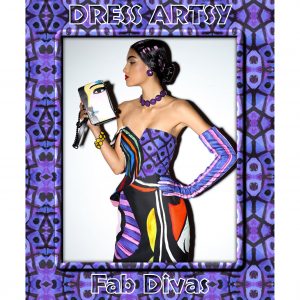
I used the template from Lab 06 Mod 03 to make my gaming group’s daily pic today. The font is White Horse which I got from a Creative Fabrica free font bundle about a year ago. Hope you enjoy it.
Lovely pages, all of you.
P = The Pickwick Papers by Charles Dickens ~ I think I only remember it from Little Women.
I = In Cold Blood
What a wonderful layout, Cristina.
Catch-22 by Joseph Heller
-
AuthorPosts


