Forum Replies Created
-
AuthorPosts
-
X = X-Ray Technician
Thanks, Cristina. I thought each day’s video would be available until the next one was posted.
Maybe I’m doing something wrong, but I’m getting an error when trying to view the video.
What is the “8 Secrets” book. Did I miss something?
Susan, great results! I love the colors you chose. I have to put that lab on my to do list.
Y = Yachting (I wish)
S = Singing
LOL, Carole. How much did Michelle appreciate it at the time as compared to now.
Love it, Sue. That new baby is so cute.
Mary, great result on the layout. It’s beautiful (no pun intended).
Thanks so much, Sue. I didn’t recognize you. LOL
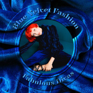
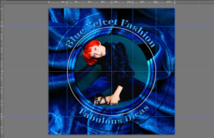
Fell in love with this photo; loved the contrast between the blues and the model’s bright red hair. I set up guides so I could use a circle selection and get it right in the middle. I used that method to erase the middle circle to frame her. I used that selection technique several more times, but promoted each one to their own layers. I applied inner bevels and little drop shadows on each to more clearly define them. I set up more guides so I could center a circular vector to create the text. I don’t know why PSP treats vectors and selections differently in terms of centering them, but I’m sure there’s a logical reason. The font is Elsie Swash Caps Black
Thanks, Carole. That’s good to know.
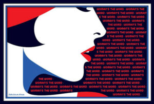
I remembered using text wrapping three years ago repeating, “WOMAN’S THE WORD.” (Remember, I don’t pick the themes lol.) The problem I had was with the word “WOMAN’S.” The program kept reading the “S” after the apostrophe as a separate word. I tried all different fonts and sizes, but this was the best I could do, or I finally gave up. I’m sure I’m the only one who noticed, but it is frustrating. Maybe I’m just too OCD.
The illustrator is Malika Favre, one of my favorites.
Love all your projects, Annie. They are all different styles, but they are all wonderful. I prefer your redo of My Country. The text wrapping in the first version made it difficult to read due to the high peaks in the Australia shape.
Sue, I’ve already told you how much I loved yours on the FB page.
Thank you, Annie. Once I watched the plaid tutorials in the Campus Creative Scrap section, I realized that it wasn’t as difficult as I thought it would be. I usually have to refer back to the tutorials as I have a lousy memory. lol
Mary, thanks so much for your kind words. I used the magic wand to select the text, then clicked on the plaid layer and hit the delete button. Once I hid the original text vector layer, all you could see was the deleted text on the plaid layer with the blue layer showing through.
Corrie, you are so sweet. I’m glad this is not a competition. Annie’s layout is gorgeous. I love the subtlety of your background. I can see just how much work you did on it. It indeed made your pic stand out.
Wonderful page, George. The more you do, the more you learn. I can see that in your work.
It’s beautiful, Sue, and I agree with you about the limitations. The tool needs to be improved in my opinion. I’ve found myself having to edit my text to get it to fit correctly within the shape.
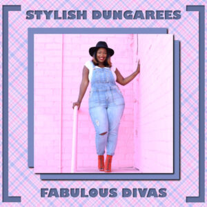
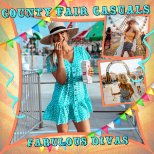
I fell in love with this picture I found on Google; it’s just so happy and colorful. I made the plaid background picking colors from the original pic. I decided to do a large, solid shadow with no blur so it looked like a solid paper; then repeated with negative offsets. Applied a soft drop shadow to the pic and the two solid drop shadows. I sometimes like adding a drop shadow to a drop shadow. By using different colors and/or different opacity and blur, you can get some very interesting effects.
The font is Gill Sans Ultra Bold. I used the magic wand to select the text, then moved down to the plaid layer & deleted to show the solid paper beneath. (Don’t forget to hide the original text layer.) Relying on guides, I used my eraser brush to create the framing. Finally, a drop shadow on the plaid layer.
If I had had more time, I would have placed the text a little more vertically centered so that it was equidistant from the framing and the blue layers below the main pic. I think I also would have placed the framing further away from the edges. Time gets away from me when working under a deadline. 🙂
As I said on the FB page, Sue, I love the little props you have for them. They almost look like they could fit in a dollhouse.
Ready-made layouts, Ann! Looking forward to seeing your follow-up.
I love everything about this, Annie. Wombats are adorable! And thanks for identifying the font; it’s awesome.
I am absolutely loving all of your hobbies and your presentations of them. Fantastic!
I used a template by Jodi Watson from A Love For Layout Templates blog train from March. As usual, I put my own spin on it. Carole has told us, a template is simply a guide and a starting point.
The font is Carnival Rimmed and the pics are from google (there was no info so I could give credit).
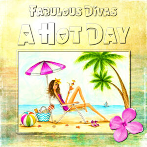
I really love using the text cutter tool and adding shadows. I think the result is subtle and allows the subject to shine. The font is Hawaiian Punk and the original illustration is by Bella Pilar.
O = Origami
Thanks so much, Sue. <3
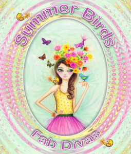
Nothing amazing, but I had fun making the background. I used a bunch of different distortion effects on the original image and I don’t remember which ones or in what order. I usually pay more attention and write down what I’m doing, but not today! LOL (The illustration is by Bella Pilar. The font is Arial Rounded MT Bold.)
WOW, you guys have been busy! Love it all. Karon, I don’t know how on earth you are so productive.
Karon, Mary, Annie, thank you so much for your encouragement
Q = Quahog (I think it’s a clam and I think I spelled it correctly.)
I can’t. 🙁
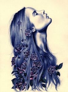
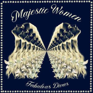
The theme Majestic Women had me stumped. I searched and searched for inspiration until I found this beautiful image. I tried really hard to find the original artist, but had no luck. Anyway, I used Image: Negative Image, duplicated, spaced evenly horizontal, flipped horizontal, and merged. I erased the background using Clipping Magic. (I pay a small monthly fee because I’m not very good at erasing complicated backgrounds with PSP e.g. her hair.) I duplicated the png image and resized by 50%. I duplicated and resized about 20 times to get this result. I ran out of time so I quickly used the vector stroke script to make a border. The script was Angelta.
Lovely work, everybody. <3
-
AuthorPosts


