Forum Replies Created
-
AuthorPosts
-
I love fonts, and since the tutorials and challenges for Special Characters i have downloaded a number of these fonts (there are lots of freebies around). I got a bit frustrated however in trying to find an easy way of identifying these fonts on the computer, whether to put them in a separate folder or what to do with them, and I also struggled to see the Private Use Area characters using Character Map, they were rather small. Back in 2014 there was a blog about Font Managers, and I had downloaded a couple of them which I use to see what fonts look like but they all seem to do different things. I was looking for updates and found Font Manager now has a 64 bit version, so I downloaded that, then thought I should probably read the help files and see what features the program had – I was just using it for display purposes. I was pleasantly surprised to find it actually solves my problems!
Font Runner is easy to use, just click on the folder/subfolder you want in the location panel and all the fonts appear in the right hand window, select the one you want. In the bottom pane you can write the text you want to preview. The mode has a drop down box and from that you can select Font Map – and there are all the characters, including the Private Use Area, just scroll down to see. And best of all you can select the font size to make the characters easier to see. Clicking on a character shows a larger version (same as Character Map) and to use the character you just copy and paste the same way as Character Map. You can even append the character to your preview (right click). The font is also available in PSP 2018 (haven’t checked previous versions) without installing, just make sure the “Share with other programs” menu under View menu is ticked (this wasn’t the case in 2014 apparently).
Another useful feature is the ability to create Projects. Under the location pane there is a “book” called New Projects, click this and enter the name of the project. You can then select any font you have and drag and drop to the project – a link will be created to that font – and when you want to use the project just clicking on it will display all those fonts. I have created a Special Character project and put all my fonts with Private Use characters in it so I only need to look in one place. Useful if you have a major project with different fonts that you don’t want to have to install.
There are other features like Search which I haven’t investigated fully yet.
Font Runner can be found at https://codeandrun.com/john/font-runner-2/
S = Sisters, a bit obvious I suppose but I have two I don’t see much of so they are often in my mind.
J = Junior, not just in the name but as a reference to the younger members of the family.
I’m glad people like the journalling, I don’t have a lot of photos of people so I tend to use places and I think it is nice to tell a little of background, especially as the pages will be seen by people who probably haven’t been to these places.
I have been such a good girl packing for my holiday that I had a bit of spare time this afternoon and was able to do a quick page for this challenge.
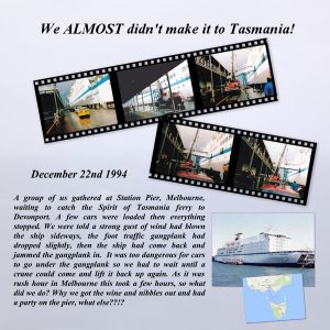
This was the start of a Christmas/New Year tour of Tasmania by four-wheel drive for a group of 30 adults and 11 children. Only 12 of us were there at the time but the story got included in the Travel Log and has become of of those stories that get told whenever we get together.
I used Cassel’s Filmstrip script, cut it into two so the photos were bigger. The font is Vijaya. The background I made from a poor photo of the Spirit of Tasmania taken in 2011, it was very blurry and you could hardly see the ship so I blurred it even more and put the filmstrip over it. It was quite dark so I put a white layer underneath and dropped the opacity right down.
Nice page Cristina, the background paper is really nice and suits the topic.
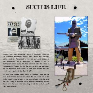
I couldn’t resist the challenge even though I am supposed to be packing the caravan for a trip away! We visited Glenrowan in February and took the photo of Ned Kelly, his famous last words were perfect for the challenge. The two clusters I made myself using items from online. The bullet holes were a tube I got from Beverley’s Boutique, part of a 2001 tutorial.
The font is Pomfrit Dandy NF for the title and Latha for the journalling (both freebies). I have been having problems getting the new Past to Fit and justification features for text in 2018 to work properly, then finally realised that you need to have a vector object with a fill, I kept trying with just an outline. Another little lesson learnt. Then of course I forgot that resizing won’t resize the journalling and had to go back and copy the text layers and convert them to raster (I wanted to keep the text for future changes).
Back to the packing!!!
Certainly Cassel, you have my permission to post the pages.
NewPeaches17 your calendar is really nice, brought back lots of memories of London from when I was younger, especially the Christmas Lights – we used to have a day trip to London to do Christmas shopping, look at Selfridges window and go and see Father Christmas there and stay to see the lights. The other photos reminded me of trips to London with my Grandmother and Mother to visit the “sights”, although at least a couple of things weren’t there then!!
Thank you ladies for your kind words, glad you liked the story, it has always been one of those memories that I chuckle about when I think of them. Fortunately I forgave Russell for kicking the door open although I did say a few “unkind” things at the time!
This page shows that you don’t need photos to make a good memory, nor do you need a lot of elements or ribbons etc. I do tend to do a lot of journaling (Russell would say it’s because I like to talk a lot!) but I think that sometimes it makes the page more interesting.
Micfin and Sue your pages are really nice and I love Mr Snow Sheila. I also have the Directional Tuber script and it is so useful and saves a lot of time trying to make the tubes yourself. I also like the explanations of how you do things, there are different ways and it is always good to know someone else’s method, sometimes it is much easier. That is one of the good things about the forums, everyone is willing to share.
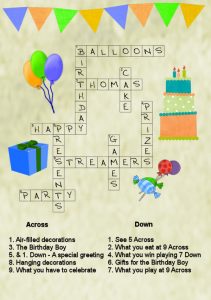
After watching the Word Art 2 Masterclass I remembered a card I had done for my Great-Nephew, who loved puzzles. The Alpha is Crossword Acrylic from Digital Scrapbooking Place, so I used Cassel’s Text Creator script for the across words and just aligned the others. Then I used a very small size font for the clue numbers – I must try using the superscript option for the text in PSP 2018. The other elements are from a mixture of birthday/celebration sets I have.
I am still working on using the Warp Mesh tool, but I am going away for a couple of weeks and won’t have much time to do anything.
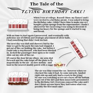
I thought about the various accidents I could use for this Challenge, not that there have been a lot thank goodness, then decided to pick a lighter example.
I made the cakes myself from a clip art – not sure if the flying one worked very well but I think you get the idea. The mud was done with free blood splatter brushes (there nearly was blood spattering too!). The font is Litoland and Litoland Title from typesgal.
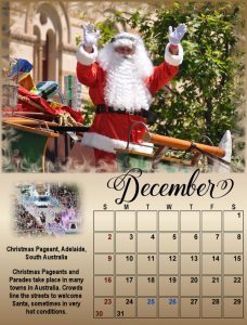
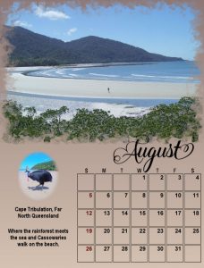
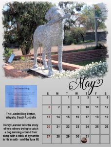
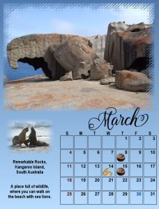
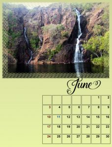
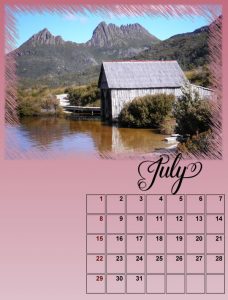
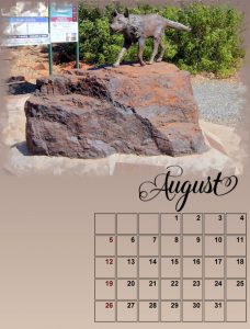
Second six months.
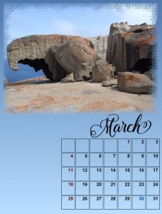
Thank you Cassel, this was an interesting and enjoyable Challenge. Using the Calendar script means the templates can be reused each year, one of the great things about digital scrapbooking that your stash never runs out or goes out of date!!
There are some really beautiful and creative calendars here, lots of inspiration for everyone and I’m sure the recipients will be happy too.
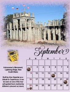
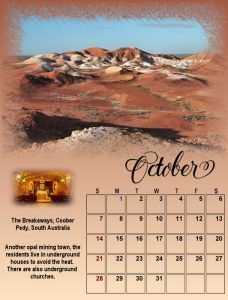
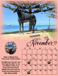
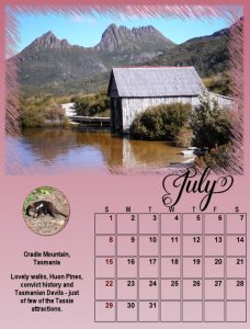
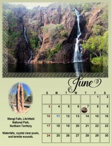
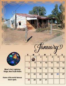
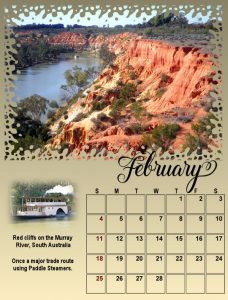
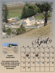
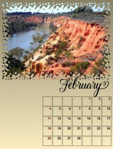
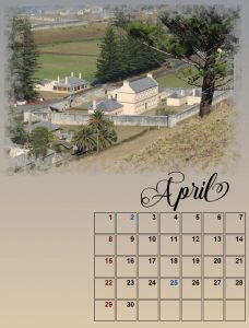
April I copied your idea of putting the days on the calendar, I also changed the photo for August and finished off with small photos and an explanation of the photos – all my family is in England so I thought I would show off this wonderful country of Australia!
Final offering in two uploads.
April your layout and suggested card are really lovely. Masks are so versatile I use them all the time, and there are lots available for free on the internet – I haven’t done much with making my own yet, I always seem to need one in a hurry and don’t have time to make my own!
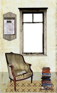
This is a card I did for my Brother-in-law. The window on the front was cut-out after I printed it to show the picture on the inside. The elements and the mask all come from a Studio Manu set called Grandma’s Reading Room, and I did the calendar with Keith’s birthday marked on it.
Next months.
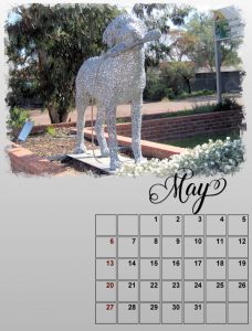
Had a big session and completed all pages up to Day 4! I used the Maphyilla font for the months, changed the Sundays to red and added a few Public Holidays. I haven’t done anything with birthdays or anniversaries, thought I might use an icon or something rather than changing the colour of the date. Looking forward to the next pages.
(I’ll upload in 2 goes just in case).
Nice layout Cassel, and I love your card. I have been very busy with cards for special birthdays (two 70th, a 50th, an 80th and now a 90th, plus a joint 60th birthday 40th wedding anniversary!) both for me and for the Golf Club I belong to. It is fantastic to be able to personalise these cards with photos. I have also done A4 collages for them. Now I need to think about Christmas cards, though the cost of postage to England means I will probably rely on emails and Facebook!
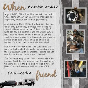
So to WHEN. This challenge presented lots of ideas but I thought the story of a nice and very helpful young man (well young to me anyway!) would be suitable. The papers are from a kit called Kindred from Scrap Girls, the alpha was from there as well. The font was Segoe Script. I used the Torn Page script from Cassel and also the screw tube from there.
Now to start on the Up To Date.
Sheila your page is really lovely, the colours are so pretty and Georgia is beautiful! Not sure what you meant about cut and fuse? Thank you for your comments. Also thank you Cristina, it is great that we are able to see new places through the eyes of other people and learn about their history or origins.
Once again Dawn and Cristina you have done beautiful layouts. The colours in yours Dawn are lovely and really complement the photos. I like the different papers in yours Cristina, I have those templates but haven’t thought to use them, I think the diagonal blocks are a really different way to use papers.
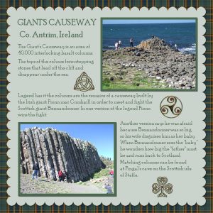
This is my contribution. The tartan is the County Antrim tartan which I found on the web. The photos are ones we took when we visited the Giant’s Causeway, we didn’t take many because it was quite crowded but I think you can see what the pillars are. The celtic symbols I found in clipart, they were black and white so I used SuperBlade Pro plugin to turn them into gold and then added one of Cass’s seed beads to them.
Hi Cassel,
I would like to join this challenge too, do I need to go through the register process only it is taking me straight to PayPal for payment?
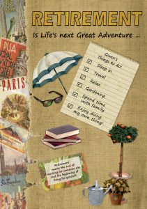
Some lovely pages here, I really like the way Cassel used the tags. I have cheated a bit, I made a card for someone who was retiring a while ago, but it fits the challenge so I thought I would add it here rather than making something new. The background was from a travel kit I had and the other clip is from various places.
I’m like Cristina and hadn’t seen the Fanned Script, I think the way you’ve used it Sue is very pretty. I might have to put it on my wish list.
I = Iron-on patches
OK I will start this off. I wasn’t sure what to do, there were lots of ideas on the blog, but then I thought of this little story about Mum’s coat: it has been a topic of conversation on many occasions when talking to the family so I thought it would be a good idea to do a page about it. I had a bit of fun with the heading, but decided that simple was the best way to go. The photo frame was from PaintShop Pro.
Dawn that is a lovely page, well suited to the challenge. You have made good use of Cassel’s scripts and I think the subtle colour works really well. I have just had a look at the Old Design Shop, there are so many lovely images I only looked at a few but I’m sure I will come back again. Thanks for sharing that information.
I found that special too Sue, I was trying something in X7 and it told me there was an upgrade, then when I had done that it said I could have PSP 2018 for 75% off!! Naturally I bought it at that price. I am having a few issues with some of the newer stuff but I am working my way through them. Love your Calendar pages, and your gorgeous cat.
C = Culottes (I still have a pair!)
Dawn and Cristina lovely projects, isn’t this a fun thing to do? I had to have a couple of tries to get the contrast right, kept losing detail, but the versatility of combining colours to match pages is very useful. Like the card Cristina, something that can be very personal and also very different.
I have seen this technique in Filter Forge but had not tried to duplicate it myself until now. As you said Cassel if you can find the right photo it is an easy process and certainly makes up for not-quite-perfect photos.
Thank you so much for these Challenges, they are always thought-provoking but very satisfying.
Thank you everyone, glad you liked the page. It was a big decision, based partly on our Best Man and his desire to go to Canada (his mum was Canadian) and partly on the fact that Russell’s Dad had turned down a job in Tasmania after the war. It was tough at first but we met some lovely people, found jobs and somewhere to live, and have never regretted the decision. The really hard part is being so far away from family (we don’t have kids of our own) but that is better now with Skype. And yes, Cristina, I do have lots of stories about our life here as I’m sure everyone does, it is only because of Cassel’s Challenges that I am starting to do pages about them.
Mary I was sorry to hear of your loss, it must be a very hard time for you. Hopefully chatting and sharing with us will help a little bit.
-
AuthorPosts
