Forum Replies Created
-
AuthorPosts
-
Day 7. I had a few landscape photos I wanted to display and the templates so far didn’t seem to match, so I went back to the double page template, changed the first page and added a completely new second page.
This challenge has been really good, certainly given us lots of practice in using masks. There have been some really great pages posted, so diverse but all with something interesting to display. Now looking forward to our next challenge.
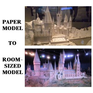
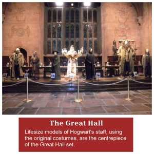
Day 5 – I was pleased the template was going to be divided into 2 as I had already thought of changing one of the others. It was really fascinating to see all the paper models of the sets, what we hadn’t expected was that at the end of the tour you walked into a huge room with the model of Hogwarts that was used in many of the distance shots. to get an idea of the size of the model you can see a couple of people on the walking in the right of the photo.
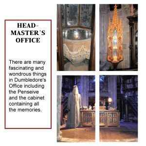
Day 6 – I struggled with this as I couldn’t find a photo that looked good divided into four – subjects were getting cut off all the time. I decided to keep the top two as small photos and have the bottom two combined, this worked much better.
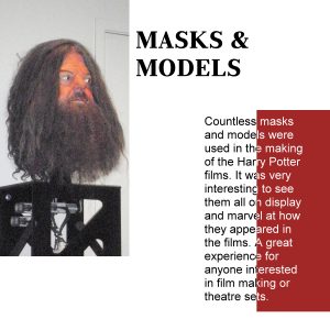
Day 4 was a bit of a challenge as I don’t have many portrait photos and the masks were quite narrow.
I have finally managed to catch up with the project, so good that the pages are nice and quick to do. This is my Day 2 and Day 3. I re-arranged the template for Day 2 as the photo and text fitted better.
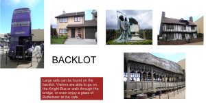
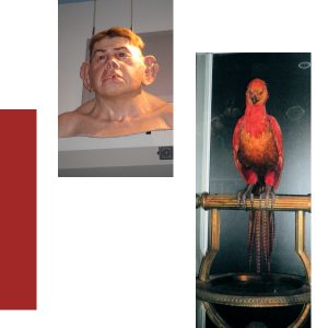
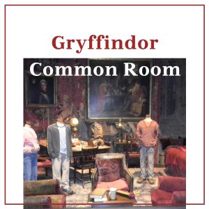
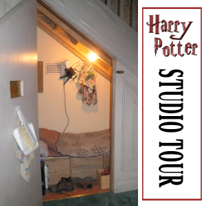
Here is my Day 1. In 2013 I was lucky enough to go to Warner Bros Studios in London and do the Harry Potter Studio Tour – it was absolutely fantastic: there were sets from the movies; costumes and props; a whole area devoted to concept art and masks; and at the end the huge model of Hogwarts that was used to do some of the filming. Unfortunately the lighting wasn’t the best for my point-and-shoot camera so some of the photos didn’t come out that well, still I will have enough for this project.
The “Harry Potter” name was from a free set I got years ago and there isn’t anything in it to say where I got it from.
The items already posted here are really good, just shows how versatile the templates are.
I’m in too, looking forward to it.
So many lovely layouts, Annie you were obviously very inspired by the theme, and your layouts are so varied.
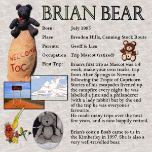
My layout is not a plush toy, but a knitted bear who became very famous among a group of intrepid 4WD travellers. A lady named Shirley made Brian while travelling up the Canning Stock Route, very bumpy track and lots of sand dunes, but she knitted all the time her husband was driving!
The background I made from a photo of a salt lake, used Image Effects, Seamless Tiling then flood filled at 200% I then reduced to opacity, with a white layer underneath, so it was easier to see the text. “Brian Bear” was done in Plantagenet Cherokee, outline only, then I used the Vector Tube script with one of Cassel’s Wool tubes. The photos were stock photos, and the flower cluster was one I made for a friend’s birthday card. For the journalling I used a rectangle selection and typed inside it. Same font as the heading.
What great layouts to inspire us all, they are fantastic.
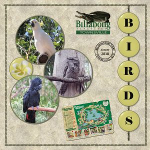
I must say the 10 circles were a bit of a challenge but I got there in the end. The photos are ones we took at the sanctuary last year, the date stamp is one I used for the Travel Challenge with updated information. The torn map of the sanctuary is about what mine looked like after being in pocket all day – I used a picture of torn/folded paper and deleted the missing bits on my picture. The stitched border is one from my stash, the string holding the letters is Cassel’s string tube. The frangipani and letter buttons were done using the Balls & Bubbles effect in PSP, very simple way of making glass buttons.
I think I got everything!
Hi Everyone,
It has been really good looking at all the different pages, there are some really terrific ones out there, so inspirational.
I had a busy Easter so have only just got around to finishing the project. I struggled a bit with the painted wood, mainly trying to make my cork hat stand out and I ended up duplicating the layers and using blend modes, I think it worked ok. For my clip I used an ellipse which I duplicated and made smaller twice, then used the pen tool to add a few lines to the end and handle on the other. I tried to get a leather look suitable for a stock whip but I think it is more bronze, not too bad though. I didn’t leave the doily white as it was too bright for the rest of the page.
This was an enjoyable challenge, as they always are, and I learnt a lot, particularly by looking at other people’s contributions.
Wow what a lot of lovely pages, so many different patterns that can be made from just a few lines. Marie, your photo of Notre Dame is heartstopping, so much history being destroyed in a matter of hours. Let’s hope some of the building can be salvaged.
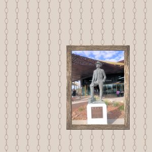
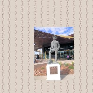
I tried a few different things, including using bezier curves instead of straight lines, and am happy with the end result. I chose a photo of the Banjo Paterson statue outside the Waltzing Matilda Centre in Winton, QLD, which has just re-opened after being burnt down. I’m hoping to be able to use other references to the song in coming days.
The frame was made from a wood texture I had and I then adjusted the brightness to suit the photo and background. I have been a Diamond Member since before it even existed (!) but have not done much lately with the tutorials, this challenge is making me revisit all them.
Sounds like a fun challenge, I’m registered.
B = Bias Binding
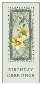
I have just watched the webinar and will have to start playing with the techniques. This card is one I did for my sister in 2016. I bought a card-making magazine which had a few examples of doing these kind of cards and I decided to try and copy it. As it turns out I did a lot of the same things Cassel showed us, although I used the brush rather than a tube – I think the tube is much better. It is a bit of a challenge having a sister who makes her own cards using traditional scrapbooking – I keep trying to match the things she does using PSP – so far I haven’t done too badly, shows what a great program it is.
E = Elastic
Q = QB VII by Leon Uris
Very nice Annie, love the colour combination.
It took a while to think of what to do, but I think this fits the brief. I had great fun playing with AV Bros Page Curl, there was a tutorial to make a can with a preset which I used for the green present and the material on the cardboard, adjusted it a bit for the Guarantee. The text on the circle was done using Cassel’s text path and I also used the Balls & Bubbles effect and a gradient. The other text is Black Forest, a free font duo. The papers were from freebies.
K = The Kraken Wakes by John Wyndham
I = I, Robot, Isaac Asimov
H = Harry Potter and the …….. (bit of a cheat really, 7 titles in one post!!)
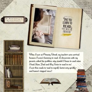
I was going to tell the story of how I came to be an avid reader, then decided to make a page about it instead! The kit I used was Grandmother’s Reading Room from Studio Manu, and the photo by Annie Spratt on Unsplash – The Lord of the Rings is one of my all time favourite series of books. The bookplate font was DSP Tiffany A from Digital Scrapbooking place and I decided to use my maiden name, the other font is Rochester.
Love your page Annie, I too enjoyed the book and I think the banner works really well. The backgrounds suit the theme really nicely, you could almost image the mists coming off the page.
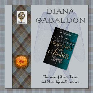
This is a combination of Theme of the Month and Masterclass – there was a question during the masterclass about putting something IN the gem and this reminded me of the second book in the Outlander series by Diana Gabaldon – Dragonfly in Amber. So I followed the instructions to get the amber gem, and put a clip art picture of a dragonfly I had in between a couple of the layers, played around with layer styles until I found something I liked. The outside of the amber was made using the sculpture effect.
The tartan is Fraser tartan from online, as well as the Fraser logo. I added a blue layer underneath the background one and used the exclusion style to get the nice blue. Like Annie I was able to scan my copy of the book. The picture behind the book was made using Sinedots II plugin from Dragonfly and the preset is actually called Dragonfly as well, nifty eh?
Micfin I love your cover, you did a really good job of making it look like a Mills & Boon romance novel. Jnet I am having great fun trying to remember my schoolgirl French reading your postings.
A = Alaska, James A Michener
Loved your elephant Annie, great idea to put the photo in another photo. Thanks to everyone for their comments, always greatly appreciated.
R = Rat bait (possibly just for the Australians in the group, it is toast with a mixture of cheese, bacon, and egg on top and cooked in the oven.)
Q = Quiche
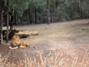
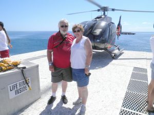
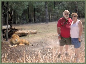
I figured that if I was going to put myself anywhere it should be somewhere I probably wouldn’t go normally, so I picked the lion enclosure at the Western Plains Zoo, Dubbo, NSW. The photo of us was after we had been on a helicopter ride over the Great Barrier Reef, only 10 minutes but well worth it.
I picked a photo of a lion that seemed to looking towards the empty space. I tried a few positions for the photo of us and finally decided that putting us on the grassy area looked more realistic. I added a new layer above us, then cloned some of the grass, trying to make it look as though we were standing in it. I ended up using the eraser with a very low opacity to remove some of the grass so our shoes sort of showed through. The shadows are hardly there in from of us, but there didn’t look to be too many shadows on the lion photo.
The only thing I’m not sure about is the relative size of us to the lion.
L = Lamington (well it was Australia Day on Saturday!)
J = Jaffa Cakes
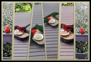
My page for this Challenge. I didn’t have too many photos that were in a sequence, then I remembered some I took at a friend’s house in Kinglake, Victoria. The birds are Crimson Rosellas (the red and blue ones) and King Parrots.
In 2009 the Black Saturday bushfires in Victoria killed 173 people, 120 in the Kinglake area alone. Another 414 people were injured. More than 450,000 hectares had burned and 3,500 buildings including more than 2000 houses destroyed. The RSPCA estimated that up to one million wild and domesticated animals died in the disaster.
Fortunately our friends managed to save their house and surrounding buildings, but lost a lot of vegetation and trees. The photos were taken in 2017 – it has taken a long time but the area has come to life again.
-
AuthorPosts
