Forum Replies Created
-
AuthorPosts
-
Hi all, I got up to Day 7 but my week has turned out really busy so I am hoping that the forum will keep going for a few more days. The idea Carole of a recipe magazine scrapbook based on my garden to kitchen adventures has some potential. Thank you for the suggestion. It would take me a long time so I would need to devote myself to the project. In the meantime I will endeavour to contribute with Day 7 and Day 8 offerings later in the week hopefully and complete the survey then. I hope this is OK. Thank you and all the members for the tutorials and advice.
Thank you Anne, Sue and Val (sorry if I haven’t caught up with all comments yet) for your tips on colour changing the frame layer. In the end I used Sue’s method with the paintbrush and the locked layer.
I have created another version for my Day 6 which I hope you will all like and it is following inspiration from Carole to illustrate a recipe, expanding on my theme from Garden to Kitchen.
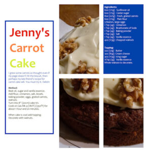
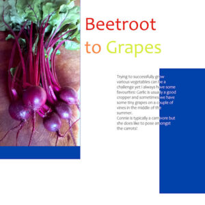
I grew some carrots so thought even if my page doesn’t hit the biscuit, then perhaps my late friend’s recipe for carrot cake will. You must try it. Delish! If you can’t read the small text on the image download then here it is:-
Jenny’s Carrot Cake
Ingredients:
6oz (171g) Sunflower oil
6oz (171g) Caster sugar
8oz (227g) Fresh, grated carrots
6oz (171g) Plain flour
3 Beaten, large eggs
1 Tsp (4g) Cinnamon
1 Tsp (4g) Bicarbonate of Soda
1 Tsp (4g) Baking powder
1 Tsp (4g) Salt
1 Tsp (4g) Vanilla essence
4oz (113g) chopped walnuts
Method:
Beat oil, sugar and vanilla essence.
Add flour, cinnamon, salt, bicarb, baking powder, eggs, grated carrots, walnuts.
Turn into 8” (20cm) cake tin.
Cook on Gas Mk 4 (180°C) (350°F) for about 1 hour and 20 minutes.
Topping:
2oz (57g) Butter
3oz (85g) Philadelphia cream cheese
4oz (113g) Icing sugar
½Tsp (2g) Vanilla essence
Whole walnuts to decorate.
When cake is cool add topping. Decorate with walnuts.
Thank you Val for your comments and interest. I am sure your plants look lovely. My parents-in-law were also both very active with the Scouts in the UK.
Clever of you Ann to make a mock up of your pages. It does help with planning. I tend to print mine out.
Rotating the mask Anne really worked with your design. I have kept to the template still with mine.
On Day 6 I had trouble at stage 9 as I could not see all 4 rectangles in one mask. I retried but it still didn’t work. However, at that stage, with the floodfill tool set to white in foreground, I clicked on each of the selections in turn and then all 4 appeared on one mask. I also found that I needed to De-Select.
I have a question.. How do you change the colour of the frames that appear as cyan in the templates please or are they just place holders for the design?
I very much liked the technique that Cristina has used with the Luminance blend mode and opacity settings.
For my Day 5, for legibility reasons I put a tiny outline around the text instead of reversing out the text that overlapped the panels.
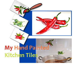
I saw Carole’s advice on the forum for one of the pages to add a drop shadow effect so I went back to my project and added thick object shadows to my paintbrush and tiles images.
For my Day 4 as we are using repeat colours I created a new colour palette named Magazine Challenge. I used the slider to find the colour values.
Having decided to keep the template proportions for this challenge, I didn’t want to distort my photos in order to fit the panels. Instead I used the lock layer and floodfill taught in Day 3 to change the colour of the photo layer.
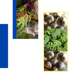
As usual Connie the cat appears in a photo!
I liked the creative uses for the split colour text particularly of the watery effect on Sue’s design and Val’s approach makes the text look intentionally ‘silly’. Then I got carried away looking at Art’s skill at his wooden pictures.
Carole, I hadn’t thought of recipes but that is a good idea as I have photos of some things being made in the kitchen.
Day 3. I have caught up and here is my design for page 3.
The heart layer (from Pixelscrapper) I duplicated so that the bottom part of the heart appeared on top of the green and the top part of the heart was on the other layer that covered the white.
My photo of beans I used Effects\plugins\pic to paint ‘watercolour’ and then bumped up the colour a bit with Adjust\Colour\fade correction.
On the print out of the file the lettering shows up fine but this miniature jpg not so well.
Hi Carole, I think your answers given to Monique were for me (Fiona) as I am the one who has got in the mess! Thank you loads though. I have amended the text issue and starting to understand it a bit better now.
Well I have made a right muck up of my Day 1 so will have to go back and redo it. Firstly thank you Lynda and Sue for assisting with the multi image merging. I managed to have images outside of the ‘Photo’ layer as well as separate layers inside but with your help I think I have got that right.
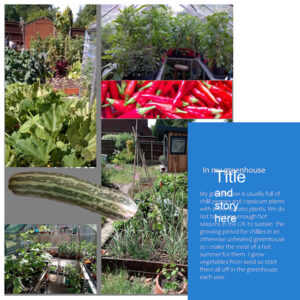
The grey background is not to my liking but I don’t want white as a bit of a background helps. Being a bit afraid of making changes to the template I have not yet changed it. How can this be done?
Then when I entered my text I cannot get rid of the headings ‘Title and story here’ so clearly I have done something wrong there. I tried to change the layer to a raster as suggested but when I activated the text tool a new vector layer appeared for my Title text.
I have noticed an annoying thing that where I had the abbreviated word ‘don’t’ at the end of a line, the wrap feature saw the apostrophe as a space and broke up the word. In the end I changed ‘don’t’ to ‘do not’.
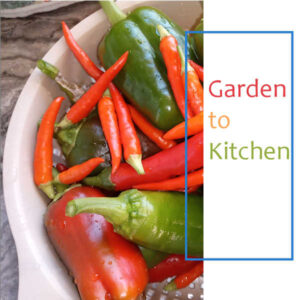
Here’s my Day 1 cover and like Lynda have focused on the garden. My cover photo is of peppers that I have grown and then visited the kitchen.
The font I have used is called Candara and I have used the dropper tool to select colours selected from the photo for use on the text.
To have more than one photo as Lynda has done, do you just keep adding to that photo layer?
Hi everyone and thank you Carole for an interesting challenge. I have not done one of these before so am getting prepared. My subject will be Garden to Kitchen as I have lots of photos of my garden and of the produce. Might be a lot of photos of marrows though!
F = Fishing
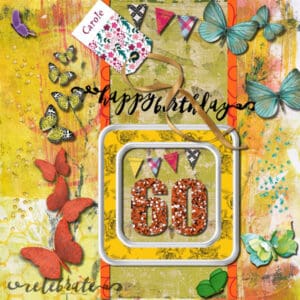
Hi everyone, I am not going to be around much for the rest of the week but wanted to wish Carole a happy birthday so I have made a scrapbook page for her which I am uploading ahead of the momentous occasion! My resources came from Pixelscrapper. Shall we all have a go so she can hang them up virtually?
Fiona
Hi Carole, For my last project, I did separate out the shadow from my ribbon and tweaked it a little but thought it didn’t need too much tweaking. Perhaps I was wrong. Thank you for your attention.
Fiona
Hi, I enjoyed the creativity of the webinar on Cassel’s ‘Using Element Templates’ and have practiced colourising by using a single layer template kindly made available by Marisa Lerin of Pixelscrapper. The template number (207817 paper template kit 214).
I used a typical set of colour combinations of my favourite textile designer, Kaffe Fassett to make my own colour palette. I then added the green background to make the image zing!
For the ‘Select All’ command I was finding that I had to remember to ‘Ctrl A’ at the end of the colourising process, before filling the image with the selected colour, otherwise it just filled one of the elements only from the current selection.
Thank you Carole for the tuition.
Module 5
Hi, Sorry that I am late with my last project but I have got there in the end. I agree with Sandra that this study group has been a success and for me, having already completed Basic Scrap Course 1 before, going over the modules again with new projects has helped being in the group for further understanding. Practice is key and having group participation has added to the study and of course is friendly.
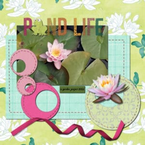
For my Module 5 I have used elements from Pixelscrapper and used them around my own photo of lilies in the pond. The rickety stitching is deliberate as that’s how I sew!
Module 5A
Customising the Layers Palette: I am going to have a go at using the ToolTip thumbnails changed from 80 to 200. It looks like it will really help.
As I had the problem before of a long list of layers to keep travelling to the top of on my project, I may try the option to have no palette thumbnails, just the Layer Names, so more layers show at once. I can still set the ToolTip Thumbnails to 200 for the larger detail if necessary.
As Carole suggested for me, also I could extend the column of the Layers Palette by dragging the bar upwards to allow for visibility of even more layers.
Module 4
Carole, I am still have difficulty understanding the difference between Flip and Mirror in Image-Mirror or Image-Flip. Is there another way of explaining it please or an example of both somewhere?
Sandra, I liked the rounded corners effect on your rows of square papers. A bit different.
For Module 4 I was going to produce a new scrapbook page but things have overtaken me this week. But I had already been through the video tutorial not so long ago and produced an image which I decided to look back at and now glad that I did.
My previous scrapbook page had a wrong shadow element so I knew Carole would pick me up on that. (See bottom pic detail). I wanted the colours of the Fire and Ice beads in the bottom row to be in the opposite order to those of the top row.
To rectify I rotated the row 90 degrees to the left so the light was from the left and then made a selection of each of the beads in turn, positioning into a new row using guidelines for the spacing. Then copied and pasted onto a new layer. Then merged the layers down onto one. I presume I should have copied each bead selection onto the same layer as the others instead of needing to merge separate layers. I then scaled the layer to fit and added a thick object shadow 30:30:60:30
I have used a photo of a toadstool that I saw on my walk (cut out with the selection tool) as a sort of button.
Thank you Carole for reminding me how to add favoured command icons to our toolbars or palettes. I don’t know why I didn’t remember your instructions from before as I was successful with the Repeat command icon in the Layers Palette. Most useful. I remembered to save the workspace after adding the icon too so hopefully this has worked.
Monique’s comment re Module 3 about the different approaches and layouts is so true. Same instructions but each person is unique.
Module 4A- The customisation I made to my workspace in addition to the background colours and icon sizes etc, was to add some scripts short cuts to the toolbar. The most useful I always find ia the Open As Layer and Rename. Also from Cassel I have Striking Photo and I also have One Step Photo Fix and Noise Removal which I have appended little camera icons to in the toolbar.
What I used to have in my previous version of PSP (2020) was a short cut for opening the frequently used command for drop shadows. I can’t remember how I achieved that though. Having the Repeat command short cut icon in the Layers panel helps with this but I find that I am not so organised usually to be creating the same drop shadow values for each relevant layer one after the other. Shortening the long winded process of Effects\3D Effects\Drop Shadow would be useful.
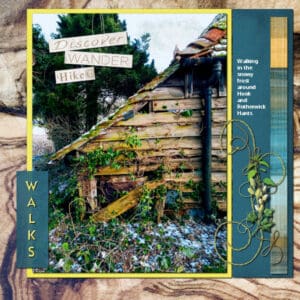
There are some good resources on PixelScrapper and I than you for the recommendation. It has helped with the PSP study. Here is my submitted Module 3.
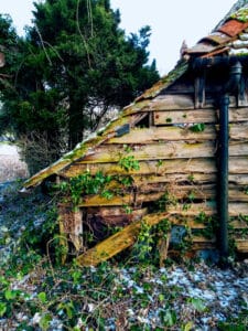
I have tried to replicate the busy effect of the undergrowth of leaves and tangled branches in the photo with the elements in the design under the ‘journalling’ text.
Where you used splodge effects on your plain paper, Carole, in your example, I have chosen to break up the plain bit of sky using a storm-cloud faint effect element.
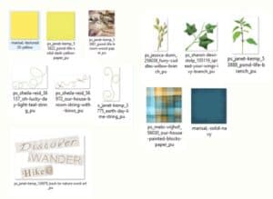
I have used various images that I have obtained for personal use from PixelScrapper for my Module 3. I did not go for a kit but was able to make a selection from their resources which has been a good recommendation from Carole.
For Module 3 I intend to use a photo from my mobile phone and to continue with my ‘walks’ theme. I came across this dilapidated shed.
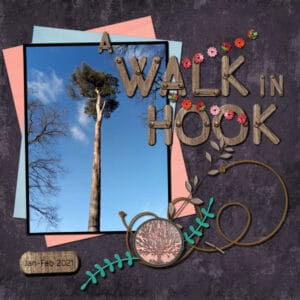
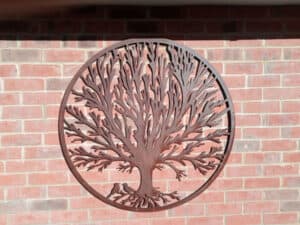
Hi, I have completed my Module 2 and managed to make a decorative element of my photo of the tree of life plaque. I added a ring element to it. I saw both this and the tree on one of my walks in the village where I live so have given it the relevant title. I used the warp tool for the shadow on the wood effect lettering as well as for the staple.
In the process, especially with shadows being on separate layers, the layers list becomes long. Is there a quick way to move a layer to the top of the list without having to move it along the row please?
I would like to mention that this week my family has had bad news and getting back into a study group like this is indeed therapy. Thank you for all the contributions. I love the funky chickens.
Hi, I’m working at your rate Henry and have not started my Module 2 yet this time around.
I did take the course before however so have already successfully loaded Carole’s Open As Layer script. I have followed Carole’s idea of the pink star icon as I think it stands out well as a frequently used command. Thank you for this Carole. It has been most useful.
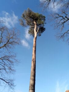
My theme for Module 2 is A Walk in Hook (where I live). In fact I may continue this theme for other projects as I have taken various nice photos on walks during lockdown. The tree of life photo I am going to attempt to make into a design for part of the cluster for Module 2.
Thanks Carole for the tips. As a result on my Module 1, I have tweaked the shadow on my frame so that it sits lower than I had it before and I hadn’t thought that I could just mirror the droplets in order to get the shadow in the right direction. I have amended those too. A note on the droplet I used – it is a PNG and the water effect benefitted from duplicating the transparency layer. I am sure you have taught that tip before too. Thank you.
Before and after images:
Module 1C: This is my finished design.
The water droplets were sourced from Pixelscrapper and already had the shadow within the PNG. I think it is in the wrong direction for my image but does it notice here too much? The transparent water effect worked better (strengthened effect) with this image by duplicating the layer so it appeared on top.
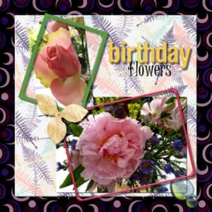
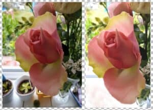
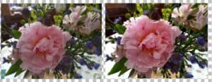
For Module 1B I intend to use these flower photos of mine and have the following before and after images:
The Magic Fill didn’t work for the rose bud image as it filled the selection that I wanted to delete (bottom left corner) with a replica of the rose petal. I think that there is not enough of a plain background in that tiny area for it to work. So I used the clone brush and Object remover. Both photos benefitted from brightness and contrast tweakings.
Thanks Carole. How would you remove one then wherever they appear just in case I should need to know for the future?
-
AuthorPosts


