Forum Replies Created
-
AuthorPosts
-
Dawn and Marlene, I can only say, amazing work! I like to pay attention to the details, and in both pages there are plenty to see.
Dawn, you showed us that we don’t need to have our own photo to participate in the challenges. If you hadn’t said anything I would have thought the trees and grass were part of the photo. The colors are perfect.
Marlene, the rusty background, papers and title are a perfect match to the photos and the place you were. You pointed out something that I didn’t realize before. We can use this effect with photos that didn’t turn out that great and that we would probably delete without thinking twice. 🙂
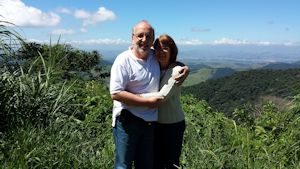
Cassel, this photo of my husband and I was taken last year when we were vacationing, and my nieces and their husbands took us for a weekend tour. We were going up the mountain and stopped there for photos, where we thought was a nice scenery. This is the original photo.
Sheila, it is amazing what you’ve accomplished with preset shape, tubes and above all, great ideas and skill. When we look closely to the image, we realize how many details it has, how many steps were necessary to achieve the final result. Great work!
Sheila, I think the way you made it’s perfect, and probably you would not have the same effect just with bevel tool. Really great page!
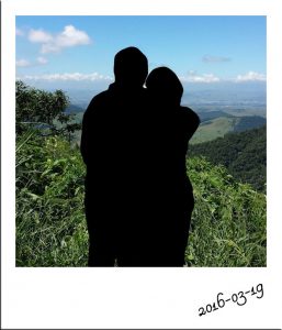
This is my take on the Silhoutte Challenge. I selected it using the Freehand > Point to Point and then edited the selection as shown by Cassel.
I cropped the photo to a square and ran Cassel’s free Polaroid Script.
Sheila, your page is lovely. I like the texture of the papers, the photos in a circle shape and, I guess, a bevel effect. The pins… I love to use them too… the shield… so many details. Nice layout!
Dawn, it is also the first time that I participate in a forum. It’s been about one year that I became a member of the Campus, and only a while ago I began to participate and share my work more often after feeling more comfortable too.
Best wishes 🙂
Josée, what a nice page. The effect of this script gives a total different and great look to the layout. I like the notebook pages used as a background and the way you’ve disposed the embellishments and words. Nice work!
Thank you, Marlene and Dawn for your kind words. I love to learn, to try out new techniques, and the process of creating a page. Sometimes it comes easily and other times is a struggle. 🙂
But here in the Campus the possibility of learning is endless, as Cassel has classes for all levels. I see the Forum as a place where we can share our work, support and learn from each other… and all of this in a friendly environment. Hopefully, more people will join us!
Dawn, another nice work you showed us…simple and elegant.
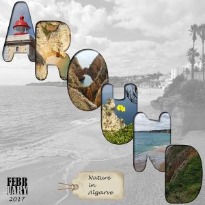
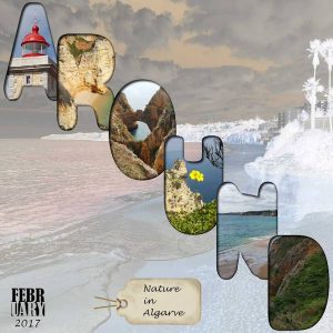
For this Word Challenge, I decided to use one of the techniques that Cassel taught on May 7th Webmaster Class “No Kit Scrap 2“.
It takes many steps to do it, but it’s worth the work. I had a few “fights” with the nodes but I manage to complete. 🙂
For the background, I used the photo of the letter N on top of a white background and lowered the opacity to 50.
I tried two different Layers Blend Modes: one is Luminance (black and white) and the other is Difference.
For the date, I used Cassel’s freebie SplitText Month, and the tag is a freebie from Granny Enchanted (Free Digi Snowman tag).
Thanks, Cassel, for the class and freebie.
Dawn, I agree with Marlene. Great idea of using the word Around on a path. Nice paper!
Great pages and photos posted here. I am getting to know so many nice places of Australia throuh your layouts.
Marlene, I like the effect of the Harlequin tile for the background, and I love the Lifted Photo Script. I have to be careful not to use all the time. 🙂
Dawn, I like very much the mask you’ve made, and the way the photo blends with the background.
I didn’t do anything yet for this challenge yet. Let’s see if I can come up with something within the next days. 🙂
April, the photos are amazing, so colorful! They match so well with the layout. I love the subtle use of the weave effect on the background paper. Great work!
Sheila, your page is lovely…The papers, mat, different stitches… very creative.
I like the use of the gingerbread cookies with sprinkles. I guess it is the Cookie script… it is on my wish list. 🙂
April, thank you so much for your kind comment! I find very good to see each other’s work, the use of different techniques… sometimes small details that make all the difference. So, if you have another project, please share with us. 🙂
The use of the small frames I have learned watching Cassel’s Scrapbook Basic Course- Module 1- Here we are.
And a correction: The name of the designer, who created the snowman element is Harper Finch.
Marlene, April, great pages and techniques… so many details… Really great!
I don’t known yet how to do a ticket… so many things to learn!
Here is my contribution for this challenge: I made the papers using the dot and plaid technique taught by Cassel in “Build your Baby Book” masterclass. For the title, I used the Powder Texture Alpha freebie and arranged the letter with the help of the Snap on/off Script. Very helpful.
I also used the Edge Font2 mat and Paper cutout Freebie. I made the ribbons and added the stitches (Stitching with Fonts). I used the Lifted Photo Script on the ticket photo. The snowman element is a freebie “Merry and Bright” from Haper Finch.
April, thanks for you nice comment! I downloaded the plugin Texturizer, that you mentioned in a comment some time ago and used on the paper. Thanks for the tip. By the way, I forgot to add the shadow to the paper. 😉
I really love your layout. The colors and the use of the Corner Punches Brush, which I also have but haven’t used yet. Your journaling is very touching and complimments the page.
Royanne, your layout is lovely. I like the Out of Bounds technique and how you placed the grasshoper hovering her hand. About puting your comment under a specific post, I think this is not available here but only Cassel can confirm it.
I see here and there that some replies have been modified and I don’t know how to do it. Anyone can tell me how? 🙂
I love to see when people post their work here. It is inspiring and I learn a lot.
Hi Howard
We are all learning here, some longer than the others. Keep trying. 🙂
Here is the page I made for the Theme – Toys.
For the title I used the the Block Alpha freebie for one part, and for the other part I used the PuffyPaint Script.
I made the flowers using the Preset Shape that comes with PSP and ran the StitchedEdges2 Script. I also used the Twisted String picture tube.
All scripts, tubes and freebies from Cassel.
Love your layout, Marlene, but love even more Bobo and your story! 🙂
What a nice card, April! I also like the way you chose to display it, using perspective.
Cassel, I liked very much the Master Class yesterday, showing techniques that I never imagine that existed. I have to watch the video, when it is available, to try to reproduce the layout.
Really beautiful, Sue.
April, Sheila and Micfin, great examples of the technique. Love them all.
Like Sheila said, hopefully more people get inspired and post their work too.
Wanda, what a cute and sweet little girl! Lovely!
Black Opals are really beautiful, Marlene, and I can imagine all the interesting things you have over there.
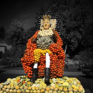
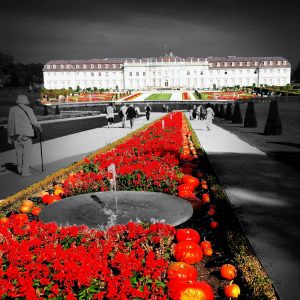
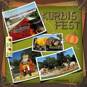
Here is what I’ve made. This is Ludwigsburg castle, where every year there is a Ludwigsburg Pumpkin Festival from September until November. These photos were taken in 2014 and the theme then was Kürbis (Pumpkin) Royal. This year will be Rome. The festival exhibition is behind this castle.
What a lovely page you’ve made, DeLoris… it’s so cute. Cassel’s scripts are really great and helpful.
Thanks for the QP!
I didn’t know this plugin, looks interesting… The process of creation is what I think it is great, the small details that in the end make a difference.
Thank you, April! I also like to see all the pages that are posted here. It is a technique that I don’t known , photos from different places, birds and plants that I am not familiar with…I enjoy being here.
This is a page I made using some of the goodies I got on Cassel’s birthday.
I used the Curved Photo Script, Lifted Photo Script and the Twisted String Picture Tube. For the title I used Cassel’s Wooden Alphabet freebie.
Papers and other embelishments are from Enchanting Autumn (freebie) by DiHillerDesigns. I added some overlays on the papers.
I love everything I’ve got and already working on my next wishlist!
I loved the texture of the papers and the way you disposed images and text, April. Lovely page.
The HTML code that appeared above was not written by me 🙂
You are totally right, Cassel
For the challenges here, I like to use the techniques you have shown us, because this is a way for me to learn and praticse, instead of using somebody’s else kit. I have fun doing it. 🙂
Now I am looking forward to the No Kit Scrap – 2 presentation on May 7th.
Nice pages, April and Marlene!
-
AuthorPosts


