Forum Replies Created
-
AuthorPosts
-
A truly delightful page Ann. Rather whimsical in it’s own way, well done my friend, I love it. ;D
Thanks so much dear Sue, your comments always mean a lot to me. The card and envelope look fine to me on my pc but when I downsized for posting the envelope flaps (shadow 0 0 45 5) got lost once posted! Ah well I know that everyone on this Campus would know they are there. White can be a little problematic for display… ;D
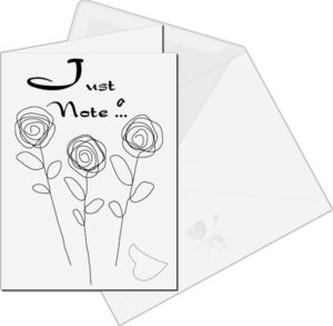
Just playing around with cards and envelopes. If you hadn’t already guessed I am a sucker for black and white. Font used is Dragonfly and the flowers and lips I created myself using the brush and pen tools. Thanks for takin a peek my friends. ;D
Terrific work on this one dear Cristina and super colours. Well done my friend, a joy to peruse. ;D
Very true Corrie … sometimes a quickie can look as good as something you have spent hours on. Beautiful cards my friend, well done. I am looking forward to seeing your magazine pages as you said you would be doing it on flowers. I haven’t really settled on a subject as yet but I think it may be about beach or holiday locations in Australia. ;D
Lovely work on this delightful photo Ann … Cosmos and Sunflowers together, they make a beautiful show and your frame has showcased them perfectly. Well done my friend. ;D
I love this page Art, my kinda scrapbook page. I would probbly go with Ann’s suggestion but only because we are a pair of ‘twisted’ women, lol! ;D
Thanks dear Corrie, glad you liked it my sweet friend. ;D
Thanks very much dear Ann. Nick Cave has been around for a while and has his own particular style. The song is also the theme for Peaky Blinders and Snoop Dogg does an interesting version … I do prefer Nick singing it though. 😉
This is another for the song colour challenge. This time I went with Nick Cave and the Badseeds – Red Right Hand. Layout is my own with a few ideas from surfing the net. Artwork is by Joe Murtagh. Title font is Barbatrick. Papers are my own and the corner punch is Caroles. Thanks for takin a peek my friends. ;D
D = Diving
This is very “Pretty In Pink” dear Corrie. I loved that song back in the eighties and I loved the movie. I always wished that Andie had ended up with Ducky but that is the way of movies for ya, lol! ;D
Oh Ann … this is really lovely work my friend. I am a fan of the big O as well … he was a very talented musician. You have done him proud my friend. 😉
I am so glad to hear that Cristina. I love your work and have missed viewing it. Very much looking forward to the Magazine challenge … see you there dear friend. ;D
Very nice work on this one Anne … beautiful colours my friend. 😉
Thanks dearest Corrie, your comments are always greatly appreciated my friend. ;D
Thanks dear Cristina, always appreciate your comments my friend. 😉
A lovely frame Sue. I used to be big on frames but now not so much. These things come and go. Perhaps I am a little like my grandmother who they used to call Contrary Mary. I used to make frames so elaborate that you forgot to look at the subject, lol! Anyway dear friend this frame is perfectly suited to the subject matter and I love it. ;D
A lovely card dear Sue. They are such sweet little birds and you have done this little one proud. <3
Lovely work Michele … lovin your fab divas mah fwiend. ;D
A lovely page Art and very nice photography. Well done my friend. 😉
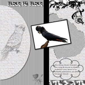
As soon as I read about this challenge the first thing that came to mind was the song “Black is Black” by the Spanish group – Los Bravos, way back in the sixties. I always loved that song and decided that was the way for me to go with my first for this challenge. I used the layout template that I created a few days ago, and the photo of the Glossy Black Cockatoo from an Australian travel magazine. The corner cluster I found recently just can’t remember where from … perhaps pngegg. Very hard to get shadows to sit up and take notice when working on a black and white project. I wanted the lattice to appear as though you were looking through some punched out bricks but not real keen on my result with it. If anyone has any suggestions on how to achieve that I would appreciate it. I ended up using a double drop shadow on an inverted selection. The font used for the title was P22Sniplash and the frame around the glossy black cockatoo was achieved using Cassel’s script “cutout edges”. Thanks for takin a peek my friends. ;D
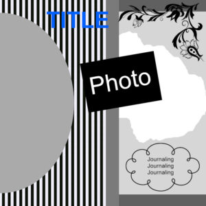
I created 2 things today … a layout template and a corner cluster sticker. I am off to bed and will be setting the alarm to make sure I don’t miss Cassel’s webinar on shadows … still a bit of a bugbear for me. Thanks for takin a peek my friends. 😉
I love it Michele, very well done and oh so summery … bit chilly here, lol! 😉
Oh Yeah! A fantastic tribute to the man, well done Ann, I love it my friend. ;D
Thanks Helen, really thrilled you liked it my friend. ;D
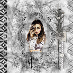
This is one I have played around with for the last couple of days. I love black and white shades with a touch of colour. The intricate frame is a tube from pngegg, the cluster is by Kate Pertiet, the border left is my own using the font Haus Ethnik Dingbats, the right border is from pngegg (greyscaled), background paper is my own, the font used for the title is Ossellany Script and the melancholy lassie is a tube I have had for quite a while. Thanks for takin a peek my friends. ;D
Thanks Ann, I will do that. I really don’t fancy getting up at 2am for a webinar … don’t think the old brain would take in too much, lol! ;D
Happy to be of service Ann and thank you for the pngtree tip. ;D
Lovely little signature strips Helen. Like yourself I am playing with PSP 2022 and so far I am happy. There is a webinar on Saturday 21st August and, unfortunately for me, it is being held AEST 2am – 3am … I have registered and will definitely have to set an alarm, lol! You can register via the Discovery Centre. ;D
-
AuthorPosts


