Forum Replies Created
-
AuthorPosts
-
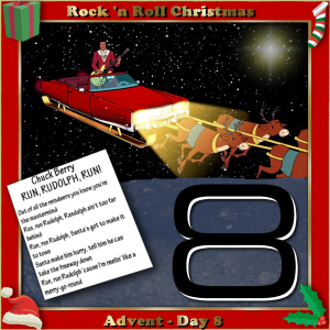
Day 8 of my Advent Calendar / Rock ‘n Roll Christmas, Chuck Berry with Run Rudolph Run for the Song Challenge. The corners are from the Christmas tube, the Chuck Berry art is from the VEVO illustration for the video of the music, the font for the big number 8 is called Square721 and the flare on the upper right is a tube.
PS: Today my new, 16 MB desktop is being delivered and installed. It’s a custom build so doesn’t have a brand name. It will help tremendously with using my PSP 2021 Ultimate as this one keeps choking on boosted CPU for the AI features. It is my Christmas gift from my overly generous daughter in CA. What are kids for, right? LOL
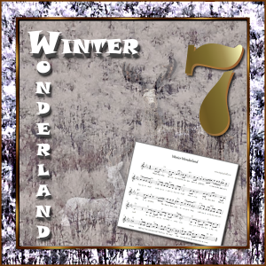
Here is my next entry in the December SONG Challenge – Christmas. I used Winter Wonderland as the song and a photo of snowy trees that I got from the Facebook site, Hudson Valley in Pictures where the postings marked as free to use. It’s also my Advent Day 7 entry.
I played around with the photo, using it as a pattern in the border and as a layer with reduced opacity over the layer with the two deer, which are elements from the AHA-Hygge kit. The font for the song title is Snap and the number 7 is Stencil.
December Christmas Song Challenge + Advent Day 7
Obviously, this is different for me. I played around with the photo of the trees in snow, using it as a pattern in the border and as a layer with reduced opacity over the layer with the two deer, which are elements from the AHA-Hygge kit. The font for the song title is Snap and the number 7 is Stencil.
Advent Day 6 – The Little Drummer Boy (also for the Song Challenge-Christmas)
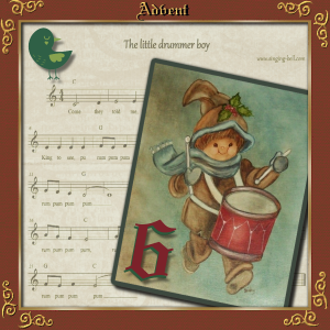
I’m keeping the same border daily though I do change the color from time to time. I found a curly font called Nymphette at DaFont for the corners and applied an inner bevel. The font on the Advent text and the Number 6 is Wedding Text BT which I thought looked antique. The drummer boy and sheet music I found on Google. I lowered the opacity on the white sheet music which is layered over a wrinkled yellowed paper from one of my kits.
Bonnie, That poster is beautifully done. I have to ask my pickleball friend if she’d like to see it. I don’t know if she’s up on the “Queens of the Court”
Well, Annie, I also did the Little Drummer Boy for my Song Challenge and for Advent Day 6, though it looks a lot different from yours, which is charming!
I found some of the fonts I was looking for. The curlicues on the corners are Nymphette from DeFont and treated to an inner bevel. The drummer boy art is from a Google search as is the sheet music. I keep using the same border frame for my Advent Days.. keeps the look consistent for me though I do change up the color.
My daily entry for the Advent Calendar is titled: “Joy to the World”.. one of my favorite Christmas carols.
Edit: I replaced the image with one where I used a lighter and brighter background. The original looked too dark.
Win 7 – Edge browser – all 10 worked fine
Just a side note: the time posted on my message is an hour ahead of me? Don’t know if that affects anything but the Campus is still slow for me.
Finished Day 5 for the Advent series.
I’d like more information on accessing the more elaborate fonts. The nice, graceful corner pieces, for example!
Edit: Day 5 looks too dark so here’s a lighter version. The bottom layer was filled with a camel color originally and I changed it to white. Also, I had reduced the opacity on the Christmas tree scene originally and now I brightened it up.
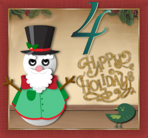
Working on Advent layouts and Snowmen in December.. here’s Day 4
I did an Advent layout for Day 4 with a Snowman. Thanks for the extra accessories. I’m enjoying playing with these.
Sue, can you tell me what size canvas you’re using for the Advent Days? You said it was smaller…
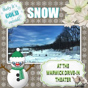
A photo of our drive-in theater during the month of March one year when the snow just kept piling up. We usually open for the season in the middle of March, so this caused delays. I posted this photo on our website, warwickdrivein.com, so customers would know why we weren’t open as usual.
The decorations come from various Iceland kits which does compete in the snow department. And of course, the snowman is from the December Theme Challenge, except for his eyeballs, which are from a tube.
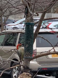
Sue: I really like your Advent pages. I have bird shots with very busy backgrounds so I guess I have to work on doing masks like your #3. Here’s a look at my woodpecker’s original shot.
What size canvas do you use?
Nice, Corrie.. looks good enough to eat! 😉
Playing with Carole’s snowman…(the eyeballs are tubes!)
EDIT: Totally re-did the snowman. Forgot to do shadows on the accessories and once I started over I had to make changes! lol
Trish: that’s a beautiful layout. They’re predicting a little snow here today so maybe it will start to look like that around here too!
Finished my Scavenger Hunt yesterday so even though it was instituted in November I think it also qualifies as a December project now!
These little plants are my newest hobby; anything to keep me busy when it’s cold outside and, health-wise, a good idea to stay home as much as possible.
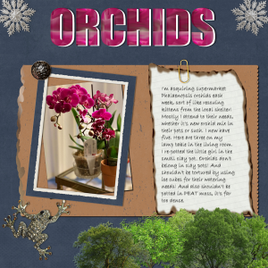
My layout theme is ORCHIDS and I’ve collected 5 of them, re-potted them all (even while blooming!) so we’ll see how they settle in.
The scavenger hunt asked for 1) a paperclip, which I created from Cassel’s tutorial; 2) a torn edge, which I also used the tutorial but am not that happy with the results; 3) scallops, I used Cassel’s script so that was easy; 4 & 5) a metallic object and a button, covered by my 1 for 2- a metallic button from my stash. I used the Impact font for the heading and filled it with a swatch I made from the flowers in the photo and backed it up with a white duplicate shifted over a bit to add depth. The trees are tubes and the papers and frame from random kits. The journaling paper is from Cassel’s burnt edges offering.
My entry in the November Scavenger Hunt Challenge. I think I got them all: a paperclip (I made my own); a metallic object; a button; torn paper edge (I followed the tutorial) ; and scallops (I used Cassel’s script). I know the journaling is also on what looks like torn paper but it’s not.. it’s burned edges I got from Cassel. The title is Impact font that I filled with a pattern made from the orchid photo and then duplicated in white to add depth. The trees are tubes; papers and embellishments from various kits on hand. I like that frog!
The story about the orchids is real; I “rescue” them from supermarket neglect and try to revitalize them. I just picked up that tiny one in the clay pot last Friday. They’re looking ok so far! *knock wood*
Barbara: I’m very impressed with your creativity with those photos. I especially like the effect of the 3 showing the spinning! Your colors are subtle but very effective. Well done!
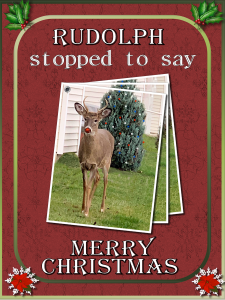
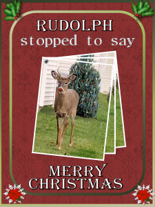
Goodness, the Campus pages are slow to load! Here’s my offering, though it’s triples, not doubles. The idea was inspired by Sue Thomas but the photo is mine of our neighorhood brat! (He broke one of my bird feeders) Sue wanted to add snow but I’m afraid I’ll jinx us and get it for real! lol
I got even with him and transformed him into Rudolph, the Red-Nosed Reindeer (though he’s a white-tail deer).
I decided to try Sue’s technique with multiple copies of the same photo but I couldn’t get the image to rotate! What’s the trick, Sue or Carole?
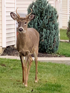
It wasn’t too difficult to align the three photos by hand, though. This is a photo of a young buck who arrived in my yard on Saturday and Sunday to clean out my bird feeders! LOL He’s a beauty and just posed ever so nicely. I’ll put up a copy of the original photo which I edited to transform him into Rudolph, the Red-Nosed Reindeer. ;D
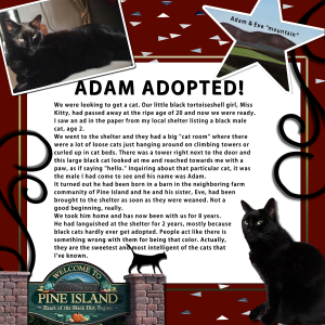
I decided to revise an old layout called Good Deeds which I used the topic of the adoption of my big black tomcat, Adam, as my “good deed” because he had been shunted aside and ignored for 2 years at the animal shelter. I completely revised the journaling (this was part of the “stories” assignments back at the end of August) I added the official Pine Island welcome sign and I revised the photo of Adam at the top which originally had a wide, brown matte and frame. Just diddling around! ;D
Vicki – here’s a quicker way. Go to File/Export as a .jpg. The result will be automatically flattened but NOT your original .pspimage or .psd file, which will remain intact. I always duplicate my text vector layers and change to raster. They might be lost in a .psd. Photoshop doesn’t support vectors. (I think)
I just did Carole’s Subway Art challenge from her blog. They are meant to be printed and possibly framed on the wall bur I made a digital version with a frame. The quotes are from an old daily meditations book called Courage to Change. Each line of text is separate on a vector layer so you can pull them out and change if needed. I also duplicated them and made raster copies in order to back up the text and make it stronger without a shadow.
Mireille: Google translated your location to English for me. You said: “I live in the south of France in Marseille, a city founded by the Greeks 2,600 years ago.”
I seriously would like to be there today! The temperature is -2C here today! Brrr! I hope Marseille is warmer.
Welcome to our chatty group. 🙂
Carole: It looks correct now. Thanks!
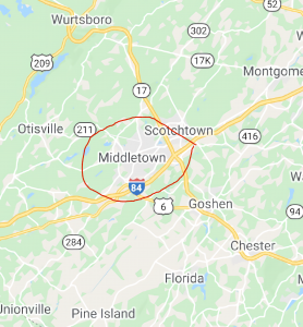
Hi Carole: I don’t see my pin on the map. Possibly you put it in New Jersey? I’m attaching a clip of that map showing the Middletown (city) New York, where I am. Actually, here’s two clips.. one is larger and shows the state lines of New York, New Jersey and Pennsylvania aka the Tri-States. I used the marker tool in PSP. Handy, dandy! Hope this helps.
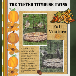
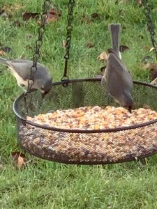
Here’s my November Sketch Challenge layout. I used the two bird photos I took of the tufted titmouse twins but I used a Corel free script on the lower one which changed it to Minimalist Gray 4, an interesting effect. Otherwise the two photos were too similar and the gold seed in the birdfeeder was overpowering.
I also got free Thanksgiving clip-art from Corel and used it here. The cluster top right is called a “badge” and comes with a thick white border in a transparent background. I’m not sure what to do with it but I colored the white border green. Corel has a freebie every Friday in the Discovery Center.
Here’s my shot at the November Sketch Challenge. I somehow feel like this kind of layout is from earlier classes, probably because I did the Bootcamp in July and again in September! I think I got it now! 🙂
These are my little twin tufted titmice that just arrived this fall. I was on the Corel site and downloaded some freebies.. one is a script that treats a photo to become what they call Minimalist Gray 4. I tried it on the bottom photo on my layout; I like the effect. Also got the freebie Thanksgiving clip art package and used it for fall decor here.
My PSP 2021 keeps freezing up. This time when I was downsizing for posting here. I shut down my computer, waited a bit and when I reopened I went to PSP2020 as I think the cache in 2021 got overwhelmed. I’ll have to look at my preferences; I think I told it to do something that’s causing my problems.
Here’s my twin birdies!
City of Middletown, Orange County, NY 10940 (there are 2 Middletowns in NY State)
Sue: I’m admiring that Christmas Grouse! Never saw one before! 😉 You mention Carol’s “punches” .. what is that? (The journaling on the card has a typo.. the plural of reindeer is still reindeer.. without the “s”)
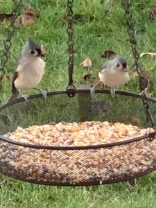
I’m trying to decide with to do with these photos I just took of the new visitors I have.. the tufted titmouse twins.. they’re so cute!
-
AuthorPosts


