Forum Replies Created
-
AuthorPosts
-
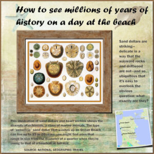
I spotted an article in my National Geographic email this morning on the topic of seashells.. specifically Sand Dollars. I arranged a page using their photo and map; the background paper from a beachy kit plus a few added shells. The headline font is Forte and the text is Franklin Gothic. I framed the sand dollar illustration with cass-frame01 but noticed the shadows that were part of it were backwards! So I flipped the frame horizontally. I’m amazed that I noticed. 😉 Oh, and I used the cass-curved photo script on the map. Enjoy!
Looking through a Summer Window. A photo by Rajinder Keating on HViP; Hedge Frame by cass; Ribbon Frame from cass-ribbon factory script. Word art in Corlita fonts and Curlz. Thanks for taking a look!
Here’s my Shells homework. 😉 The photo is from a member of the Hudson Valley in Pictures Facebook group. It’s open to all; you don’t need a membership. It’s Cassel’s frame.
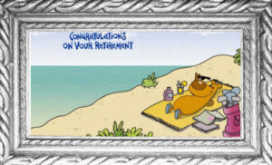
Fabulous, Carole! I had to hunt down this Forum thread as there was no link on the email I got this morning for this. Now I must get Rosetta Stone and figure out all the good wishes that are in French. Usually I can highlight messages in the Forum or even the Webinar but not with images. Enjoy your retirement, though, like me, you’ll probably be busy with “work” anyway! 😉
-
This reply was modified 3 years, 6 months ago by
Ann Seeber.
Happy Independence Day USA: Here’s a double layout I devised from an interesting story in my NY Times. I’ve always admired Maya Lin who was an 18-year-old woman, an Asian freshman at Harvard, when chosen for her design for the Vietnam Veterans Memorial in D.C. This is her latest installation and I’m in awe!
There were several photos with the article: I used one, blurred and twirled, for the background. I used the vector spiral script on the one on the right. (Thanks guys for your help, Carole and Corrie!) No special fonts. I’m uploading the double page scaled down and also each half which will come up larger so you can see the text.
-
This reply was modified 3 years, 6 months ago by
Ann Seeber.
Corrie: I have so enjoyed visiting The Netherlands via your Travel Tale. Very enjoyable with the consistent palette and fonts. I never knew my Dad’s father, Cyrus Terwilliger, or any of my Dutch relatives. They emigrated here from Amsterdam on a sailing ship back in the 1600s.
Last year I did one of our family trips to Acapulco, Mexico, and it was the very first assignment for me when I joined the Scrapbook Campus. With the double pages it felt like a baptism by fire! But I do have a key tag and stamps! 😉
I used Cassel’s Ribbon Factory with the color palette. Here I have 5 that I used her Bow17 script on.
Thanks Cassel!
-
This reply was modified 3 years, 6 months ago by
Ann Seeber.
-
This reply was modified 3 years, 6 months ago by
Ann Seeber.
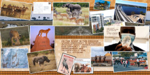
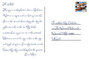
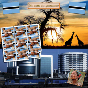
JUNE FINAL BOTSWANA: I followed the style of the Safari layout but didn’t use the template. It’s only a motley collection of leftover photos – animals to the left and city to the right. The story of the famous diamond found that made the country’s fortune. It does have the highest per-capita income in Africa. I used the June color palette to create ribbons using Cassel’s Ribbon Factory. I was quite pleased with all the ribbons created with that palette. Only one is used on this layout. The font is Farmhouse. I’ll also post my postcard along with the layout.
-
This reply was modified 3 years, 6 months ago by
Ann Seeber.
Corrie and Annie T: Thank you both for posting the postcards separately. My eye surgery is not slated until November so in the meantime I’m struggling a bit with smaller type.
Corrie, I really like your design with the darker background. I would love to visit your country some day.
Annie T, Tasmania is certainly beautiful! Until you posted the postcard I didn’t know there was word art on the bottom right! The background used for the postcard layout is gorgeous. Did you create it?
Cassel: Congratulations on your retirement! Myself, I love it! (I really have to curb my tendency to use so many exclamation points!!) 😉
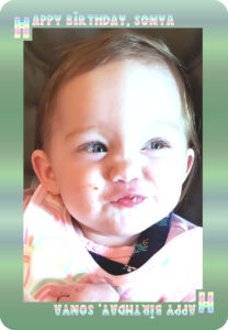
I did my little assignment for today and probably will use it on my final layout but not today as I’m off to Sonya Anne’s Birthday party.. she’s now ONE.
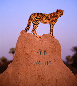
Here’s my Mark titled “Cheetah on a Termite Mound” and here’s Sonya’s birthday card courtesy of Cassel’s script.
-
This reply was modified 3 years, 6 months ago by
Ann Seeber.
Corrie: I love learning about my heritage – The Netherlands! The doors on the Tower of our Lady are magnificent. I can see seeking sanctuary there. I can’t see your stamp very well (blame my upcoming cataract surgery) so if you could add it as an extra to your post I’d appreciate it. Thanks!
Annie T: You’ve got me down to a “T” 😉 I am also photography challenged so Google is my friend, also. Picking up and moving to Brisbane was a fantasy when we were roughly 18-23 and not yet married. Adventure time! Most interesting your Postcard from Tazmania. That name invokes the Tazmanian Devil and I never realized it was so beautiful there. That handsome background is wonderful. Thank you for that enlightenment! Unfortunately I can’t read your postcard at all; could you post it separately?
(See, now I asked both of you to help out this old lady. 😉 )
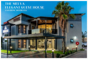
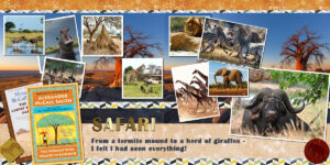
Of course I had to go on Safari while in Botswana! There were lions but no tigers and bears.. 😉 And I read another “Ladies’ Detective” book when I got back to The Melva Elegant Guest House. I also finally conquered the leather tags.
Annie T– Believe it or not, years ago my first hubby and I explored moving to Brisbane. He was a police officer in our town and wanted to move and join the police force there. Nothing came of the inquiry but it was a fantasy adventure all the same! That is an interesting Alpha you used! 😎
AND here is BOTSWANA-PAGE 5 – doing some sightseeing (including stamps to send out postcards!)
Here’s my page THREE and FOUR as a double page. I used one of Marisa’s layouts for this one. I’ve just landed in Gabarone, Botswana, and crashed at my Elegant Guest House. (They really do name their businesses very literally!) and as you can see, Gabarone is not filled with grass huts! I tried the template and it was all over the map so I gave up and went to the .jpg. Because of that, I had to do a lot of pasting and filling and such. I think it came out ok.. take a look! 😎
-
This reply was modified 3 years, 6 months ago by
Ann Seeber.
-
This reply was modified 3 years, 6 months ago by
Ann Seeber.
I did my “Date Stamp” with no date for my Fantasy Trip to Botswana. I applied it to my Page Two and after many OTHER tweaks, I feel sort of happy with it.. (I replaced the art on the bottom right because I remembered this class from last year and knew I’d need my original later) 😉
Michele: Gentle hug; quick healing; feel better, hun! Your Fabulous Divas are Fabulous, as usual. Just what does this group do that makes them Fabulous?? 😉 (Hoping the image makes you laugh!)
-
This reply was modified 3 years, 6 months ago by
Ann Seeber.
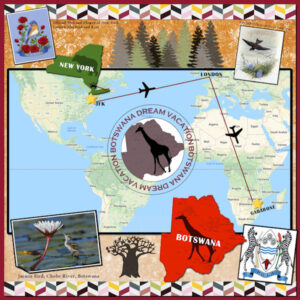
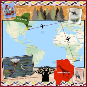
My Day 2 assignment; didn’t realize it had to be a double but, oh well, here’s my single Page Two. I have a short taxi trip from home to JFK airport on Long Island, NY and then fly to London, England, and then hop on down to Gabarone, Botswana. Actually, I think you have to fly to Cape Town, SA, first and then hop back to Gabarone, but I simplified it. The whole thing is a fantasy trip and is pretty much self explanatory. Nothing fancy except a small page curl on the lower left photo. Google got a workout from me!
Edit: I see it’s hard to read the photo captions so here they are: Top Left is “Official Bird and Flower of New York State / Eastern Bluebird and Rose”; Top Right is “English White-bellied Swallow – Panteek Gallery”; the stamp lower right says: “BOTSWANA POSTAGE REVENUE – Secretary Bird – 5c”; and on the Lower Left is “African Jacana Bird, Chobe River, Botswana”
-
This reply was modified 3 years, 6 months ago by
Ann Seeber.
Annie T: Wow, you are just blowin’ me away with both of your layouts. The backgrounds, the designs, the colors, the fonts: all are just PERFECT, Mma! 😉 I’ve now figured out you’re going from Aussie-land to New Zealand but, do tell, did you find the background on your Day 2 or how did you create it??
Minka: We have a chain of shops called Subway that specialize in “subs” sandwiches. I’m sure you’ve seen the shops. 😉
-
This reply was modified 3 years, 6 months ago by
Ann Seeber.
Minka: One of the places I remember going with my parents when I was about 10 or 11 was Bar Harbor, Maine. We took a ride out to sea in a tourist boat and were thrown around with enormous waves that I found very exciting! My parents.. not so much.. they got seasick. We also visited the Desert of Maine. Looking forward to more of your travels; I live just to the left of the “d” in your label for the Hudson River in New York. Save me some lobster rolls-YUM!
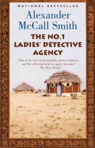
I decided to do a fantasy trip to somewhere I’ve always wanted to visit; mostly through the “No. 1 Ladies Detective Agency” novels. My destination is Botswana, in southern Africa. I did my first page but my PSP has been acting up and now Corel wants me to delete all temp files and download the program all over again. Aargh!
Meanwhile, here is my Botswana and the first book in the series that inspired me.
-
This reply was modified 3 years, 6 months ago by
Ann Seeber.
-
This reply was modified 3 years, 6 months ago by
Ann Seeber.
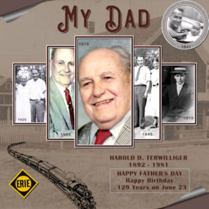
It’s Father’s Day here and we always celebrated my Dad’s birthday, too, coming on June 23 and always close to Father’s Day. He was born in 1892 and always marveled at the changes he witnessed; going from horse and buggy to cars to rockets to the Moon! He knew Morse Code as he worked on the Erie Railroad for 40 years as Chief Night Dispatcher here on the East Coast. The background is a photo with an added sepia tone, of the post office in Granite, NY, where he was born. The photo on the far left is his mother, my Grandma, Henrietta. The photo second from right he’s with my Mom, Mildred. I’m in the top, round photo with him.
The page curls were done with PSP/Effects/Image Effects. The headline font is Aviation Cocktail Shadow. Thanks to Sue for the frames template. I used Cassel’s Raster-to-Mask script with it.
Happy Father’s Day!
Just so you know what I get up to when not doing school designs.. here’s a promo I just finished in PSP for our business. This is intended for our Facebook page and Instagram.
Marie-Claire: That is one of the most effective uses of pale pastel colors that I have ever seen. The lifted photos stand out and are perfect for that design. You inspire me! How lucky to live in Belgium, home of one of my favorite TV shows on PBS: Professor T. 😉
Annie: How interesting you make geography. Antarctica is unfortunately in the news more lately as it shows signs of melting faster than usual due to global warming. Is a rainforest far behind for its distant future? Your design is very effective and, as usual, commands my attention! Good work, my friend. 🙂
-
This reply was modified 3 years, 6 months ago by
Ann Seeber.
Sawnie: That’s so sad; I have tears in my eyes! :’-( The crazy weather lately is hard to take. Your album showcases your plants beautifully. Good job!
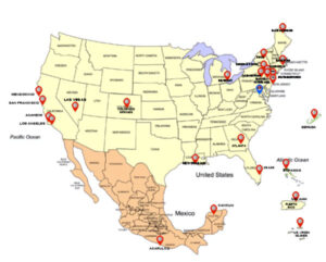
I’ll be here but haven’t decided what travel story to tell this time. Here’s a map I started showing all my stops through the years; I may even use it for this class. I may have to “fake it” with photos in some cases as my old ones are boxed in the attic in the envelopes from the pharmacy! 😉
Edit: Did more work on the map but still don’t have a trip planned…
Lynda: This Bob Dylan is a SUPER job! Everything is perfect, including the sketchy guitars and the wind blowing from the title. Well done! Were those guitar drawings on a paper or what?
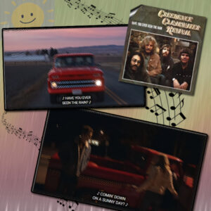
June Weather Song Challenge: I love the Creedence Clearwater Revival and especially this song: “Have You Ever Seen the Rain.” I started with screen grabs from the music video on Vemo and I added ripple effects to suggest rain. I had to reserve the lyrics and paste them back in so they were readable and added a black border to each scene. I got the album cover from a Google search and I had the sun clipart. The background is from a previous art media paper I made but I added the Rainy Day script over the top and then added the musical bars.
Edit: Oops, forgot shadows!
-
This reply was modified 3 years, 7 months ago by
Ann Seeber.
-
This reply was modified 3 years, 6 months ago by
-
AuthorPosts


