Forum Replies Created
-
AuthorPosts
-
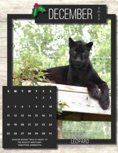
The second of my Dec 2022 calendars is for my Big Cat collection, this one from the Wildcat Sanctuary in Sandstone, Minnesota. Introducing Shadow, one of my favorite cats, the black leopard. Shadow, is getting along in years but, as typical of black leopards, is still very feisty. The templates were offered last year and I add a background and texturize the frame and calendar.
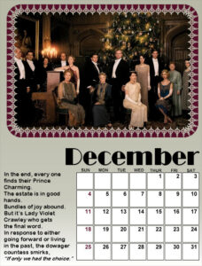
Here is one of my December calendars, that I put together from Cassel’s templates for the Up-to-Date class last Fall. This became a holiday gift for my granddaughter, Anna, who is also a huge fan of the show, Downton Abbey.
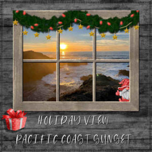
Daughter Debbie sent another shot of the Pacific at sundown, so I put it in Cass’s Holiday Window Frame. The background paper is ps_janet-kemp_95882_christmas-day-wood-paper. I used a snowflake brush on the border. The gnome and gift are from my large Christmas stash. The font is Banana Pancakes. I fiddled with the shadows that would be coming from the setting sun in the window.
Sue Thomas: Wow, they’re both great! I’m especially admiring your butterfly and would like to know the technique for the border, especially at the bottom. It gives a look of transparency that is very nice.
Oh, Suzy-so glad to see you back in good health now. We missed you and sorry you missed Thanksgiving dinner. It’s one of the highlights of my year. Stay well! 🙂
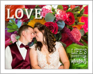
After learning from the Master Class, I created this blended layout from my granddaughter’s wedding photos. I think I only used the smart selection brush and the eraser tool. I need more practice with the multiple masks. This was the happy couple and a photo of the flowers on the head table at the reception. I had the word art in a wedding kit.
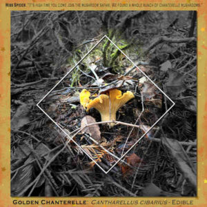
My California daughter, Debbie Lennox, took this great Golden Chanterelle mushroom photo and handed me material for the Gold Challenge. The layout is a template called cass-SimpleArtsy01, the background paper is ps_marisa-lerin_11183_stars-04-paper-yellow-pink_cu, the second background is an enlargement of the photo with layer effect Luminance and then I reduced the opacity to 51%. The journaling font is Copperplate Gothic, where I’m having a problem with the reproduction of the font when I reduce the size of the layout. Carole/Cassel, can you help?
I now see it looks alright if you enlarge the image here.
Oh, that’s nice, Cindy! I like how you used the glitter. Great work!
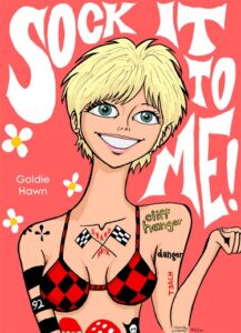
Cindy, what a blast from the past! Rowan & Martin’s Laugh-In. Here’s Goldie from Deviant Art.
I found another one I did when we were playing around with the watercolor effect in PSP. When my daughter, who paints in watercolors, came to visit, she said: “Mom, watercolor paper is not textured like canvas!” LOL
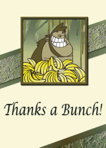
Card 7 – A Thank You to Carole/Cassel for this wonderful workshop. Lots to learn and lots of fun. Thanks a bunch! 😉
I used the script cass-ribbon factory C to make the gradient ribbon. I added a strip with the wet leaves texture on top of the ribbon. The font is Lucinda Calligraphy. The illustration is from nicepng.
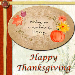
Card #6 is finally done! My hold-up was deciding what the theme would be. So, here’s a digital Happy Thanksgiving for my friends and family. I struggled with the warp brush to straighten the ribbon. Need more practice! I created the brad with using some clipart over an existing brad. The title font is Lucinda Calligraphy. The word art in the oval was from a Thanksgiving kit. The background paper is from ps-jessica-dunn-naturally-curious-nature-paper.
Carole: When I trid to upload an image with this post I get a 404 error that says the transaction is potentially unsafe.
Just getting started on Card 6 and 7 but I had to say how great everyone’s work is. You are truly an inspiration!
Susan & Linda: While we’re chatting about print-work experience I’d like to join in as I spent many years working in either the shop or advertising departments of two different newspapers. I still have the “roar” of the presses soothing me to sleep at night! ( 😉 ) Here’s a layout I did awhile back about my experience with papers.
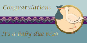
Here’s Card #5 – The baby is due June 26. We don’t know the gender yet. I followed Carole’s video and made my own ribbon by adding blinds texture to the template’s strip and the putting the embroidery on top of that. My font is Lucida Calligraphy.
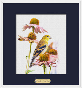
Another one: The Golden Crowned Kinglet in Cassel’s tatted frame.

Here’s my Golden Apples are Magic! from the Oct 22 Scrap Bootcamp.

Card #4-Jack Skellington (and his little dog) from A Nightmare Before Christmas say Happy Holidays from someone’s front lawn in inflatable decorations. The font is Horror Story (of course!) the garland is a Picture Tube, the strings of lights are from the decoration set. The frame is a PSP Frame. Backgrounds are a gold gradient under one called Rocket. I used my eraser tool to get the punches to reveal the gold layer underneath. Enjoy!

Corrie: Your card is charming! In order to view the posted work better, I right click and open in a new window. With yours, the glitter shines! 🙂
Card #3 – A birthday card for my daughters’ stepbrother. Jim is an electrician and will be 59 tomorrow.
The font is Bungee, and I used the Snowy Mountain gradient for the background, treated with a Weave texture. I found the electrician symbols at Nicepng. Just using it as a digital card so I didn’t make the back.

Dianne: I love your Steampunk Turkey!
Here is my Day 2 Card: A birthday card for my daughter. I used the colors from the flowers and the kaleidoscope effect to create the design for the top strip. The font for Happy Birthday is Banana Pancakes; the font for Debbie is Wide Latin. I also create a back but didn’t post it here. I’m probably going to send this to Debbie on her birthday, Dec 28th, as an eCard, anyway.

Tee: 😀 Wow! Thanks!
Now my whole post is gone. Here it is again.

Sue: Well, this Gallery thingy is new for all of us! LOL Here’s Carole’s instructions for posting an image from the Gallery into the Forum. I keep it handy myself as it’s not a habit yet.
 A Halloween party in Mendocino, CA. Daughter Deb sent these photos but no explanation yet. I used the campfire photo enlarged for my background also. All the embellishments are from the IN THE MOONLIGHT mega kit from Digitalscrapbook.com
-
This reply was modified 2 years, 1 month ago by
Ann Seeber.
Here is Card 1 – Thinking of You – Photo by Debbie Lennox – Brad from DS-Marisa Lerin: Coastal Special – I did all the shadows with the light coming from the top right.

Here’s an entry for Alphabet Album – W

Lynda: I’m in a Betta group on Facebook. It would be a good place to start to see if that’s what you’re looking for. I’m looking forward to my 4th great-grand! Ilana says she prefers the blended wedding photo with the flowers.
-
This reply was modified 2 years, 1 month ago by
-
AuthorPosts


