Forum Replies Created
-
AuthorPosts
-
Sue, delightful page! I’d love to visit the land of the Welsh Princes! In your recipe there is something strange to me. What is swede?
Ha ha ha! Gerry, that’s really funny. I’d love to meet River who truly seems precocious. I also have a black and white Tuxie. They are lots of fun. That is such a nice layout for her story. Well done.
-
This reply was modified 3 years, 4 months ago by
Ann Seeber.
My Day 2 – Page 2 of Birds of the Hudson Valley. The Brown Thrasher likes his grape jelly! He has a staring eye like the grackle. If he meets the Blue Jay, things may get exciting!
My bird info comes from the Cornell Lab of Ornithology here in New York. As you can see I rotated the template to accommodate my photo that is in landscape mode rather than portrait. Using the Berlin font again but this time with Arial instead of Copperplate.
Art, Fiona, Linda, Sue, Minka: Your magazine covers are delightful! I’m getting so many ideas. I hope we do this more often!
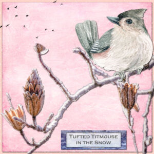
So here’s my new take on the winter palette. I used a snow script and a snow overlay and the frosted branch is also an overlay. The font is Copperplate Gothic.
Christina, Monique and Anne: A very nice start for your magazines! I feel like I’m getting a free subscription to each! 😉
Here is my Day 1 – Magazine Cover – I’m going with bird photos as I do not have wedding photos… yet.
These will all be from The Hudson Valley in Pictures on Facebook. I devised a gradient to match the Blue Jay’s coloring. Blue Jays are corvids which means they are related to Crows and Grackles and are feisty and entertaining. My information comes from the Cornell Lab of Ornithology here in New York. The font for the title is Berlin Kitchen 2 and the font for the date is (appropriately enough) Birdy. The background is filled on the right with a red/orange gradient reduced to 70% opacity.
Edit: I added a fine line between the photo and the right panel.
-
This reply was modified 3 years, 4 months ago by
Ann Seeber.
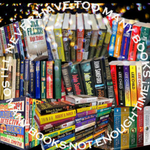
I did another layout for books and it has most of my favorite authors. I used an overlay that Corel supplied as a freebie and the script from Cassel for the circular word frame. It’s titled Never Too Many Books!
-
This reply was modified 3 years, 4 months ago by
Ann Seeber.
My mind’s eye immediately pictured two designs I did already. I’ll post them here but will follow up with something new, also.
Annie: Your design is very clever! I can make out The Mists of Avalon and The #1 Ladies Detective Agency. The third one made me CHEER! Sharon Kay Penman’s Here Be Dragons, the first in the Welsh Princes Trilogy. I own her complete set of works and have recently shared some with my daughter so now she’s a fan also. So sad we lost Sharon last year. R.I.P. 🙁
We certainly have similar tastes in books, you and I. 🙂
Showcasing my hobby of reading books. I used cass-bookshelves, I extracted the girl and her pile of books from an illustration for Book Week using the selection brush, the trees and bushes are tubes, the paper was from the Animal Kingdom kit, the background and title are colored with a rainbow gradient. The photo is from HViP and the white photo frame and the sky/clouds are both PSP Picture Frames.
Edit: I forgot to mention the title font is Georgina.
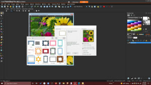
Sue: Here’s a screenshot of my PSP where I found your frame. It’s in the lower left corner of the dialogue box for Picture Frames. It says: SueThomas01. I have a lot of frames installed. If one comes in a kit I copy it into this file as I find them more accessible. I rarely make my own frames when I have a good stock of them here. I’m also not very good yet at extractions. I need more practice!
Sue: I’m sorry for the confusion. I am going by the file name inside my PSP Picture Frames but perhaps it was mislabeled? It is a beautiful frame and I thought I was giving attribution to the creator. Sorry again. 🙁
Sue: I’m not sure. That’s what it said in the PSP picture frames dialogue box. “Sue Thomas frame.” I found it to be very handsome! Did you add it as a file on the Facebook group?
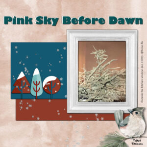
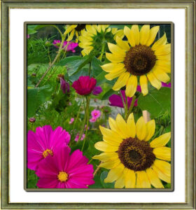
I spotted this gorgeous photo by Julie Maserjian on HViP and wanted it on my desktop but it looked unfinished so I added white 60px borders and created a selection border around the photo itself. Then I looked in my Image/Picture Frame collection and spied this one from Sue Thomas. I went back and colored the selection border with a shade from the frame and applied inner bevel and shadows. It now has pride of place on my 30″ black desktop monitor.
Art: That is a most interesting design. If you don’t mind a suggestion; I would twist the hanging at the bottom to the right, so the right edge is lower than the left; the opposite of the red one just above it.
Now if I had to guess where you live I’d say in Canada based on the maple leaf but not sure exactly where?
-
This reply was modified 3 years, 5 months ago by
Ann Seeber.
Annie: Very nice! I particularly like the touch of the red suspender instead of ribbon, rope or chain. I never heard of this artist but, then again, I’m not particularly up on current music.
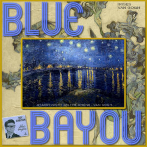
Here’s my Song Challenge – Blue Bayou as illustrated by Vincent Van Gogh. The alphas are cass-neon, I had the art in my files and I found the album on Google. I played with opacity and hue a lot. I was introduced to Roy Orbison’s music by my husband and I enthusiastically became a fan, too! 😉
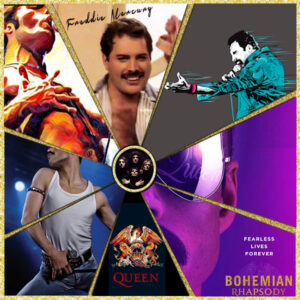
I felt sort of stuck for a topic for hobbies as I’ve illustrated almost all of them here already. I’ve done my cats and tropical fish, my wild birds and other wildlife. I finally decided to do my favorite music of all time, the iconic Freddie Mercury and Queen.
Template from cass; images I’ve collected through the years, background is gold glitter, round frame from Pixelscrappers.
Annie: The email I got from the Discovery Center had that webinar and also had about four separate videos to pursue re: PSP2022. I feel like they’ve explained all the new features so I’ll skip the webinar. Hopefully, you still have their email or can access their website.
Helen: I like your little signature strips. I see you’re using PSP2022. Have you noticed any differences from PSP2021?
Annie: Thanks for the reference. I went there and already downloaded two flocks of flying birds! I also use pngtree.com, in case you need more resources.
Annie: Glad you’re along for this ride! I’m hoping to get photos from my granddaughter, Jackie’s, wedding back on 6/11. I didn’t take any myself as there were photogs all over the place on the day. One of the few photos I have show me in that famous dress 😉 with my grandson, Tyler, brother of the Bride and part of the famous Flower Bro duo. (see below)
Christina: Especially glad to see you again as I’d heard there was flooding in your area and we hadn’t heard from you. Scary weather phenomena lately!! Climate Crisis for sure!
Annie: So nice to have a veggie garden and hens for eggs. In my first veggie garden I was overwhelmed with cucumbers! I never had hens but three gifted ducklings turned into good layers. We enjoyed duck eggs, larger and richer than chicken eggs. One thing I don’t follow. You said ” The hen is a tube from toppng.” What does that mean? Your layout is very pleasing!
Corrie: What beautiful lacework you created! I never did much in that line but my mother was big on crochet. Yes, thank goodness for digital graphics; a lot easier on these elderly fingers. While you are fixing Rembrandt’s name check the last line and fix the word “contemporary.”
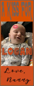
Trying out Cassel’s Word Frame 2 script. Logan is turning six months old on Aug 6. The script generated the orange frame at the top and I added the matching one at the bottom. The “kiss” is a tube, the top font is Farmhouse, his name is in Dingo Nursery and the sig is Emelyne.
Edit: I changed the last line; I knew something wasn’t right! 😉
-
This reply was modified 3 years, 5 months ago by
Ann Seeber.
-
This reply was modified 3 years, 5 months ago by
Ann Seeber.
-
This reply was modified 3 years, 5 months ago by
Ann Seeber.
Annie: I like your color palette on this design though I usually go for stronger colors. Since you asked for input, and after reading Sue’s comments, I have to chime in with my thoughts. I agree that the “gem” on the shell is invisible without a shadow; I didn’t even see it until Sue pointed it out! Also, a good idea to thread the ribbon through a hole in the top of the shell instead of the chain. My only other thought is the title looks a bit disjointed. I would push the word Artistry up closer to the word Seashell, but otherwise a rather pleasing design. If it were me, I’d be going back to fix things as I always want to “fiddle” with my designs. Good luck! 😉
Here’s my entry in the Scavenger Hunt: My granddaughter Jackie (newly married) working with Marshmallow, a baby African pygmy porcupine that she got to bring home over the weekend from Claws ‘N’ Paws Wild Animal Park in order to bottle feed it.
I got the thread from Pixelscrappers and the curved and shadowed frames were in PSP and came labeled sg-exuberance and I flood-filled them with blue denim texture. The tag upper right is torn. Jackie is wearing a pendant necklace I added. Finally, I added a scatter of stars. The headline text is Curlz and the labeling is Copperplate Gothic
-
This reply was modified 3 years, 5 months ago by
Ann Seeber.
The new Freebie Template generated this using photos from HViP. The background is a wallpaper made available for free from a collection labeled abstract on deviantart.com.
My latest creation: Kaaterskill Double Falls.
TITLE FONT: COPPERPLATE GOTHIC
TEXT FONT: BABILONIA
HOW I MADE THE TRANSPARENT FRAME AROUND THE TEXT:
(ON NEW LAYER) SELECTION/MODIFY/SELECT SELECTION/EFFECT:CHISEL/DESELECT/MAGIC WAND/INVERT/DELETE/EFFECT:DROP SHADOW
PHOTO FROM GOOGLE SEARCH USED AS BACKGROUND CHANGED TO SEPIA
KAATERSKILL TRAIL AND FALLS COLOR PHOTOS BY CHUCK CALIO AT HViP
RIVET/GROMMET IS A PICTURE TUBEEuka: You have posted some fine work. Somehow, I never associated camels with Australia but I will now. I do like the colors in your “Cousins” design. And that Broome sunset is spectacular. Good job!
-
This reply was modified 3 years, 4 months ago by
-
AuthorPosts


