Forum Replies Created
-
AuthorPosts
-
S = Severe illness (possible)
O = Over-the-counter medicines, such as acetaminophen (Tylenol)
L = Lockdown
J = Jobs lost
G = Get vaccinated!
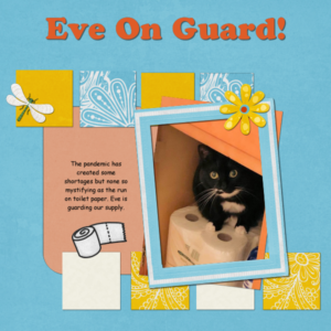
Reading today’s Campus Update, I remembered that I had documented the hoarding that took over our communities early in the pandemic. I used a little humor which I recalled seeing the layout entitled “Snot Funny” on the Update. Mine was “Eve on Guard” for our toilet paper stash.
yes! it worked here, also. Thanks, Carole!
testing image upload
ah, it worked this time! Hooray!
here’s my image
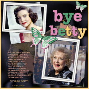
Working from the Basic Scrap Course, Module 1 – Here’s a bit of a tribute to the great Betty White who passed away on Friday in her sleep at the age of 99-3/4. Everyone thought she had at least 10 more years! RIP special lady! :’-(
-
This reply was modified 3 years ago by
Ann Seeber.
Rene, you might want to explore the Scrap by Numbers Master Class we had on doing graphics using statistics.
C = Cough
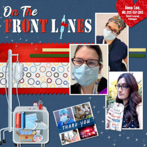
My granddaughter, Anna, is an SLP (Speech Language Pathologist) on the front lines at her hospital in California. She works with Covid-19 patients who are unable to speak or swallow after having a tube down their throats for weeks on end.
-
This reply was modified 3 years ago by
Ann Seeber.
Ooo! I’m FIRST! 😉
I’ve been wanting to illustrate a fun activity we have at our theater. Here’s the Mud Bog!
Helen: I often look at my designs the next day and make changes, even after posting here. Looking at yours, I think I might try adding another layer at the bottom, filling it with white and then reducing the opacity on the busy background paper so the text would show through better. Other than that, a handsome tribute to your parents!
Mary: Thank you for your compliments. The barn lower right is a piece of clip-art from a kit called Rustic Farm.
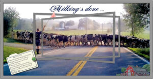
My turn: Well, I tried Sue’s triple frame technique. Not sure if I did it right but I’ve been itching to do something with this photo I’ve had forever. I took it through my windshield. My former town of Warwick has quite a few dairy farms and I think this shot is iconic. I had trouble with the Emboss brush. Didn’t get much texture from it.
Edit: Thinking about the heading, it’s not really correct. The herd is going out in the meadow for the day after milking.
-
This reply was modified 3 years ago by
Ann Seeber.
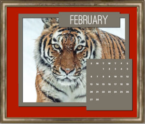
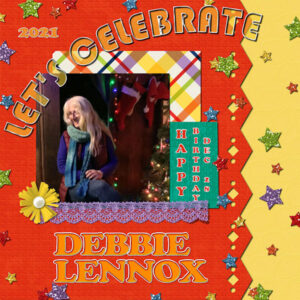
MoniqueN. – Handsome calendar; similar to my Downton Abbey. Glad I’m not the only one illustrating a media favorite. Carole send a new Quick Page, which I was glad to see had a mask for the photo insert. Looks much tidier to me. It was my daughter, Debbie’s, birthday yesterday so I did the Celebrate for her. I experimented with reproducing the font used on the QP header. It certainly is a colorful layout!
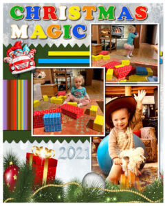
Theme: Christmas Toys. Here’s my great-grand Magic with some big Melissa & Doug cardboard blocks (I hear she knocks them down with glee!) and becoming a rodeo rider on her first rocking horse. Three photos from California and Colorado this year. I used a Christmas paper from CF while resurrecting an old busy bee design from one of Carole’s classes. The alpha is from Carole’s wooden puzzle.
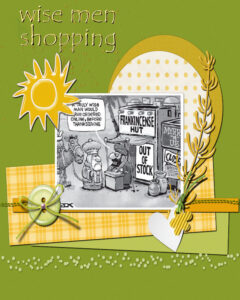
Having a little fun with a cartoon from the newspaper and a Quick Page. The font is Tempus Sans. I used my eraser a lot with this one instead of re-building as a template. Enjoy! 😀
I had this little humorous quote in my memories for today and I decided to play with a design to match. I knew I had the gnome silhouettes, and that’s what inspired me. Then I thought of the Christmas tree silhouettes I had just acquired so I laid out trees, quote and gnomes in an 8×10. The quote was on a black background, so I went with that for the whole thing. I made all the silhouettes into negative images, to show up against the black background. When I filled the background layer with black, I discovered the silhouettes and quote were not included, so I decided to fill with colors; green for the trees, red for the gnomes and white to border the quote. I finished off with a snowflake punch. 😀
I made a little something showcasing my heart-kitty, Eve, wearing one of Carole’s holiday hats. Creative Fabrica Christmas background paper, PSP frame, various embellishments. I’ve started building them as 2400×3000 so I can print on my desktop printer.
b
X = Xfinity (see illustration for proof that it is a real thing)
I took Carole’s DIY Snowman and created a Troll/Gnome. The background paper, which includes the greenery and the center frame is from CF this morning for $1.00. The overall frame was from my psp frames but I colored it with a gold gradient using the Color to Target brush. I found a clipart Leprechaun pipe and used a watercolor brush tip to make smoke. The word art and stylized tree were in my Christmas clip art collection. This was fun!
V = Victoria’s Secret (continuing Michele’s theme of underwear. 😉 )
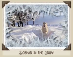
Corrected a typo in my IWs name. It should be Siobhan, of course! Duh!
My design for the Shopping challenge is also using the Palette for the frame.
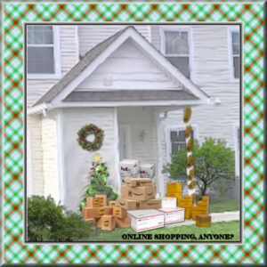
Here’s my house buried in boxes delivered by the various services in response to my online Christmas shopping. 😉
The frame is the December palette plaid, chiseled and buttonized. I also made a pattern from the palette and treated it to a kaleidoscope effect.
Yes, that’s really my house.
Carole Cassel: You could call them Seminars: Love Story Seminar, Magazine Layout Seminar, etc. An alternate might be Workshops: Love Story Workshop, Magazine Design Workshop, etc.
-
This reply was modified 3 years ago by
-
AuthorPosts


