Home of the Scrapbook Campus › Forums › Showroom › Wise Words Challenge 2020
- This topic has 326 replies, 36 voices, and was last updated 4 years, 7 months ago by
Cassel.
-
AuthorPosts
-
April 27, 2020 at 1:12 am #42186
This was an uphill battle fighting the text tool all the way through it. I did not end up following instructions, but did the best I could to achieve the end result.
April 27, 2020 at 8:15 am #42189Day 5
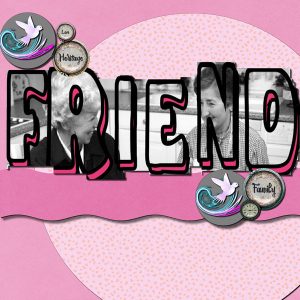
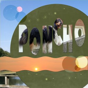
I used the template of Carole, and had a challenge to fill the letters with color and texture, because I always lost the color and texture afther each letter. But at last I had the result 🙂
April 27, 2020 at 8:48 am #42191Minka, I love what you have done with day 7. The whole thing is perfect.
April 27, 2020 at 10:59 am #42192It’s beautiful I love it. Great job.
April 27, 2020 at 12:01 pm #42194Not sure if anyone is still watching since it’s Day 8…
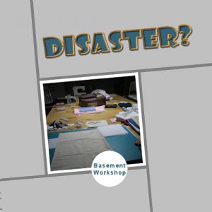
Here is my Day 6 submission. I kept it very basic to show the “rope” effect. The picture is of my sewing workspace in my basement. The table is supposed to be a pool table…who knew???
April 27, 2020 at 12:01 pm #42195First, I want to apologize for my semi absence. Health issues were kind of messing with my availabilities, but I am happy to see that everyone was still working hard on this challenge, so here is my long-due feedback on your projects.
Sue, you can definitely call yourself a scrapbooker (everyone else will!). I am sure I saw the third squirrel very clearly, but when I blinked, it looks like it went away! 🙂 I had thought of using the tutorial to show how to cut out the letters individually, and that would have worked too.
Jnet, les textures utilisés pour Picolo sont très efficaces! J’aime bien ton “out-of-bound” avec le chapeau de chef! Les papiers choisis pour le Bonne Fête sont tellement bien appropriés! Le problème avec le Ctrl-Y me surprend. Es-tu certaine que la dernière commande est “répétable”? Tu devrais peut-être mettre un raccourci en haut de la palette de calque. Ça sauverait encore plus de temps!
Minka, when you have ONE text object, the pattern or gradient will cover that whole object. Once you convert it to separate shapes, each one will take on the gradient or pattern as if it were alone, which explains why the edge got repeated. It is a bit surprising when you don’t know about it, but at the same time, it could be a fun feature to use in other times. If you ever want to look for some technique in particular, instead of going hours and hours on YouTube, drop me an email; there might already be such a tutorial in the Campus (if not, it will be a good time to add it!). glad the latest projects were faster to complete. Practice, practice. Your colorful layout about Florida is well done. Your Crew layout is delightful!
Bonnie, if you like the challenge, who knows? You might reuse the techniques in different ways for more projects! Afterall, everyone might need practice with some of those techniques. It is not always easy to get inspired for 7 days in a row. And it is ok. You might come back later with a new idea and you can tweak it or start over.
Lydia, your tiger project is nice and the quote is so current! I love the idea of using one photo multiple times with the different background colors.
Isabel, you say you had issues with the text on the curve. Can you expand on what kind of issues you were facing? I am happy to hear that you are learning something in every lesson. That is the whole goal! I really thought that the rope tube was a standard tube in PSP. Glad you found another one to use.
Marie-Claire, it is a gorgeous dog and you found a great way to present him to us!
Cyndi, that is such a creative way to showcase those photos and to use the different text techniques! When you tried to use the K for the Pick tool, is it possible that the image on the layer was just too big and then, the handles would simply be outside of the image margins? If that is the case, you can always grab the edge of the canvas and stretch it. Sometimes, it is just enough to see the handles and then grab them. It is a great practice to combine several techniques in one layout. I am not sure why you say that you could not return to a path after you resized the text. Wasn’t the Text still a vector? Maybe you could no longer convert to path because it was still a path?
Royanne, I think that a simpler background paper behind Sweetpea was the correct choice. A busier background would not have given the same result with the text on it. Good choice and I like how you try and tweak. That is the beauty of digital! Using the Vector Tube script to ONLY use the stroked layer is often a great way to display text. A fill is never required if it looks better when empty.
Alicia, it is fun to see how those separated letters got their own “gradient” instead of a single one for all the letters. Just like Minka had mentioned she observed. Are the cookies planned for Christmas? The colors used on the stroke would be perfect for that. Great CACTUS layout. Glad you get to practice more.
Dorothy, you are right: the text on path does not work well with multiline text! I wish it did, but so far, it doesn’t. I noticed that the photos you used are distorted. You have to make sure that when you resize a photo, you always use the Scale mode and use a corner handle. and NEVER try to “fit in the space”. Instead, “show what you can” and leave the rest out (just like you would if you had a printed photo to fit inside a frame). If you end up with a layout that you don’t “love”, it is ok. Keep it in .pspimage format, and maybe tomorrow or another day, something will stand out and you might find a way to tweak it to something new. The Gill font used does look like the one I have. I think it is a standard font in Windows. I am not 100% sure though.
Lynda, great California title. It really stands out. On the “best dog ever”, I would suggest that you add some shadows on the stroke around the title to give it more dimension. In the same way, the curly ribbon at the bottom could use some shadows. Do you know how to add shadows to curly ribbons? the Yohoho layout displays the photo very well. Good choice of font!
Trish, very colorful Mexico layout. The colors are perfect for the theme! Same for the Jester layout. You definitely love colors! It is great that you were able to “fit” everyone nicely in the letters in the WOW layout.
Vicki, too bad you don’t have that Text Wrapping feature in your version. If you ever upgrade, that is ONE definite feature that is worth it (I had been waiting for that feature for years!). That tribute to your uncle is fantastic! For the Canadian Cousin layout, you could have placed the text on two separate lines. That is one way to possibly feel less “cramped”. Or, you could have used ONE word with this technique and the other two words with regular text. The VectorTube never really had that step in the instructions about converting to path. In fact, I think I tweaked the original to include the Convert to path step in the script itself, but if anyone had the initial script, that step was needed. In order to fit everyone in a “word”, sometimes, you might need to choose either a thicker font or reduce the kerning so that there is less space between the letters. Of course, it might affect how legible the text is, but it is a bit of a trade off.
Annie, subtle and simple colors for a simple photo. Very effective.
Shirley, great fishing layout. Those little fishies are so cute on the bottom. The chain tube used around the HIDING looks good. Where will you use it now?
Cindy, Bruce seems comfy under that blanket! For the Tacos layout, I suspect you squished the photo a bit (you must have a headache now!) Remember to never “fit in the frame”.
Gerry, is that your dog? that little creature is quite small. Is that a crab?
Euka, that is a great photo to have taken of the lightening! Have you tried adding some shadows to your various papers and photo? As for the Materials palette, it is true that mine looks different. That is because I use the Classic Material palette. You can read this article where I explain how I have customized my workspace, in case you want to replicate it.
Jeanny, great photos of your grandson and the text on path is well done too. It is great that he is learning to sew that young! Good choice of colors on the Kiruna layout. It works very well with the rest of the layout.
Corrie, even with the given templates, it is quite ok to not use them, or use something different. Not every theme or photo would work well with what is given. You can also use a template from a previous day if it suits better. If you are not fan of larger patterns, you can always resize the paper down a bit, just enough to cover the area you need, so sometimes, it does yield a smaller pattern.
Annie, simple and great results on your Venice layout. Those templates can be time-savers, right? The Text confetti would use the text as an element in the size you start with, so is it possible you were starting with too large text in the beginning?
Leslie, that Masks layout is simple and effective. It might benefit from some shadowing on the paper elements.
April 27, 2020 at 12:11 pm #42197These projects are lovely to view!! Mine will be just practicing the skill Cassel showed us. I got behind. I downloaded a free image from the Internet to use as a background to off set my text. I tend to enjoy bright colors. I realize the edges of the image don’t align but I still wanted to practice the text on a path. For some reason, I think it’s fun to put text on paths.
April 27, 2020 at 1:37 pm #42199I have to say that it was a joy and still is to come here and see all the creative, lovely, and beautiful work posted. Congrats to Everyone, and thanks for the inspirations.
I couldn’t participate as I intended, but at least I was able to finish Day 1 today. I will work on the next tutorials in the following days.
I used Carole’s template. I love all the templates she offered in this challenge. Papers and the element are from DiHiller “My Tribe” Mar2020 PixelScrapper.
Carole, I want to thank you again for this challenge. I always learn a lot from every tutorial. I hope that everything is okay with you now. <3
April 27, 2020 at 1:50 pm #42201Day 7 Sorry I am a day or two behind. I had done one previously but I didn’t like it. Thank you so much Carole. In every lesson I learned something new. First chance I get I will join so I can learn about scrap booking.
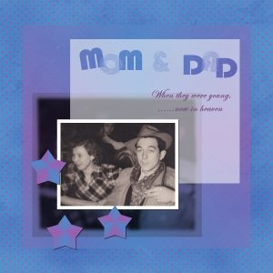
April 27, 2020 at 5:08 pm #42205I decided to try one more time on this day 7. What I did was make the title part on a separate image instead on top of the template. It does not look as distorted to me now. I feel much better about this challenge 🙂
It has been fun and at times a bit hard because a lot was o things I had not known before. I thank you, Cassel for that!
April 27, 2020 at 5:11 pm #42207This is day 6. I’m also a little behind but we had such lovely weather for april! It was a joy to be outside and be able to go for long walks or work a bit in our little patiogarden and have your coffees or meals there. Tomorrow the weather will change and we are getting (much needed) rain. So tomorrow hopefully the last project.
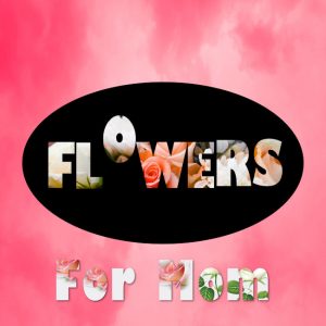
April 27, 2020 at 5:46 pm #42209Day 7 – I had such a hard time with this one. Yet everyone has done such a good job. I must have had a mental block ….. Maybe I should have moved my font a bit more ….. I started about 5 pages. I really wanted to do a jeeping one but I could not come up with anything. Then my mom, cause I thought mom was a small word and do something with it …. but again not happy with results. Then did a sunset, no good either. So my final result is ok but not overly pleased. I really enjoyed the challenge and look forward to the next one. Everyone take care and stay healthy and PLEASE keep inspiring me with your projects.
April 27, 2020 at 7:11 pm #42212Cristina, I love what you have done with this … delightfully simple and effective. Well done my friend. <3
April 27, 2020 at 7:13 pm #42213Corrie, this is a very pretty page. Well done my friend. <3
April 27, 2020 at 7:15 pm #42214Royanne, I think your end result is lovely, well done Hon!
April 27, 2020 at 7:28 pm #42215Mary, you nailed the text on a path … well done Hon!
April 27, 2020 at 7:36 pm #42216Cassel, thank you for these lessons they were delightful. I really enjoyed having to produce something everyday … perhaps indicative of our current times but I am a recluse anyway so it really does not impact on me. I think the challenge keeps the brain active and for that I am grateful. I do hope you are feeling much better and I look forward to any future challenges you may have for us. Stay safe and well my friend. <3
April 27, 2020 at 7:42 pm #42218Day 6
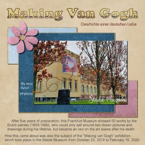
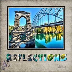
I learn a lot what is possible with text, i’m very happy ! Thanks Carole !April 27, 2020 at 8:51 pm #42220Day 7 reflections, fairly simple today, but I always think less is more if it tells the story. This is our local bridge, the remains of the old one still remain. The colours are always beautiful at this time of year. I only used the inner bevel effects on the photo and words.
April 27, 2020 at 8:55 pm #42221Thanks Carole, Yes these 2 were great buddies. I guess will probably run that vector script on the more projects again now that you have brought it back to my memory.
April 27, 2020 at 8:59 pm #42226Thank You Carole, your the Best Teacher.
Trying to catch up I do like puzzles, man templates are so hard but fun.
April 27, 2020 at 9:10 pm #42230Cassel –
Thank you for another fun and instructive challenge. As always, I learned a lot.
The pup in the Day 5 challenge is my dog, Lynda. She will be 13 in August. The picture was taken in 2009.
The little creature is what we call a “crawdad,” also known as a “crayfish.” They are lobster-like critters found in streams and creeks in the South – in my case, Alabama. Larger ones are Southern delicacies (or so I’m told!)
Thanks again and I wish you the best as you continue to mend.
April 27, 2020 at 9:57 pm #42232OK Carole, I made your suggested changes….I knew I forgot something. Not sure if I got the ribbon shadow right.
April 27, 2020 at 11:47 pm #42233I reckin I am difernt and try not to look at others work until the challenge is over. I started back on page one and made it through page six tonight. I am so impressed by what I have seen. Both the newbies and the old timers have outdone themselves in my minds eye.
You have all taken me to fantstic places and shown me things I never knew before. I have used an online translator and found some of you live in places my honey talks about, e.g. near Wiesbaden. He was stationed in Germany twice and often talked to me about the castle in the middle of the Rhine River. He said it was like a toll gate is here in the States to collect the taxes from the grape growers who floated their goods to market. I had him take a peek and he said. “that’s it”!
April 27, 2020 at 11:53 pm #42234As I said I only got thru pages 1 to 6 and truly enjoyed the trip.
Jnet, Lydia, Sue,Jackie,Minka (congrats on the new house), Isabel,Marie Claire (we share the same middle name),Royanne. Bonnie,Alicia, Annie (glad you aare doing better my friend),Shirley, Gerry (such attractive great nieces and nephews), Jeanny, Trish, Mars (I like golf too), Lynda, Royanne (What an apple picker you have:),Corrie (I love those cherry trees and this year they had a great bloomimg here), Alicia (Did you get to AZ when all the cactus were in bloom?), Jackie (Great tribute to your momma),Vicki (You made the coffee when I made the tea <grins>),Rita, (nice work on Greece), Shelia (Great pictures of Stonehedge), Euka, Leslie(Thank you for making masks and gowns), Bihg hugs foryou all for great works!!
April 28, 2020 at 9:36 am #42235Mary, it is quite ok to practice. It will make you feel a bit more comfortable with those tools and functions and steps.
Cristina, since there is no deadline, you can’t be “late” 🙂 Keep posting!
Isabel, we’ll be waiting for you inside the membership. There is SO much more content, lessons and classes to explore: you can be quarantined for another 6 months and won’t go through everything!
Dorothy, beware of the distorted photos. I see that the part that is in the title is correct, while the larger photo IS distorted. DO NOT “fit the image to the frame”. There is probably some parts of the photo that will be “cut off” on the edges, but that is NORMAL. HERE is the article on resizing correctly.
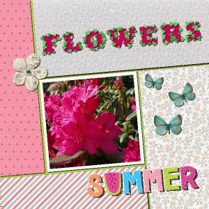
Corrie, for the outline using the leaves, if you see the element being unevenly spaced, and you want them even, you can change the setting for “Placement” when you select the tube, and change it from “Random” to “Continuous”. I love how you created the SUMMER word at the bottom!
Royanne, even if you master the technique, there is always a matter of matching the right word, the right font and the right photo, so it is not always easy to pull off. But at least, now that you know how to do it, if you come up with the right photo in the future, you will know one way to display it.
Annie, I am sure that although you liked to have your brain active during these days, for some, it might have been a little “torture” 😉 But it is all meant to be inspiring and informative.
Marie-Claire, usually, I would say that you could have added some shadows to separate all the papers, but in your case, the choice of the “papers” lends itself very well to the look of a magazine, where you rarely will see shadows. This is a good example of when something usual, is not always necessary.
Shirley, yes, sometimes less is more. But remember to add the details about the photo (source, date, etc.) when you can (and it is meaningful).
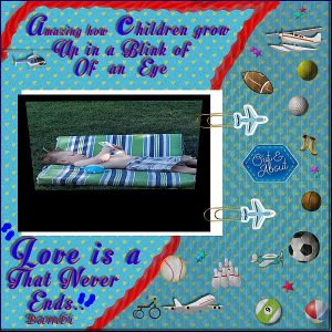
Cindy, that little man has been squished!! You know, all those little stickers on the right (and all over) could use a little shadow to show them as stickers, and even the paperclips too. Give them some volume!
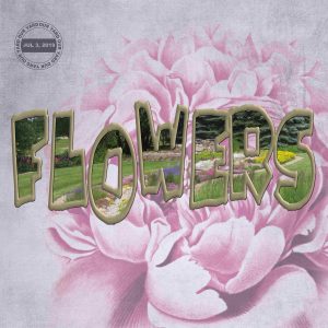
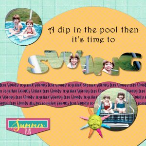
Gerry, good use of the picture in text. You managed to get the heads in the right place.
Lynda, for the curly ribbon, you might want to review the module 5 of the Basic Scrap Course. It has specific steps for that particular type of shadow.
And remember to fill out the survey!
April 28, 2020 at 10:40 am #42237Annie, thanks a lot for your kind comment, dear friend! <3
Carole, I will! 🙂
April 28, 2020 at 11:02 am #42240Hello everybody,
day 7I am sad the Challenge is finished. It whas fun to see all the work en ideas of everyone, also inspiring.
Thanks Carole for the lessons and the templates wich help me a lot ! also thank you for looking and comment our creations.
For this last work I just tried something using the effects, and had fun.When I look at it now on the forum I find there is something missing…maybe a litte text…
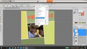
April 28, 2020 at 11:04 am #42242Day 6, I did not succeed, in the dropdown menu “script” I do not have a “vector tube”. I don’t get a border around the letters.
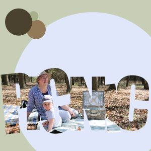
Day 7, it took me a long time to find the right photo and text with few letters.
it was fun!
April 28, 2020 at 11:10 am #42244Jeanny, did you download and install the VectorTube script? It does not come with PSP by default.
-
AuthorPosts
- The forum ‘Showroom’ is closed to new topics and replies.


