Home of the Scrapbook Campus › Forums › Showroom › What did you do (in November)?
- This topic has 65 replies, 8 voices, and was last updated 7 years ago by
Cristina.
-
AuthorPosts
-
November 3, 2017 at 7:45 pm #15643
Show off what you are working on in November, be it a scrapbook page, a tutorial, or anything else you want!
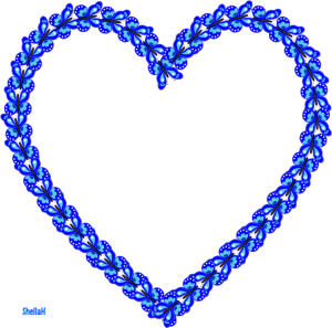
We are curious and want to see, and get inspired.November 7, 2017 at 5:22 am #15697I bought some more of Cassels Scripts and have been playing. I just love Butterflies of any colour and shape so Cassels Butterfly script was a must have for me. This is one I tinkered with after running the script by using a brush and adding additional colour and shapes. I then ran the Directional tube script (another fav) and created a Butterfly Heart frame. TFL.
Sheila xx
November 7, 2017 at 8:56 am #15699This PaperButterfly Script is lovely… A few tweaks like yours and the results are endless. You created a nice picture tube with this Directional Tube script… good idea!
November 7, 2017 at 9:21 am #15700I am so happy to see those butterflies tweaked and customized even more! that is what I had in mind too! Great use of a tool to make something else that will be unique to you!
November 7, 2017 at 11:09 am #15706Thank you Christina and Cassel. I have bought some lovely scripts from the store and haven’t played with them as much as I want to but I have some ideas for using them in my head when I get some quality time to do so.
Sheila xx
November 7, 2017 at 10:23 pm #15710Hello Sheila, you have created a nice butterfly with the script and extra tweaking…. great idea to make a frame and it is very pretty….. I have also purchased the script so will enjoy playing with it to see what results can be achieved ……… Best wishes to you,
Dawn.
November 9, 2017 at 11:32 am #15720Thank you Dawn. Here is what I did with the cloud script, I made Mr Snow. I vector drew his hat and scarf, used a few lighting tricks from Cassel and brush shapes for his features. I placed him on a photo from Pixabay and a plugin to make some snow. Hope you like him.
Sheila xx
November 10, 2017 at 1:49 pm #15723Sheila, you did a terrific job creating this snowman… And what an interesting plugin that creates snow. The whole page is lovely.
November 10, 2017 at 5:38 pm #15730Thank you Cristina, I glad you like him and of course the free image from Pixabay suits him so well.
Sheila x
November 10, 2017 at 5:54 pm #15731Hi Sheila! love your Mr Snow… a really great work creating him with the cloud script and the other elements for him to wear. the snowman looks great on the photo and it does suit him well. this page would make a great Christmas greeting card or email greeting.
Dawn.
November 11, 2017 at 7:05 am #15734Sheila, I LOVE what you did with the butterflies and Mr. Snow is just adorable. I’m going to have to get that Directional Tube Script.
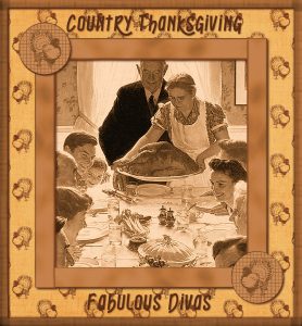
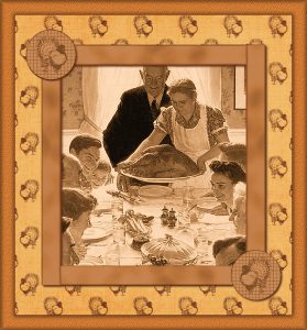
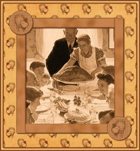
Yesterday’s theme for my FB gaming group was Country Thanksgiving. I immediately thought of Norman Rockwell’s famous Freedom From Want painting. The background came from Marisa Levin’s Thanksgiving Mini-Kit from Pixel Scrapper. I used the Sepia Toning Effect on the original colored Rockwell pic, then Adjusted the Vibrancy until I was satisfied it would blend well with the background. With a ribbon from Cassel’s Ribbon Factory, I used the Change to Target Brush to get the right color, but leave the subtle nuances of the ribbon’s texture. Cutting it to size, I duplicated it and placed the pieces to form the inner frame. I used a Merged copy of it so the 3D Drop Shadow Effect would give me the desired look. I used the round turkey flairs from Marisa’s Mini-Kit and added shadows to them, too. I was really going for a shadow box feel for the project and at that point, I was stumped as to what kind of frame to use for the outside. There weren’t any in my files that worked well. After playing around, I finally used a piece of the ribbon and resized it. I duplicated it, changed the angle on the duplicate to 90 degrees and lowered the opacity so the edges of both layers would show; then I Merged them into one. Using the Erase Tool, I made the Merged layer into a frame and, again, used the 3D Drop Show Effect. The font is Breathe that I purchased for $.90 in FontBundles’ monthly $1 sale.
Hope I didn’t bore you with all the details, but I learn so much when others explain how they got the results they did on their projects. If anyone has any suggestions as to how I could have achieved any of these steps in an easier way, I’m all ears. With the pressure of having to do my group’s pics in only an hour or two every night, I sometimes do things the hard way. It’s only afterwards that I find easier methods.
November 11, 2017 at 9:06 am #15735You created something really beautiful, and authentic looking. It really is lovely. To give more of a more 3D effect, with depth of field which is what I sometimes do, depending on the project. This is how I do it. First using the dropper tool select foreground (left click) and background (right click) colours from the image, one being slightly darker than the other. Go to image, add borders, choose 1 or 2 pixels, choose a colour not in your project. Using the magic wand, select your new border and flood fill with black. Go to selections and invert, go to effects 3D effects and cutout, set setting to what you desire, say 1 one or 2 pixels. For the colour choose one of the dropper colours you chose, preferably the background colour which should be slightly darker. (right click). To use the cutout effect, you have to have use a new layer. Repeat the cutout with a minus -1 or -2 on a new layer. Select none. Go to image, add borders, this time choose a much wider border, any colour other than black, magic wand, select border, edit, paste paste into selection, flood fill with the foreground colour, effects, texture effects, texture and choose a texture to your liking. Effects 3D effects inner bevel. Select none. I hope this makes sense, if not let me know and I’ll try to be more specific. I posted 2 framed projects in the making on the new facebook page, which will give you an idea on what the results are using the above techniques. you can repeat this process as many times as you want.
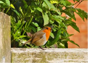
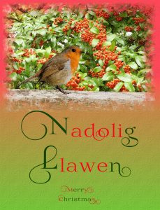
November 11, 2017 at 9:20 am #15738I made something different from one of the calendar Challenge pages last night. A front cover for a Christmas card for a member of my Welsh family. I took these pics when I was home last month. I extracted the robin and the top rail of the wooden gate it was perched on and placed them into a photo laiden with berries. I created some fine falling snow to give it that final touch, using cassel’s snow tutorial. I’m addicted to extracting objects, as they can be used over and over again.
November 11, 2017 at 3:37 pm #15741micfin and Sue, beautiful pages! I love to see all the techniques both of you used… and thanks for sharing how it was done… I learn a lot with you.
November 11, 2017 at 5:37 pm #15743Micfin and Sue your pages are really nice and I love Mr Snow Sheila. I also have the Directional Tuber script and it is so useful and saves a lot of time trying to make the tubes yourself. I also like the explanations of how you do things, there are different ways and it is always good to know someone else’s method, sometimes it is much easier. That is one of the good things about the forums, everyone is willing to share.
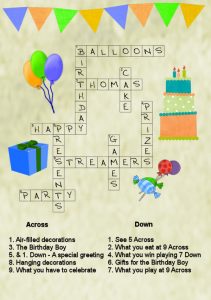
After watching the Word Art 2 Masterclass I remembered a card I had done for my Great-Nephew, who loved puzzles. The Alpha is Crossword Acrylic from Digital Scrapbooking Place, so I used Cassel’s Text Creator script for the across words and just aligned the others. Then I used a very small size font for the clue numbers – I must try using the superscript option for the text in PSP 2018. The other elements are from a mixture of birthday/celebration sets I have.
I am still working on using the Warp Mesh tool, but I am going away for a couple of weeks and won’t have much time to do anything.
November 11, 2017 at 8:36 pm #15777micfin and Sue , both of you have created lovely pages and thanks for sharing how you achieved your result. it is really great we can share in this way and we can learn different ideas from each other.
Marlene, a great idea for a card. enjoy your time away.
Dawn.
November 12, 2017 at 5:47 am #15782Thanks so much for the kind words, ladies. <3
Sue, that is a great pic of the robin. He’s so beautiful. I extract a lot, too, but I’m not very good at it in PSP so I use ClippingMagic.
Marlene, the card you made for your nephew is super fun.
Sue, I don’t think I followed your directions properly, but I ended up with a sweet beveled frame. I played around with the Inner Bevel settings and got a different look. I’m going to experiment more to see what kind of different effects I get. Thanks for your suggestions. Learn something knew every time I come here 😀
November 12, 2017 at 4:52 pm #15785Although the original is lovely the beveled frame you made is awesome, it gives the project that little extra finesse. You could add another two borders with different widths. Add a cutout using a plus and a minus to give extra shading for depth.
November 14, 2017 at 6:23 am #15795Thanks, Sue. I’ve already been playing around with it.
November 14, 2017 at 9:38 am #15798Marlene, nice idea for a card. This webinar was great… I have to watch again and try something too.
micfin, all three images are great, and my favorite is the beveled frame 2. That is the good thing in the Forum, Campus, and Store: we have tons of new things to experiment.
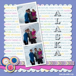
This is the layout I came up trying to practice the tutorials (Photobooth Frame, Arrow Ribbon, and Cutout Edge) from THE LAB 7-Module 11. I also added other techniques from previous modules… some of them I have already shown here before: Text Background Paper and Scallop Edge.
The font is Ellis with an Ice Texture that I found on the internet… I added a cutout effect to it. The elements are cass-LayeredFlowers freebie (Layered Flowers Script)… They are so cute!
November 14, 2017 at 11:01 pm #15800micfin, all 3 of your creations are really nice….the bevelled frames on the 2 pages above look really effective.
Cristina… a very nice page , love the colours and I love how your lab lessons turned out. very effective … I am also having a play with that Lab module. I especially like the cut out edge lesson and yours looks great!
best wishes to you both,
Dawn.
November 15, 2017 at 7:28 am #15802Hi Dawn! Thanks! I like the Lab very much…It has tutorials, different layouts to get inspired, templates, fonts… For my needs at the moment, it is perfect.
November 16, 2017 at 8:01 am #15805Cristina, your Alaska page is lovely. I love the colors and the scalloped edges are fabulous. I always click on the pics to enlarge them so I can see the details.
Thanks April and Cristina. I liked the beveled effect. Thanks to Sue, I’m getting the hang of it. I changed it up a bit in today’s group pic. I used the Outer Bevel instead of the Inner Bevel. I was very happy with the result.
Wish I could afford the Lab or Diamond membership, but I learn a lot from you ladies and it’s really appreciated.
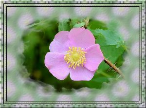
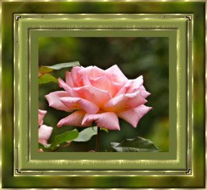
November 16, 2017 at 9:30 am #15808What a really lovely page you made. Experiment with the different bevels, to achieve different effects. I used bevel #10 for the gold frame. These are pages I made quite some time ago,
To achieve the rose photo to come through into the frame, Image , add borders, select a colour not in the photo. Save project as a PSP. Open the original photo, copy and paste into the project you are working on. Change the background layer to a raster. Magic wand, select new border. Edit, paste, paste into selection. Here I chose the weave texture. Effects, 3D effects, bevel 2. Settings depend on the size of your project. Selections, select none.
November 16, 2017 at 2:05 pm #15809micfin, your page is really lovely and the photo and colours are just beautiful. I always click on pics to enlarge them to.. as it gives a better viewing. the forum is a great place to share with each other our ideas and techniques of how we do our projects.
Sue your projects are lovely also, the texture in the background photo of your rose is very effective. thanks for sharing your tips on how you have achieved your result. as I have said this is a great place to learn from each other.
well done ladies,
best wishes,
Dawn.
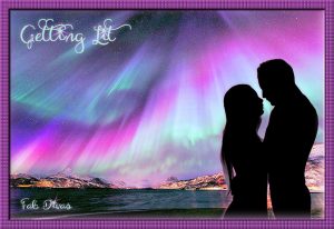
November 16, 2017 at 6:03 pm #15812micfin, thank you! I also enlarge the photos, because I love to see the techniques and details. Everyone has a different style and I think this is what is great here. I learn with all of you….Your new layout is beautiful! I love the colors, the cute font, the frame, background, the silhouette… great job.
Sue, your layouts are lovely! I like very much the frames you created and thank you for explaining how you did. I have to try to make them.
November 17, 2017 at 8:27 am #15818Now I’m going to have to use time I was keeping to do something practical so I can try your new suggestions, Sue. I’m so disappointed…NOT. I’d rather do this than pretty much anything else. Thanks for the suggestions.
Thanks so much, April and Christina. I’m glad you liked my project. I have a thing for the Aurora Borealis. The colors in this particular picture I found were just astoundingly gorgeous. They really inspired me.
Just a little additional info: I used the shape tool to make the stars for the dots over the “i’s” in the text. Then I used Corel ParticleShop Plugin to create the little flares to put under the stars. The font is Heavenfield, another one that I picked up during a $1 FontsBundles deal.
November 17, 2017 at 6:53 pm #15823I shall make this my last framed page to post. I’m always happy to share what knowledge I have. I’m always learning from others. This is the gold fill pattern I made and used in this rose frame, feel free to download it and add it to your Patterns folder in PSP. Go to documents, Corel folder, open the PSP program that you are using, and paste it into the patterns folder. I love all the work submitted. Like you I too open the pages to have a closer look, and make note of details added, and learn from them. Great work girls!
November 18, 2017 at 6:41 am #15826Hi Sue, a very nice framed rose project. roses are such a beautiful flower.
Dawn.
November 18, 2017 at 7:23 am #15827It’s so lovely the way you framed it. I’m going to keep practicing until I can get to that level. I like how you challenge me.
-
AuthorPosts
- The forum ‘Showroom’ is closed to new topics and replies.


