Home of the Scrapbook Campus › Forums › Showroom › Template Workshop 2022
Tagged: Template Workshop 2
- This topic has 406 replies, 43 voices, and was last updated 11 months, 1 week ago by
Cassel.
-
AuthorPosts
-
March 25, 2022 at 9:38 am #74141
Mask day 4 /600
March 25, 2022 at 10:58 am #74143TEMPLATE-DAY 4 – Hudson River Watercraft. All photos by Chuck Calio on The Hudson Valley in Pictures.
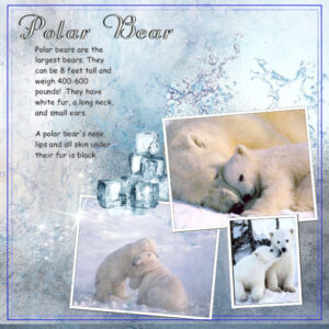
March 25, 2022 at 11:40 am #74148OMG! Trish, so cute. Have you seen the show ARCTIC VETS? It’s a Canadian Show about veterinarians and keepers at the Assiniboine Park Conservancy in Winnipeg, Manitoba. It has lots of polar bears featured and they have an exhibit where you go through a glass type tunnel in the pool that the polar bears are swimming in. It’s a dream of my hubby and me to go there.
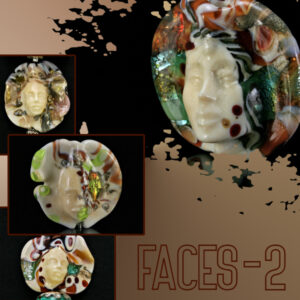
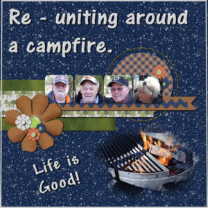
here is my Day 4 layouts. I didn’t add drop shadows because they didn’t really show up and really looked weird on the Font (Lover Brooks Sans Outline from CF). I liked the frame technique. I really like the Clip to It. I will have to go back to the long way after the workshop until I can do the steps as fast as the script (hahaha, I’m obviously wearing my “rose-colored-glasses” again). I did add frames to the Faces-2 smaller photo’s to separate them a bit.
-
This reply was modified 2 years, 9 months ago by
Susan Ewart. Reason: missed a word, I blame the rose-colored-glasses!
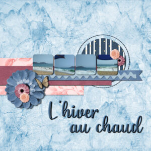
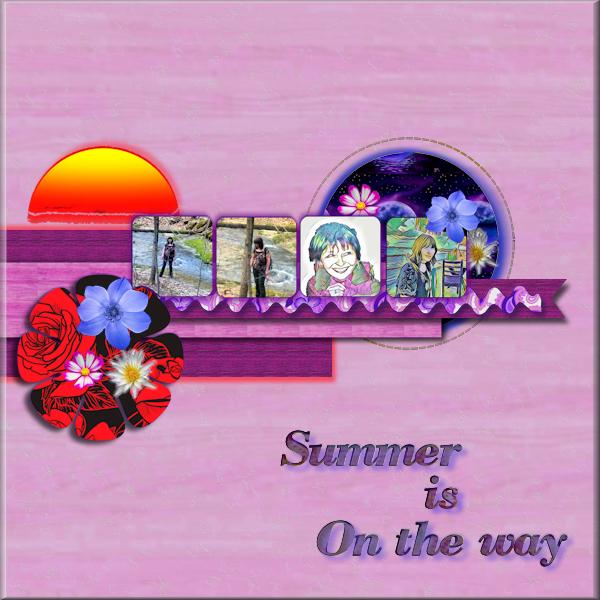
March 25, 2022 at 1:10 pm #74155Day 5 project, I chose to recognize that summer is on the way 🙂 Hope you like it. I maybe should have used the sun in the circle, but….
 March 25, 2022 at 1:11 pm #74157
Day 5
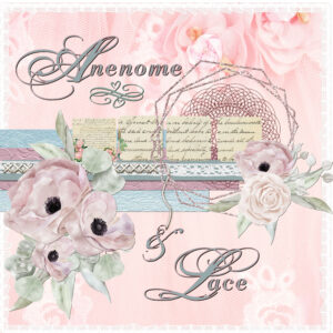
I love the fact that your script puts the elements in the right place. Before I had to search for the layer, now just click on the element and the script does the rest. I used Angelhaze’s part of the Digital Scrapbook train blog from March 2022
March 25, 2022 at 1:34 pm #74159Susan have you been watching the Game of Thrones, your faces reminds me of that Thank you for your comment.
Mask 5 TemplateMarch 25, 2022 at 2:43 pm #74165I had some things come up this week and just now caught up on watching the videos. I ended up ordering a new computer on Monday but it won’t be here for several weeks. Once it is, the scrapping shall begin again!
Just wanted to comment on lesson 5. I scrap with templates all the time and they all have placeholders. Like Carole showed, just because a flower is shown it doesn’t have to be used. In the past I might have used stars or hearts instead or not use anything at all. The one thing I did learn early in my scrapping that was when applying shadows, to start with the bottom layer and work your way up the layer palette. Quite often if I have a stack of papers in varying sizes, it won’t look right with the same shadow on every layer. Because as you go higher in the layers, you would be going farther away from the background paper if you were actually using paper. By starting the shadowing at the bottom, I can see how each layer will look as I go up the palette and adjust when needed. I also tend to do lots of clustering (say over 5 elements in a cluster) and the top element of that cluster is farther away from the background especially if there is some depth to the elements below it. I also have drop shadow presets set up for my most used settings and it is just a matter of selecting which preset to use although I do sometimes adjust.
I have the open as layer script but never use it. I have 2 monitors and use a program where I can see all my supplies much easier than windows explorer. This program is open all the time when I scrap so I just drag and drop my chosen paper/element right into the layer palette (works with windows explorer as well) and the name of the paper/element shows as the layer name. I’ll just say I don’t like using the open command in PSP to find stuff. I have over 3000 folders with items to use in them (collected over a period of 14 years).
I do not have the clip to it script and don’t plan on getting it at this time. Let’s just say, I have a process down that works for me quite well.
I do like learning little things like changing the color on stitching in this lesson. I usually delete a stitching layer in a template because I never liked how it looked. Learning this will be something I can try in the future and I might learn to love stitching!
March 25, 2022 at 4:09 pm #74170Carole thank you for reminding me that there is a blogpost about writing on 2 surfaces. Sometime ago we had a weekly challenge about this topic and I downloaded the tutorial but I simply have forgotten it….. I’ll change my page!
March 25, 2022 at 4:12 pm #74171Trish I like your day 5 and may copy your idea not to use the squares for photos, because my photos most certainly do not fit those little squares and I want to continue my story about the balloon.
March 25, 2022 at 4:18 pm #74173Lesson 4 Template: Something went wrong with the shadow and white frame on the large framed photo. But by that point, I was past caring. I wanted to do the steps and correct as much as possible as I went along, but by then I was too weary to try and fix that. Also, forgot to blur the masked photo to soften the edges.
I am SO happy with the two scripts: Open rename & Clip To It. I’m glad Carole made me go through the l-o-n-g version of doing those steps so I would REALLY appreciate the shortcuts!
I do foster dogs. The one in lower right is a long-term one (with me still). The two in the frames in the centre found a new home together. And the wee girl in the mask crossed the Rainbow Bridge after two years here. I always get the older dogs, usually with some health issues, but that’s the point. I want them to spend their remaining time in comfort and be spoiled.
Question: If I save the “page border” layer from this template, can I use it again in other projects? I’ve often wondered how to create that effect, with a thin border. The double border is even better as an option.
March 25, 2022 at 4:24 pm #74175Day 5 I didn’t add shadow to the ric rac because I had already accidentally included it with a merge. I thought about going back to the original template and doing a copy paste of the original right over my project . . . but I didn’t . . . but I could have . . . but I didn’t! LOL!! Also, pretty sure this is my first upload of this project. Yesterday, I inadvertently uploaded a project twice. I look forward to each day’s new tutorial, and I know come next Monday morning, I will be having withdrawals without a new template to work on!
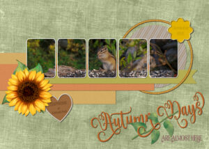
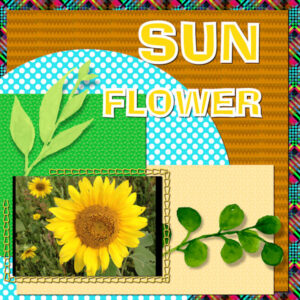
March 25, 2022 at 4:42 pm #74177Day 5. I had this photo earmarked for this workshop. I was keeping my fingers crossed that I would have a chance to use it. I’m sorry Carole, as you can see I made some adjustments to accommodate the photo. I also resized the whole page to 8×10 inches. Carole’s seed bead picture tube, custom brad script. The sunflower and leaves are from creative fabrica. Papers are my own. Background paper has an overlay, the striped paper is what I created for one of my 13 lined ground squirrel projects.
Carole, thank you for your very complimentary comment on day 4’s page. The corner font is my go to font for creating those type of frames. If I’m not mistaken, I sent you that font.
Chipmunk feasting on sunflower seeds.
March 25, 2022 at 4:52 pm #74178Julie, you can save the border you created, providing you created it on it’s own layer. By copying and pasting it as a new image. Personally I don’t do that. They are so easy to create, plus, it will depend on whether you want a rectangle or a square, wider or narrower between each frame, depending on your project.
March 25, 2022 at 4:54 pm #74180Template from Fiddlesticks
March 25, 2022 at 5:11 pm #74181Thats fine Corrie, mine was just one sheet across the whole boxes as I can’t find a good picture that fitted, Looks like Sue just did the same, dont know how carole managed it on her one. Are you into Balloons, my cousin lives in the wine area in California where they have balloons take off and fill the sky , lovely with the light all aglow can,t remember the name but it being with a T. I have a picture of it, Ill see if I can find it.
March 25, 2022 at 5:39 pm #74183I can hear the alligators already and it’s not even April yet. I guess they don’t pay attention to the calendar. I am mindful about walking in the dark!!! An alligator can probably outrun me for about twenty/thirty feet. I took a few liberties again with the template and I would like to go back and redo the little boxed pictures … but I am all out of time for today so won’t get to it until some time over the weekend. I played with making the picture the entire background and then altering it a bit. I made the alligator ric rack with Carole’s easy-peasy ric rack maker script. I guess it will have to stand for today. It’s fun to make something, then sit back and decide how to redo a portion for perhaps a better effect. The alligator signs are all up at my condo complex around the pond. It always surprises me how little attention the VRBO folks pay attention to them while they walk their little pets not eight to ten feet from the waters edge. Coming home from there to my house the other day there was a ten footer just laying right beside the road! I thought perhaps he had been hit, but no, he walked right across the road. These are the months, they are on the move lookin’ for luv! And they are noisy about it! Have a nice weekend everyone.
March 25, 2022 at 5:47 pm #74185Awesome results everyone.
Attached is my result for Day 5 using the template provided and backgrounds and elements from kits by Marisa Lerin relating to Travel together with flowers from a kit by Gina Jones called My Tribe both at DigitalScrapBook.
Font used for title – Bodoni MT Black
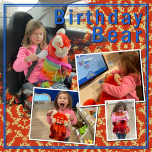
March 25, 2022 at 6:32 pm #74188My day 4 project. My granddaughter, Kari, got a birthday gift of a bear from the Build-A-Bear shop. She chose the red bear from the movie Turning Red.
March 25, 2022 at 7:59 pm #74189Corrie. I had to change the squares to rectangles, in order to make the photo fit.
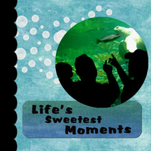
March 25, 2022 at 9:34 pm #74192Any suggestions welcome….I really wanted to use the black scallop edge but wasn’t sure about creating the shadow(I did my best). I also wasn’t sure If I needed to apply shadow to text in the bottom frame? I’ve really been been enjoying the awesome work that has been posted!
March 25, 2022 at 9:41 pm #74193I pulled elements from a bunch of different kits and, honestly, after going back and forth so many times I couldn’t tell you which ones finally were used.
River is my older cat, but only by three weeks. Still, she is always quick to remind Rudy that he is the baby of the family and he has to do whatever she says because she is the oldest. My world gets complicated sometimes.
March 25, 2022 at 9:48 pm #74195March 25, 2022 at 11:01 pm #74197Pirkko (#74120) did you modify the irregular shape to accommodate your photo? If so, that is a great adjustment for a great effect.
Fiona (#74134) sometimes, those white frames are a bit hard to identify and match with the correct photo. It has happened to me too.
Euka (#74136) that is quite a colorful page!
Trish (#74139) thanks for letting me know. Those droplets looked really good. (#74141) Who would have thought that the polar bear’s skin was black? (#74159) That is a very soft layout with subtle patterns.
Ann S (#74143) those added little arrows are great ways to add details.
Susan (#74148) although a shadow would not show much because of the dark background, it would still show on some areas, like where the photos are overlapping, and for the frame, on the top left of the page. Of course, on the title, it would not show at all.
Hank (#74155) it is a great idea to show the sun as setting behind those papers! You might want to review your shadows: they are in different directions (like the patterned flower and the ribbons for example).
Jnet (#74157) the script will put the layers just above the one that you have activated, so if you choose the right one to start, it will be added correctly. Otherwise, you might still be searching for it!
Rene (#74165) somehow, I did expect you to have your own process as you are already a veteran scrapbooker! If you ever change your mind, you at least know where those tools are. And yes, when you have two monitors, that would definitely work out faster.
Julie (#74173) of course, I had to show you the loooong way to make you appreciate the shortcuts! In fact, the long way can still be useful in some situations where the script would not work well (you will see in Lesson 6). As Sue has replied, yes you can save the frame separately; simply copy and paste it as a new image, and save it as a png format. But with some practice, you won’t need to save them as you will just create them in a few seconds.
Joyce (#74175) although you didn’t “fix” that error, you know how to do it, so that is a win, don’t you think? After the workshop is over, you can always go back to DigitalScrapbook.com and download other layered templates to continue!
Sue (#74177) I guess using all the photo spots for a single photo is a great way to complete the project faster (but of course, it is not cheating if the photo calls for it!).
Minka (#74183) the fact that you rotated the template got me confused! LOL Your shadows are a bit wide and blurred. I also suspect they are in a different direction than I would expect; I see them toward the top right instead of the bottom right. Also, they would need to be smaller and more defined especially for elements that are flat against the background like the stitching. Because you have photos over photos, you might want to consider cheating a bit by using some reverse shadows on the tiny ones in the middle. You can read about that in this post.
Lois (#74185) thank you for making us travel with you.
Marvin (#74188) such a fun page to showcase a happy event (and a cute little girl!)
Nancy (#74192) by adding a shadow, whether your element is black or not, the blur will give the desired effect. For the title, it is up to you to decide if you want the letters cut out of paper, or printed. Both would work.
Gerry (#74193) I guess you will have to make a matching page for Rudy!
Randy (#74195) great work!!! Your shadows are all very consistent!
Keep it up. Only two days left!
March 25, 2022 at 11:37 pm #74198Beautiful work, Everyone. I am experiencing a little computer trouble. I have today’s templates almost completed but PSP is so slow and keeps freezing. Tomorrow I am going to uninstall and reinstall so I can complete those templates and continue the workshop.
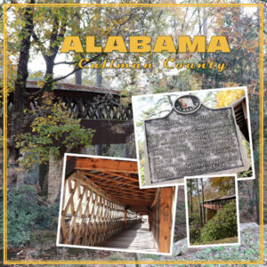
March 26, 2022 at 12:13 am #74203I can’t believe it’s almost midnight! Well, as you know I’m behind and only on day 4. I finally finished the layout. Had to watch the video multiple times for how to do that page border. Really interesting way to do it! I didn’t do the blur on the main picture, but that does work. Well, all the pictures are mine – no elements. Not sure what fonts I used. I think I’m going to use more of this Alabama trip for the Diamond layout.
March 26, 2022 at 12:25 am #74204(#74159) Trish. I haven’t been watching. Now I am intrigued. I will ask my husband as he watched the show and read the books years ago. I love fantasy, but not if there is too much drama, I like adventure so I never got into Game of Thrones (I tried).
My internet and computer is acting weird today so I’m posting before I lose it. I used Digital Scrapbook papers and elements for both layouts and the same font (Magdala Script – it has lots of glyphs). The layout called Metal and Glass has some issue’s. I see the far left frame is thinner than the other ones, I don’t know what happened there, but I did have a weird lag in the computer at that time. I didn’t shadow the title either, it looked weird and I’m going to pretend it was done with ink. I turned the layout 90 degrees to get portrait type layout for the photos. Photo’s are mine, glass/jewelry is Melanie Rowe.
A question for Rene. When you said you changed the shadows because as you go up the layers the papers would be farther from the base. Do you base the shadowing on it’s relative nearness to the paper directly below it or to the very bottom layer (further away). I was wondering because a paper layered on another paper (even several layers up) would be the same distance to the paper right below it as the first paper up from the base would be to the base. Does this makes sense. I like to hear about how people tackle shadows and make note of their techniques.
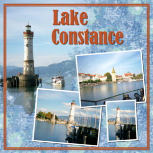
March 26, 2022 at 12:38 am #74206Here is my Template Day-4:I had a lot of trouble with the the text tool and finally finished it. It seems that all of a sudden my PSP started acting up and whenever I started to write the text as a vector it turned it into a group and placed a text layer underneath the vector layer. Even when I just added a vector layer it formed a group. I worked around it and hope someone will have a suggestion for that. I used the background paper from the tutorial (Rachel Martin) and used Hue and Saturation to blend well with my pictures. I took those many years ago when I visited my cousins in Germany and we went for a drive to the beautiful Lake Constance in the city of Lindau. Lake Constance (known as Bodensee in German) is a 63km-long central European lake that borders Germany, Austria and Switzerland and it is fed by the Rhine River.It is composed of 2 connected parts, the Untersee (lower lake) and the larger Obersee (upper lake). Ringed by resort towns, it’s a summer destination for sailing, windsurfing and swimming. The Bodensee-Radweg cycle path encircles the entire lake in about 260km.
March 26, 2022 at 2:52 am #74208IT’s now nearly 2am. I did finish the diamond layout and did use the pictures at the campground when we visited Alabama in 2020. So nothing new – just copied the title and page frame from the first one since these 2 layouts go together!
March 26, 2022 at 3:53 am #74209Anonymous
- 335

- Enthusiast
Carole: Did you mean the paw prints… yes, I copied them and pasted on background paper (mirrored first and scaled too)
March 26, 2022 at 3:58 am #74210Regarding Vector layers: I just figured it out and found it has always done that. When I added a vector layer it puts the small arrow on the left side of the layer palette just like with a group. I just never paid attention to it and now with closing groups and merging groups I started to notice the little arrows. I could have saved myself a lot of time if I had thought about it and looked at my earlier projects. Guess I was just getting very tired and it looked odd to me. Will get a fresh start tomorrow with Templates Day 5. Everyone’s projects here look very beautiful.
-
This reply was modified 2 years, 9 months ago by
-
AuthorPosts
- The forum ‘Showroom’ is closed to new topics and replies.


