Home of the Scrapbook Campus › Forums › Showroom › Scrap Bootcamp – July 2022
Tagged: project 4
- This topic has 228 replies, 29 voices, and was last updated 2 years, 4 months ago by
Nancy McNamara.
-
AuthorPosts
-
July 22, 2022 at 9:26 pm #79834
Anonymous
- 335

- Enthusiast
my result for Day 11 – Project 5
the dog is from here: https://unsplash.com/photos/pM6Pm0juZlM
July 22, 2022 at 11:12 pm #79835Harmony (#79792), that is a very dramatic black and white photo and well showcased.
Sharla (#79806), it is totally fine to rotate the page idea when it fits the photo better. Good work. (#79821), That is a great background. Was it a ready-made paper or did you do it yourself?
Donna (#79808), I am glad you enjoy the bootcamp. And yes, even though the projects are “scrapbook-based”, the same tools and techniques can be used in so many other types of projects! I look forward to seeing some of your cards, in the What are you working on? thread!
Hank (#79810), did you merge the photo and the frame before adding the shadow? That is what it looks like and that makes the shadow look odd as it shows on the bottom right of the frame, but not on the top right. Do you see that?
Gerry (#79813), interesting twist when using the overlapping/interlacing frame/photo! Great effect. (#79824) I think the one with the shadow is just right. You SEE the shadow when you really look for it, but it is not “in your face” to make you wonder why there is thickness. That is when the experience with shadows are becoming very useful.
Jannette (#79818), this seems quite frustrating. If more than one version of PSP is giving you issues, maybe it is not a PSP issue. Are you having problems with other programs or ONLY PSP? beautiful page!
Andrew (#79828), may I suggest that you have some sharp (not blurred) edges for your papers? It will just make things easier to shadow. Did you add that blurred edge on purpose?
Joyce (#79831), beautiful page. Your shadows are right on point!
Pirkko (#79834), great work. I see you used the interlacing/overlapping technique with the rope. Good place to use it!
Keep them coming. If you started late, you still have time to catch up to be entered in the draw on Monday night.
July 22, 2022 at 11:21 pm #79837Getting caught up! Day 5; project 2.
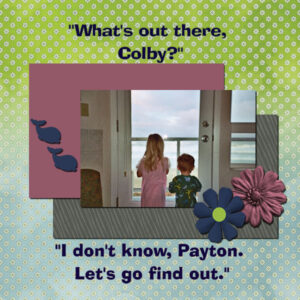
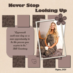
Granddaughter Payton and Grandson Colby at the Oregon Coast, 2004.
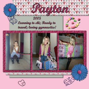
July 23, 2022 at 1:58 am #79844Day 7, project 3. So sorry. I forgot to resize before uploading.
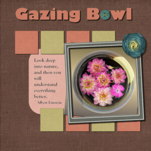
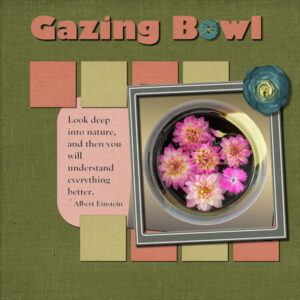
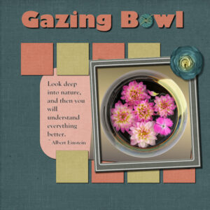
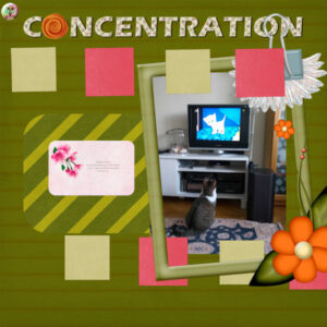
July 23, 2022 at 2:25 am #79848Day 11 Project 5. I have three different backgrounds. I had worked through the layout with the green background and when I was adding shadows I turned on the blue one and thought hey, I like this one better. Same with the red one. then I just couldn’t decide. I don’t normally choose papers from the same kit and this time I did, even the flower and frame. although the flower looks like a blue cabbage. They are from Digital Scrapbook (Gina Jones “my everyday” July 2021). The title font is Gills Sans Ultra Bold and I think the journaling is Gloucester, both windows fonts. Photo is mine from my Gazing Bowl series that I extracted and put on a gradient background. You can see I have journaling text this time. And yes, I had the same error where it wont save. always right after I’ve used the selection tool and put text inside the box. So I hit undo, made the selection and put my text inside and then converted it to a raster and it would save. I must’ve gotten the only PSP 2022 lemon. I think I’ll go back to 2021 and see how it performs. Thankfully I have never had the saving error message on the title vectors.
Carole you have eagle eyes. Yes, I see I did something wrong on the shadows of that big picture. I’ll fix that up tomorrow.
July 23, 2022 at 5:26 am #79849Susan Ewart: I vote for the red one! 😉 I had a thought about text bounding boxes: it’s a feature that is not supported by Photoshop so I’m wondering if there’s a connection there?? (just speculating…)
July 23, 2022 at 1:25 pm #79867That’s cool Ann, I had originally started out with the red one, then abandoned it and went with the green one. I still had the three papers in my layers palette, with two hidden. What a surprise when I tried them out. I’m leaning to the blue first, then the red and lastly the green one. It’s also the first time I did an adjustment layer ever. I’m going to watch the master class on Adjustment layers and learn more.
I’m not sure what a “bounding box” is. I’ll add that to the list for the next Q&A. Or is it just what the selection box is called. I’ve had weird messages pop about about a bounding box and I have no clue what it meant. So much more to learn. Keep speculating please, I don’t want to have to abandon PSP 2022 and go back to 2021. I am presuming it’s operator error, but I don’t know enough to know what the error is that I’m making. ? I am going to try doing some tests, I haven’t tried adding text without using the selection box (I just love doing it that way).
July 23, 2022 at 1:39 pm #79868Susan: It’s probably not you. Even Carole admits that placing text within the selection can be tricky. I think it’s a relatively new feature and may not be totally de-bugged yet. I do know that you can totally lose journaling text if you haven’t made a raster duplicate. It’s the vectors that seem to be the problem. And yes, I said bounding box meaning the selection area. I don’t know where I got that term from … :-\
July 23, 2022 at 2:55 pm #79869Susan and Ann, I’m going to step into this conversation and give my 2 penneth worth of using the selection tool to add text, whether it is to type your own text, or to copy and paste. You can only copy and paste text from an outside source into a selection. Which will allow you to edit it, (with limitations) Even if you type your own text in a selection it has MANY limitations. Using the selection tool for text has been available for several year. Certainly 6yrs. I will say that on the odd occasion I have used the selection tool, I haven’t encountered any issue
Personally I don’t use the selection tool with text. For a shape I will use the vector shape tool, or create my own, and convert to a raster, otherwise having 2 vectors in play can be awkward, when using the text tool. I use all the tools available in the text tool bar. Align, justify, sometimes. What I use the most are the offset, leading and kerning etc. Guides too. It may take a little longer, but the end result is better than using the selection tool.
July 23, 2022 at 2:58 pm #79872Anonymous
- 335

- Enthusiast
Joyce – #79837 This is absolutely gorgeous
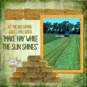
July 23, 2022 at 2:58 pm #79873Day 11, Project 5. Not feeling very creative with this lesson. Did 2 because I couldn’t decide which to use, so submitting both (NOT for brownie points!!). hehe
July 23, 2022 at 3:14 pm #79874Thank you Sue! Your experience is greatly appreciated. I did not know having two vectors in play would have problems, which goes back to I don’t know what I don’t know. Thankfully you do know. I didn’t know there was limitations and it explains a lot. That’s makes me feel better about it. If I know there is limitations then I can find a work- around like what you have done. I’m glad you jumped in to help get me straightened out.
July 23, 2022 at 3:33 pm #79875Susan, changing the shape to a raster just makes it easier to be creative with the text tool.
July 23, 2022 at 4:22 pm #79877DAY 11-Project 5
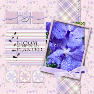
Here’s my Vanda orchid project. I used scrapbooking materials from “Free Digital Scrapbooking” and “Digital Freebies”, 2 old scrap kits in my collection. I incorporated what I learned from the video and am still fascinated with the zig-zag paper cut edge—very cool! I thank you for sharing your PSP knowledge, Cassel, with us. I love learning new tricks, Karen
July 23, 2022 at 5:16 pm #79878Karen, that’s so pretty.
July 23, 2022 at 9:07 pm #79888Thank you, Pirkko!
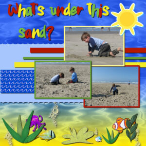
July 23, 2022 at 9:09 pm #79890Day 9. Colby & Riley on the Oregon Coast, 2006.
July 24, 2022 at 12:20 am #79906Joyce (#79837) the colors you picked matched very well the photo you are showcasing. (#79844) Good use of the glitters. I see you sized the photos without any distortion. Good work. (#79890) I see you used the round brush tip for the “pinking edges” which turned out to make waves. Very fitting for the theme of the project!
Susan E (#79848), isn’t it interesting how different background colors can be just as nice, yet give a different result. I would also have a hard time picking only one! Your mention of not saving when you use the wrapped text makes me wonder if you have set the Compatibility mode to a previous version than 2022?? If you do get odd warning messages, take a screenshot and ask. Sometimes, it could be something simple to address.
Ann (#79849), you can surely add that question for our Q&A. Others would likely want a demonstration of the answer! And maybe something else can cover the text wrapping too.
Sue (#79869), I tend to prefer to use the Selection instead of the vector because it offers more flexibility. However, yes, there are some particularities with that tool.
Susan (#79873) are you using the hay bales from the Campus freebie?
Karen (#79877), those are such delicate colors! I think you might have missed one shadow on the ribbon knot on the frame. Is that possible?
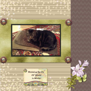
July 24, 2022 at 12:37 am #79908Continuing my catch up – this is Day 5, Project 2. It was interesting to learn how to copy the text to a Raster layer so that I could add Drop Shadow, but still leave it open to editing later by keeping the vector layer. In his last few years, our cat, Lynx, loved to sit on a heating pad to help ease his aching joints…of course, sitting in his human’s nice warm lap was even better!
July 24, 2022 at 1:04 am #79909Carole, I may have set the compatibility mode by accident. I don’t know how to do that. I think you had a post about that, I will look and see if I can find it.
July 24, 2022 at 1:25 am #79910THAT’S IT!!!
Carole, my compatibility mode was set to PSP X8. I don’t know why or how it was like that. But I am a clumsy clicker sometimes so it is like I thought. I did it and didn’t know I did it. If that makes sense. No wonder the text tool was also acting weird in the box itself. It was “blinky” and it hesitated when I’d type, probably trying to tell me, “change the compatibility mode you idiot”.
Thank you for your help. I was getting anxious every time I’d save something.
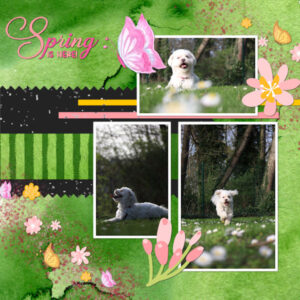
July 24, 2022 at 7:09 am #79920My better Project4. Thanks Carole for your comments:) and not the best Project5. I’m sorry;(
July 24, 2022 at 8:02 am #79924The trick to having two vectors in play is to create a new vector layer before creating the second vector so that it goes on it’s own layer rather than as a second object in the same layer as the first vector. I hope that made some sense for you.
July 24, 2022 at 12:05 pm #79950Day 11, Project 5
I’ve really enjoyed doing the projects for this bootcamp and seeing everyone’s ideas. Thank you, Carole, for all you tips, ideas, and suggestions in all your webinars! I always look forward to them each month.
July 24, 2022 at 12:05 pm #79951I’m a bit behind on the bootcamp, because I went to Paris! So I thought it was fitting to make the second project Paris-themed. I used a photo of the Mur des je t’aime as a background. The flowers and papers and fonts are all from Creative Fabrica.
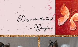
July 24, 2022 at 2:05 pm #79954I am on Project 3, and I’m having weird issues. My laptop crashed multiple times, I’m not sure why. Because she’s so old, I tried on my partners pc instead. Still having some issues:
– When I selected the text “Dogs are the best – Everyone” to change the font, PSP kept changing the font of “Friendship” instead. The texts are on separate vector layers.
– I can’t open “file” anymore, so to save as jpeg I had to use the shortcut CTRL + F12.
– Now I’ve saved my image, and there is a drop shadow on the text, but I never added a shadow! It seems that the shadow is added when I resize to 600×600 pixels, so maybe it is just an illusion?I don’t know what’s going on, but PSP seems to be cursed today! Hopefully the next project will go better. All these issues aside, I loved the tutorial! I learned some new shortcuts and had never considered working with guides before to align the images like that.
July 24, 2022 at 2:26 pm #79955Lisa, when you add the text, check if there is a little (annoying) icon called “Remember text” to the right of the “Create as…“. If it is clear, it has been toggled and will cause the text to always be the same as the previous time you used that tool. If that is the case, click on it to toggle it off. Then, try again.
July 24, 2022 at 3:29 pm #79959Project 4 went a lot better than Project 3! I’m personally very happy with the result 🙂
I especially loved the trick with holding shift and the erasor tool, so cool!
@Carol, the icon is toggled off. I think my file from project 3 went corrupt somehow, because nothing was working as it should!Question: When you click an image with the Pick Tool, the mode is usually on “Perspective” for me. Is there a way to tell PSP I want it to be “Scale” by default?
July 24, 2022 at 3:51 pm #79960Lisa, that issue with the Pick tool is actually a bug. It should, in theory, stay to the last setting you used, but in 2021 and 2022, if you used the Ctrl key for another command while the Pick tool is active, it THINKS you are using it for changing the mode and often, it gets stuck there. Unfortunately, it means you have to check that every time you need to use it.
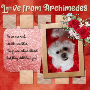
July 24, 2022 at 5:19 pm #79962And here is my version of Project 5 🙂
When sizing down, the poem disappeared. I solved this by converting the poem to a raster layer, and then it worked fine! Maybe the issue I had earlier with drop shadows appearing on my text could be solved the same way. I think it’s just a bug with my computer.
@Carol: Thanks, I didn’t know that was a bug. Hopefully it gets fixed soon!Thank you for this bootcamp, I learned a lot this week!
-
AuthorPosts
- The forum ‘Showroom’ is closed to new topics and replies.


