Home of the Scrapbook Campus › Forums › Showroom › Quick Page Workshop – Feb 2022
Tagged: (#71982)
- This topic has 214 replies, 25 voices, and was last updated 2 years, 9 months ago by
Susan Ewart.
-
AuthorPosts
-
February 20, 2022 at 4:40 pm #71953
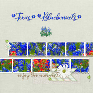
QP-Workshop-7: For this project I selected the Bluebonnet, the Texas State Flower, and filled all the frames with one picture. The Font I used is Spring Flowers. I ended up with a little extra space between the T and the e, so I played with the kerning a bit. Then I added a smaller bluebonnet graphic that I exported to my picture tubes a few years ago.
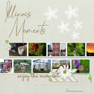
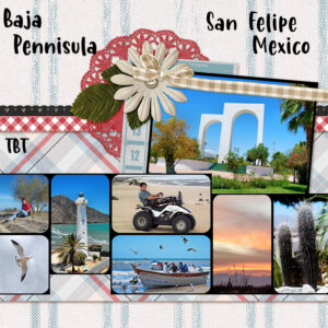
February 20, 2022 at 5:01 pm #71956I used these Quick Pages to highlight photos from Illinois and San Felipe, MX
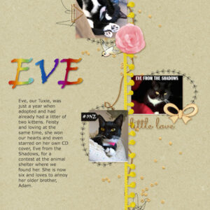
February 20, 2022 at 5:17 pm #71959QP6-EVE
February 20, 2022 at 6:09 pm #71970My Day 7 pages. this has been fun and I sure can see the value of having Quick Pages at the ready in the Supplies folder. Looking forward to the Masks workshop. One question about that script that finds extra pixels (I forget the name). Is this a good thing to have for when you are erasing with the eraser tool and might miss some pixels. I’ve always wonder what that script was about.
February 20, 2022 at 6:33 pm #71972QP Day 7
Geometric shapes made with 2021 effects and all from the same black outline shape.
February 20, 2022 at 10:44 pm #71977And now for QP Extra 5. My cousin and I visited Navy Pier in Chicago and saw the Tiffany Glass Museum – many colored glass displays. There was a pirate ship on Lake Michigan which came to “port” while we were there. Would have liked to take the tour, but we ran out of time.
February 20, 2022 at 11:06 pm #71978Euka, (#71852) yes, you cheated a bit, but it fits the quick-page very well. Why not? After all, it should be a QUICK page! 🙂
Paul, (#71854) thanks for the reference. I might get some. (#71856) We call those “Dad jokes”.
James, (#71859) the title might need to be enlarged. I think it is a combination of the “fanciness” of the font itself and the busy background. But if you made the title on two lines, by enlarging it, it might stand out more.
Julie, (#71864) I think you might want to tweak the placement of the title on your page so it does not overlap any element that should be thick and where you would not write. Maybe split your title in two lines? (#71898) Fun penguins! And I to wish the lurkers would post their projects.
Lynda, (#71865) yes that is what I was talking about. It is ok. Quick-pages are like templates: they are a starting point. After that, you use your knowledge of PSP to tweak it. (#71890) Have you considered using the Warp brush to slightly warp the “save the date” since it is sitting directly on a raised paper? (#71909) Flat Stanley is quite a fun idea! Interestingly, he can also travel by mail!! (#71956) Great display of multiple photos.
Liz, (#71872) those are great starting pages. (#71878) You are really catching up!
Monique, (#71881) that is a very interesting way to use a photo (four sizes). (#71915) I hope we will see more of this garden in the coming spring.
Anita, (#71884) the kerning is going to stay from the last time you used it. Maybe you created something like stitching and adjusted the kerning for it, or you might have run a script that changed it. By default, it should be set to 0. (#71953) That is certainly a way to complete a quick-page… quickly
Randy, (#71900) posting in the What are you working on? is still true! We use a separate thread simply so that everyone posting is familiar with others’ projects. (#71905) Your solution is very creative and effective!
Bonnie, (#71917) now we are waiting for your pickleball class for deers! We want photos!
Corrie, (#71921) do you have all those butterflies in your garden?
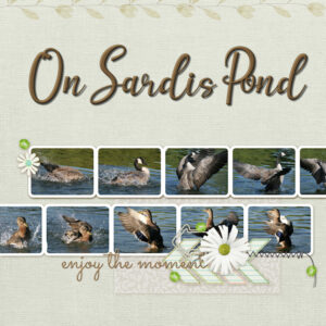
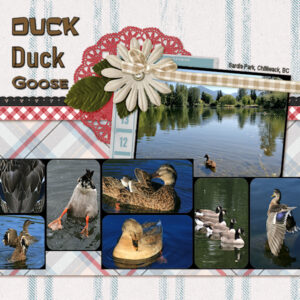
Trish, (#71924) it looks great to have a fainted version of the photo on your page. (#71926) And those swans are so beautiful. Did you “cheat” and use several spots for a single image or are they really are individual images?
Mary, (#71929) I wish I could make a butterfly garden here with native plants too! (#71977) That is a well-tweaked quick-page!
Ann, (#71932) great use of multiple photo spots for a single photo. (#71959) I never get tired of those cat photos.
Anne, (#71934) that is quite an interesting use of photos that would otherwise not stand out much.
Marie-Claire, (#71937) starting late is not a problem! Glad to see you post. (#71945) Nice beach photo. Perfect for that quick-page.
Susan, (#71970) to answer your question, that script can certainly be used for that. It was meant mainly for those who want to extra elements from photos to use like picture tubes or simple png elements, so in a way, it would do the same thing if you want to remove background.
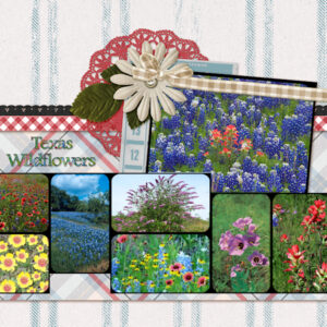
February 20, 2022 at 11:21 pm #71980QP-7 Workshop: I used some 0f the Texas Wildflowers for this one. Font is was one of my regular Windows Fonts, Footlight MT Light and I filled the text with colors from one of the Wildflower pictures. This week went by quickly, and I had a lot of fun with all the QP pages. Thank you Carole for these inspiring workshops.
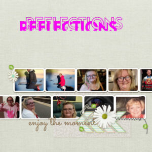
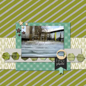
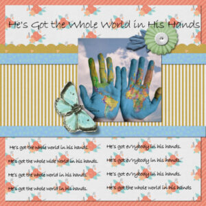
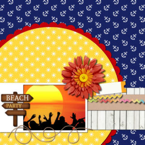
February 21, 2022 at 12:09 am #71982February 21, 2022 at 12:12 am #71985THESE are my extras thanks for the workshops Cassel
February 21, 2022 at 12:13 am #71988February 21, 2022 at 12:14 am #71991February 21, 2022 at 12:16 am #71993February 21, 2022 at 6:57 am #71997Hi Cassel
The link to day 8 of the Quick Page Workshop is password protected do we need to be DIAMONDmembers to reach it
Liz
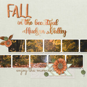
February 21, 2022 at 8:58 am #72002QP7-Fall in the Beautiful Hudson Valley – I’m coming in for a landing; one more after this … mostly I’m hunting for photos large enough to fill the space.
February 21, 2022 at 9:09 am #72006QP7 extra.
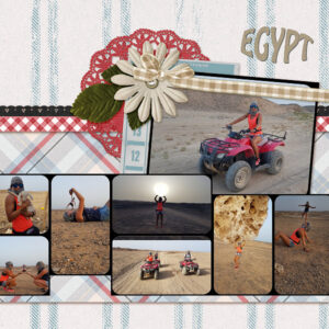
Photos of my daughter on a vacation in Egypt 2016February 21, 2022 at 9:29 am #72007Wow! so many inspiring pages and so many ideas. I love the look the the single image filling all the spaces, great idea. this has been an eye opening workshop.
February 21, 2022 at 9:55 am #72008Carole that is a good question, We were sitting my the river at a cafe, a bit nervous as swans can do damage and we were eating, they are like pigeons when it comes to food, there was a large number of them , moving around and coming to the table for food, they loved my ice cream, and they got a bit too close for comfort and they did get pushy. I just took shots, they all basically look the same, so in answer to your question …. your guess is as good as mine.
February 21, 2022 at 12:52 pm #72026I just downloaded 5 new free Quick Pages from Digital Scrapbook. Take a look – some even came as a .psd so they can be saved as .pspimage with layers.
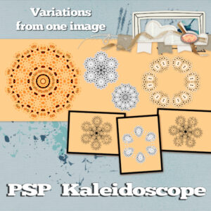
February 21, 2022 at 3:08 pm #72040QP4 – I decided to take an image of a snowflake that I created in InkScape, flip it and then apply kaleidoscope effects.
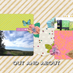
February 21, 2022 at 3:22 pm #72044QP5 – Before Covid, I used to do a lot of walking outside. Now not so much but am hoping that this summer will be better. Anyway, this reminds me of the beauty I would see along the trail (and birds in the sky that you might not be able to see) and one of the distance markers.
February 21, 2022 at 3:27 pm #72049QP6 – People don’t like me sharing their pictures so I just went with this. Even when I don’t have anything that I can use, the use of PaintShop Pro and the tips that Carole drops in are helpful. Thank you, Carole, for these workshops. I thought I had put some text here but it may be one of those disappearing text within a selection problems. 🙂
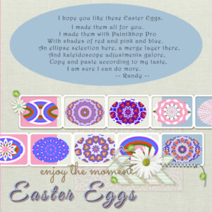
February 21, 2022 at 3:43 pm #72051QP7 – I finally got here. It is strange that sometimes when I am sick, I get some of those things done that I had not gotten to. It was nice to have these Quick pages to work on to pass the time. I decided to do an Easter Egg theme. I started out with an ellipse as the starting point for my eggs and went from there. Once I got my egg done with multiple layers of decreasing size and colour, I used that as a base for some Kaleidoscope effects. I also used blend effects and merge layers. In one case, I moved a copy of the egg to the left, leaving the original underneath and then mirrored a copy of the egg moved to the left to the right – and because I did everything after the first egg was created with a selection around the original egg, I was able to merge visible layers to new layer and copy the selection and paste as a new layer and remove the background.
When I was playing around with the Kaleidoscope, I noticed that some hearts began to appear so I spent some time tweaking to get them to a point that I really liked. Playing around with the tools can be very helpful.
Speaking of backgrounds, I decided to put a background behind the quick page because I had a transparent area outside of my eggs. Then I decided to copy and paste the background I created and change the colour. That caused a surprise for me because I had not noticed that in moving things around I had moved a background to the right. So I had two different colours for background. And I liked that so i did something similar for the right side of the background.
I even decided to create a video of my screen while I created the eggs so that I could review again if I have any questions about what I did to get through each stage.
I might make more eggs. 🙂
I HAD FUN and am thankful for this workshop. Thank you, Carole.
February 21, 2022 at 6:04 pm #72069Oh, Randy! Your eggs are very nice. I can see you had a good time doing it, too! Well done!!
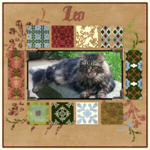
February 21, 2022 at 6:18 pm #72075Here is one of the Quick Pages I downloaded from Digital Scrapbooking. Thank you Csrole for the link. I added a picture of our sweet and handsome Leo who crossed the Rainbow Bridge on January 22, 2022 The font I used is Ghosthey from Creative Fabrica. Leo was a very courageous Cat and this font fits him well. Leo will be forever in our hearts.
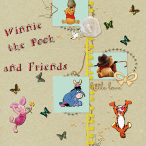
February 21, 2022 at 6:20 pm #72077ARHerman is my font. This is QP-6. I really like Winnie the Pooh.
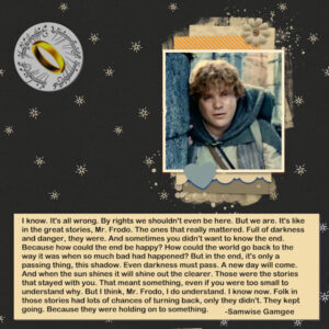
February 21, 2022 at 11:56 pm #72120And here is my tribute to the real hero of The Lord of the Rings – Sam Gamgee. The quote, picture of Sam, and picture of the ring of power all came from the web. If Sam hadn’t stayed the course, the ring would never have made it to the fire, for he even carried Frodo up that tortuous trail in to the crack of doom. And, Sam wore the ring for a short bit and he willingly gave it up when asked – it did not really have power over him.
February 22, 2022 at 1:12 am #72135Anita, (#71980) nobody would get tired of looking at beautiful flowers like that! I am happy that you like those workshops. See you in the Masks Workshop! (#72075) They have a lot of quick-pages to pick from. You have so many choices.
Liz, (#71982) I am curious what is the font you used for the title? (#71988) It looks like you had fun with those extra goodies! (#71997) I hope you get the corrected link for Day 8.
Ann, (#72002) you don’t need large photos; you can use several small ones. (#72026) If you find quick-pages in PSD format, you are lucky!!! Typically, designers don’t create them in that format as it is like giving away their elements!
Marie-Claire, (#72006) that makes for such a dynamic page!
Trish, (#72008) LOL. Isn’t it funy when you can’t remember/identify a particular photo? I have a similar situation with one photo of my son… but I cannot identify which one it was!
Randy, (#72040) that is incredible that all those images came from the exact same source! (#72044) Hopefully, you will be able to take more pictures this summer. (#72049) Yes, text disappearing happens when it is wrapped in a selection and left in vector format. Simply go back to the full-size version, make a duplicate of the text layer, and convert it to a raster before resizing it to 600. It will stay there.
Mary, (#72077) cute Pooh and company.
February 22, 2022 at 5:06 am #72143Hi Cassel the FONT is called Break but i can’t remember which site i gotit from dafont has one similar but it doesnt cut the bottom of xxx
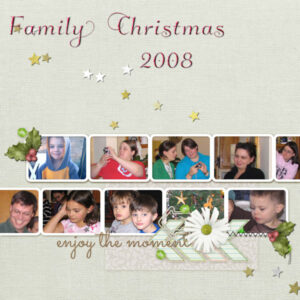
February 22, 2022 at 3:20 pm #72182I’m really behind: day 2 of Mask Workshop and I haven’t even started. You all are doing just great. Well, I am going to finish the QuickPage Workshop 1st. So – here is QP-7. Font is Klemiskey with inner bevel and shadow; the holly is from PS-Gina Jones and the stars are picture tube: Cass-Star gold and silver.
-
AuthorPosts
- The forum ‘Showroom’ is closed to new topics and replies.


