Home of the Scrapbook Campus › Forums › Showroom › Quick Page Workshop – Feb 2022
Tagged: (#71982)
- This topic has 214 replies, 25 voices, and was last updated 2 years, 9 months ago by
Susan Ewart.
-
AuthorPosts
-
February 20, 2022 at 7:31 am #71859
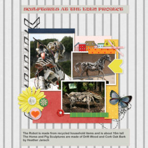
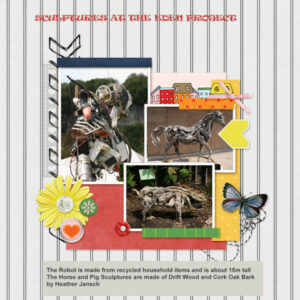
Here is my QP-3 . I tried to find a font that looked like a sculptured font but the nearest I could find was RAVIE. Now that I have resized to 600 pixels I may have to redo the text as it appears hard to read.
-
This reply was modified 2 years, 10 months ago by
James Durrant.
February 20, 2022 at 8:39 am #71862Corrie, great idea to use one pic in this QP, maybe I will do that too.
February 20, 2022 at 9:47 am #71864My QP-6, a bit late. I was thrilled to learn the selection box technique for adding continuous text! It has solved the problem that I had, wondering why I couldn’t add a “text box” as I do in word processing! Hooray!
-
This reply was modified 2 years, 10 months ago by
Julie Magerka.
February 20, 2022 at 9:48 am #71865Hi Carole,
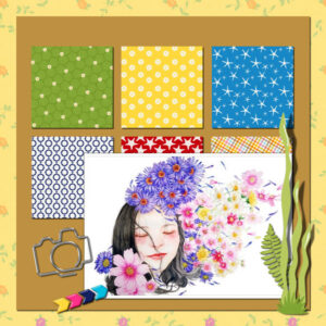
I think you are talking about the Naval Academy Graduation page. I started with the original but changed all the graphics. Added stars and stripes , downsized the frame and added the insignia. The reason, I found the photo of my grandson and his girl but the flowers etc. didn’t go with the photo or the occasion.
As far as the addition of the oval window in extra 3. I made a selection of the flower with the smart selection brush, promoted the selection to a layer. Then I made an oval selection on the yellow part of the layout and deleted the yellow, used the modify selection border to create the border, filled it with white and put the photo in the oval. Since I cutout the flower it still remained on top. The reason, I had two photos I wanted to use.
I hope that’s OK,
Lynda
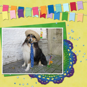
February 20, 2022 at 10:06 am #71867Ann Seeber – love your meme with your fur-friend! So clever.
February 20, 2022 at 10:15 am #71872this is my p1 and p2
February 20, 2022 at 10:17 am #71875Didnt realise this page was here lol
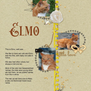
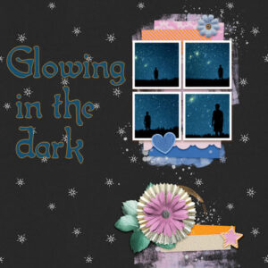
February 20, 2022 at 10:18 am #71878February 20, 2022 at 10:53 am #71881I’m cheating a bit: the first page (Elmo) I made last year.
The second project was torture 😀
I didn’t know what to put on the dark background, I haven’t got suitable pictures myself to add. Google is sometimes your best friend and I used that pic four times with different sizes of the figure.
Font is Isla bella with a glowy orange edge (stroke on 5.0)
February 20, 2022 at 11:11 am #71884Revised QP-6Extra with adjusted kerning. Thank you for pointing this out. It took me a while but it finally seemed to make the “r” in Starry letters look a bit better. I used the text as is, could my kerning settings have been off somehow? What are the default settings in the kerning options, so it will not use the last settings I used on a new project? Also should the button automatic kerning be checked? Thank you, I appreciate any tips. Some of the tools in PSP are still a bit new to me.
-
This reply was modified 2 years, 10 months ago by
Anita Wyatt.
February 20, 2022 at 11:56 am #71890Quick page 5 and Extra
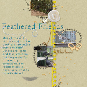
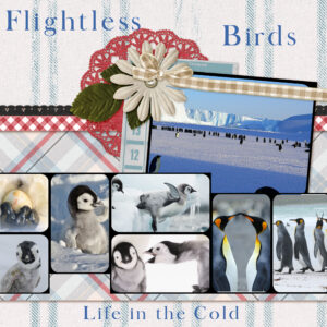
February 20, 2022 at 12:59 pm #71898My QP-7. Again, a bird theme. Easy pix to find on the ‘net. I’ve got to say, if I spent half as much time tidying and cleaning as I do choosing pictures and making a “quick” page, I’d be in good shape. Alas, this is more fun! Liked using the selection tool & inverting to eliminate some of the photo overlaps.
This has been fun; the best part is seeing the different projects that come out of a single layout. I wish the “lurkers” would post their work too!
-
This reply was modified 2 years, 10 months ago by
Julie Magerka.
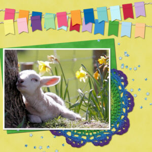
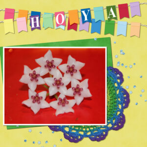
February 20, 2022 at 1:15 pm #71900For Quick Page 1, I added the picture of the Hoya and chose to put the name of the flower on the flags.
I did not realize that there was a separate place to share the Quick Pages. So I had entered in the February forum for pages 1,2 and 3.
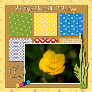
February 20, 2022 at 1:20 pm #71903Here is my QP2 – a simple buttercup with text.
February 20, 2022 at 1:22 pm #71905Quick Pages 3 – I wanted to add add a title but the font I chose did not look good crossing the lines and I did not think I could make it work with an individual letter between each vertical stripe. My solution was to copy the area of two vertical strips, rotate 90 degrees, stretch it out and use as a background for my text. I cropped area that went beyond the stripes so that the vertical lines touched the lines from what I had copied and pasted.
I tried other colours for the text and this one seemed to stand out the best so I decided on it.
I know this is about quick pages but I really did not feel it was complete until I did this.
February 20, 2022 at 2:13 pm #71909QP6 and Extra
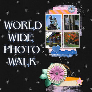
World Wide Photo Walk is an activity where photographers from all over the world take photos in their own backyard and then share them and compete.
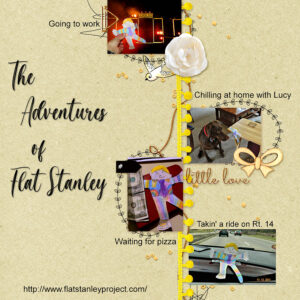
Flat Stanley is a project to acquaint school children with other parts of the world. My Granddaughter , who lives in Texas, asked me to take Flat Stanley around where I live in Illinois. These are only a few of the photos taken for the project. Haley was 11 at the time, she is now 18.
The fonts used are Philosopher and Magista Brush as well as Arial.
-
This reply was modified 2 years, 10 months ago by
Lynda DiGregor.
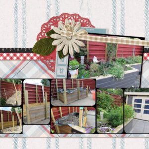
February 20, 2022 at 2:27 pm #71915QP7-extra Pictures are too busy for the layout, but didn’t feel like starting all over again 🙂
My husband made me a little garden “bin” on height, so if we get older we still can do some gardening.
And the one with the pets ifs from last year. 🙂
February 20, 2022 at 2:41 pm #71917Wow! So many pages…great work, Everyone!
No, Carole, I copied part of the background paper and pasted it over the cluster. I felt the cluster was a distraction. I’m not a big fan of any cluster…especially the flower one. I love “real” flowers but not the ones in scrap kits so much. I’m sure you’ve noticed my pages have few elements of any kind.
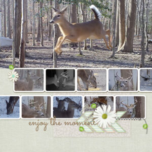
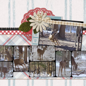
Day 7
All photos from my trail camera.
February 20, 2022 at 2:42 pm #71919Day 7, part 2. Again all photos from the trail camera.
February 20, 2022 at 2:46 pm #71921Monique great idea to us the same photo 4 times on the QP-6 Extra, I must remember that trick!
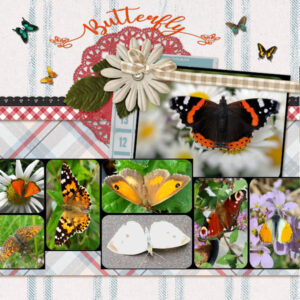
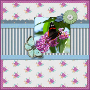
This is my QP-7 Extra and because of the still gray, rainy and stormy weather we have I neede something to cheer me up! The photos of the butterflies (and 1 moth) I took in the past summers certainly did that. The font is My Butterfly and I used some butterfly picture tubes too.
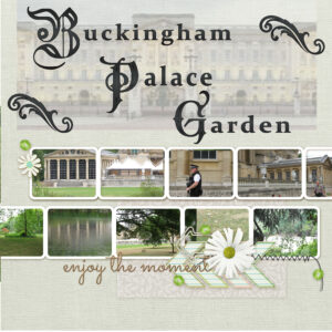
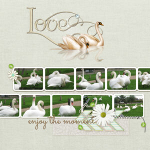
February 20, 2022 at 3:01 pm #71924February 20, 2022 at 3:04 pm #71926QP7 Swans at Southwold
Carole the font you ask about is called Back to Black
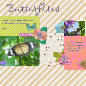
February 20, 2022 at 3:41 pm #71929WOW! Everyone is posting such beautiful pages! I am still in the back field – Just qp5. But I’m still in there. I have been to the butterfly garden in Chesterfield MO several times and taken pictures there. Visited the butterfly garden south of Atlanta with my Aunt Anne before I had a digital camera and visited the butterfly garden in Branson Missouri. All are beautifully done. The experience is wonderful. One time, a little girl had flowers on her dress and the butterflies were all trying to land on her dress.
The blue skipper picture was taken by my step grandson who lives in Sweden. He is a great photographer and so is his son and they have shown some really great pictures of Sweden. Two landscapes Mikael did I may showcase later.
The font is Gigi and I did some inner bevel on it (just because).
February 20, 2022 at 3:52 pm #71932QP6-Extra: This was a feature in my local newspaper today, but I had to hunt up artwork to illustrate it.
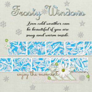
February 20, 2022 at 3:55 pm #71934Q P 7 Frosty Windows. Over the years whenever there has been pretty frost designs on the windows, I have taken some pictures. I selected one and played around with it until I could get a colored background on it to show off the designs. That took a lot of playing around, but I am glad I finally found a way to use one of those pics. The font for the title is French Script MT. The snowflakes are a picture tube.
February 20, 2022 at 3:58 pm #71937So many beautiful pages! I started late, and in the meantime stopped for a few days, I now also notice that my 4 first QP are in the wrong forum. So I’ll put them here again with the pages I made today
February 20, 2022 at 4:01 pm #71942QP2 and extra
February 20, 2022 at 4:02 pm #71945QP3 and extra
February 20, 2022 at 4:04 pm #71948QP4
February 20, 2022 at 4:08 pm #71951QP5 and extra
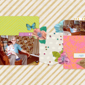
QP5 is a photo (1981) of my father with my daughter.
My father passed away in 1987. -
This reply was modified 2 years, 10 months ago by
-
AuthorPosts
- The forum ‘Showroom’ is closed to new topics and replies.


