Home of the Scrapbook Campus › Forums › Showroom › Masks Workshop 2022
Tagged: Day 2 Mask Workshop
- This topic has 562 replies, 61 voices, and was last updated 2 years, 1 month ago by
Lesley Maple.
-
AuthorPosts
-
February 26, 2022 at 12:01 pm #72673
Day 6 Mask Project – month on the ocean….
 February 26, 2022 at 12:06 pm #72675
Lynda, I love your Linoleum. The colors are stunning against the browns of the desert and RV. Hank your band pic is awesome. Mary, I like the soft purples in your Grand Canyon.
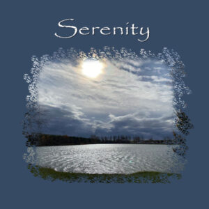
Here is my Day 5. it is my second attempt. (I ditched the first one, and started fresh with a brand new photo) This is an early morning photo of the lake. When we get up in the morning, grab some coffee, open the blinds, and sit looking out the window. This particular morning the sun was shining, and the water on the lake looked almost white. So, I got dressed and went outside, and snapped a few quick pictures.
February 26, 2022 at 12:38 pm #72677Here is my day 6.
February 26, 2022 at 12:46 pm #72678Thanks Mary,
I’m glad you like it. A little tribute to the best dog ever… She is very old and has never given us a problem from day one although she is the beggar supreme! 🙂
Lynda
February 26, 2022 at 12:50 pm #72680Day 6, wow another great technique. Enjoyed this too. Such awesome pages done by all, I have seen some great ideas that I will use. Thanks for sharing.
February 26, 2022 at 12:51 pm #72681Well Laurie, I’m jealous.. I would love to live on a lake or other body of water. Don’t think it’s going to happen though.
Your layout is lovely.
Lynda
February 26, 2022 at 1:08 pm #72684Liz (#72646) if you want frames to add as a separate layer, the Add Frame would not meet your requirements. You can download some HERE. This is our go-to site for scrap resources.
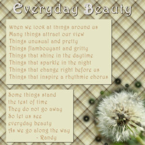
February 26, 2022 at 1:52 pm #72686Here is day 4. Sometimes it takes awhile to get everything just right. And sometimes you just have to say, this is my finished product!
February 26, 2022 at 1:57 pm #72688Here is my result for Day 5.
I started out trying to have the picture as the focus but realized somewhere along the way that it was necessary to make it smaller. But the exercise to get the mask with an element related to the picture seemed to come together well. Thank you, Carole for your teaching of how to do things in PSP.
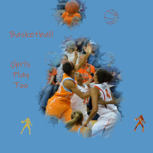
February 26, 2022 at 2:03 pm #72690Day 5…another UVA basketball page. I didn’t have basketball brushes so I made some following Carole’s directions, https://scrapbookcampus.com/2019/03/adding-brushes-to-paintshop-pro/
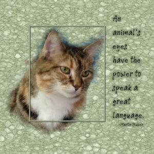
February 26, 2022 at 2:04 pm #72692Day 6…Green eyes Poppy…I now have another idea for another page. We’ll see if I manage to pull it together.
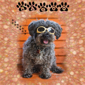
February 26, 2022 at 2:17 pm #72694Carole, your grandson is adorable!! Here is my Mask 6 lesson. My dog Magoo in his doggles. I did the background both ways, then blended, and added a radial blur, then did some masking to tone it down a little around the picture. My font is Ennobled Pet, and I forget where I got it. My heart with paws is a brush.
-
This reply was modified 2 years, 9 months ago by
Sherie Dracup.
February 26, 2022 at 2:23 pm #72697Lesson 6
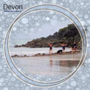
Nice marbly background and I tried the unchecked Mono alternative and didn’t like it as much for my design as it tended to dominate but can see it would be good for more vibrant images. To focus a bit more (and for a sort of binocular effect I added a circular frame from Marisa Levin of DigitalScrapbook. The AI setting for resizing seemed to take ages so I used bi-cubic in the end. The ladies in my photo were braving the autumn weather but seemed to be really enjoying themselves. I was developing a cold when I saw them so wasn’t inclined to join in. (That’s my excuse!)
February 26, 2022 at 3:07 pm #72705At the risk of repeating myself, everyone’s work is beautiful.
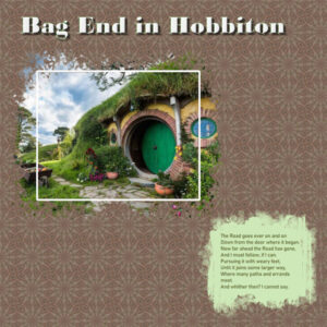
This is my extra layout for Project 3. Such fun with the Kaleidoscope and tiling! Can’t remember the name of the font, but I have fallen in love with the inner beveling on fonts! I am such a fan of Lord of the Rings. This picture of Bilbo’s and Frodo’s door in Hobbiton I got from the web – tours in New Zealand are being made to the sets of LOR. The poem is Frodo’s as he and his companions are getting ready to set out on the road to their “dark” adventure.
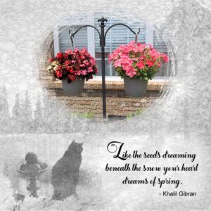
February 26, 2022 at 3:16 pm #72707February 26, 2022 at 4:05 pm #72709Each spring, I pick up a couple of baskets of hardy flowers for the front. The cat in this project is River.
The picture used as the overlay is from Pixabay and the font is Faithfull from Creative Fabrica.
February 26, 2022 at 4:12 pm #72711Lesson 6 – I’ve loved these tutorials using buttons I normally pass right over because I haven’t known the benefits of using them and creating all these unique options! I used a gradient for this linoleum. So sorry we only have one more lesson to go!
February 26, 2022 at 4:14 pm #72713Thank you so much for this course, Carole – it has been so much fun to see everyone’s lovely work!
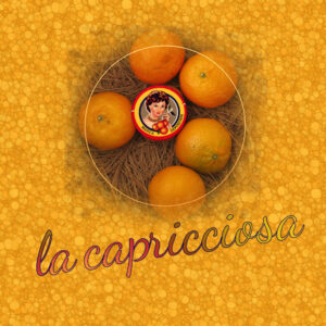
Here are my bubbly oranges for Day 6 – the little label came wrapped around a blood orange called “La Capricciosa.”
February 26, 2022 at 4:31 pm #72715February 26, 2022 at 4:54 pm #72717February 26, 2022 at 5:55 pm #72725I haven’t commented very much, but every one has made such lovely and different pages.
Mary Solaas, I like you hobbit’s house and I’m a fan of Lord of the Rings too!
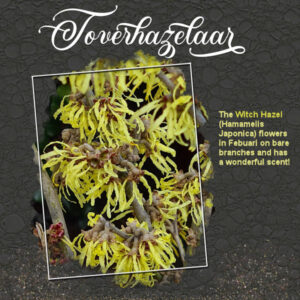
This is my day 6 of the workshops with again another tree in bloom. I did a couple of linoleum backgrounds with a color from the photo and didn’t like them. They stayed all a bit bland even with the blend mode set to soft light. I changed the blend mode to difference and reduced the opacity a bit, which gave me this result that suits the photo much better, at least I think so.
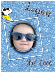
February 26, 2022 at 5:59 pm #72727Here, back again, is great-grand Logan from last May. He just turned one Feb 6 this year. He’s so cool! Love lino backgrounds. I save them with my stash of papers, too. Everyone’s work is fabulous!!
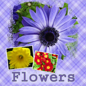
February 26, 2022 at 7:29 pm #72730Masks Lesson 2
This took me a little while to do, and I think I got there phew!! I took the plaid colours from the leaf of the anemone, but on finishing the page I did wonder if I should have taken the ‘colours/pattern’ from the red and yellow picture. I used the brush to highlight the letters as I also did those in a purple but added a dark green outline.
The plaid was fun to do.
I know I’ve said it before but there are awesome pages being uploaded and I’m enjoying the stories behind them. The pics on this one I’ve done are from my Mum’s garden.
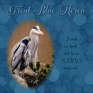
February 26, 2022 at 8:30 pm #72732Lesson 6. Today I used a scanned image of one of my photo’s. This photo is from 1993! A time when I shot mostly slides, very little film. Except on this day when I went to the Vancouver Aquarium where this guy landed on top of an exhibits (pretty sure the rocks are fake), I was shooting film. 19 yrs later the negative (which has been kept in the dark) is not viable anymore, wish I’d shot slides that day. I had a few problems today and was able to overcome them when I used my laptop to follow the lesson on making masks from selections, while actually doing the lesson on my desktop. I had written the instructions wrong and I was on the wrong layer while making the selection. And I also had to go back to get the settings for the brush behind the quote (from Lesson 2). And, I see it needs to be moved to the right a bit. the lino paper is fun to do and quick.
February 26, 2022 at 9:17 pm #72734Day 2…sigh….I have had a long week. I have not accomplished much in this workshop so far. Too many things I have forgotten. Too many things to do.
When I finally got to making the plaid, I lowered the opacity because it just seemed to overwhelm the photos. I think I missed a step on one of the masks, but I guess it worked.
I will look at Day 3 now, but I am going to have to sleep soon, because tomorrow is another day. And I have more stuff going on then.
February 26, 2022 at 10:00 pm #72735here is day 6 very rear to see a young ibis. When he is fully grown he will be solid white. He also was alone which i have never seen they are usually in flocks when traveling threw my yard. I really do like the technique you stumbled across!!
<p style=”text-align: center;”>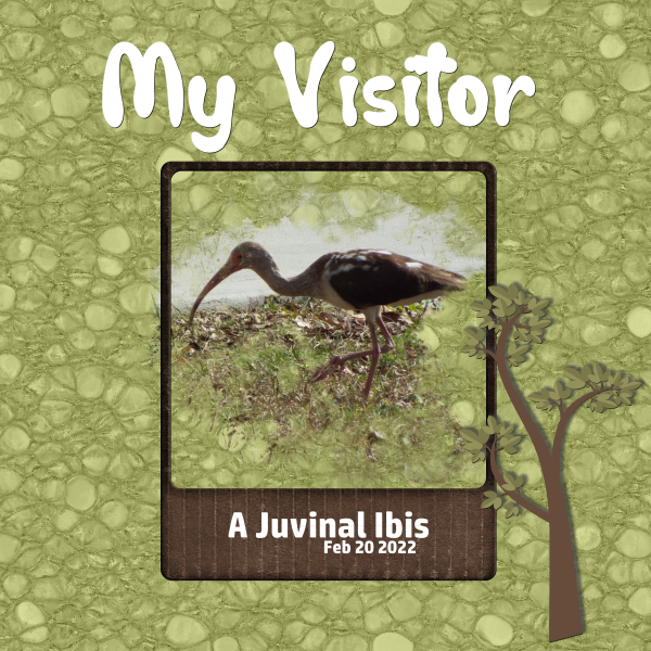 </p>February 26, 2022 at 10:51 pm #72741
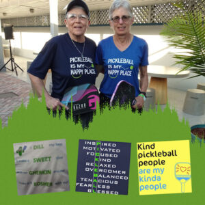
Day 6, extra template. My friend and I wearing matching T-shirts. She gifted my shirt to me. Below are 3 more samples of pickleball T-shirts.
February 26, 2022 at 11:17 pm #72747Day 6 I used the red-brown color for the background because red dirt is one of the things Maui is known for, as well as their Beautiful rainbows and sunsets. This photo was taken from the walkway of our hotel. P S I do like making the masks with the paint brush. I chose a solid round brush to start with and enlarged it to the size I wanted for the center, one click only, then went to a different brush to do the rest.
-
This reply was modified 2 years, 9 months ago by
Anne Lamp.
February 26, 2022 at 11:43 pm #72751Day 5 Masks Workshop 2022
February 27, 2022 at 1:06 am #72752Mary, (#72638) did you brush on the mask layer or on the photo layer? Typically, there should not be visible “dark” edges around the image. (#72705) Beware of addition on that kaleidoscope effects.
Liz, (#72651) I love how you have that frame that lets the image overlap. Very creative. As for the LOVE one, it is probably because the background is light and does not show the edges much.
Matsugirl (#72655) welcome to the Workshop. Your first page looks great. You didn’t encounter any difficulties?
Anita, (#72661) if you create a mask and end up with the edge of the photo showing, one little trick could be to make a copy of the photo layer, activate the bottom layer of the two, enlarge it a bit and add a blur. It will blur the edges and give you a little extra space if some small sections of the mask are outside of the original photo. Something to try.
Lynda, (#72665) that is a bummer that your PSP complains when you resize the pattern. At least, you used an interesting alternative and I like the result. Maybe something else to consider in the future.
Hank, (#72671) that is a colorful page. I suspect you might have squished your nice photo. Those people look unusually thin. Maybe you can give them back a little weight? (#72673) Beautiful colors on that one.
Laurie, (#72675) that solid blue background definitely makes the photo shine. Good work on the mask.
Sue, (#72677) simple and delicate; your signature!
Royanne, (#72680) fantastic page and the masks really blend in with the background.
Randy, (#72686) beautiful way to display that flower. And you are right, sometimes we have to say “enough is enough”. However, I guess it is so tempting to continue tweaking, and undoing, and redoing when using PSP!
Bonnie, (#72690) that is such a good idea to create your own brush! (#72741) How many pickleball t-shirts do you have??
Sherie, (#72694) did you happen to add a radial blur to the background paper? It gives a great effect to focus on the photo.
Fiona, (#72697) maybe your solution to resize would help Lynda? Sometimes, the result is better when using monochrome, sometimes, without it. It all depends on so many factors. As long as you know how to make it, tweak it and select the result that you want, that is what counts.
Lois, (#72707) the color choice is fantastic with that photo.
Gerry, (#72709) did you use the linoleum background as an overlay on the cat photo too? Whatever you did, it looks great!
Joyce, (#72711) using a gradient is a great variation on the tutorial and the result is very interesting.
Connie, (#72713) nice and great overall color. It is perfect for the photo. And by the way, we are not done; there is another lesson tomorrow!
Ellen, (#72717) the colors look great with the photo. It almost looks like cobblestones around the edges of the photo.
Corrie, (#72725) that pattern used as overlay looks great!!! It almost does not look like linoleum. And the dark color makes the photo shine!
Ann, (#72727) really cool kid. The additional Snoopy is a great touch!
Theresa,(#72730) I would also say you got it. Your page is gorgeous. The plaid is perfect and not overwhelming the photos.
Susan, (72732) I am a bit curious what size you started with for the lino pattern? The end pattern is quite large (I like it though) but it seems larger than others.
Linda, (#72734) yes, lowering the opacity is a great way to use that pattern and the end result is great.
Lavada, (#72735) the green background is perfect for the photo. I thought there was actually grass on the photo in the first place.
Anne, (#72747) yes, going around with different size or different settings is the way to go with those masks.
Sharon, (#72751) that is such a beautiful photo. Great way to make it “shine”.
-
This reply was modified 2 years, 9 months ago by
-
AuthorPosts
- The forum ‘Showroom’ is closed to new topics and replies.


