Home of the Scrapbook Campus › Forums › Showroom › Love Story Challenge 2020
Tagged: Love story challenge - Day 7
- This topic has 282 replies, 23 voices, and was last updated 4 years, 10 months ago by
Gerry Landreth.
-
AuthorPosts
-
February 23, 2020 at 4:37 pm #39604
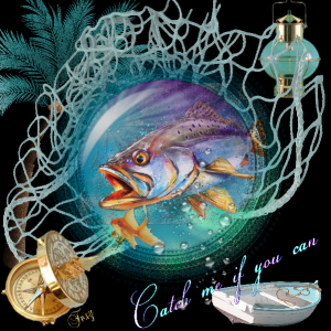
still try to master the more than one mask , here is my take on it. xx Still trying to find out what that dropper and brush thing is, does anyone know xx Thank you
February 23, 2020 at 4:50 pm #39607Trish, the E and B shortcuts are for the Bokeh tutorial: E = Eyedropper to pick a color and B = Brush to add a dot of that color.
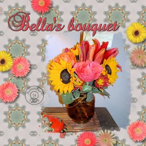
February 23, 2020 at 4:51 pm #39608Here is my Day 3. I love making these kaleidoscope tiles for flood-filling a background. I often use Cassel’s trick of duplicating the background and filling the underlying layer with white. That way I can adjust the viability of the kaleidoscope tiled background to get a faded, but colorful effect. Font is Baroque Script. Circular date stamp is one of Cassel’s scripts. Flowers are from Corel’s flower picture tubes.
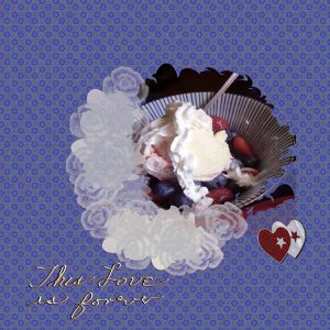
February 23, 2020 at 6:50 pm #39620I have really enjoyed the love story challenges and have learned a lot about masks though Im still a rank beginner at them. I was really going to try to get through the whole challenge without doing a food themed piece this ice cream sundae was irresistible! I did make a polka dot background but decided to go with a kalidascope pattern I madde earlier. Cassel thank you especially for the help with using two masks .
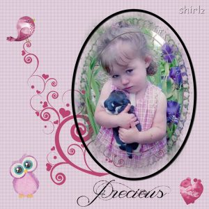
February 23, 2020 at 7:24 pm #39623Well what can I say, for day 7. I was following the tut for the spots background and it went wrong but I liked it for this photo so I have used it. The photo was again in my face book feed and what is more precious than a child’s love. The lace’y mask from my masks in psp. The little owl was masked although it doesn’t look like it is. So much for being adventurous lol. The oval frame worked in a fashion, but not for the owl, so he went frame- less. The elements were from Brown Owl at scrap twist. The text from my fonts. I was going to use the one Carole suggested but I need to look into why it didn’t show up in my fonts. I like simple so I can feature the main subject. Quite a challenging week, now I can get some chores done.
February 23, 2020 at 8:53 pm #39624Great background effect Shutterpixi, well done my friend.
February 23, 2020 at 10:13 pm #39627Went back and dug out those bokehs again … better attempt I think this time.
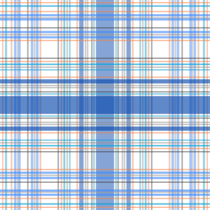
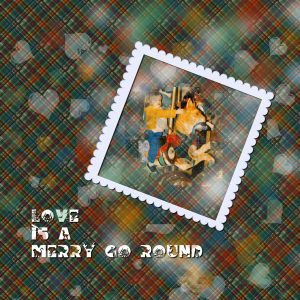
February 23, 2020 at 10:23 pm #39631And yes … I made a plaid. Kind of a muted one to start, but it worked. I’ll use more colors next time – now that I know how to do it. 🙂
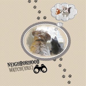
February 23, 2020 at 10:24 pm #39632Final day! (I didn’t think the wire effect font fit this layout so I didn’t use it.)
Teddy the dog and Peep the cat are on the lookout for squirrels, possums, and raccoons-all three can be found in my backyard. I know raccoons can adapt to many different environments, but how possums got to a typical suburban neighborhood is a mystery to me. They’re here, though, and they drive Teddy crazy at night as they do a really amazing balancing act on the overhead utility lines as well as the fence in my backyard.
Thank you so much for this challenge. I enjoyed each day’s assignment and I learned a lot–not only about PSP but also about my design style.
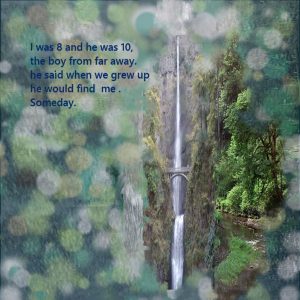
February 23, 2020 at 11:01 pm #39635This is a different day 6 Multnomah Falls, When I first met my husband about 22 years before we met on a computer date and married. combined the Bokeh effect with an overlay of the falls water.
February 23, 2020 at 11:23 pm #39639Day 3 – Julie Faber Miller photos and a Pixel Scrapper Jessica Dunn mask.
February 23, 2020 at 11:37 pm #39641I also did this more valentiny one with the polka dots thank you all for the lovely art and valuable info
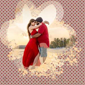
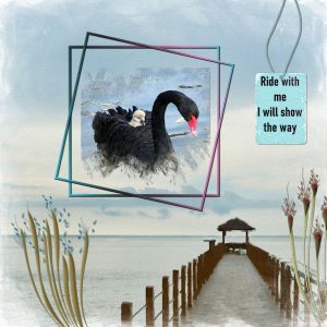
February 24, 2020 at 6:51 am #39646Day 7. Photo from Unsplash and taken by Tholaal Mohamed. Thanks for takin a peek!
February 24, 2020 at 9:07 am #39647Cassel: You had remarked earlier that the masks in the layers<load-save mask function filled the entire page. In my PSP 2019 there is an option to load as is or to fill entire page, so smaller masks literally sit in the upper left hand corner when used if the “as is” option is chosen.
February 24, 2020 at 11:43 am #39648Thanks, Jnet, Sue and Annie!
Jnet – I’ve enjoyed seeing your hibiscus pages, each flower is so beautiful and you’ve showcased them well.
Cristina – What a really lovely collection of family pages you have made for this challenge! That’s something that you and your family will look back on and treasure!
Gerry – Have fun cleaning up those old family photos. You will have some priceless memories from your results!
Minka – The paint brushes tied together on the side of your Happy Easter picture really made for a nice touch on a beautiful page!
Annie – Your pages are always a delight, as are you and your uplifting and encouraging comments! You have such a wonderful attitude and it shows in all you do.
Shirley – You have the right caption for your Day 7 page, as your granddaughter truly is precious! Very nice!
Everyone – Such wonderful work has and is still being done. I’ve enjoyed looking at everyone’s pages and I look forward to seeing the rest as they are posted.
Cassel – Thanks again for this challenge!
February 24, 2020 at 1:12 pm #39655Shutterpixi, thank you so much for your kind comment! <3 … I love all your layouts; the Bokeh effect and Polkadot are amazing.
I love to participate in the challenges; it’s an opportunity to practice, be inspired by all the participants, and also learn from each other. After I talked to Sue yesterday, I did today another layout with the Bokeh effect. Now, it is more the way I like.
I hope to see you more often here on the Campus. 🙂
And thanks to Carole for this and all the other challenges.
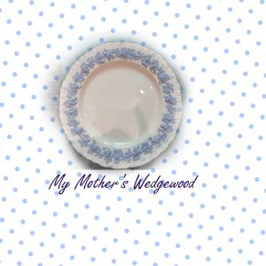
February 24, 2020 at 3:03 pm #39661Well, I made it to Day 7 (a little late). I wasn’t able to master the wire effect, but I did have some fun with the polka dots. The colours seemed to work with a picture of my mother’s china (Wedgewood) so here it is. Thanks Cassel for all of the information and thanks everyone for the inspirations.
February 24, 2020 at 5:04 pm #39663I’m really enjoying seeing everyone’s creativity! Thank you to all for the great pages and inspiration.
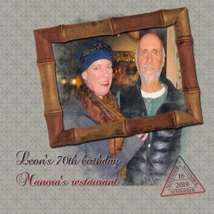
It’s amazing how much I’ve forgotten since I went through the Love Story challenge a year ago, but that’s what makes it useful to take up the challenge again. Today was much easier and more fun making my own mask. Here’s my Day 4.
That’s Cassel’s Date Stamp #6. Once again the font is Baroque Script, this time with gradient Deep Stills. Paper and frame are from Pixelscrapper’s bundle The Good Life November 2019. They are a great resource. Thanks for turning us onto them, Cassel!
February 24, 2020 at 6:19 pm #39667I just needed to have another go at getting a better frame and brush work, I used the brush variance and increased the hardness to get a stronger rub out. I think this was day 2. I am much happier with the frame just needed some revision on old tasks. I did find when setting the rotation on the brush varience it didn’t appear to rotate.
February 24, 2020 at 6:35 pm #39669Carole, the mask is the same one Peggy Jenthof used.
February 24, 2020 at 7:46 pm #39672Good Morning Scrapbook Campers! Well, I am now on my second cup of coffee and I decided to peruse the entire 9 pages of this challenge. What a delight and one thing stood out … the creative development of each participant as the lessons progressed. It was wonderful to observe because initially there were participants who doubted their ability to master the lessons. But, here we are, at the finish line and … we made it! So congratulations to each and every one of you and my thanks because I learned, not only from the lessons but, from yourselves as well. I sure enjoyed my second cuppa this morning! <3
February 24, 2020 at 9:59 pm #39684I really did not like my first day six I think I this one works better combined a plaid and the bohkeh effect and added a frame , its still very busy but in a more organized way.
February 24, 2020 at 10:44 pm #39686Thank you for your feedback, Cassel, which I just saw. I played around with the blend modes on the Day 1 project and turned it from Normal to Color (Legacy). This represents so much better the effect I was trying to produce. Now you can see the delicate love artifacts. Thanks so much, Cassel!
February 24, 2020 at 11:01 pm #39687Annie, your Bokeh effect complements well that photo. Just a fun interpretation!
Lydia, those faint colors on the dark background make for a great Bokeh effect. For your Day 7, I love how you managed to use the shadows effectively.
Jnet, as-tu utilisé un pinceau pour le “texte” ou était-ce un papier déjà fait? Pour le Jour 6, quelle sorte de pinceau tu as utilisé pour le contour du masque?
Shutterpixi, you might have worked a lot on that background but it is very well done! I like that. Simple page and effective.
Barbara, yeah, that is what I thought that you didn’t have much space around your pets to showcase them. That final project is so cute with that photo. It is a story you might want to add to the page OR make a matching page with the story on it.
Cristina, I think that the best Bokeh effect is done when the dots are a little more blurred. For your Day 6 2-1 I would love to see the frame “seem” to go behind the legs. I think it would be fun. For your Day 7, I love that font!
Sue, did you create all those masks for the Day 7 project? They look great!
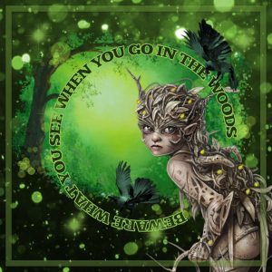
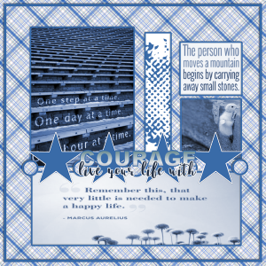
Minka, that polkadot/space invader is actually cute, and you know, you can use multiple dots for a different effect. I think you might need to add some shadows to your paintbrushes cluster to give it a little more volume. For the green Bokeh, it is VERY effective and looks magical. Your blue plaid is also well-executed. You can even change the scale when you apply it for different effects.
Trish, for that fish layout, I almost feel like it is going to jump at me!!!!
Redradar, you can also use a different color under any paper that you want to “mute down”. I have seen black used too, or any other color that might be the overall tone of the page. Also, when you have a tile made from the kaleidoscope, you can try to flood fill at a 45-degree angle for yet another effect.
Peggy, I am a little puzzled by the sundae layout. Is the row of white flowers supposed to be part of the mask? For the wire text, I wonder if you used the angle of the light in the opposite direction. It looks like the light side is on the bottom right instead of the top left. As for your Day 6 project, I really want to know more about how you knew/met your future husband that young and how you managed to meet again, online, that many years later! And thank you for that last one you posted.
Shirley, the font you used is also very nice and match your project.
Lynn, it is a great idea to use that photo in the background. Being able to create your own mask allows you to place it in the “right” place from that background image and you did it very well.
February 24, 2020 at 11:15 pm #39688I am sorry to realize that the previous post should have been posted LAST NIGHT, but somehow, got “hung up”. So, onto today’s feedback.
Annie, you always find great photos! Unsplash must love you!
Barbara, thanks for the tip. I just learned something!
Leslie, great choice of color for the dots in order to showcase that plate. If you have time, you might want to add a rectangle to include more of a story about this (date, location and more).
Redradar, did you happen to resize the photo horizontally? It seems that his head is a little squished.
Shirley, yes, the brush and settings are going to give different results. It all depends on the photo, the project and your own preferences too.
Lynda, thanks for pointing the mask you used.
Peggy, did you create that frame or did you get it somewhere? Even if your plaid is very colorful, I think it works well.
If you are not done yet, don’t worry, this thread will stay open for you to add your next projects!
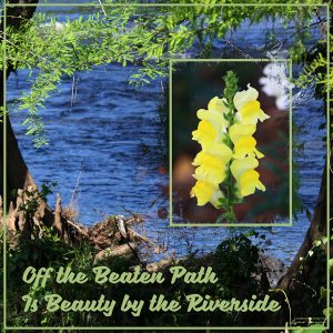
February 24, 2020 at 11:41 pm #39690Bokeh Day 6
February 24, 2020 at 11:42 pm #39691The flowers are supposed to be a frame of whip cream outside the mask.
I probably forgot to check the light my classic light has often been from the right.
we met when his family toured the Northwest in the Fifties played at a couple of the tourist attractions and to everyone’s great amusement he said he would come find me when we grew up and marry me. Years later in San Francisco we met in an early for! If computer date really pre internet, it was a few years after we married before my daughter found some photos of Mike and I in my mother’s album. The frame is one I made from scallop ed paper I had made years ago.
February 25, 2020 at 1:14 am #39693I believe I missed one day but I think I’m done anyway. Learned a lot of new things and had a great time looking at everyone’s creations. Until next time. 🙂
February 25, 2020 at 6:34 am #39702Carole, thank you for the tips! I like the feedback, and I always pay attention to the advice you give to other participants; they can be useful to me too. I love the idea of having the frame underneath the legs; it makes so much sense. Back to the drawing board on both layouts. Thank you!
February 25, 2020 at 8:56 am #39707 -
AuthorPosts
- The forum ‘Showroom’ is closed to new topics and replies.


