Home of the Scrapbook Campus › Forums › Showroom › Love Story Challenge 2020
Tagged: Love story challenge - Day 7
- This topic has 282 replies, 23 voices, and was last updated 4 years, 10 months ago by
Gerry Landreth.
-
AuthorPosts
-
February 22, 2020 at 5:50 pm #39484
Im doing something wrong, I can choose the color with the dropper tool but when shift to the brush tool it reverts to the prior color , obviously im missing a critical step
February 22, 2020 at 6:56 pm #39490Here’s my Day 2. I’m having a little problem with the template. When I use the eraser brush to try to erase some of the template artifacts, the brush is dark, not erasing. So I left it the way it was; it still doesn’t look as good as I’d like it to, though.
February 22, 2020 at 7:37 pm #39491Barbara, Gerry, Lynda, Minka, Redradar, Shirley, Shutterpixi, Sue, and Trish … wow! What delightful pages to peruse over my morning coffee. I would have commented individually but I would have been here all morning and today I have some cooking to do for a family event … guess I can’t play all the time, LOL!
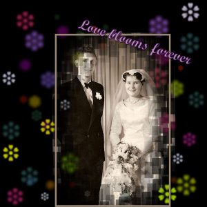
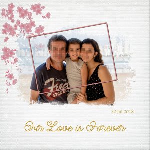
February 22, 2020 at 7:49 pm #39495My day 6. After my massive debar-col yesterday I have gone fairly easy today. I was having issues defining masks brushes and templates, all of which you can mask with in all sorts of different ways. Then I tried text on a curve, then a frame all of which went wrong. But I am not an easy quitter. I have decided that there are a million ways of getting results from all the tools so getting any kind of satisfying result is a plus. I did enjoy using the e and b shortcuts today. I have used my wedding photo and created my frame. My mask is from my psp mask selection. I thought the colour around the black and white photo would be interesting. I feel I have learnt something new and satisfying today at the same time kept it simple. Every picture tells a story Thanks Carole.
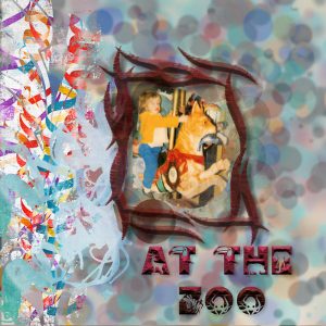
February 22, 2020 at 8:28 pm #39501this is way more grungy than intended I originly took the bokeh colors from the picture but then went to the negative image with one layer from the original colors as it was just too gaudy. I whad made a different bokeh backgroung for a different picture first and will probably do that one later . I still have to figure out why my dropper shortcut is not working, I useclipart graffiti from a kit called Carnaval
February 22, 2020 at 8:55 pm #39505Wow, I still have to refer to my notes to create a Mask, but with the notes it’s getting easier. I was able to make a 4-object mask this time and used the colours from other Niagara pictures to create the background. The colours are a little bold, but right now it’s all about the process. Hope you like my pics from the Butterfly museum at Niagara Falls.
PS I really like the keyboard shortcuts, but I’m not sure I will remember them for long. lol
February 22, 2020 at 8:59 pm #39506Thank you so much for your kind words, dear Annie!
February 22, 2020 at 9:42 pm #39510Hello Dear Scrapbook Campus. Here is my day 6. The photo is from Unsplash and was taken by Cristian Newman. Font used is Xiomara. Thanks for takin a peek!
February 22, 2020 at 11:07 pm #39515I see I am way behind you all, but I will continue on. I am enjoying looking at all the lovey work.
This is my try at day 2.
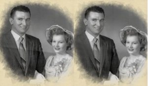
February 22, 2020 at 11:23 pm #39516Gerry: I’ve played around with removing creases and wrinkles using the clone tool. I start with the opacity at about 50 and density at 70 or so, take a sample under the crease and then move smoothly upward over a very small piece of the crease. A little at a time, I’m trying to make a more gradual color shift from dark to light, and the clone tool seems the best at doing this. I think it’s easier to get rid of creases on clothing than it is on background. Getting larger areas of exactly the same color to look blended and smooth is harder. I worked a little on your picture and got rid of the most obvious creases.
Bottom line: Experiment with the clone tool. You may find it helpful in getting rid of lines and creases.
February 22, 2020 at 11:35 pm #39517Barbara: Thank you for the advice. I had read about the tool some time ago but never got around to working with it. Now that I have discovered the old photos, I will know where to begin. The difference is amazing.
February 22, 2020 at 11:40 pm #39518Barbara, those photos for the Day 5 layout are fun to look at. One suggestion I would like to offer: if you add some feathered (or blurred) edges, it would make the images a little wider with still focussing on the main subjects. That is if your photo has more “space” around the animals. For Day 6, your addition of the other background paper gives a great result!
Annie, I think the challenge is possibly because the background of that image you used was mostly one color. Is this possible? Or just because the mask had less fading on the edges? Just thinking out loud. That Bokeh looks like confetti falling over that couple! 🙂
Shirley, it seems like you are getting the hang of masks, even if you don’t “love” them. Over time, with all this practice, at least, you won’t get intimidated by them. And remember that every “miss” is an opportunity to learn how a tool works (or does not work).
Shutterpixi, that Day 6 layout is so simple and delicate. A great way to showcase that photo!
Sue, it is interesting how using a simple gradient for the background complements the photo so well. I love your frames and find it so effective when frames are still showing the fading of the mask.
Minka, typically, a Bokeh effect would cover most of the background as it is supposed to replicate a photo where various lights are blurred. But then, using dots LIKE Bokeh can also give a different effect. And since Bokeh is replicating blurred lights, it is always associated with a darker background, but then, you can always use the technique for something else. PSP is full of tools to use in many ways.
Trish, on that revised layout, you found a very effective way to keep the white details and make them fit perfectly on the page. We will have to look into why you got layers merged when you didn’t want. For your Day 6, that is such a great photo you have! Nicely showcased!
Gerry, PSP is a great tool to help improve old photos. If you ever choose to upgrade your membership, we have two full-length classes on restoring old photos that you can look into. For this layout of yours, it is showcasing that special photo. I can surely imagine a whole album in the making!
Peggy, for the color issue, can you check if the checkbox for All tools, in the Materials palette is checked. It might have been unchecked accidentally.
redradar, when you want to soften the edges of a mask, you don’t use the Eraser. If you look at the mask, it is made of black and white (and grey), so you would have to “paint” the area in one of those colors. And by adjusting the opacity of the brush, you can really soften the edges to your liking. You can even do that now, if you want to see the result.
Leslie, if you don’t remember the shortcuts, it is ok. I still have to look for them when I need them. Notice that the shortcuts are always written beside the tool/command. And if you don’t need them very often, you might be ok not to remember them. As for the Bokeh, if you were to use a darker background, the dots might end up softening a bit.
Gwen, out of curiosity, was the mask just inside the rectangular frame or would it have included the white areas above and below that frame too?
February 23, 2020 at 12:34 am #39520Here is another for day 6. Photo again from Unsplash and was taken by Trent Haaland-Ylsjn. Alpha is Organized Mess by Rose Thorn from Pixel Scrappers. Thanks for takin a peek!
February 23, 2020 at 5:44 am #39523Thank you for compliments Carole, I take it you are refering to Hubby and myself on the occasion of my sons second wedding xx thank you xx
What is dropper and brush relating too, I see it mentioned Did I miss something xx
February 23, 2020 at 7:15 am #39524Cassel, you are quite right. The background was all the same colour, so that would have been the issue. The photo, more often than not, determines the techniques required to showcase it. Thanks Cassel!
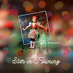
February 23, 2020 at 8:01 am #39526Day 6: … waiting untill my grandchildren went home after a ‘sleepover’ to start on this new project …
Nice how we learn to make the bokeh in PSP!
Went well with the original lights in the picture.
February 23, 2020 at 10:14 am #39528Félicitations pour toutes les mises en page que je viens de visionner. On remarque l’amélioration de ceux et celles qui débutent et parfois de belles surprises nous attendent
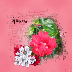
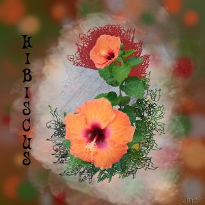
Toujours avec des hibiscus qui ne sont pas les miens. J’ai la chance de vivre quelques mois au Mexique et il y a des hibiscus partout
February 23, 2020 at 10:29 am #39529Thank you Annie, Sue and Cassel!
February 23, 2020 at 10:30 am #39530Sue – All of your pages never cease to amaze, entertain and educate. I particularly like the chipmunk page, as it has so many details that pull it all together. Cassel touched on some, but another that you used that I liked was the curl brush. The edges of the mask look delicate, like little fine wisps. Very nice work and a lot of attention to detail, Sue – very well done!
February 23, 2020 at 10:32 am #39533Everyone has done such wonderful work during this challenge. It’s been a pleasure to look at all the pages!
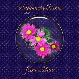
February 23, 2020 at 10:34 am #39535My Day 7. I played a lot with the background, starting out using a portion of a landscape timber from the photo for a pattern. Through trying lots of plugins, I found one that made the wrinkled fabric look, and another that provided the blue pattern. My polka dots are pink, but at a much reduced opacity. The circle frame is one I made from a circle preset shape that started white, but then I applied Effects – Texture Effects – Sculpture using goldbeads. Then I applied Graphics Plus – Cross Shadow to it. I selected inside the gold circle frame and used Eye Candy 4000 – Glass to give it a look of being under a glass dome. The text is font Manohara Script. It started pink but I changed it to the gold via the inner bevel using a yellow color. The mums are from my flower bed.
February 23, 2020 at 10:41 am #39538Cassel: Thanks for the comments. I agree my day 5 page needs some help. My problem was that the pictures I was using were close-up shots, there were no margins to work with. I tried putting layers that sort of matched in color under each before making a mask so I’d have room to feather around the outside. That sort of worked. But then I started fooling around with the pictures and the page and totally lost track of what I was doing. In the end, I did an entirely different page and then added lots of stuff the first to page to make it more interesting. This is the new one. I put the reworked one next to the one I already did on day 5.
February 23, 2020 at 11:39 am #39543Bravo Shutterpixi et Barbara, c’est joli
Shutterpixi, j’aime le mouvement autour de la photo et du cercle – bien pensé
Voici mon jour 6 – j’ai fait un deuxième masque afin de bien voir celui du hibiscus
February 23, 2020 at 12:46 pm #39583Thank you, Annie, Carole, and Barbara, for your kind comments. <3
Everyone is creating lovey and creative layouts, and it is a joy to come here and see all this great work.
Day 6
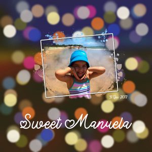
I am still not comfortable creating the Bokeh effect. Each time I do, I learn something, but I need to practice a lot more.
I created two layouts, one following Carole’s tutorial and the other following Sue’s instructions from Love Story 2018 Challenge. Both instructions are great. I did each layout using different background photos, but I am only going to post one of each.
February 23, 2020 at 12:59 pm #39585Day 7
My heart polkadot paper can hardly be seen at 600 px, but it is there as the background paper. This year I didn’t add the Wire Effect to the title, and I use the same text as Carole but with a different font (Lovely Valentine).
Paper: KAagard_BasicallyWhites_Paper5
I really enjoyed participating in this challenge again!
February 23, 2020 at 2:43 pm #39593Shutterpixi, Thank you for your very kind comment, seems rather inadequate for the compliment you paid me. Your kind words are very touching and very much appreciated. Your day 7 page is exquisite. I love it’s simplicity.
Cristina, I love your Bokeh pages. For me it’s not creating the Bokeh, but the colour scheme. To me I feel some colours are better suited for this technique.
Thank you, to the others that have complimented me on my pages. I love scrolling through the pages each day. There is so much talent out there. They are a great source of inspiration. Well done all.
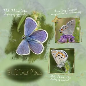
Once again I’ve used nature photos. These are some of the smallest of butterflies, only 20mm. I used one of the photos to create the background paper. I’ve used the same techniques in all of the pages for this challenge, to maintain some continuity. I have thoroughly enjoyed this challenge, even though I’ve participated before.
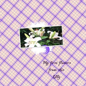
February 23, 2020 at 3:31 pm #39597I played with polka dots … and doubled mine up … and it came out looking like little space invaders. I could have just taken on layer off and it would be dots, but I kind of liked them so left them. Reminds me of the old days. I did not use wire as this project didn’t seem like it needed wire … but going to play with wire on something else. Inbetween times, I have been playing with the vases with the tips Cassel sent to make them seem more “rounded” … and I also went back to day number 2 and made a plaid! Crammed a lot in today! LOL I am at a different house today with different computer and supplies so will only send the polka dot for now. When I get home I’ll send a plaid. It was easy, just like she said. I just wasn’t grasping it all on the first go round. Sometimes I think I do a lot better if the tv is OFF and the door is closed! No distractions.
February 23, 2020 at 3:53 pm #39598Sue, thank you! This is where I am not comfortable, choosing the colors of the bokeh effect and the background. I agree with you; some colors are better suited than others, I only have to find which they are by trial and error 🙂
The layout and photos are beautiful, and I love how you do the background papers.
February 23, 2020 at 4:19 pm #39600Same to you too Cristina. (thank you 🙂 )x Trial and error, is the key to learning. I also find I can get carried away, and over do the bokeh effect. I’ve found I much prefer less than more of them.
February 23, 2020 at 4:29 pm #39602 -
AuthorPosts
- The forum ‘Showroom’ is closed to new topics and replies.


