Home of the Scrapbook Campus › Forums › Showroom › Love Story Challenge 2020
Tagged: Love story challenge - Day 7
- This topic has 282 replies, 23 voices, and was last updated 4 years, 10 months ago by
Gerry Landreth.
-
AuthorPosts
-
February 20, 2020 at 10:38 am #39244
Jnet – The embellishment you added highlights the beauty of your flower. Wonderful combination and such a beautiful result!
February 20, 2020 at 10:38 am #39245Here’s my day 4 of the Love Story challenge. This was an easy page to create, as I had previously made the masks. The Shaped Text tutorial can be found in the Lab. The frame is a combination of a brush, a font and a preset rectangle. Which looks a bit quirky, but then so is the relationship between Tess and Tomi. So I’ll call this page quirky love! 🙂
February 20, 2020 at 10:41 am #39247Sue – Beautiful day 4! Great job!
February 20, 2020 at 10:42 am #39248Annie – Your image is so lovely, and I like how you kept the kaleidoscope background from dominating. I think your floral corner is the part that really pulls it all together and makes it wow. Very nice!
February 20, 2020 at 10:44 am #39249Cassel – It was easy to create my own mask following your instructions (I’ll admit to having the benefit of going through this challenge last year). It’s quite freeing to be able to make a mask that suits my needs rather than having to rely on a pre-made mask of someone else’s that might not be what I want. Thank you!
To all those folks who are struggling with masks, I have to agree with Cassel and others who have urged you to hang in there and keep trying. You’ll have that “Aha!” moment and after that, you’ll be so happy!
February 20, 2020 at 10:51 am #39251My Day 4. This rosebud is from an old-fashioned rose in my flower bed. I didn’t put a frame around the rose, as I wanted a simpler, more basic look. The background was done with a lot of playing around and trying different things, but the part that is most noticeable is the texture followed by the plugin Simple – Diamonds. The fonts I used, starting at the top, are Scriptina, Sophistica 1 and Trebuchet MS.
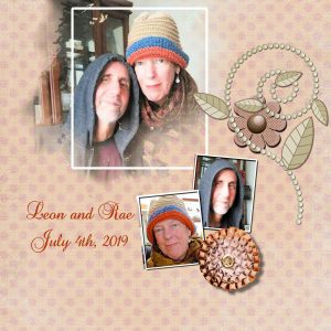
February 20, 2020 at 11:09 am #39252First of all, thank you so much, Annie, Shutterpixi, and Carole for your kind words on my project. <3
I have to say that you, Annie, and Shutterpixi are creating amazing and creative layouts. Sue, your work is beautiful, and I am loving how you are lately creating the frames.
Everyone, even the ones that are saying that are struggling, is doing a fantastic job, showing beautiful pages, and touching journaling.
I am glad I am participating for the third time in this challenge, always learning, getting more comfortable creating masks, and being inspired by you all.
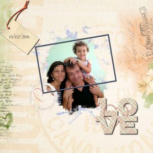
February 20, 2020 at 11:17 am #39254Here is my Day 2
Template 2 (by Cytisia) – Love WordArt (by Alinamaria PBS Escale Amourese) – Painted love heart (by Palvinka) – Tag with string (by Janet Scott-PixelScapper)
I duplicated the background paper layer and changed the blend mode to Multiply for the colors to pop up a little bit more.
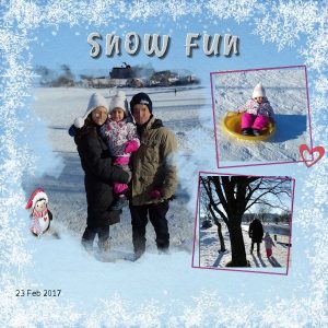
February 20, 2020 at 11:24 am #39256Day 3
Template (Lady DCS template2 avril 2016) – Winter Beauty Edges3 (Palvinka) – Paper and Penguin ( KAagard Winter Wonderland) – Heart (Nicky PBS Escale Amourese)
For the penguin, I used a technique from Carole’s “PopUp Masterclass.” Although not evident with this layout size, I used the kaleidoscope pattern in the title.
February 20, 2020 at 12:50 pm #39259I have to admit, like Barbara said, I don’t use the shortcuts …
I digitise a lot for embroidery and … my brain can not remember those shortcuts. (grrrrr)
Everyone: beautifull pages in scrapbooking!!!
Me myself I use PSP for my pictures in family-friends-wedding- albums, and I’m learning here a lot!
The pictures of the birds are really spectacular!!!
Day 4: playd with several masker-layers
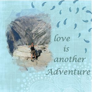
February 20, 2020 at 3:42 pm #39261well that was fun and easy The paper is from a Dea Spina kit a Persian Appeal, from my old stash and a paisley brush from a font. the photo is my oldest child.
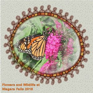
February 20, 2020 at 3:49 pm #39263Wow, with all the downloads and installs I know I never would have figured this out from any manual. Thanks for the great instructions Cassel. And thanks to the other participants for their great inspirations. Here is my Day 4 Mask, still pretty basic, but I added a frame from Bootcamp and coloured the text based on the butterfly wings. My cold is almost gone so the brain is starting to work again.
I’m trying to create a circle logo with writing around the border. I saw a post today that had a similar text art, but I’m not sure where it came from. Any help would be appreciated. Thanks.
February 20, 2020 at 4:46 pm #39265I tried different fonts, mostly cursive, but it was clear that I need to work on spacing to make it look seamless.
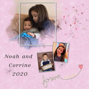
These are my great-niece and nephew. The former “baby of the family” is doting on the new “baby of the family.”
February 20, 2020 at 5:03 pm #39267the previous post was day 4 this one is a version of day one with the photo I originally planned to use.
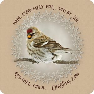
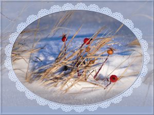
February 20, 2020 at 5:23 pm #39270Leslie You are probably referring to text on a curve. I posted something similar on scrapbooking with PSP a short while back. I’ve attached it, using one of Cassel’s lace fonts. The other is text around a mask. You have to create a circle or ellipse using a preset shape, convert to path, then by hovering over the circle with the text tool, click. Then start typing. There is a tutorial on the blog. I’m sure Carole will direct you in the right direction. In order to have text at the bottom, you need to duplicate the circle, convert to a path, select the pen tool, right click in the circle, select edit, and click on reverse path. Then start typing . I’ve attached 2 examples for you to see.
February 20, 2020 at 5:49 pm #39272day 4: this is my dog Teddy. I don’t know where I got the belt frame but I think it’s kind of cute, sort of like a collar. His toys are scattered all over the house so I decided to give him some toys here too. The carpet and the toys are from pixelscapper and I think they’re adorable!
A couple of days later. I’m not sure about this. Tried something else.
Also, I went back and redid days 2 and 3.
February 20, 2020 at 5:53 pm #39273Wow there are a lot of beautiful tags on here, well done everyone xx
Carole you havent lost your chance, shove Tuesday, pancake day isnt until Tuesday.
February 20, 2020 at 7:17 pm #39286Hi All
My day 4, I used another photo that was on my f/b feed yesterday.The brush was one I had previously downloaded. The paper and elements were from rush ranch.
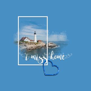
February 20, 2020 at 7:31 pm #39288I am 1600 miles away from home for the winter. Don’t have any photos here of family … but while I like it here, I miss my home. Can’t wait for spring so I can go back.
February 20, 2020 at 7:33 pm #39289Minka-lovely page!
February 20, 2020 at 7:51 pm #39290Sue, a lovely day 4 my friend. I really appreciate the frame, very clever. A big thumbs up to quirky love! <3
February 20, 2020 at 8:57 pm #39291Barbara, you did a terrific job on this page. Teddy is too cute and sure has a cheeky look about him. I do love the belt frame and it works well for this project. Your background page is lovely, well done.
Cristina, lovely work on both pages my friend. The penguin is really cute and you did a terrific job with him, he looks as if he is part of the family! <3
Gerry, looks as though you are not going to have problems with masks! Job well done and cute family to boot!
Leslie, the frame you used is delightful and really suits the painted lady butterfly. Love your background paper too. Well done!
Lydia, a beautiful use of colours for day 4. They generate a calmness and serenity for the occasion. Well done Hon.
Minka, a lovely use of a mask for this project. Simple and very effective, well done.
Peggy, you are coming along in leaps and bounds! Love your day 4 … persistence pays!
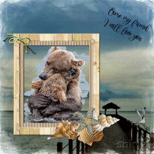
Shirley, a gorgeous page my friend. Showcases that beautiful photo perfectly. Gotta love bear hugs! ;D
Shutterpixi, Stunning … both the photo and the page you have created to showcase it. My kinda page Hon, well done!
I hope I haven’t missed anyone. If I have, please forgive as all the work is really amazing. You really are a creative bunch!February 20, 2020 at 9:27 pm #39296Made the mask from a brush I already had, added 3 layers of paper each faded out, a paing splash to just lift the colour a little, added a faded frame and a graphic to finish Text is Charline.
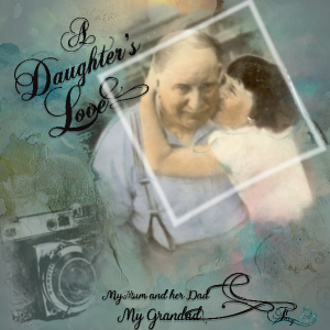
February 20, 2020 at 9:39 pm #39299You put some work into this Trish and it shows. A delightfully nostalgic page my friend, well done!
February 20, 2020 at 10:50 pm #39300Sue, really nice effect on that frame. Very original. Those lace frames are so fun too.
Shutterpixi, very delicate effect on that background. Was it actually on purpose or did you use random settings until you found something you liked?
Cristina, I love those brush effects. Are they added by you or part of the background paper? The penguin is a fun touch.
Lydia, you did a great job on the shadow of the pillow! I am sure you will find great ways to showcase wedding photos with masks since they can give such a delicate effect when they have faded edges. You might become known for a new style? 🙂
Peggy, I was trying to make those projects simple and quick, so the focus is on using the masks and learning more about them, instead of adding complicated steps or elements. You are completing those projects faster now?
Leslie, I am glad you are enjoying all the new knowledge and new supplies you are gathering through this challenge and other Campus activities. As for the text on path, check out this tutorial.
Gerry, if the letters are too spread apart, you can adjust that. It is called the Kerning, and you can find it in the Other options of the Text tool. Select the text and find that Other options icon (it looks like three faint horizontal lines) and in the dialog box that will appear, find the Kerning. Set it to 0 and see if the spacing is how you like it. If it is still too spread apart, lower it (clicking the up/down arrow right beside the value will increase/decrease by 25 at the time).
Barbara, I love how you are taking this opportunity to actually TELL a story with those pages. Those are great memories.
Shirley, awe… such a nice and sweet photo! My modo is “when something goes wrong, there is something to learn”.
Minka, where are you from? That page is super simple, yet it is beautiful!
Trish, that is a lovely photo and well showcased too.
February 20, 2020 at 11:30 pm #39302I’m off to a slow start on my second time at the Love Story Challenge. Here is my first page.
I spent quite some time trying to get the underlying greyish “pattern” that was part of the initial background paper to show. I turned that into a mask but I could not see any of the artifacts, either leaving it white or trying to negative image that layer. I have gone over the instruction video many times trying to suss out where I’ve gone wrong, but after trying this process 5+ times without seeing the results I gave up on it. Too bad as I really liked that pattern. Guess this will have to do for now.
Paper and elements are from PixelScrapper’s Love Birds bundle.
February 21, 2020 at 12:25 am #39303Thank you, Cristina, Annie and Cassel!
Cassel – I had some ideas on what I wanted to do, but that changed the more I played with it. When I applied the texture (fine canvas, I believe), I liked that look and did some fine-tuning with it. That led me to then use Simple Diamonds to further tweak it, and after that, I adjusted the opacity of about 3 different colored layers to get the shade I wanted.
February 21, 2020 at 12:26 am #39304Cristina – Your day 2 picture is lovely (such a great family photo!) and what you did to make the colors in your background stand out worked well. Looks like everyone is indeed having fun in your day 3 image! I think the kaleidoscope pattern makes the title look snowy – nice effect!
February 21, 2020 at 12:27 am #39306Gerry – What terrific family photos! You put them all together very nicely – great job!
February 21, 2020 at 5:39 am #39311Day 4. I decided to use one of the paintings (hundreds) I have from DeviantArt. So, this one is a little fantastical. Cassel, you mentioned that this tutorial could be addictive, well heck yeah, I love it! Thanks for takin a peek!
-
AuthorPosts
- The forum ‘Showroom’ is closed to new topics and replies.


