Home of the Scrapbook Campus › Forums › Showroom › Love Story Challenge 2020
Tagged: Love story challenge - Day 7
- This topic has 282 replies, 23 voices, and was last updated 4 years, 10 months ago by
Gerry Landreth.
-
AuthorPosts
-
February 19, 2020 at 5:44 pm #39176
Day 3 project. I’m so happy to know how to use a mask like this. I have tried uploading them to PSP and using them with the “load/save mask” option under layers, but many of those masks, if loaded at their original size, load in the upper left-hand corner of the page which is a pain.
Cassel: Yes, the “select none” option was what I needed. Quite honestly, I don’t find using the shortcut methods any easier to use than what you refer to as the long way, maybe because I don’t have to remember anything. All I have to do is look at my choices and select. Who knows?
I put a small drop shadow under three of the elements on this page.
February 19, 2020 at 5:46 pm #39178I still fumble repeatedly even with written directions and watching the lesson repeatedly but it is coming along slowly
this time I just used one of my old papers and one from a kit that was use din the basic course. it looked kind of flat so I came up with a way to fake having a drop shadow on the mask.
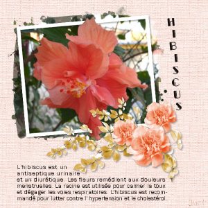
February 19, 2020 at 6:42 pm #39179A beautiful page Jnet, hibiscus are a beautiful flower and you have presented it in all the glory it is due. Your background paper is a delight. Well done Hon.
February 19, 2020 at 6:56 pm #39183Day 3 and still having issues with the masks. I don’t know why as I have done it a few times now. At least this one came to me easier. The process is quite intense though. Pixel scrapper, what a great site.
February 19, 2020 at 7:27 pm #39186Sue, you have created a delightful page for Tomi. I like that you used the kaleidoscope pattern for the frame. I am yet to try it but I have never been happy with anything I have created using the kaleidoscope or pattern tool in psp. Anyways, well done my friend and again your photography is faultless. <3
February 19, 2020 at 7:33 pm #39187Very nicely showcased Shirley. What a lovely photo and the background paper suits perfectly. Well done my friend.
February 19, 2020 at 7:40 pm #39188A lovely background for this one Shutterpixi well made and the photo is delightful. I love the frame effect, well done Hon. Thanks for your comments on my work my friend, always appreciated. <3
February 19, 2020 at 8:01 pm #39189I love them Lydia, great page my friend!
February 19, 2020 at 8:05 pm #39191February 19, 2020 at 8:10 pm #39193Annie, thank you very much for your very kind comment on the Tomi page. As for the kaleidoscope tool, I must admit, it’s not a favourite tool of mine. I use the random, in the hope that I get a pattern that I will like. If I like the pattern, the colour will be not to my liking, which is what happened with this one, hence using the colourize tool, to get the desired colour, to go with the page. I really reduced the size of the pattern though. You create fabulous pages, although I’m not a scrapbooker, I commend you on your subject to detail, from co ordinating colours, to precise shadowing. Well done my dear friend!
February 19, 2020 at 8:25 pm #39195Lynda, what a beautiful page! Definitely shows off the lovely couple. You both show that quality of enduring love. Well done my friend. <3
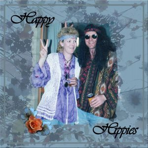
February 19, 2020 at 8:27 pm #39196Oh my gosh Shirley, I adore this page, brings back loads of memories. You old hippie you … You Go Girl!
February 19, 2020 at 8:30 pm #39197A lovely result here Leslie. Keep going with the kaleidoscope and plaid, it will improve as you go along. <3
February 19, 2020 at 8:37 pm #39198Very effective Trish and I do love the colours you used, well done Hon.
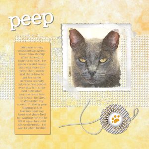
February 19, 2020 at 8:40 pm #39199Nicely done Barbara and I really like the photo of the cat … has a quizzical look on the face, 🙂
February 19, 2020 at 8:43 pm #39200Peggy, you are forging ahead nicely my friend. Each project shows a keener knowledge of psp tools. Keep going my friend. <3
February 19, 2020 at 8:51 pm #39201Thank you Sue, very much appreciated. We each have our creative side and it manifests in many forms. I love your photography and, believe you me, that is definitely not one of my talents, LOL!
February 19, 2020 at 10:23 pm #39206February 19, 2020 at 10:43 pm #39208Carole, I used your frame finally. The texture is from Coffee Shop. Julie Farber-Miller for the picture.
February 19, 2020 at 11:25 pm #39212Il s’est ajouté de superbes pages Bravo à chacune et c’est agréable de lire vos écrits
Merci Shutterpixi et Annie pour vos gentils mots
Je continue avec les hibiscus – j’ai tourné le masque pour ajuster à ma photo. Le feuillage et les fleurs sont de Angelhase
February 19, 2020 at 11:52 pm #39214Hi Scrapbook Campus. Here is my Day 3 project. I did use the mask from Pixel Scrapper and, I made the background by following Carole’s kaleidoscope tutorial and it took a little while to achieve the result I was happy with. I set it in the patterns tab at 45 degrees and 25% size. I then added a solid paper to overlay and tone down the colours of the kaleidoscope pattern. The floral corner is my own creation from my watercolour graphics folder which is a forever folder. Thanks for takin a peek!
February 20, 2020 at 12:00 am #39215Gwen, Jnet and Lynn, nice work on your pages ladies, well done.
February 20, 2020 at 12:07 am #39216Lynn, the blending of the mask makes it almost like the image is part of the background. Great work.
Annie, the black and white image makes the overall page stunning.
Shirley, your result does not show at all that you are “not in love” with masks. What part is still “stumping” you? In the second project here, what mask did you use? it looks so good! And it seems to come faster with each project, which is great.
Jnet, une page toute délicate! Le fait de découper les pétales par-dessus le cadre donne un effet délicat!
Minka, your use of the mask is perfect. As for plaids, it is often a matter of “playing” with the colors and size, and a suitable result is not always the first one we get. And yes, the challenge is all about learning more about the tools and how to use them. And the Kaleidoscope effect can certainly take a long time to find something we like. I also always use randomized settings until I find something suitable.
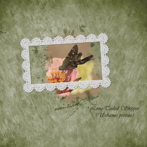
Lydia, making your own paper always has that advantage of perfectly matching since you are the designer and you choose the color palette yourself. That is one great advantage over trying to find ready-made supplies. I love how you placed the tail over the frame! A small detail that makes a great effect.
Trish, I see you made a larger shadow on your flower. I might have been unclear in what I said previously; I thought of a blurred shadow. But of course, if you want to “envision” the flowers like a cutout in paper, you can definitely do it too. YOU are the creator! I love your Mardi Gras project. You reminded me of that day. Here, my husband knows that day as Pancake Tuesday, but when I reminded him, he said he had already prepared dinner and forgot it was supposed to be pancakes!
Sue, using other tools to create you project is always welcome, and it is great when you share what you did so others can be inspired AND try it too!
Shutterpixi, how was it to create your own mask? Was it new to you? or challenging?
Leslie, it is always a good idea to add those details: location, date and names when appropriate because even though WE know, others might not (and sometimes, we also forget!). Your kaleidoscope effect looks like a patchwork design 🙂 For the plaid, you might need to lower the opacity of the top layer if you want the effect to show through.
Barbara, you are totally free to use the “long way” instead of a shortcut. It is all a matter of preferences and PSP gives you that option. Your shadows are good on the page, however, is it a shadow in the opposite direction on the title? As for the Load/save masks, it will always use the whole surface of the image, which might be wanted, but not always, so now, you have another way to use mask.
Peggy, you are determined and it shows. Learning those tips and techniques take practice, and I am sure it will get easier with future projects.
Lynda, good choice of mask. Was it one from PixelScrappers?
Gwen, great first project. You should have time to catch up!
Annie, your background is very delicate because I don’t see the kaleidoscope effect 😉
February 20, 2020 at 12:18 am #39217Annie, this is beautiful.. well done
February 20, 2020 at 1:04 am #39218Thanks Carole. For my 2nd day, I used one that came with my psp 2020. Yes I was happy with it and loading it from my psp was a lot easier. Because your tutorial for masks is in the 1st project, I have had lot of to and frowing. Lots of layer shifting. If you were here you would probably laugh at me and do it in one click, but as my husband would always say when things were going wrong. “You won’t give up will you”
February 20, 2020 at 1:40 am #39221Annie: thank you so much for noticing my Rahne and Peep. They were both very special to me.
February 20, 2020 at 1:51 am #39222Cassel: The actual drop shadows I applied all go in the same direction. But, I’ve been playing with adding depth to different fonts and elements by duplicating the letters or objects and making the bottom layer black or white. Then I move that bottom layer either up or down a little to the right or left. I particularly like moving to the left with fonts…for some reason, they’re more pleasing to my eye that way. I usually move that bottom layer in the same direction for all of the elements, but I notice I didn’t do that on my Peep page. So, I’ll go back and correct it now!
February 20, 2020 at 2:58 am #39223Thanks Lynda and Cassel!
February 20, 2020 at 6:10 am #39238February 20, 2020 at 10:37 am #39243Thank you, Annie, for your comments on my work! Appreciate it!
-
AuthorPosts
- The forum ‘Showroom’ is closed to new topics and replies.


