Home of the Scrapbook Campus › Forums › Showroom › Greeting Card Workshop (2022)
Tagged: Workshop Card 6
- This topic has 337 replies, 49 voices, and was last updated 2 years ago by
Chris Schults.
-
AuthorPosts
-
November 16, 2022 at 3:58 pm #86665
Template 3
November 16, 2022 at 3:58 pm #86667Hi everyone. I have to circle back and do Day 2, but here is my Day 3 creation. Thanks Cassel for the new info.
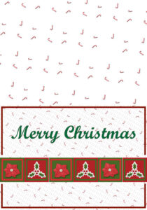
I found a background with candy canes and used one size on the front of the card along with other Christmas features and used a slightly larger size, arranged differently for the back.
-
This reply was modified 2 years, 1 month ago by
Leslie Gifford Cook.
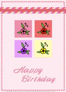
November 16, 2022 at 4:50 pm #86670Card 2. I did not feel happy about the ribbon but it is what it is. I used a free floral doodle to colour in and although I tried Carole’s technique i got into a bit of a pickle so did another technique. Still, Carole’s one is something new and for me to practice another time. The font is called 4 Magic DNA. I used some texture on most of it. TFL.
November 16, 2022 at 4:58 pm #86672I just got started so I’m a bit behind. First card
Carole asked where the watercolors came from.. You can get them at Digital Scrapbook/Pixelscrapper .
-
This reply was modified 2 years, 1 month ago by
Lynda DiGregor. Reason: answer to Caroles question
November 16, 2022 at 4:59 pm #86675Day 3
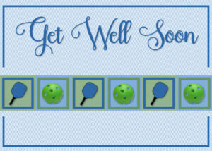
There will be lots of room inside for all the pickleball players to sign the card before it is sent.
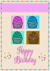
November 16, 2022 at 4:59 pm #86676This was fun to do. I added a few sprinkles to the chocolate frosting and next to the Birthday Greeting. The font is Nouradilla from Creatfve Fabrica and the sprinkles are from Digital Scrapbooking.
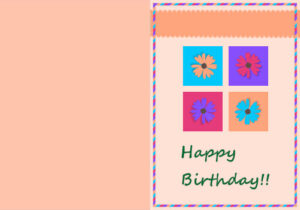
November 16, 2022 at 5:33 pm #86680A little late, but here is my Card #2. A Birthday Card for my husband who loves flowers.
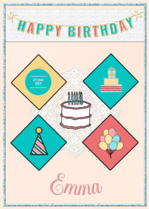
November 16, 2022 at 5:45 pm #86682On day 2. All the elements come from PS – Marisa Lerin, except the doily which I had made in a lab. The border is Cass glitter. Loved learning about selecting a portion of an element and then coloring it on a raster layer you put behind the element. Neat.
-
This reply was modified 2 years, 1 month ago by
Mary Solaas.
-
This reply was modified 2 years, 1 month ago by
Mary Solaas.
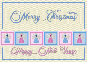
November 16, 2022 at 6:47 pm #86698I stick with christmas cards and used the angels that Carole had as a freebie over 2 years ago I think. The colors are not old fashioned christmas colors but I’m okay with that. I learned a new trick to make a quick diamond pattern! The font is Briantone Unique.
November 16, 2022 at 7:57 pm #86705I made this composite a few years ago, but I added shadows to the original for this workshop. The brad is from Marisa Lerin. What a nice simple layout, Thanks Carole!
November 16, 2022 at 8:35 pm #86709The font is Star Bright from Creative Fabrica. The flowers are from Digital Scrapbook.
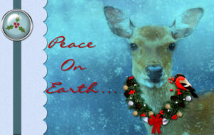
November 16, 2022 at 9:04 pm #86710 Instead of creating diamonds for the background. I used the same technique to create this background. I used a font . Holly and berries, coloured them to create the pattern.November 16, 2022 at 9:04 pm #86712
Greeting Card Workshop – Lesson 3 made with the kit: Autumn Wind Bundle by Gina Jones
November 16, 2022 at 9:06 pm #86715November 16, 2022 at 9:47 pm #86717
How can you tell I’m a rookie lol…heres my first send for template 1
-
This reply was modified 2 years, 1 month ago by
christine carlson.
November 16, 2022 at 10:11 pm #86719I am learning SOOOO much about how to use PSP. I’ve literally owned copies of this program since the 90s back when JASC still owned it (I think my first version was 3) but never really explored this part of the program. Thanks so much for making this understandable. I just don’t know that I’ll ever be able to keep track of all the layers. Does it come with experience or are there tips to keeping them all straight?
November 16, 2022 at 10:27 pm #86721Day 3 Merry Christmas x
November 16, 2022 at 10:27 pm #86722Christine, you did a great job for a rookie, but it does take a long time, doesn’t it? I’m not even a rookie and I bet I spent 5 hours on this stupid thing!
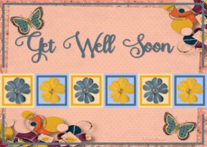
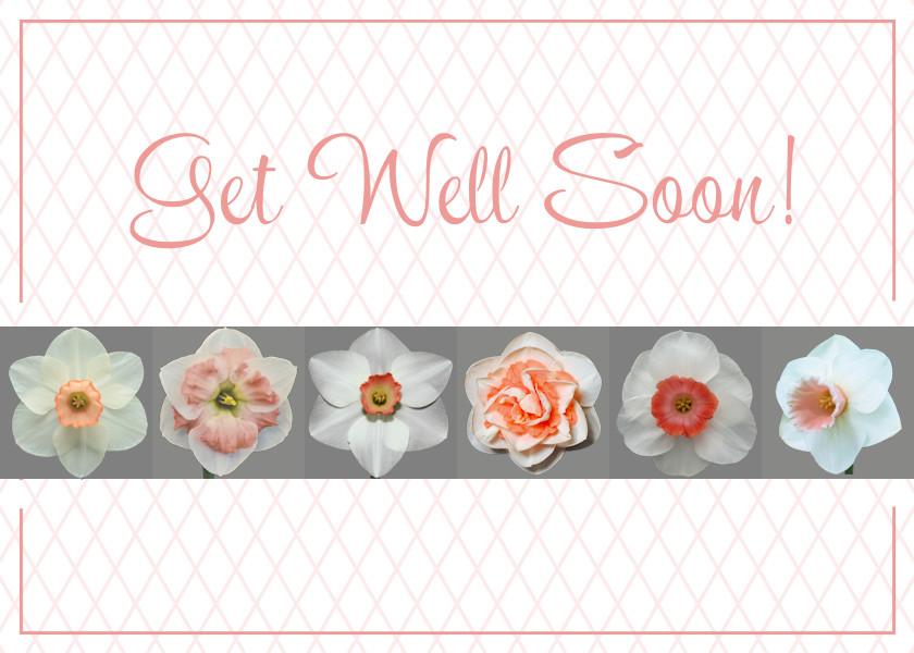
Lesley, same here! I can’t even see, so when I add a new layer, I actually do not use the default “Raster 1” or whatever, I use something like “Border”or the exact text, e.g. on my card “Get Well Soon”. That helps a little bit. Not a lot but a little! Carole is a fan of “groups”, so pay attention to those. She might have 5 or 6 layers in a group, so that shortens the long list by a lot.
I really want that font, Holiday Melodine?, but it’s a little too expensive. I didn’t see the bundle!
Bonnie gave me this idea, thank you! — for everybody at the Daffodil Society meeting to sign!
Ok. I pretty much have no idea how to get it in the forum from the gallery, so here goes!
-
This reply was modified 2 years, 1 month ago by
Suzy.
November 16, 2022 at 10:53 pm #86724Chrine try this one it is free, I have this font but its under a different name, Ill d
search tomorrow to see if I can find it, but I have so many I get lost lookin let me know if this works
November 16, 2022 at 10:56 pm #86725Suzy try this ifont/holidaymeladine
its free on this site. good luck
if it doesnt work I have this font but it has a different name, Ill try to find it, but I have so many fonts I get lost looking, so let me know if ifnt is any good xxNovember 16, 2022 at 11:33 pm #86726Not much originality; just trying to learn the basics.
 November 16, 2022 at 11:41 pm #86727
Thanks, Trish! I think I will change my card with the newer font which I like a LOT better than the one I used. (kontikienchanted).
November 16, 2022 at 11:51 pm #86729November 16, 2022 at 11:57 pm #86730Suzy (#86584), when seeing your card, I immediately thought of those keylines! I am sure you will use that technique again! If you want to make it a quarter-fold card, you might have to crop it to fit your printer. (#86722) Maybe I got that font in a free bundle at one point or another. Keep an eye on Creative Fabrica, and you might see it in a future bundle.
Bill (#86586), to color the ribbon, there are two typical ways: Colorize and Hue/Saturation/Lightness. You can read more about it in this article (even if it illustrates lace, the same techniques apply for other elements).
Sharla (#86607), that design behind the little images give such a great effect. I see you also duplicated the ribbon to put the text in two lines. Creative and effective.
Chris (#86618), I am sure I have seen and commented on those cards. Maybe they were in previous “pages” of the thread? Using a photo on the left side is very creative and gives a great result. (#86631) That texture can give a great effect for backgrounds of any color. Maybe you could colorize the grey boxes so they match the rest of the card? Maybe a peach color? (#86633) That is a fun card. Are we invited?
Jnet (#86574), that is a very creative way to use the template. You can get many different cards using such modifications.
Ann (#86630), so simple but very elegant!
Kasany (#86643), that is such a good idea to use the squares for window panes. I never thought of that!
Ann (#86645), although you can use the same card over and over again, I am sure you can easily tweak it for individual recipients.
Susan (#86646), I could certainly imagine most of these cards in a greeting cards display at the store!
Marie-Claire (#86653), such a beautiful traditional card!
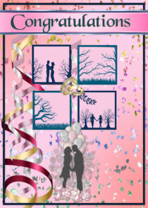
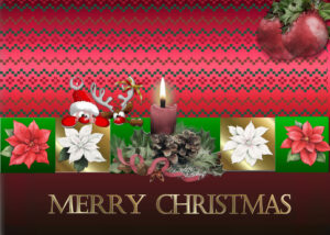
Trish (#86665), that slight overlap of the leaves over the frame and the small squares create such a great effect. (#86715) those silhouettes are such a great idea! I might suggest you move the streamer in front of the squares and the frame? (#86721) Those peeking characters are so cute!
Leslie (#86667), that is a fantastic card. Do you plan on printing it? (#86680) Nice way to use alternating colors!
Sheila (#86670), you will surely have other occasions to use that technique. If something is unclear or not working as you expect, don’t hesitate to ask.
Lynda (#86672) did you paint those images? Watercolors are great on greeting cards.
Bonnie (#86675), hopefully, you don’t have to many sick or injured friends to use this card!
Anita (#86676), yummy!! Those sprinkles add some interesting details. Maybe you can add a little shadow on them?
Mary (#86682), wow!!! What a different way to use that template. Those diamonds look great!!
Corrie (#86698), that is a very interesting font! Glad to see you use those angels!
Nancy (#86705), yes it might be simple but it is very elegant!
Gerry (#86709), I love that font. I have it installed and love using it too.
Sue (#86710), those subtle colors are still very seasonal without being overpowering.
Louyse (#86712), since the papers and elements have obvious shadows, maybe you could consider adding some for your little squares too?
Christine (#86717), where did you get that great image? Perfect for the season!
Lesley (#86719), what version of PSP are you using? Since many versions, there is a thumbnail for each layer so that can help. And you can customize the size of that thumbnail if it could help.
James (#86726), these lessons are just like learning a recipe. It is ok to follow it to the letter so you can tweak it later, but also ok to be creative.
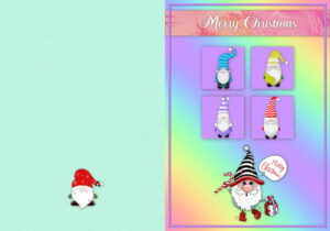
Lois (#86729), those gnomes are so cute!!! Good idea to use the back to add more design!
It is such a pleasure to see all the creativity you are showing and how you tweak and change the starting template and end up with something totally new!
November 16, 2022 at 11:57 pm #86732November 17, 2022 at 12:41 am #86733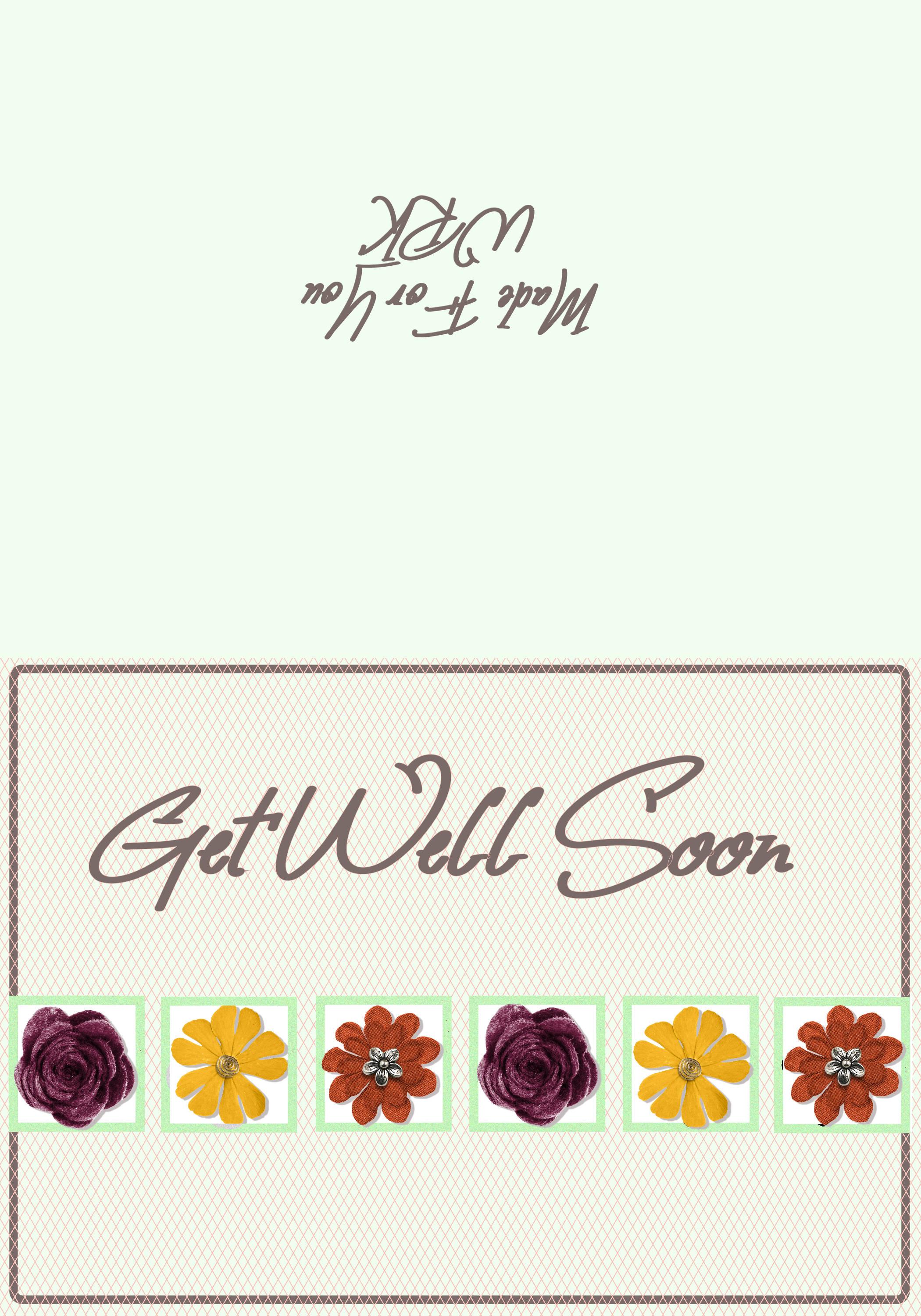
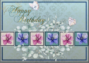
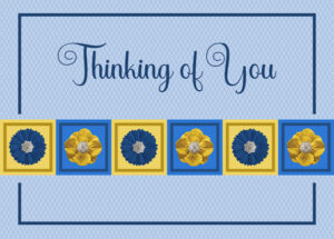
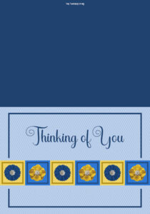
I had trouble with the borders around the flowers. I could create them okay but the FloodFill tool would not work. So I ended up just keeping the borders and doing away with the background for them. It still looks nice to me. I included text on the back page. It would need to be inverted to show properly when the card is folded.
Once again, there is a lot to learn from this class!
My font is “Aloha Summer” and the flowers are all from Creative Fabrica.
November 17, 2022 at 9:20 am #86767For card 3 I stayed with Carole’s theme so I could follow and learn the techniques.
November 17, 2022 at 9:42 am #86769November 17, 2022 at 10:32 am #86770Card #3 – A birthday card for my daughters’ stepbrother. Jim is an electrician and will be 59 tomorrow.
The font is Bungee, and I used the Snowy Mountain gradient for the background, treated with a Weave texture. I found the electrician symbols at Nicepng. Just using it as a digital card so I didn’t make the back.
 November 17, 2022 at 11:07 am #86771
Ann Seeber: Fine cakes on the card:))
-
This reply was modified 2 years, 1 month ago by
-
AuthorPosts
- The forum ‘Showroom’ is closed to new topics and replies.


