Home of the Scrapbook Campus › Forums › Showroom › Double Take Challenge 2021
Tagged: Da1
- This topic has 251 replies, 24 voices, and was last updated 2 years, 7 months ago by
Kathy Trush.
-
AuthorPosts
-
April 24, 2021 at 3:14 pm #57203
I amended the final page, by replacing the lifted corner image with the original unlifted.
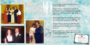
April 24, 2021 at 4:10 pm #57206We had a bit of an adventure getting to our wedding ceremony. Hereby lies the tale…
(I also had an adventure trying to post this.. the wedding bell elements vanished when I scaled down the .pspimage. I had to go back and put them back in and then I saved it as a .jpg full size before scaling down. That worked!)
April 24, 2021 at 4:43 pm #57207Jnet I love your pictures and layouts as well. My favorite so far is the one that you showed the front of your RV. We are RVers as well. My dream is to possibly one day travel the US and Canada. Just experiencing this beautiful world. Do you live in Quebec? My grandmother was born in St Wensalas. They moved to America when she was 16 to work in the textile mills. My grandfathers people were of Scottish descent, and many of them left America to settle in the the Shelborne area. Hopefully my French will be good enough someday to navigate around Quebec.
April 24, 2021 at 5:40 pm #57209This has been a rough year for the world. Last Tuesday marks the anniversary of my second vaccine. The number of active Covid cases in Memphis has been horrible. So, we have been very careful. This week was the first time I bought my own groceries without curbside delivery. It was so nice to go in a store and actually pick out what I wanted for myself. I have missed talking to people in person, except for my immediate family.
I enjoyed creating the background for this layout. My ‘grunge’ is subtle, but it is there.
April 24, 2021 at 6:01 pm #57211Wow Ann what a wedding story!
Monique a lovely way to show us all the pets you have had over the years!
Carole, I indeed tried a darker background on day 4 with all the whites, but I found it to dark, jut a personal preference. I was careful not to put text in the middle, as you pointed out earlier. I certainly will make an album.
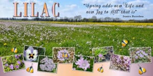
Here is day 5 and the color is lilac. The panorama is of a meadow and some of the flower photos are shots from that meadow. I extracted the butterfly from one of the photos (not very well, sorry) and used it as an embellishment because the layout missed something.
April 24, 2021 at 6:21 pm #57212Cindy, I wanted to encourage you to not give up. I have been where you are. I first bought PSP in 2018, and for three years every time I opened the program I closed it immediately in frustration. Carole offers a Basic Scrap course that is very good. I think also from time to time she has a Scrapbook Bootcamp as well that starts with understanding Layers.
April 24, 2021 at 6:25 pm #57215You folks never fail to amaze. I love all the pages/pets/birds/flowers/trips/weddings! Thank you all for brightening my day.
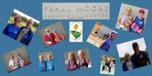
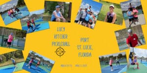
I will post some of my pages. Remember, I have never posted my 2018 results for this challenge…I got off course on some of the pages…that may be the reason I never posted…I really don’t know but I didn’t report a single result. South Carolina Senior Games. I played pickeball singles, doubles, mixed doubles. My friends played doubles and horseshoes.
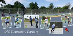
April 24, 2021 at 6:27 pm #57217My pickleball group at play during the summer…
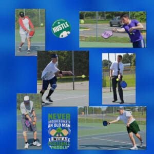
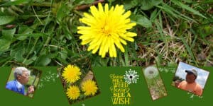
April 24, 2021 at 6:28 pm #57221This did not follow the lesson…oh, well….
April 24, 2021 at 6:29 pm #57222Here is day 6. For some reason when I reduce the photo to 600 pixels the text gets very feint. At full size it’s quite dark. Not sure I’m happy with the highlighting, but I guess as it’s on its own layer I can always turn it off. This whole challenge has been lots of fun and I feel like I’ve learnt so much. Hopefully I don’t forget it all!
April 24, 2021 at 6:30 pm #57224Now for the completion of my 2021 exercises:
April 24, 2021 at 6:31 pm #57226Day 5
I really struggled with this one…just could not find photos I liked for the layout…these are, however, my photos.
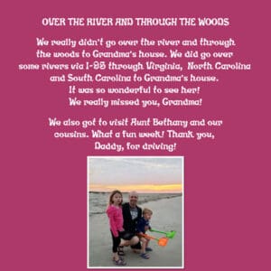
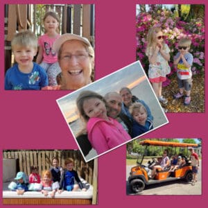
April 24, 2021 at 6:40 pm #57229My friend lives in Washington, DC and his Mom lives in SC. He has just beaten cancer and took the kids to visit their Grandmother while his wife was helping her Mom with things.
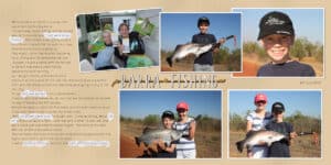
April 24, 2021 at 6:46 pm #57230Jean…you posted while I was posting. I love your page! If you would adopt me, you could take me fishing. I have fished all my life when I could…not very often, I am afraid. Thank you for sharing this fun page!
April 24, 2021 at 7:32 pm #57231Carole, thank you, and yes it is a free font, Novak Spring, and I believe it is available at a few of the popular freebie font sites.
April 24, 2021 at 7:42 pm #57232Thanks Jean. We really do have beautiful birds here and the Rainbow Bee-Eater is superb. I was a hopeless photographer and most of the photos I use are from Australia Geographic … and they have some amazing photos of birds. 🙂
April 24, 2021 at 7:47 pm #57234Thanks very much Ann. It is a lovely compliment and I appreciate it. I really love your Wedding Day story … quite amazing, and you did look very elegant in your wedding gown which would stand the test of time. Well done my friend. 🙂
April 24, 2021 at 7:48 pm #57235Thanks very much Monique, greatly appreciated my friend. 🙂
April 24, 2021 at 7:51 pm #57236Monique, precious ones showcased wonderfully, well done my friend. 🙂
April 24, 2021 at 7:56 pm #57238Very nice Monique. I love chooks and I have just purchased a chicken coop and moveable run for them to be able to get a green pick. 🙂
April 24, 2021 at 8:04 pm #57241Sue a beautiful page for a sad story. I see it here too my friend … no place for the native wildlife to go.
April 24, 2021 at 8:15 pm #57242Lynda, I really appreciate the page you have created. A little history lesson included makes this a keeper. I hope you don’t mind that I have taken a print screen shot to keep in my history folder! 🙂
April 24, 2021 at 8:17 pm #57243Jnet, thank you very much for your lovely compliments. 🙂
April 24, 2021 at 8:19 pm #57245Very well done Jnet and it does look an exciting place. 🙂
April 24, 2021 at 8:35 pm #57247Corrie, what a meadow! It is beautiful and the individual photos of the flowers are adorable. The gradient is a match made in heaven. Well done my friend. 🙂
April 24, 2021 at 8:49 pm #57253Cindy, please do not give up. You will experience such joy when you first conquer a hurdle. Need I say that we all started at exactly the same place you are and what we put out now has come from years of highs and lows … and, Cassel’s amazing tutorials. You must holler for help and anyone of us will be ready to respond, and you can call on Cassel at anytime. You may think that my work is nice but believe me when I say it is quite ordinary when you look at some of the designer sites … that is when I know that I have a long ways to go, lol! Chin up Hon. ;D
April 24, 2021 at 11:32 pm #57273Ann, when I mentioned cropping, I didn’t mean that you had to cut them to that shape, but using a mask gives the same effect as cropping (the viewer does not know how you do it). I meant it more as a different way to showcase the image in a unique way. Sorry for the confusion. You are getting the hang of the double pages now! The issue with the wedding bells might have been because it was a font (a dingbat) and when you use wrapped text, that does not resize as vector (although I would think that since it was not wrapped, itself, it would have resized) but I am glad you found a way around.
Barbara, I see a good composition with that panorama. Beware of the shadow on the eagle. In such a situation, it would not cast a shadow on the background. However, I had to look twice to notice it! As for your question about previews, surprisingly, many designers don’t understand shadows. They create elements separately, without making sense of the realism. Of course, they might not care about that either. It really makes me cringe when I see that. If they don’t understand shadows in their preview, would their elements be consistent with shadows and light sources? If anything, I think it has been a trend to simply add shadows to separate elements from their background, period. Does that make sense?
Monique, how many pets would you have at the same time? I am also a pet lover, but my husband is not as enthusiastic. The most we have had was two cats at the same time, and never “intentionally”. I agree that you likely have doubled the shadow on the dogs page, as it is more visible. Yes, you are developing your eye for shadows! That is a big step. For the shadows on a group, Sue explained well how to make it without losing the flexibility of the layers.
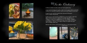
Laurie, the darkened background definitely does not look too dark. I actually thought it was just a shady area and that brightness (or darkness) seems quite natural. That last page about finding beauty in the small ordinary things is so powerful. Didn’t this past year forced us to re-evaluate some of our priorities too?
Sandra, those grungy overlays you are creating, you can also save them as your own so you don’t need to redo it every time.
Sue, using characters to showcase photos is definitely another creative way to display them, that is out of the ordinary. You might inspire others to try that! I agree that the script seems to have worked oddly on your photo. I am not sure why.
Lynda that is an interesting fact about Earth Day (I wonder if they did it on purpose to choose my birthday??) I am a little unsure about some of the images on the right; although they are displayed in a thin shape, it FEELS like a couple of them are somewhat distorted and squished (the second and the third one). Do you have the original image to compare?
Jnet, I didn’t even know of those places in Las Vegas! I am traveling with you!
Corrie, glad you did try the darker background even if it didn’t make it. Sometimes, it can look good in our head but when we do it on the image, it does not turn out the same way. The beauty of digital is that you can always change your mind! Your butterfly looks well extracted (at least at this size).
Bonnie, 3 years is a long time to wait for posting. Out of curiosity, if this (day 4) is what you did then, what would you do differently now, using the same images? I think the right page of your Day 6 might be missing some shadows. Is that possible? It is so much fun how you added those flying seeds between the photos! Clever!
Jean, when you resize, everything gets smaller so if your font is small to start, it will look faint. Also, make sure you don’t have a stroke around the text as sometimes, it affects how it will resize. As long as it is dark enough in the full size if you want to print it, you are ok.
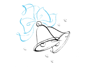
April 25, 2021 at 3:06 am #57275Cassel: Thank you for the clarification. Meanwhile, the wedding bells are a transparent .png that I found with Google which, of course, had a fake transparent background so I wielded my trusty background eraser and it was pretty easy after all. It has two colors so I don’t think it’s a dingbat and I didn’t treat it as a font which I would ordinarily duplicate the vector and rasterize. I was rather dumbfounded when it vanished on resizing. Here’s a peek at the original piece of art…
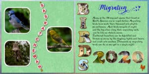
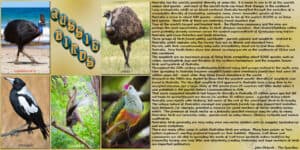
April 25, 2021 at 3:37 am #57278Hello Campus Friends. Day 6 for me is completed. The font for the title is Festival and I created the alpha by laying the letters onto emu eggs. Thanks for takin a peek. 🙂
April 25, 2021 at 3:53 am #57279Thanks Bonnie. Glad you liked the page. Lach is now a very keen fisherman, but he only wants to catch big fish. While we gave him a wonderful experience, I think we have spoilt him.
-
AuthorPosts
- The forum ‘Showroom’ is closed to new topics and replies.


