Home of the Scrapbook Campus › Forums › Showroom › Double Take Challenge 2021
Tagged: Da1
- This topic has 251 replies, 24 voices, and was last updated 2 years, 7 months ago by
Kathy Trush.
-
AuthorPosts
-
April 23, 2021 at 8:37 pm #57119
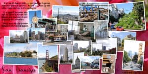
Ann Seeber, thank you. Your birds are really beautiful and colorful. Yes it is Celine Dion’s star. I walked all the way to Hollywood Blvd to find her. My text: We settled in a campsite in Malibu and we visited
Los Angeles May 7-8. Walk of Fame – Universal Studios Hollywood – The Hollywood sign – Beverly Hills – downtown Beverly Hills to see the High standing stores – the Dolby theater, the neighborhood
Spanish, El Pueblo, museum, China Town. I liked this city. To see everything, you would have had to spend more than two days there.Thanks Annie Tobin
Bravo Gerry, Sandra, Corrie and Jean for your pretty pages
April 23, 2021 at 8:37 pm #57120A lovely page Gerry and I feel where you are coming from. We lost our little Jasper in May of last year and I love him as much today as I did throughout his life with me. He was 12 yr old and should have had a few good years ahead of him but that is the way it goes.
April 23, 2021 at 8:43 pm #57124Translation of my text:
If someone told me tomorrow morning, we’re leaving for San Francisco in two days, I’d be leaving. Despite the fact that I have been there twice, I did not see everything.I spent two days there with my husband in 2011 and four days in 2015 always with my husband and with a group of caravanners.
We lived there unforgettable days and a dream of always
April 23, 2021 at 10:15 pm #57126Hi You all are Such Artists. I am not as Advance as any of you, its over my head every time I try I cant do it. I am still in Learning but I am following and your all so Great. I want you alls Talent.
I did buy a few scripts HOpe you went to the Store campus Store. I haven tried them yet but going to
thank you all love your Work its ART
April 23, 2021 at 10:15 pm #57127Beautiful work by everyone. It is such a joy to pop in daily and feast the eyes. So amazing … same tutorial and such diverse results … love it.
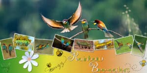
This is my day 5 … guess by now you have all figured that I love our feathered friends. Thanks for takin a peek! ;D
April 24, 2021 at 12:04 am #57128Laurie, that bottom border is a clever way to use a photo!
Annie, those flamingos are beautiful. I also love your font. Is that a free font? Yes, I think we have guessed that you like birds, but we LOVE to look at them so we are even! 🙂
Raymond, the reason I was asking was because the images were similar yet different so I was wondering if it was two different sets in the same year, or two different years, or even maybe the same set at two different times (the mom might have moved them around). I guess I am curious, and that is a good thing: it means your layout piqued someone’s interest!
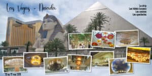
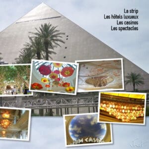
Jnet, nice and colorful layout about your trip. I like that semi-solid background! Is that a glitter pattern? That last project is a real gem with all those photos. We might not think of putting that many photos on a page, but double pages allow us to do that, AND since you likely don’t need text, it is very pleasant to look at each of them.
Gerry, you can make a very simple frame just with a vector rectangle. Something solid can be very elegant. And if you want to get even more elegant, look for some corner fonts that you can use (maybe corners could be a future class… hum… something to add to the poll maybe?). What font did you use? It is very elegant. A beautiful tribute to Lynda. Those fur babies are our babies, even with 4 legs.
Sandra, I think you aligned and chose the images perfectly to have the option to split it into two pages if you want, and if you want to print as one piece, it would be perfect too. I don’t have any suggestion for the color other than maybe pick the red and the blue from the kids’ clothes? Try it. I am not 100% sure how it would show from the background.
Ann, this is another example where a thin crop of a photo would not be “expected” on bird photos, but it becomes a creative cropping, which gives a very unique effect.
Corrie, nice white flowers. This might just be a personal preference but to showcase white, I would have tried a darker background. Did you try that? Maybe it didn’t work? Just a thought (again, it is only a personal idea).
Jean, great panorama! yes, a tick is sometimes all you need to success or pull your hair (and there are so many boxes to tick or untick in PSP!)
Cindy, why don’t you try one double-page? Even if you don’t do all of them, give it a try. Everybody started where you are. We are here to help you.
April 24, 2021 at 2:35 am #57129Annie, the rainbow bee eater is my favourite bird too. Lots of them in the Territory. Back in film days, I wasted a whole roll of 36 trying to catch the birds in flight with their beautiful wing colours showing. They are beautiful birds.
April 24, 2021 at 3:11 am #57130Annie: My goodness, you have smashing birds Down Under! The colors blow me away. Your layout certainly does them justice. If I were you I’d contact the Tourism Department to see if they’d buy it for their promos! Well done! 😉
April 24, 2021 at 3:26 am #57138Carole: I’m a little confused. I didn’t know I was supposed to crop the photos for the slats. I just chose photos that seems to work vertically. I actually enlarged them to 2900 in height to fill the slat and then slipped into the mask to get that effect which is what I saw you do on the video.
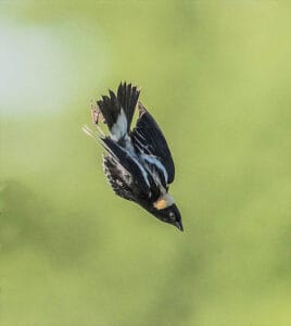
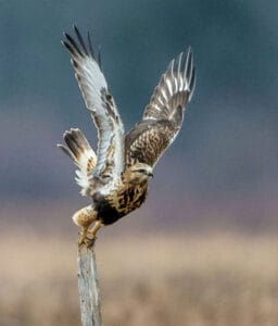
Here are the full photos of each bird, resized for posting here.
April 24, 2021 at 4:08 am #57139Oh wow, Annie, What a beautiful project! Love the birds!!
April 24, 2021 at 6:29 am #57141April 24, 2021 at 6:48 am #57144Cassel: a lot of designers are arranging their kits so that the elements jump off the page. I know they use large drop shadows and I’m guessing they put the elements with drop shadows on a number of layers before merging everything. I could be wrong, but the shadows don’t seem to all go in the same direction. Do you have instructions about how to do this somewhere in Scrapbook Campus? I wanted to make the birds on my day 5 page pop more. But I couldn’t figure out how to do it.
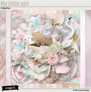
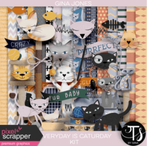
The cat kit is from Pixelscrapper and I guess it’s okay for me to show a picture of it since it’s free. The second is Scrapgirls. I’m not sure about the ethics of including a picture of it since it has to be purchased. I’ll delete it if it isn’t right to show it.
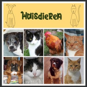
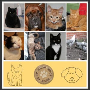
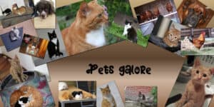
April 24, 2021 at 7:36 am #57148My day 1 was ready earlier this week but forgot to upload it 😀
The animals on the pages are the ones we had over the years. (We had more, but before the digital era, so don’t have pictures of them scanned yet)
Two of them are still here, the rest are in heaven 😉 You could say I’m a pet lover (and my husband too)
-
This reply was modified 3 years, 8 months ago by
MoniqueN..
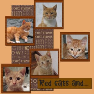
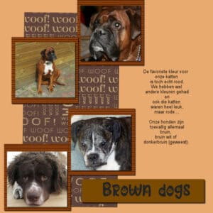
April 24, 2021 at 7:42 am #57159And day tw0 🙂
I think I have a double shadow on the banner at the dog page.
If that’s correct, I’m gonna jump for joy because I finally (maybe) see shadows better (well how they show) 😀 😀
Text is in Dutch, so translated it is:
The favourite color for our cats is really red, we’ve had other colors, but red ones….
Our dogs are accidentally all brown, brown/white or dark brown.-
This reply was modified 3 years, 8 months ago by
MoniqueN.. Reason: Dutch translated text added
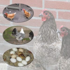
April 24, 2021 at 10:21 am #57165Day 3
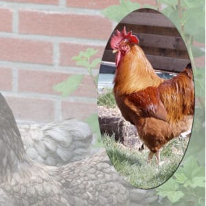
We had several kinds of chickens over the years and even some little ones (how do you call them? Chicks?)
When you add shadows the groups merge?
April 24, 2021 at 10:29 am #57168This is my Day 5. I decided to darken my background picture on purpose. I hope it works.
April 24, 2021 at 10:30 am #57169Wonderful pages submitted by everyone, they are all inspirational, educational, and fabulous layouts. Well done ladies and gentlemen! I’ve had a couple of busy days in the saddle moving cows, so I’ll miss the two days and create day 6 later on to post.
Monique, what I do is duplicate the mask with the photo in, close one, and merge down the other before adding a shadow. That way you will always retain the original masks you created. As you have to merge the group in order to add a shadow.
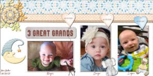
April 24, 2021 at 10:45 am #57174Worked up another double page, not necessarily a particular lesson, though this had the three photo masks. Good for me to practice doing them. I still have to have a “cheat sheet.” LOL I used a “template” from last year’s Travel Time Challenge but it is really a sketch as there were no layers included. I used several baby kits that I’ve accumulated since the great grands started showing up. 😉
-
This reply was modified 3 years, 8 months ago by
Ann Seeber.
April 24, 2021 at 11:46 am #57178Day 6. I loved doing the grunge background. Now that I know how to make them I can stop buying the overlays so thank you Carole for the wonderful tutorial.
I know I keep posting some of the same pictures but my 500 gb hard drive with all my older pictures crashed recently and I am not sure if they can pull the photo’s off. I did thankfully also put all those photo’s on disk I just cant get to them right now.
I love everyone’s page. All the animals are gorgeous. I am a flower person so I am also enjoying all the photo’s of them and the babies are just precious. Great job everyone.
April 24, 2021 at 12:13 pm #57181Another pets lay out……….
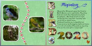
April 24, 2021 at 12:14 pm #57182Day 6, I cheated a little, I used the Saskatchewan element which I created a long time ago. At the time it took quite a while to do, to get the beads to align on the rope correctly. As the word is a long one! 🙂 I also used the BIRD word, which I also created some time ago. Using letters and numbers are a great way to showcase lots of photos. I like to add subjects showing at least one of their eyes. I used an overlay on the background paper. I have several grunge paper templates which I have created, and they are great to add to a flat background paper.
April 24, 2021 at 12:16 pm #57183Thanks Sue, I wrote your tip down for the future projects 🙂
April 24, 2021 at 12:30 pm #57184You are most welcome Monique. By retaining copies, and saving the pages as a PSP file, you will always be able to go back at a later date to copy and paste masks, text, and lots more into new projects, without having to start from scratch. Same goes for the grunge papers you create.
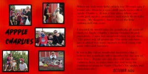
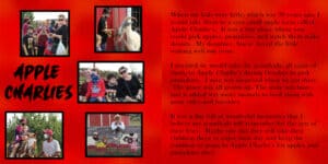
April 24, 2021 at 12:35 pm #57185Sandra: That’s a wonderful story! We have something similar here called Pennings’ Farm and when they wanted to expand the town was fearful they would bring in outside produce but they eventually got permission and my grandkids loved it too. I do love your red background! A quick hint, your title APPLE CHARLIES has too many “Ps”. 😉 I used to work as a proofreader and the hardest mistakes to catch are those in the largest type!
April 24, 2021 at 12:43 pm #57186Our resident campus proof reader doesn’t miss a typo! Well done Ann! 🙂 You beat me to it, Sandra posted this page after I had scrolled through what I had missed over the past few days. I spotted it after I had posted my day 6 page. I was about to comment, but you beat me to it . By the way Ann, great work!
April 24, 2021 at 1:34 pm #57192Ann and Sue: Thank you both so much for catching my typo. Very much appreciated. Thank goodness Carol taught us to always make a copy of our text before doing anything with it.
Ann sometimes its the little places that are the most fun. I find it sad when they go all big and commercial. They seem to lose their charm to me.
Here is my corrected copy.
-
This reply was modified 3 years, 8 months ago by
sandra jones.
April 24, 2021 at 1:42 pm #57195Day 2 Better late than never
April 24, 2021 at 1:52 pm #57196Annie Tobin, your photos seem to fly at the same rate as the flight of birds. Babies are beautiful on your pretty page
Thanks Carole, I used a red rose photo and adjusted it for my background
Barbara a beautiful photo montage for your day 5
Monique, many pages on animals, they are so cute
Laurie, the pictures come out bright against this darkened background
Sandra, sorry for your photos, hope you can get them back
Sue, original letters and numbers. I think your layer from the first photo has moved
April 24, 2021 at 1:55 pm #57200April 24, 2021 at 2:42 pm #57201Jnet, I used the lifted corner script on the first photo, but looking at it now it doesn’t look quite right, I don’t think it scripted properly. I’ll go back and try it again.
-
This reply was modified 3 years, 8 months ago by
-
AuthorPosts
- The forum ‘Showroom’ is closed to new topics and replies.


