Home of the Scrapbook Campus › Forums › Showroom › BOOTCAMP – May 2020
Tagged: Bootcamp may 2020 welcome
- This topic has 231 replies, 29 voices, and was last updated 4 years, 6 months ago by
Ruth Seibert.
-
AuthorPosts
-
May 15, 2020 at 5:34 pm #42827
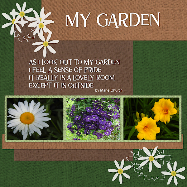
Day 5 – I am posting a page with pictures of my favorite pansies. I am also reposting my day 3 corrected to have drop shadow (too hurried).
May 15, 2020 at 6:55 pm #42830May 15, 2020 at 9:05 pm #42833Hello Everyone. I took this picture of an incredible waterfall in Jamaica. We ended up climbing the entire way up to the top stopping to rest in the pools that were formed by the cascading water. We also managed to get under a few of the waterfalls and get totally soaked. Enjoyed this project as I had to try and find a photo to work with the kit and then select appropriate components to build my page. I had a lot of difficulty with the text. I will try again tomorrow after reviewing the video again. I am confused with bringing the text to a different layer. With a good night’s sleep and clear eyes, I will give it another go. Carole, I have a few questions. Sometimes I can’t sit and do a complete project at one time. Should I be saving my work and if so, how & where, or do I just leave the program open on my computer? Currently I am saving ‘kits’ in a folder on my desktop. Should I be saving these ‘kits’ for future use in the program somewhere? Thanks.
May 15, 2020 at 10:07 pm #42836Day 5 adventure
May 15, 2020 at 10:13 pm #42837Marcia. Some years back Carole had a subject on how to save your scrapbook files maybe it is still around in the campus
May 15, 2020 at 10:24 pm #42841Joy, very nice flower. I can see why you want to showcase it. Good catch on the repost with the shadows! On your title, you have used a white outline. Have you tried without that outline? I wonder if it would make the text a little easier to read? For your project 2 (Day 5), it is simple, yet effective for displaying your favorite photos.
Sue, just a quick question; is the Day 4 project one of the Bootcamp project or an extra you made? I am just checking so I can keep track of the projects posted.
Glenson, that title makes me smile as it is PERFECT for that photo!!! Good job in colorizing the paper to match the photo. That is the beauty of digital work!
Krystyna, I am glad you discovered that one detail with the Text tool that will make your life easier. Although it was not in the tutorial, I see that you are using elements that would (if done in traditional paper scrapbooking) fairly thick (the flowers and the leaves). Try to add a much larger shadow (like 25 or 30 of offset) with a blur of 30 but an opacity of 30 or so. See how it looks.
Lynda, that layout could definitely be framed!!! Nice result!
Fiona, to answer your question about the drop shadow, if you have applied it on a separate layer, yes, you could then remove that layer and add another one. If, on the other hand, you have not applied the shadow on its own layer, it is quite difficult to remove without messing up the rest. That is why I strongly suggest one adds those shadows on a new layer.
Jose, you worked hard and very efficiently on your layout. It is a great looking page. You have a great tip to rasterize anything that has a text if you are to send the pspimage version to someone else. I see you used a “fancier” A for the title. I can suggest that you read this article on using fancy fonts (if you can find some, you will see how addictive they can be).
Isabel, it is totally ok to not use the supplies I suggest if they don’t fit with your photo or your vision of a project. And using existing supplies in PSP is also the simplest way to go.
Cindy, you are progressing very very well. I see that you resized the photo without distortion and you added shadows everywhere! Good job!
Theresa, nice photo for you to use. Your photo of John has some stains. We have some classes in the Master Classes to help with improving old photos. Something you might want to look into, in the future (not now).
Marica, when you want to stop working on a project but you don’t want to lose everything, save it as a .pspimage format. That will keep all your layers intact and you can simply reopen it the next time you open your computer or your program. It is ALWAYS a good idea to keep a .pspimage version, even when you are done, in case you find a typo or want to change something. For saving your supplies, I would suggest that you create a “main” folder called something like “Graphic resources” or “Scrapbooking” or even “PSP resources”, then inside that, you can have one folder called “kits”. Just make sure you start with a sort of organization right away, because those supplies multiply faster than bunnies! You have a look at this article on organizing scrapbooking supplies. On your project, I think you might need to add shadows on the photo and paper, and I am not sure the white element needs some. It looks like a paint splash that would likely not have enough thickness to need a shadow. Try and see how it looks.
Shirley, nice and simple. That photo is great on its own!
May 16, 2020 at 5:19 am #42847Not overly happy with the papers (all mine) but this is for my son and these are the colours he wants. The plaid and texture of the smaller papers don’t show very well when reduced and the background paper actually started as wattle flowers. The picture is of rooms that used to house the single miners and the smaller one is an old radio on site.
May 16, 2020 at 5:20 am #42849Here is my day 2 sandwich and table setting changed the colors of the setting and added cheese to my sandwich enjoyed the task
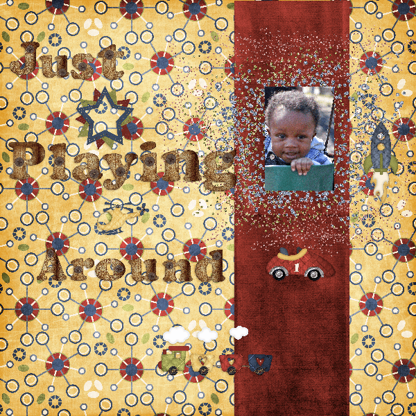
May 16, 2020 at 5:29 am #42851Here is my day 3 layout it’s the first one I’ve ever done and it was easier than I thought it would be not one bit of anxiety I used a kit by Farrah ‘s Designer Scraps called All Boy I love the colors.
May 16, 2020 at 8:33 am #42852Good morning Carole. The Swallow project is day 5. Yesterday’s tutorial. Sorry I wrote the wrong day on the project.
May 16, 2020 at 12:45 pm #42855Hi Carole,
I’m attaching a screen shot of a problem I’m having. I create my canvas and load my picture in a layer. Then when I want to load a paper for a background, my original background and picture go away and I’m left with just the paper I wanted to use as a background. I don’t know why and it keeps happening. Can background pictures be either .jpg or .png? Also, for some reason my background originally, I think, was the black and white squares, now it’s just plain white. I must have changed something.
Any suggestion?
Thanks,
JoanMay 16, 2020 at 12:54 pm #42857Hi Carole,
I just figured out what I was doing wrong (not copying as layer), but what has also been happening is when I go to scale, the options are not the same. What am I doing wrong? Just when I thought I was learning how to do this, NOT!
Thanks,
JoanMay 16, 2020 at 1:20 pm #42858Joan, not knowing exactly all the individual steps you took to get to this result, I cannot be 100% sure my suggestions will be perfect but here is what I think:
- when you added the papers on the project, is it possible that it was simply added on top of everything, which is why it would hide the other layers? If that is the case, you could just move the layer.
- you said you were not adding “as a new layer”. What were you adding it as?
- when you say that you don’t have the same options when you set the Pick tool to Scale, what options are you looking for? Are you missing the handles on the left and right sides? If so, you can stretch the canvas by grabbing the very edge of the image (the thin frame) and you should then see the handles you will want to resize.
Are those helping?
May 16, 2020 at 2:00 pm #42863OK, I am ready to post my 2nd project. I redid it a number of times before being satisfied with it. I love looking at every ones work. Really marvelous. Eula Eula has done a number of things I would like to know how to do – especially her 1st one. Eula, you used your picture as the background, but it is like the picture is behind a veil and barely recognizable as the same picture. Also, it appears you used the boards of the building as the rectangular strip. Really an amazing picture. In my 2nd project, I experimented with changing the complete color in order to get the dark brown strip. As a matter of fact, I had experimented with changing a gold strip to brown and had to delete it. However, the materials palette kept the foreground and background of what I was trying to do so when I brought in the new rectangular layer (which was also a golden hue) something I did changed it to the dark brown I was looking for!!! I couldn’t find any flowers to use that appealed to me. The gold leaf was good for keeping the color I wanted and so I duplicated it and resized copies of it and turned them different directions. The red heart and the gold bow I got from a pizza freebie kit. I am really amazed and love what everyone is doing. Really enjoying this bootcamp.
May 16, 2020 at 2:12 pm #42864Sorry – That was Euka Euka, not Eula Eula. And she said the filter she used was a simple “4 way average filter”. Where is that located? Also with the 2nd project I had thought about using a landscape picture as the background and I see that Lynda DiGregor has done hers that way very effectively. Really love to see the way everyone expresses their creativity in doing these projects! Thank you, Carole.
May 16, 2020 at 3:46 pm #42876When I added the shadow to the trees, they looked a little more blurred. But I left it anyway.
May 16, 2020 at 3:56 pm #42878Everybody is doing a wonderful job on this challenge. Congrats to all!
Here is my Project #2.
The papers are from the “WeLoveSummer” kit by Palvinka with a few tweaks on the colors.
I used Cassel’s “Lifted Edge Script” and created the Admission Ticket (CreativeScrap>Text and Journaling>Admission Ticket).
Fonts: Bauhaus Std Medium and Beauty and Love Sans
May 16, 2020 at 4:18 pm #42879Laurie, I love your work. I hope you get my message. I don’t know how to get around the forum.
May 16, 2020 at 10:04 pm #42883Euka, you chose the colors well for your page. I do find that the background looks good. Maybe you see something different when it is full size, but at the 600 pixels format, that background appears patterned but not overpowering.
Dawn, good sandwich! For your first project, it is a fun kit you used. Since you have a busy background, I probably would have tried some solid colors for the title instead of a pattern. Shadows on your elements would also give them more definition, especially with such a busy pattern. If you still have the .pspimage version of the page, try to add those shadows and see if it makes them stand out.
Mary, good layout for your project. Over time, if you hang around in the Campus, you will surely learn new tricks to play with the shadows, for example, to make the bow look like the end is off the paper.
Joan, the effect you see on the trees is normal and actually gives that volume to the element. Sometimes, you can play with the opacity of that shadow if you feel it overpowers the element, and go slightly off the suggested values. It is by experimenting with those settings that we each find the sweet spot for any element.
Cristina, nice layout using interesting tools (that are not necessarily available to our beginners 🙂 ) Thank you for mentioning what you did, so at least, they might try to experiment with your instructions.
May 16, 2020 at 11:37 pm #42885Cassel
I’m enjoying making scrapbook pages never explored it before so thanks for opening my eyes. I’m not sure but my shadows don’t look quite right I switched them to the side they are on now because they looked worse on the other side. I used a bokeh bubbles paint brush for the doodles below the picture. The background is rice paper and the paper below the picture is a part of a photo where I liked the grass. I had a good zoom although these guys were still close
May 17, 2020 at 1:28 am #42887hi
Well a definite challenge but I didn’t quit lol but need a lot more practice. so here is my lunch. I got hungry making it but enjoyed it when finished. Thank you for a great lesson.
May 17, 2020 at 2:54 am #42888Mary Solaas, firstly your great grandchildren have gorgeous smiles! and I like the way you present your projects. I love seeing the ideas of others and how they are presented, there is always something to learn.
The 4 way average I used is one of a set of Simple filters (Simple is the name of the set). I am sorry but the filter is not part of Paintshop but is an addon, and yes for my panel I took a selection of the wall from the original photo and added it as a layer to my page. Thanks for your comments and interest 🙂
May 17, 2020 at 10:53 am #42893Wonderfully creative projects being submitted. Well done everyone!
For me this was a quick easy page to put together. I had previously chosen my photos for the boot camp. I always start with photos, and the rest slips into place, well most of the time anyway. I used Cassel’s gold glitter, as I wanted a colour close to the colour of the Robin’s beak, which wasn’t anywhere else in the project. The lace edge, is one of Cassel’s lace fonts, which are delicate, and beautiful to use in any project. Cassel’s corner punches are another favourite of mine. I took a colour from the robin, for the background paper, and used the blinds texture. The punched paper, is a gradient I made myself from a tutorial from the calendar challenge. The word ROBIN, is a font called playtime, where I changed the direction of the text, converted to a raster, inner bevelled, and drop shadowed. I used a tutorial in the lab, which is available to those that subscribe, called photo cutout on the main photo, which is placed in a blue frame using the selection, modify, select selection borders, for the frame, and another gradient I made to fill.
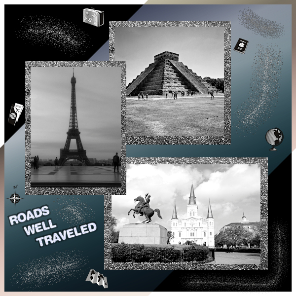
May 17, 2020 at 1:23 pm #42897As a guy, glitter is not up my alley so in order to do the class I found some black and white glitter paper for free and downloaded. I can not remember from who so my apologies. I started my background with a transparent layer, added a gradient color, duplicated it and changed the layer to a blended mode of multiply. I then dropped my pictures, arranged them. Then like you did, I put in the glitter paper and duplicated it twice in order to have three of them. I then put one under each picture and adjusted accordingly. Typed Roads Well Travelled, rasterized it, then I added an effect called chiseled. I then went into the Tube and found some glitter which I sprayed around some areas. I really was not happy with so I did another duplicate of the original background and again changed the bending mode to multiply which darkened it more. Still not fully satisfied so I played around with distortion effects until I got the one I liked. Still did not look like a scrapbook and as such went into the Tube section, picked Travel and added a bunch of tubes in several spots on their own layers. Still not happy, I added another layer, poured white paint, did a selection just off the edge and cut out all from the middle to give it a white border. Thought the white was too strong and played with blendings till I got to Difference. Now I was happy….LMAO
P.S. I see with the white background you have the white part of the border does not come through as it blended in. Ohhhhh well….time to see my NASCAR racing…..have a good day!
May 17, 2020 at 2:30 pm #42901Love your robins, Sue…nicely done 🙂
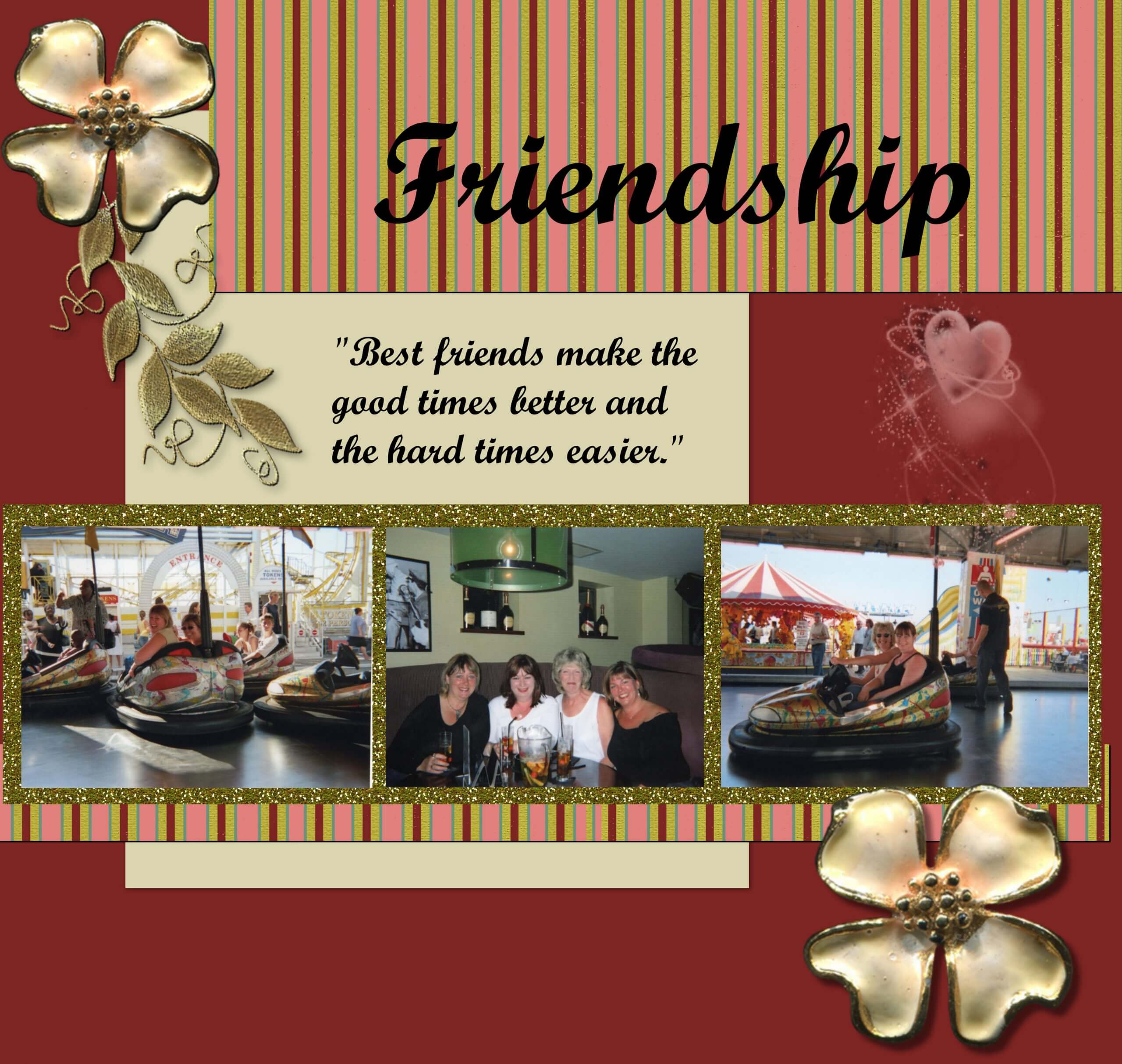
May 17, 2020 at 3:16 pm #42903Hi everyone, as ever there is some very good work being produced here with lots of tips and inspiration, so thank you. Here is my take on the Friendship project. This took me over 3 hours to do. First, I had to make the striped background by modifying a page from one of the scrapbook freebies because the original colours did not match my picture. I selected the various strips and colour using the magin wand and the shift key, chose my colours from the photos, and filled the selected areas. I then found the stripes were spaced too far apart, so I copied a stripe, added a new layer and pasted in the larger gaps with the selected stripe. Then I couldn’t find a nice scroll amongst my collection, and after trawling through my long forgotten folders I came across the gold leaf in my accents folder so I used that, and then found the heart in the same folder. So, it has taken me a while to say the least!
Loved the idea of the glitter background to the photos which are of me and my friends enjoying a day out in Brighton UK.
This project certainly took me out of my comfort zone, but very worthwhile for what I have learnt, and became familiar with those things that I had long forgotten.
May 17, 2020 at 3:17 pm #42904Lovely work, Sue, those robins are cute. What an inspiration!
May 17, 2020 at 4:15 pm #42909Love seeing all the work you all are doing. I’m still a rookie at this, but was inspired by Euka Euka and DiGregor who used photos for the background instead of paper. So, I made another copy of Laurie and the State Park and came up with this. I will still have to do my new project, but that is on the wait list.
May 17, 2020 at 4:59 pm #42911Day 7 project friendship
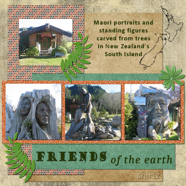
May 17, 2020 at 5:17 pm #42913Project 5 Day 7.
In keeping with the tutorial, I have cropped and sized my 3 photos to place in formality above the piece of glitter. I accidently added a 4th photo as it helped to tell the story. When we were travelling around in our holiday bus, we came across this place with all these carvings in and on the trees, they were fantastic and my camera just kept clicking. Last year I took some friends, and it was all gone. What a disappointment. Apparently it had all been shifted to another province, it is hard to accept how all these living things from the earth could be shifted successfully without a trace left behind. It was a truly exciting experience the carvings were brilliant, it was hard to choose which photos to place on my project.
-
AuthorPosts


- The topic ‘BOOTCAMP – May 2020’ is closed to new replies.


