Home of the Scrapbook Campus › Forums › Showroom › Bootcamp – January 2022
Tagged: project 5
- This topic has 303 replies, 27 voices, and was last updated 2 years, 10 months ago by
Cassel.
-
AuthorPosts
-
January 23, 2022 at 5:08 pm #70314
Ann Seeber and Mary Solaas – Thank you both so much for your lovely compliments 🙂
January 23, 2022 at 6:43 pm #70315yes she is a chi
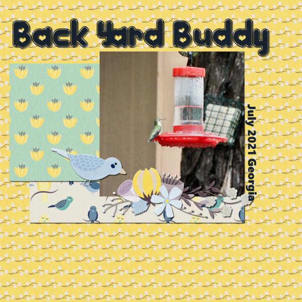
this is project 2 we have hummingbirds that migrate threw here in the spring as well as other birds and animals i call them my backyard buddies. i have one woodpecker that has stayed threw this winter and am still feeding her. I am not happy with this papers in this kit for this photo so i will look for a different one and redo it.
 January 23, 2022 at 6:58 pm #70316
Thank You All,
my Granddaughter read me a lot of writings and she thinks your the Nicest People me to. The Stillness is what I been doing in between er and dr visits Thank You
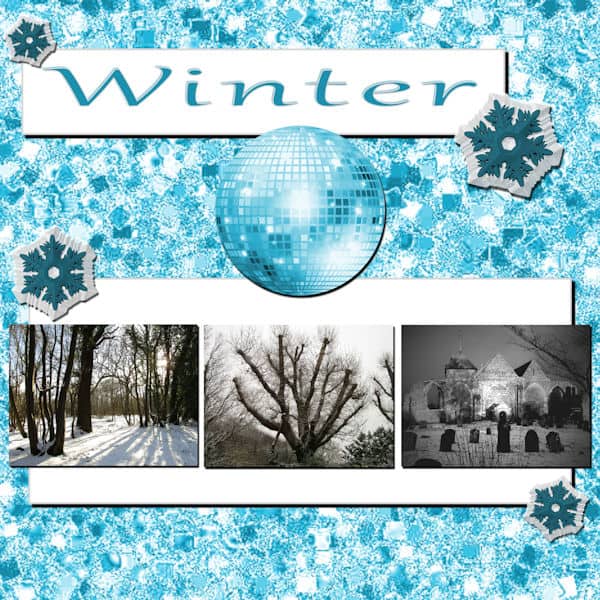
January 23, 2022 at 7:22 pm #70318January 23, 2022 at 7:44 pm #70320Here is my Project 3 – Winter…
I downloaded the glitters that were on the tutorial page of the video. I adjusted the colour to suit the wintry feel. The snowflakes are a tube from PSP 2022, and I gave them the chisel effect and altered the colour of them. The glitterball was in with the tubes also and I slightly adjusted the colour, but not by much and gave it a drop shadow. I also added a drop shadow to the white background where the photos and the title are.
Carole/Cassel – thank you for the CTRL Y tip – never knew that!
January 23, 2022 at 8:04 pm #70322My Day 7 Project 3. All the papers and elements are pixel scrapper. Title font is “Impact” and the paragraph is “Bahnschrift”, which could be from windows. Photo’s are my own. I put a skinny black frame around the photo’s glitter paper to help it stand out a bit. I used an inner bevel on the title to give it a more rugged rusty metal look.
Really enjoying the diversity of pages. So many creative minds.
Cindy, Hang in there, you got this!
January 23, 2022 at 8:09 pm #70323Carole, thank you about the shadows. I still use my cheat sheet, but have been playing with settings more and seeing what I like. Barney is full-grown and he’s pretty tall, his head came up to my chest level. He passed a few years back (old age). He was such a character.
January 23, 2022 at 9:13 pm #70324** Thank you, Cassel. I am adding a second attempt with resized photos.
Day 7: This project is fun. I used bits and pieces from various scrapbook kits. Each project I see posted here is so interesting.
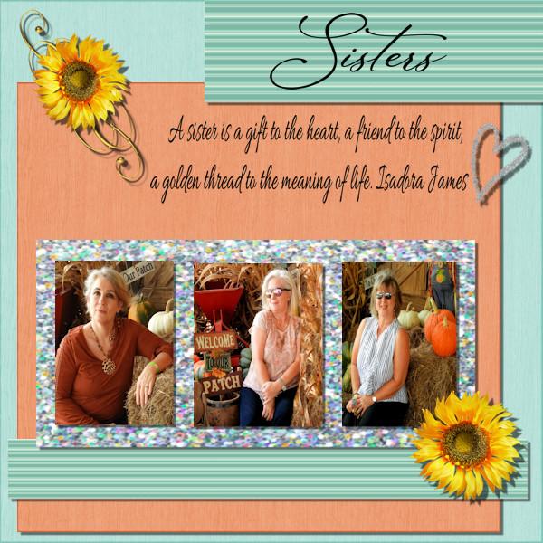
I spent my Sunday afternoon thinking about times with my sisters. Before the pandemic, each of us would travel and meet for a sister reunion every year. I miss our reunions.
“A sister is a gift to the heart, a friend to the spirit, a golden thread to the meaning of life.” – Isadora James
-
This reply was modified 2 years, 11 months ago by
Diane Lochala. Reason: Resized Photos
-
This reply was modified 2 years, 11 months ago by
January 23, 2022 at 9:40 pm #70325I am enjoying seeing all the posts!
Trying to work on project 3, but PSP keeps closing on me tonight. So far it has closed 4 or 5 times, and I have had to repeat my steps when I reopen PSP. I am learning to save often! Frustrating evening. But I think I am happy with my layout for tonight.
-
This reply was modified 2 years, 11 months ago by
Linda J Walker.
January 23, 2022 at 11:28 pm #70329Anonymous
- 335

- Enthusiast
here is my page for BootCamp Day 7
I did everything myself except the text – it’s from the Bible 🙂
January 24, 2022 at 1:24 am #70330Theresa, you can definitely keep it simple and it is often a better way to showcase the photos and the story than to make everything very busy. Just make sure to add some shadows so we can see the elements you use. On your second layout, I see that shadow you added. If you have your shadow on a separate layer, give a try to a darker but smaller shadow. Compare the two. You can just hide the existing shadow and you can hide and unhide to see the difference. I love that little fox! You are creative with that winter layout; using the glitters as a large background and colorized is well done! Try to stick with black shadows. If you have the opacity anything less than 100%, it will automatically show the color underneath in a natural way. I think you forgot the shadows on the photos?
Peter, those shadows really make your layout stand out! Having more than one element on a single layer can happen very easily. As long as you don’t need to move them, you won’t notice but if you have to move or rotate or shadow one element, that is when you notice. And your solution was the only one! Good thinking.
Gregory, that is a statue???? It looks so real!!! Since you are using solid colors for the shapes, I would suggest you add some texture to them. It will just add some depth. There are a few textures you can use in Effects > Texture Effects > Texture.
Lavada, what is it that you don’t like about that paper? Maybe a little too bright? You can darken it a little with the Adjust > Brightness and Contrast > Brightness contrast and reduce the Brightness. You can also add a layer, fill it with a different color and reduce the opacity of the solid color layer for another look too. Of course, you can also change paper completely if you prefer.
Liz, you are doing good with the sizing of the images. I would have two suggestions: 1- the black and white strip is on top of the flower; maybe slip it below instead since the flower seems to have more thickness than the paper and 2- try to avoid having some written text over two surfaces; you would likely not be able to do that in a paper project! 🙂
Susan, very well done on this layout! Have you considered lightening the title a little? I am not sure if it will solve the issue but it seems that the dark color added to the darkness of the bevel AND the dark shadow makes it a little hard to read. Maybe just adjusting the Brightness a little?
Diane, your work with the shadows is great. I am a little concerned about the resizing of the photos. I have the impression that they were not resized proportionally. It is ok if they are not the same width, as long as they are the same height. The middle and the right photo seem a little squished horizontally. Poor ladies might get a headache!
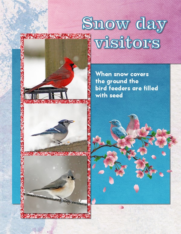
Linda, those are beautiful birds! Your layout uses shadows very well. However, you have that nice branch that extends over the blue paper. This means it is on its own layer so it should have some shadows. May I suggest that you add a small shadow but with a large blur and very low opacity? This would give the impression of the branch being off the page instead of looking like a paper cutout. Give that a try.
Pirkko, beautifully done. Your stipe paper is very well done!
January 24, 2022 at 9:02 am #70332January 24, 2022 at 9:04 am #70335The photos are more from my college friend’s backyard.
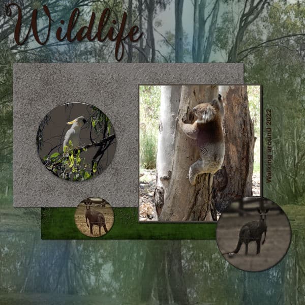
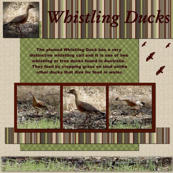
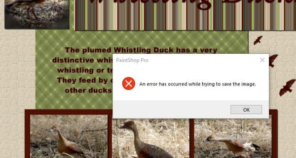
January 24, 2022 at 9:34 am #70339Running a bit behind but here are my Day 5 and 7 projects. Still wandering around at my sons, he has lots of native wildlife. I need to remember my camera when I am there as my phone doesn’t zoom very well. Day 5 saved ok but day 7 refused to save as a pspimage the same as it did for day 3. Not sure why. I have attached the error msg. Thankfully jpg works. I was using PSP2020. I had saved quite a few steps but still a long way off finished. Both projects are my work apart from the flying bird brush.
January 24, 2022 at 12:18 pm #70343Day 7 project
Thank you, Cassel, for the advice about the photos. I will add another attempt.

-
This reply was modified 2 years, 11 months ago by
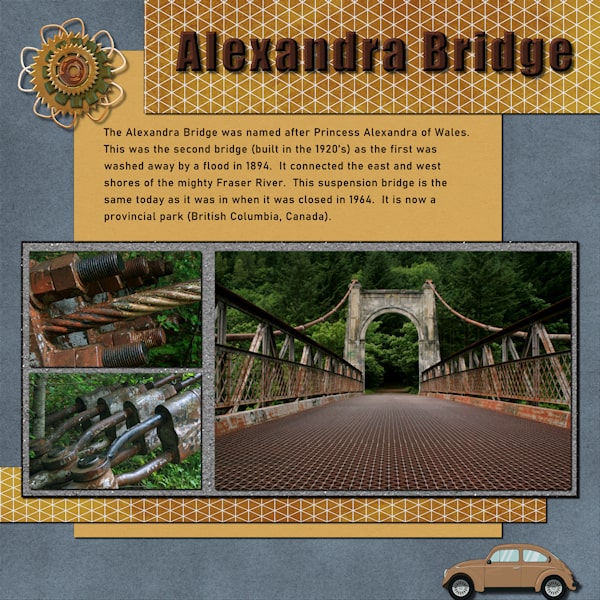
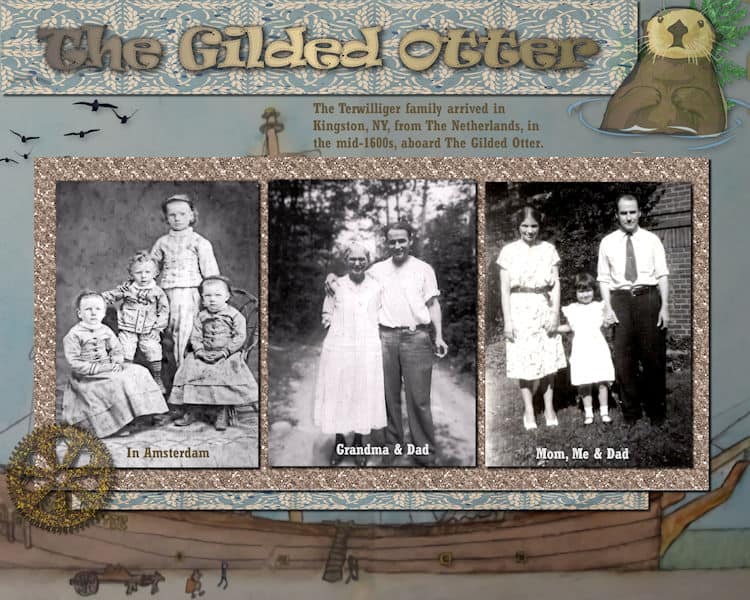
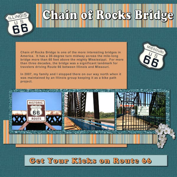
January 24, 2022 at 12:47 pm #70346Here is Bootcamp Project #3 – It is based on a watercolor painting of the ship, called The Gilded Otter, that carried my ancestors from Amsterdam, The Netherlands, to the New World in the mid-16oos. They landed in Kingston, NY, after traversing up the Hudson River a-ways. The left photo is not identified though the photographer mark is in Dutch. Center is my grandmother and father. Right is my mother, dad and me. We are all Terwilligers!
Actually, the ship painting is in two halves in a museum in New Paltz, NY, which is near Kingston. I attempted to join them to show the entire ship.
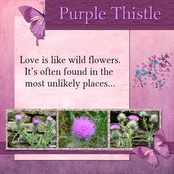
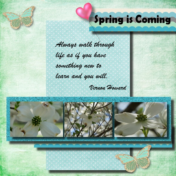
January 24, 2022 at 1:18 pm #70348I photographed these flowers growing out of a wall last year. It’s nice to be able to use them in a project.
I mainly used the spring kit that Carole gave a link to. I downloaded a pink glitter paper from digital scrapbook and made a textured rectangle for the title and below the photos.
January 24, 2022 at 2:05 pm #70349Carole/Cassel – thanks for the advice about doing the drop shadow in black, and I’ll give it a go…. But, is it possible to delete/remove the drop shadow, or is it a case of redoing the ‘rectangle’ and starting that part again to add a fresh drop shadow?
I’ve opened us the pspimage of ‘Winter’ and can’t figure out if removing the drop shadow can be done. I’ve tried changing the settings on it, but it just adds another drop shadow onto it. I was hoping there’d be a ‘clear drop shadow’ or something similar to click on to remove it… Have looked in the help section regarding 3D effects to see if that has the answer but I’m not having much joy with that..
It’s probably something simple, and more than likely something I should know, but going back to work today after a few days off may have fried my brain a bit LOL 😉
Any help or thoughts would be much appreciated.
January 24, 2022 at 2:11 pm #70350Theresa, it depends if you created the drop shadow on a separate layer or not. If you did, one layer should be called something like “Shadows of Raster 1”. If that is the case, you can delete that layer and add a new one. If you created the shadows on the same layer, then it is trickier. You could use the selection tool, select a rectangle where your shadow is and remove it. It would work easily on rectangular elements but obviously would not work if you had a shadow on a flower for example. That is one reason why we recommend adding shadows on a new layer (there is just a checkmark on the Drop Shadow dialog window).
January 24, 2022 at 2:46 pm #70351Carole/Cassel – Ohh, thank you… I did see ‘shadows on a new layer’ but left it unchecked. I did think of cropping the rectangle or redoing it but knew I was missing something regarding the drop shadow and wanted to understand it. I’ll have a go at it shortly.
🙂
January 24, 2022 at 3:19 pm #70353Version 2 of Winter.
I don’t think I’ll ever do a drop shadow again without checking that little box 🙂
January 24, 2022 at 4:42 pm #70358Carole,
I added a shadow to the branch. Maybe it is too much?
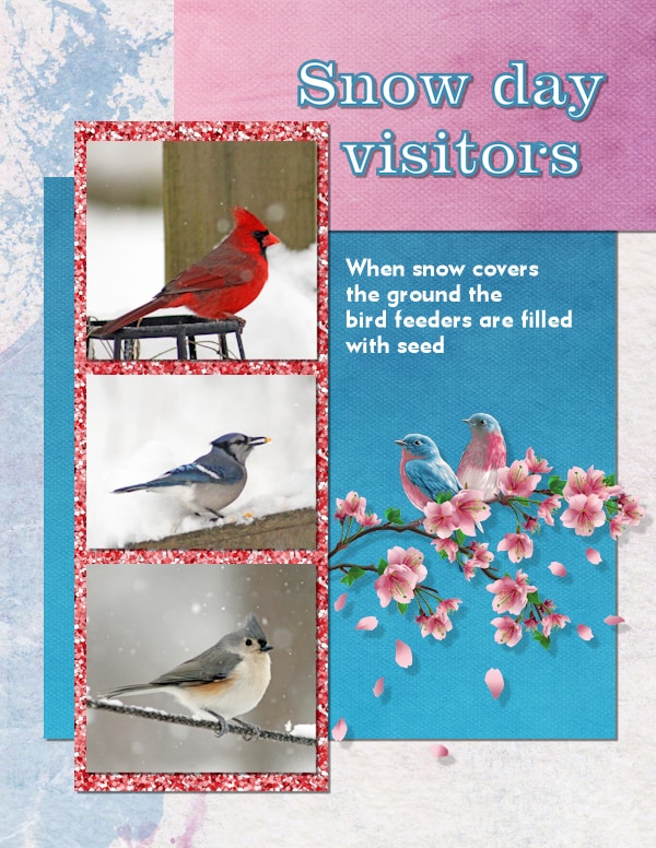
I keep my DSLR with the zoom lens on the kitchen counter, so I am always ready to take photos of the birds! Probably too many photos of the birds!
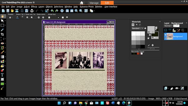
January 24, 2022 at 6:51 pm #70362I’ve run into several snags on project 3. First, the one you’re most likely to know the fix for: I was ready to put the textured frame behind my photos, but my Materials palette shows up with no tabs to get to the “textures.” How do I do that?
Second – and I think I’m going to have to start over on this project – when I brought up my project there was only one layer. It had been a PSPimage file originaly, but was now a jpg. I imported the three photos into the PSP image, but edited and re-saved each photo as jpg’s before proceeding. I added each photo and “saved” after each addition. Apparently PSP saved the entire project as a jpg.
I’m stuck, right? there’s no PSPimage file for this. Do I need to start from scratch?
Also, now that I think of it, is the fact that this image is a jpg what keeps the Materials palette from offering me the options I was looking for?
Thanks!
Peter
January 24, 2022 at 6:56 pm #70364I found this Project so frustrating. One: I only have 3 kits all from you as I can’t pay – only using free stuff. So it took forever to get a light springy look thus all the coloring doesn’t match. Second I had to rewatch the video and figure out how to get the pattern of glitter paper. The trick is to hit the center of the green square (on your video) to get to the next window and scroll to see the paper!! Yikes! Third since I have had 2 major surgeries in 2021 – the last one 4 weeks ago – I can’t sit nor stand very long without pain. The anesthesia and pain meds already lost some memory function! Thus more frustration. Sorry! Not your fault. Carol, what does Anti-alias on the Text Tool do?
Thank you Linda Walker for the snow suggestions. I did download some free there but didn’t have time to redo my Project 2 for a 3rd time.
Carol my photos were too big to start so I used the pick tool but I know you said not to do lots of resizing with it. What size should I do on the photo before I bring it into the Project?
January 24, 2022 at 7:01 pm #70365Peter, let me answer your question immediately.
If you have only one layer, you are stuck, whether it is a jpg, a png or a pspimage format. Sorry!
At any point, if you saved your image without noticing the file format, it is POSSIBLE that it was set to jpg as the previous save you had saved, and any subsequent saves would also be of a flattened image. Unfortunately, yes, you will have to start over.
As for your Materials palette question, the Texture is available in the Materials Properties dialog window, which you access by clicking on the swatch itself. Then, it should appear on the top right of the dialog window. But are you trying to add Texture or the glitters pattern?
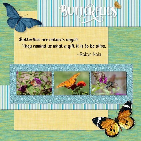
January 24, 2022 at 7:54 pm #70367Didn’t think I would finish Project 3 today, but I did. Not as happy with it as with others, but oh, well, here it is. I do have to say that everyone is really doing well – love what is being posted. Ann Seeber – that is a great way to show your family. Gerry – love your butterflies. Grammie – I love your colors and showing the dogwood – real harbinger of spring.
All my own papers and elements again.
January 24, 2022 at 8:16 pm #70369Yes, that is what I thought. Thanks for verifying it. Not a big deal… I just started over, and this time I did it a little more carefully. I will get it done in the next day or so, assuming all goes well.
As for your question about texture versus glitters, I was going to use a different paper other than glitters to add a texture behind the photo. However, I’m going to try it your way first. Maybe that will work!
Thanks, as always for your support and help.
Regards,
Peter
January 24, 2022 at 8:20 pm #70370project 3..the pics might be a little off from alignment as i am using jac 9 and for some reason when i use the guide line it freezes up my program..
 January 24, 2022 at 10:39 pm #70372
Project 2
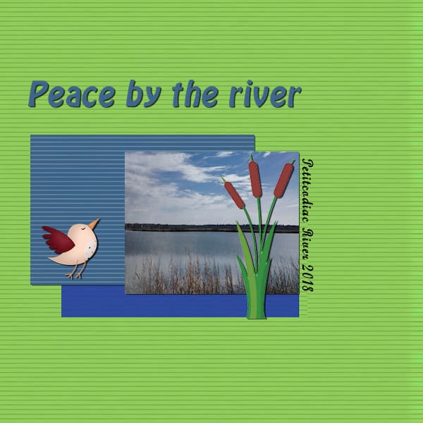
My adventure often is just a stroll. On a beautiful summer day, I took this picture. The clouds were really beautiful but for this project, I decided to focus more on the water. The items I added are mostly from digitalscrapbook.com
I used a blur against the darker blue background which left the rightmost part transparent. When I tried to add a drop shadow, it cut across the Location / Date. So I removed the drop shadow for that layer.
I would like to better understand how to determine which colours look best when used with each other.
I know that within PaintShop Pro you can see Complimentary, Triad, Tetrad, Analogic and Accented (and Mono). But I don’t understand how these work.
January 24, 2022 at 11:49 pm #70373Liz, great change. Layering can have an important effect on a layout.
Gerry, I see that you used different shadows on the papers and the butterflies. That yields a great effect.
Euka, that kind of error is an “unknown” one. There is no clear explanation when it happens, and it is frustrating. Not sure if it would work, but try saving in .psd format to see if it would work. That format would keep the layers (although it won’t keep the vectors). It is worth trying instead of losing all the work.
Diane, YES, that is quite different. You solved their potential headaches!
Ann, I am just curious why the cogwheel is translucent on the left. I would definitely expect it to be opaque.
Sharla, those are beautiful flowers and you found great matching papers for them.
Theresa, it is always a good idea to have shadows on separate layers, for that exact reason. A good habit to take.
Linda, that is not too much at all. How does it look to you? Over time, you have to be able to gauge the look while tweaking those shadows and finding the best setting for the element and the look you want to achieve.
Peter, sorry for your tech issues, but at the same time, you learn even through those. I think you are looking for the PATTERN tab if you want to use the Glitters tile or any other tile, not the TEXTURES one.
Gramie, you are a determined one getting through all those frustrations. For free supplies, you can check the Resources page for a list of freebie sites. You will see your stash grow over time. Anti-alias will make a difference between a smooth or a pixellated edge. You can read more about it HERE. As for the photo size, considering that the whole page is 3600 pixels wide, you can estimate that if your photo is slightly less than that, you can then size down using the CORNER handle of the Pick tool.
Mary, you picked great colors to complement your photos. Did you forget the shadow on the top piece of paper?
Lavada, I feel your frustration. Yes, I suspect it is a bug and when using the guides in PSP9, you cannot hesitate to hold it too long or it will freeze your program. The only trick I found is to place the guide quickly and adjust the placement, if needed, by right-clicking on the tiny rectangle in the Ruler. Good resizing of the photos! No distortion!
Randy, you should never remove a shadow. If needed, you could move the text slightly away, or you can lower the opacity of the shadow so that the text is easy to read, even if it is on top of the shadow. If the shadow happens to be on top of the text, you can rearrange the layers so that the text is moved upward in the Layers palette. To answer your question about the Complimentary, Tertiary, etc. colors, they are just that: colors that go well together. For example, if you start with a yellow color, choosing the Complimentary color will point to pink. If you choose the Triad, and start with the same Yellow, it will point to two colors at equal distance from the previous pink. If you move one of those colors in one direction, you will see the other move in the opposite direction. Play around and you should find those colors that match one that you pick from your photo. I guess a blog post is needed 🙂
-
This reply was modified 2 years, 11 months ago by
-
AuthorPosts


- The topic ‘Bootcamp – January 2022’ is closed to new replies.


